Table of Contents:
Introduction:
This is a list of analyses of Covid-19 cases worldwide as reported by the Johns Hopkins University (JHU) at https://github.com/CSSEGISandData/COVID-19. These bulletins were shared with friends.
For the library of Excel charts of Covid-19 cases: at Political rallies; confirmed cases and deaths daily and cumulative in various regions of the world see https://www-iepm.slac.stanford.edu/pinger/excel/
For information on how to use the Excel files see https://confluence.slac.stanford.edu/display/IEPM/Covid-19+-+Visualizing+the+data+with+Excel.
In cases where we have tried to display many countries (e.g. for all of Africa) the lines are too cluttered, so we have also broken down into smaller geographic areas.
July 3, 2020: Initial reach out.
I saw the article on Covid-19 (https://www6.slac.stanford.edu/news/2020-04-16-slac-joins-global-fight-against-covid-19.aspx) and the article about Arty Bienenstock and Paul Michelson's efforts (https://news.stanford.edu/2020/06/30/global-scientific-cooperation-needed-pandemic-fight/) and thought there may be interest in the following.
I have been analyzing the Covid-19 cases based on the Johns Hopkins data and using Motion Charts to look for correlations with population density, income, political leaning, population density, education, age etc., and also to see the evolution with time for the US and California. The report so far is at https://confluence.slac.stanford.edu/display/IEPM/Covid-19+-+Visualizing+the+US+and+California+data. As a follow-on I am looking at the evolution of Covid-19 in African countries.
The summary and observations are:
US States time series plots of Covid-19 cases, May-June
- time series plot of the US Confirmed cases by state on a log scale.
- percent deaths/confirmed cases by state as a function of date:
US States Motion Charts of Covid-19 deaths vs confirmed cases
Cumulative:
- cases with bubbles sized by US state population and colored by per capita income (Jan 28, 2020 - Apr 28, 2000)
- cases per million population with bubbles sized by US state population (May 1, 2020 - Jun 22, 2020)
- cases per million population with bubbles sized by US state population and colored by per capita income (May 1, 2020, Jun 25, 2020)
- cases with bubbles sized by population density of state and colored by per capita income (May 1 2020 - Jun 26, 2020)
Daily:
- daily cases per million population with bubbles sized by US state population and colored by per capita income (May 1, 2020, Jun 26, 2020)
- cases with bubbles sized by US state population and colored by per capita income (May 1, 2020, Jun 26, 2020)
Observations
- Looking at the total deaths vs cases it is seen that New York (NY), Delaware (DE), Massachusetts (MA), Rhode Island (RI) and Connecticut (CT) lead the pack followed by Maryland (MD), Illinois (IL) and more cently Louisiana (LA) but other states are catching up.
- It is a similar situation when one normalizes the states by their populations.
- When one looks at the new daily confirmed cases/Million state population and deaths/Million state population it is seen to be very variable day-to-day.
- Arizona's increased confirmed cases pulled it away from the pack starting May 14, 2020, and Florida pulled away starting May 24, 2020
- The values of new Confirmed cases/day/Million State population appears to decrease as one moves forward in time beyond May 23 but then to increase again (driven by Arizona) starting June 14, 2020. Maybe tgis part of the "opening".
- Comparing the above with the same data but not normalized by state population
- At the start of May there is a noticeable correlation between deaths and confirmed, by the end of June the correlation is much weaker
- At the start of May the deaths and confirmed is dominated by New York (NY), New Jersey (NJ), Illinois (IL), Massachusetts (MA), California (CA) and Maryland (MD). By the end of June California (CA)is still a leader joined by Texas (TX), Florida (FL), Arizona (AZ), and Georgia (GA).
- Looking at the cases with bubbles sized by population density:
- Some states with high population densities such as New York (NY), New Jersey (NJ) and Massachusetts (MA) have high numbers of confirmed cases while others such as Washington DC, Rhode Island (RI), Delaware (DE) have fairly low numbers of confirmed cases.
- In general, the deaths/confirmed cases appear to be falling with time for especially as we get into June. This may be a mixture of increased testing finding more cases as well as more effective treatment.
- Exceptions that are still increasing include: NJ, MA, PA, CT, SD, NH, IL.
California Counties Motion Charts of Covid-19 deaths vs confirmed cases
bubbles sized by population density for CA Counties and colored by per capita income (Jan 25, 2020 - Apr 30, 2020)
cases per million population with bubbles sized by CA county population and colored by per capita income (May 1, 2020 - Jun 25, 2020)
- Observations:
- In terms of confirmed cases and deaths per 1 Million county population
- The leading counties are Lake (LAK), Nevada (NEV), Mono (MNO) with Imperial (IMP) catching up since the end of May.
- These are followed by LA County (LA), Orange Country (OR), Kings County (KIN), Tuolumne (TUO) and Riverside (RIV).
- If one just takes the number of cases (i.e. do not normalize by the population of the county) then:
- The leading counties are LA County (LA), Orange County (OR), Lake County (LAK), Nevada County (Nevada), Riverside (RIV), San Diego County (SD) and San Bernadino County (SBD)
- By March 24th the following counties were already observing deaths: Santa Clara (SCL), Riverside (RIV), San Jose (SJ), Sacramento (SAC), LA County, Orange County.
- The last county to record a Covid-19 death was Sierra County (SIE) on May 21st, 2020.
- In general, the counties with lower per capita income appear to have lower numbers of confirmed cases and deaths, The exceptions are Lake County (LAK), Imperial County (IMP), Kern County (KER), Tuolumne County (TUO) and Fremont County (FRE).
- In terms of confirmed cases and deaths per 1 Million county population
Notes
Demographic correlations for CA
We investigated the correlations between the demographics and the confirmed Covid-19 cases for CA. We used the R squared coefficient of determination to characterize the degree of correlation between the various demographics using a linear fit.
| Demographic | Income | Education | Cases | Politics | Age | Population density | Population |
|---|---|---|---|---|---|---|---|
| Per capita income | * | 0.81 | 0.0032 | .28 | 0.008 | 0.12 | 0.19 |
% of people completing college education for CA | 0.81 | * | 0.016 | 0.43 | 0.009 | 0.20 | 0.043 |
| Covid-19 confirmed cases | 0.0032 | 0.016 | * | 0.34 | 0.012 | 0.14 | 0.77 |
| % of Registered voters who are registered as Democratic | 0.28 | 0.43 | 0.034 | * | 0.089 | 0.15 | 0.081 |
| Median age | 0.008 | 0.008 | 0.012 | 0.0089 | * | 0.0029 | 0.084 |
| Population density (people/sq mile) | 0.12 | 0.20 | 0.14 | 0.25 | 0.0029 | * | |
| Population | 0.19 | 0.043 | 0.77 | 0.081 | 0.084 | * |
It is seen that there is a strong correlation between the per capita income and education and between confirmed cases and population, a medium correlation between registered voter political leaning and education. The excel spreadsheet of the analysis of the above demographics and their correlations can be found here.
Jul 7, 2020: Covid-19 and countries with larger populations
I have extended the analysis of the Johns Hopkins University (JHU) covid-19 data to focus more on the countries with larger populations (10M up). As before, I am utilizing Motion Metrics (see www.charte.ca) to visualize the data and then reviewing the data and making observations on the progress of the virus as a function of time and country.
The latest visualization and analysis is to be found at:
https://confluence.slac.stanford.edu/display/IEPM/Covid-19+-+Visualizing+Countries+with+various+populations
Jul 23, 2020: Covid-19 and California counties
I have updated the analysis of the Johns Hopkins University (JHU) covid-19 data on California counties. As before, I am utilizing Motion Metrics (see www.charte.ca) to visualize the data and then reviewing the data and making observations on the progress of the virus as a function of time and county.
The latest visualization and analysis is to be found at:
https://confluence.slac.stanford.edu/display/IEPM/Covid-19+-+Visualizing+California+data
The observations are:
- Deaths are roughly linear with confirmed cases on a log scale
- By March 24th the following counties were already observing deaths: Santa Clara (SCL), Riverside (RIV), San Jose (SJ), Sacramento (SAC), LA County (LA), Orange County (ORA).
- By June 25th:
- In terms of confirmed cases and deaths per 1 Million county population
- The leading counties were Lake (LAK), Nevada (NEV), Mono (MNO) with Imperial (IMP) catching up since the end of May.
- These are followed by LA County (LA), Orange Country (OR), Kings County (KIN), Tuolumne (TUO) and Riverside (RIV).
- If one just takes the number of cases (i.e. do not normalize by the population of the county) then:
- The leading counties are LA County (LA), Orange County (OR), Lake County (LAK), Nevada County (Nevada), Riverside (RIV), San Diego County (SD) and San Bernadino County (SBD)
- In general, the counties with lower per capita income appear to have lower numbers of confirmed cases and deaths, The exceptions are Lake County (LAK), Imperial County (IMP), Kern County (KER), Tuolumne County (TUO) and Fremont County (FRE).
- In terms of confirmed cases and deaths per 1 Million county population
The full report for countries of the world etc (including US, California, Asia, Europe, South America) is at Covid-19 - Visualizing the data with Motion Charts
Aug 4, 2020: Update
I have added a new section on Global impact of Covid-19 (see https://confluence.slac.stanford.edu/display/IEPM/Covid-19+-+Globally). In particular, this contains:
- a chart (attached) of the Confirmed cases and deaths per day per thousand population for countries with > 5M population at the end of July. Note the predominance of the US, S Africa, and S American countries such as Argentina, Brazil, Bolivia, Chile, Colombia...

- a chart (attached) of the history of confirmed cases and deaths per day per thousand population for N American and European countries. Note that for Confirmed cases the US now leads the next highest country (Spain which is having a recent resurgence in cases) by over three times and the other countries by over a factor of ten. It also appears the US has maybe passed its peak while Spain is increasing.

For California (see Covid-19 - Visualizing California data)
- I fixed a bug in the summing of California confirmed cases and deaths that miscounted Lake county. This makes the correlation of increased cases in Hispanic communities more evident (see attachment).

- I added a history of confirmed cases and deaths (see attachment) that shows how the ratio of deaths/confirmed cases has gone down by a factor of 2. For a discussion of the possible causes of the reduction see https://www.theatlantic.com/ideas/archive/2020/07/why-covid-death-rate-down/613945/

For the US States, I have added a motion chart and bubble charts with correlations between the percent Hispanic + Black population (see attachment) and numbers of confirmed cases and deaths.
Aug 16, 2020: Covid-19 Data visualization for S. America
I have analyzed the most recent Johns Hopkins Covid-19 cases information for South America.
The report is at: https://confluence.slac.stanford.edu/display/IEPM/Covid-19+South+America
I have broken S America into two to prevent congestion of data in the charts.
One region is the Mercosur countries (see https://en.wikipedia.org/wiki/Mercosur), the other is the political Andean countries (see https://en.wikipedia.org/wiki/Andean_states).
Observations for the Mercosur countries:
- Chile recorded its first confirmed case Feb 23, followed by Brazil on Feb 26.
- Chile and Brazil followed by Argentina lead in terms of both confirmed cases and deaths.
- For the ratio deaths/confirmed cases Brazil takes the lead firstr followed by a dead heat between Uruguay and Chile followed, in turn, by Argentina.
- In terms of the ratio deaths/confirmed cases:
- Brazil, Argentina and Chile passed their peak in the April May time-frame.
- Then in June Chile started rising again, passed the first peak and continued rising.
- Uruguay has remained fairly constant since May.
- Argentina and Paraguay appear to be seeing an increase again in August.
- Venezuela appears to have rapidly reduced the ratio and held it steady at about 1% since May. It also appears to have the lowest reported deaths. This is strange given the concerns over the Venezuelan Health care system and the impact of international sanctions (see https://en.wikipedia.org/wiki/COVID-19_pandemic_in_Venezuela)
- Looking at the daily confirmed cases per million population in Mercosur countries , Chile passed its peak in June. For the other countries, the daily confirmed cases are still increasing or flat.
Observations for the Andean countries:
- The first confirmed case was from Ecuador on Mar 1, followed by both Columbia and Peru on Mar 6. Bolivia was the last country to announce a confirmed case on Mar 11.
- Peru leads in both number of confirmed case, number of confirmed case per million population and deaths per million population.
- Bolivia had the highest per cent deaths per confirmed cases (or Case Fatality Ration - CFR), followed by Bolivia.
- It does not appear that any of the Andean countries have passed the peak of daily confirmed cases.
Aug 21, 2020: Analysis of Nordic and Baltic countries , W. Europe and S.E. Europe countries
The analysis is available at https://confluence.slac.stanford.edu/display/IEPM/Covid-19+Europe
Observations for Nordic and Baltic countries:
- Finland recorded the first confirmed Covid-19 case 1/29/20, followed by Sweden on 1/31/20.
- Sweeden also recorded the fist death on 3/11/20.
- Sweden stands out as having the highest number of cases as well as the highest deaths per million population (over five times that of the runner-up Denmark) and the deaths/confirmed cases. See for example https://newsroom.uvahealth.com/2020/07/03/covid-19-deaths-in-sweden/ for how this is related to the country's lack of a lockdown.
- Iceland also stands out in the effectiveness in reducing the increase in confirmed cases. For more information on How Iceland beat the Virus see https://www.newyorker.com/magazine/2020/06/08/how-iceland-beat-the-coronavirus.
- After Sweden, Iceland has the second-highest confirmed cases/million population.
- On 3/2/20 Latvia was the last country to record a confirmed case and the last country to record a death on 4/13/20.
Observations for West Europe:
- Spain and the UK lead in numbers of confirmed cases, with Spain having overtaken the UK in the second week of August. Spain and the UK are followed by Italy, France, and Germany.
- When one normalizes the confirmed case by the population then Spain still leads, but now followed by Belgium, the UK, Switzerland, and Italy. Austria and Germany have the lowest values.
- In terms of deaths per million population, Belgium leads followed by the trio of Spain, the UK, and Italy. Germany and Austria have the lowest values, about 10 times lower than Belgium.
- For all countries, there was an initial peak in daily confirmed deaths starting the 4th week in March and ending the 3rd week of April. There is a further rise starting in the 4th week in July.
- The ratio of deaths/confirmed cases for all countries except Italy peaked in May. Italy peak a month later. The ratio has continued to reduce for all countries since then. Belgium, France, and Spain saw a large decrease starting in August.
Observations for South East Europe:
- The first countries to report a confirmed case were Croatia (2/25/20) followed by Greece and Macedonia (both on 2/26/20).
- The first countries to report a death were Greece and Albania (both 3/11/20).
- Serbia took the lead in confirmed cases in the first week of April and has held it ever since. Serbia is followed by Bosnia Herzegovina and Macedonia with less than half the number of confirmed cases. With about half the number of cases again come: Albania, Greece, and Croatia. Cyprus has the smallest number of confirmed cases.
- Between April and June Slovenia, Montenegro, Albania, and Croatia flattened their curves (also see https://emerging-europe.com/from-the-editor/nobodys-talking-about-south-east-europes-success-at-containing-coronavirus-anymore/). All are now trending upwards with Montenegro, Boznia Herzegovina, Serbia and Albania leading the charge (also see https://balkaninsight.com/2020/08/03/europes-southeast-grapples-with-covid-19-resurgence/)
- If we normalize by taking the number of confirmed cases per million population, then Montenegro and Macedonia are the leaders. They are followed by Boznia Montenegro, Serbia, and Albania. Greece has the lowest value.
- Albania and Serbia both peaked in the ratio of deaths/confirmed cases at the end of March/early April. Slovenia, Boznia Herzegovina, Macedonia, and Croatia all peaked in May-June.
- Overall Serbia appears to have managed to maintain the lowest deaths/confirmed cases since the 3rd week in March. Just recently Croatia is has achieved similar ratios.
- Bosnia Herzegovina and Serbia currently (8/18/20) have the highest daily confirmed cases. Slovenia, Croatia, and Greece have the lowest daily cases.
Sep 9, 2020: Covid-19 and political rallies
There have been several political rallies in the last month and a half (see https://en.wikipedia.org/wiki/List_of_post-election_Donald_Trump_rallies) that have attracted crowds with apparently little concern for social distancing or mask wearing. If we look at the daily confirmed cases (from Johns Hopkins University) before and after the events (allowing a delay for the incubation period) there is evidence of an uptick in the number of cases. In the most noticeable case of the Winnebago rally the increase is about a factor of five or six times more daily confirmed Covid-19 cases.
Sep 12,2020: Covid-19 forecasts for the US
- The recent predictions from the University of Washington of COVID-19 cases in the US between now and the end of 2020 are very interesting since they predict the number of deaths between now and the start of 2021, will exceed a simple linear extrapolation of the current data by over 120,000.
See https://confluence.slac.stanford.edu/display/IEPM/COVID-19+Forecasts+for+the+US
Sep 19,2020: Updated Covid-19 and political rallies
I have updated the web page on the impact of 18 political rallies, from August through the end of September, on Confirmed COVID-19 cases in the host and adjacent counties. The Excel charts indicate the counties included, the date of the rally and 14 day incubation period together with the daily confirmed Covid-19 reported cases.
It is evident that most counties experience an uptick in cases.
The information is at https://confluence.slac.stanford.edu/display/IEPM/Covid-19+US+cases+by+counties+following+political+rallies
Oct 4, 2020: Covid-19 cases for Western and Northern European countries and the US
For the full report and charts etc. see: https://confluence.slac.stanford.edu/display/IEPM/Covid-19+-+Visualizing+the+data+with+Motion+Charts#Covid19VisualizingthedatawithMotionCharts-WesternandNorthernEuropeandtheUS10/4/20
Observations:
- in early March and April 2020, Italy followed by Spain and Belgium were the first countries to experience an outbreak
- The initial peak for all countries with the exception of Sweden had passed by May 2020.
- Secondary peaks were experienced by Sweden in June and the US in July 2020.
- Spain, Belgium, France, and the UK in that order experienced a significant secondary increase in cases starting in July through August 2020.
- Spain appears to have peaked the second time in September 2020. Belgium, France, and the UK continued to climb in October 2020.
- In terms of cumulative deaths/million population, Germany has by far the lowest trajectory. The next lowest country, France, has over 4 times Germany's number of deaths/million population.
- The leader in cumulative deaths/million population is Belgium, followed by the US and the UK running almost dead equal with the US just having overtaken the UK.
- Northern Europe:
- Iceland was the first country to experience a notable rise in daily cases.
- By the middle of April 2020, all countries apart from Sweden had experienced a peak in cases and passed the peak.
- Sweden continued to experience an increase in daily confirmed cases per million population until the end of May 2020.
- The different trajectory of Swedish cases presumably reflects the fact that it did not implement a lockdown and "masks were never required and aren't commonly worn". Sweden "managed to flatten its curve, prompting its health leadership to claim victory -- but others question the cost of the strategy, as the country has a far higher death toll than its Scandinavian neighbors." see https://www.medpagetoday.com/infectiousdisease/covid19/87812.
- The Swedish deaths as seen in the North European deaths chart above are seen to be over five times that of the next N European country, Denmark.
- It appears significant that though Sweden leads in confirmed deaths/million population in Northern Europe, it is below Spain the second lowest in Western Europe.
Oct 7, 2020: Covid-19 cases as a function of whether a state was likely supporting Trump or Biden
Looking at daily US state Covid-19 cases as a function of whether the state was likely supporting Trump or Biden it is interesting to see that:
- in April, the Biden states were hit harder in daily confirmed cases and deaths than Trump states
- since then, the Trump states have taken the lead both for a second peak in July-August
- and is leading in the build up for the third peak
See https://confluence.slac.stanford.edu/display/IEPM/Covid-19+US+cases+by+political+leaning
Nov 1, 2020: Europe takes off in number of Covid-19 cases below:

Nov 2, 2020: Comparison of US, Europe with East Asia
See attached Image where the left-hand axis is for E Asia, and the right-hand axis is for W Europe and the US. The differences in the axis scales are almost a factor of 100. An indication of E Asia's success in containing the virus compared to the West.

Nov 9, 2020: Covid-19 in countries with most cases
Looking at the Covid-19 cases per head of population, currently, Western Europe is surging way ahead. In particular, Belgium is way in the lead. Wikipedia indicates that "However, Belgium may have been over-reporting the actual number of cases." Another possibility, especially as one compares Belgium and other European countries with less densely populated countries such as Brazil, Russia, US etc, maybe be related to the increased population density assisting in the virus spread.
See Covid-19 in countries with most cases
Nov 19, 2020: Covid-19 in US states and a comparison of Democratic governor states with Republican governor states
We have looked at the US presidential election results by state together with the political party of the state's governor, and compared with the Covid-19 confirmed cases and deaths.
We use the state's governor's political affiliation since according to https://www.nbcnews.com/politics/politics-news/covid-cases-soar-gop-state-lawmakers-keep-fighting-limit-governors-n1247801) "in public health emergencies, governors have broad powers to impose quarantines and other actions to stop the spread of disease" (also see https://www.nga.org/coronavirus-state-actions-all/ for some of the actions taken). It should be noted that in some states such as Wisconsin (WI) with Democratic governors but GOP legislatures and largely conservative courts, however, the governor has had their power to control the spread of the virus limited in some fashion through lawmaker actions.
We show that states with republican governors typically have a larger number of confirmed cases per capita than democratic governor states (the average(confirmed case for Democratic governors)/average(confirmed cases for Republican governors) ~ 0.8).
See Covid-19 in US states and a comparison of Democratic governor states with Republican governor states
Nov 27, 2020: Covid-19 comparisons by region
We have looked at the Covid-19 daily Confirmed cases for about 160 countries (whose populations sum up to about 7.4 billion) that are included in the Johns Hopkins University (JHU) compilations (see (see https://github.com/CSSEGISandData/COVID-19)). The observations are:
- There are notable differences in the numbers of confirmed Covid-19 cases per million population between the various regions of the world. The lowest number of cases are in the Asia east and Australasia sub-region followed by the Asia south east sub-region. The highest numbers of cases are in Europe west, Europe central and Europe south east. The differences in cumulated confirmed cases per million population between these two groups are well over a factor of 10
- When one takes each US state separately rather than the US as a whole, the maximum Y-scale goes from 800 to 2000. This is much closer to the maximum Y-scale for the 36 European countries. Also note the differences in the US state peaks for the first wave (led by New York and other eastern US states), second wave (led by Florida and Arizona), and the third wave (led by North Dakota, South Dakota, Iowa, Wyoming).
- It is interesting that the most physically isolated state Hawaii (HI), and physically isolated countries such as Fiji (FJ), New Zealand (NZ), Papua New Guinea (PG), Solomon Islands (SB), Ireland (IE), Bermuda (BM) in America north, and the Caribbean islands, tend to have lower cases per capita. A notable exception is Iceland (IS in Europe north)
For the full report with charts for countries in each region see https://confluence.slac.stanford.edu/display/IEPM/Covid-19+comparisons+by+region.
Dec 3, 2020: Covid-19 Top 30 countries by Confirmed Covid-19 cases on Dec 1, 2020
Here we are here looking at just the top 30 countries as measured by the cumulative number of confirmed cases in the country on December 1, 2020. The 30 countries include a population of ~3.8 billion. We are interested in looking at the data via different metrics. These include looking at both confirmed cases and deaths, both cumulatively and daily, and also normalized by dividing by the populations for the various countries, as well as the impact of 7 day average smoothing of the data.
Looking at the charts of the various metrics for these 30 countries at https://confluence.slac.stanford.edu/display/IEPM/Covid-19+Top+30+countries+by+confirmed+Covid-19+cases%2C+December+1%2C+2020 we make the following observations:
- There is a large difference in the cumulative confirmed cases (and deaths) versus the cumulative confirmed cases (and deaths) per million population. In particular if one does not normalize the cases by the population then the worst-off countries in order are the US, India, Brazil, Spain and Russia. Once one normalizes the cases per capita population then a different set of countries appear as leaders, in order: Belgium, Czech Republic, US, Israel, and Spain.
- The 'Cumulative ratio' shows that the ratio of deaths/confirmed has dropped dramatically since the early days (April-May 2020*). Mexico stands out in that the ratio has only dropped by about 10% while other countries have dropped by up to a factor of 10 or more.
- There is a big difference between the 'Daily confirmed cases' and the '7-day average smoothing daily confirmed cases', in particular removing the jitter caused by the irregular/uneven reporting of Covid-19 data (e.g. missing data at weekends that is added on the following days) makes the un-normalized data very spiky and harder to view for trends.
Dec 7, 2020: Covid-19 Compare China and the US
We are interested in the apparent dramatic difference in the US and Chinese Covid-19 cases. We show both Confirmed cases and Deaths.The table below shows some metrics for December 5, 2020
Metric | China | Hubei | % Hubei/China | US | California | % California/US |
|---|---|---|---|---|---|---|
| Population | 1,439,343,000 | 59,020,000 | 4.1% | 331,020,000 | 39,145,000 | 12% |
| Cumulative cases reported | 92,993 | 68,149 | 73% | 14,367,462 | 1,337,941 | 9% |
| Deaths reported | 4743 | 4,512 | 95% | 278,932 | 19,870 | 7% |
| % Deaths/Cumulative cases | 5.1% | 6.6% | 1.9% | 1.5% | ||
| Cumulative Confirmed cases/million population | 65 | 1,155 | 44,052 | 34,179 | ||
| Cumulative Deaths/million population | 3.3 | 77 | 849 | 508 |
Note that Hubei province with ~58.5 million people contributed over 70% of Chinese confirmed cases and 95% of Chinese deaths, even though Hubei has less than 5% of China's population.
We look at confirmed cases and deaths per capita, both cumulatively and daily. The charts are created in Excel. using the Perl Excel:Writer package (https://metacpan.org/pod/Excel::Writer::XLSX). The Excel data and charts files can be found at https://www-iepm.slac.stanford.edu/pinger/excel
| Daily Confirmed cases | Cumulative Confirmed cases | Cumulative Deaths |
|
|
|


At first glimpse, there is a dramatic difference between China and the US. The maximum daily peaks for the US and California are almost ten times that for Hubei province China, or about 200 times that for all China. The cumulative deaths per million population for California are about seven times higher than for Hubei province and the US cumulative deaths per million population are about 300 times greater than China's.
There are possible explanations for this discrepancyTB including:
- Culture (e.g. greater good vs. individualism, compliance to mask-wearing, parents living with children rather than in nursing homes), centralized epidemic response system (e.g. ability to impose lockdowns).
- "Two-thirds of the discrepancy in Covid-19 cases and deaths in the US and China may reflect the advantage of the Chinese authoritarian regime in mobilizing public collective action as well as the public minimization of the health hazards by President Trump".AK
- Anecdotal evidence of under-reporting of deaths by China: "The cover-up of information about deaths by the CCP in the initial outbreak period during the first third of 2020 raises the suspicion that at least part of the better Chinese performance since April is due to under-reporting of deaths. Some counterfactual thought experiments imply that, at most, one-third of the discrepancy between the US and China since April may be due to under-reporting" AK.
A second discrepancy is the ratio of deaths/confirmed cases. China's ratio is 2-3 times greater than the US. Some reasons may include: "Inadequate testing, ageing populations and overwhelmed health systems" DH. Another reason, in this case, is due to when the major cases occurred. The majority of China's cases occurred early on in February and March 2020 when little was known about the virus, and how to treat it, whereas the US cases did not start to take off until the end of March and have increased dramatically since then. As can be seen in the charts below, the ratio of deaths to confirmed cases drops for all major counties as one gets to June and beyond.
Comparison of the ratio of deaths/confirmed cases for China and the US | Comparison of the ratio of deaths/confirmed cases for the top 30 countries in terms of cumulative confirmed cases |
|---|---|
|
|


Also see:
- https://news.northeastern.edu/2020/06/26/new-cases-of-the-coronavirus-in-china-leveled-off-in-less-than-a-month-of-restrictions-why-hasnt-the-us-had-the-same-success/,June 26, 2020
- https://www.chathamhouse.org/2020/04/blaming-china-dangerous-distraction?gclid=CjwKCAiA_Kz-BRAJEiwAhJNY7_qAJ-2zA3hSR4EYOY8zPmpdefHerNm4wLrMsLMffsQtlvQMSIhFUBoCI50QAvD_BwE, April 15, 2020.
- This document is available at: https://confluence.slac.stanford.edu/display/IEPM/Covid-19+Comparison+between+China+and+the+US
References
TB "China's successful control of Covid-19" Talka Burki, Lancet Vol. 20 Issue 11, November 1, 2020. See https://www.thelancet.com/journals/laninf/article/PIIS1473-3099(20)30800-8/fulltext
AK "Why is COVID-19 incidence in authoritarian China so much lower than in the democratic US: Effectiveness of collective action or Chinese cover-up?" Alex Cuckierman, October 26, 2020. See https://voxeu.org/content/why-covid-19-incidence-authoritarian-china-so-much-lower-democratic-us-effectiveness-collective-action-or-chinese-cover.
DH "Why does the coronavirus fatality rate differ so much around the world?", Doug Hendrie, April 30, 2020. See https://www1.racgp.org.au/newsgp/clinical/why-does-the-coronavirus-fatality-rate-differ-so-much
Jan 17, 2020 Covid-19 and Africa
Given the attention in the news to the Washington insurrection, the US Covid-19 cases, and the vaccine, there has been little attention given to the state of Covid-19 cases in Africa. This is an attempt to show the current situation in Africa based on the Johns Hopkins University (JHU) compilations (see https://github.com/CSSEGISandData/COVID-19)
We divide Africa into five sub-regions to enable easier discrimination of each country's cases.
First, we plot the daily smoothed confirmed cases:
West sub-region | North sub-region | East sub-region |
|---|---|---|
|  |
|
Southern sub-region | Central sub-region | Top Countries by cumulative cases Dec 1, 2020 |
|
|
|


Just looking at the Y-axis scales, it is apparent that Southern Africa has the most cases and West Africa has the least. Also, it is evident that only Southern and North Africa have seen massive increases in cases in the latter part of 2020. The Southern Africa increase in November-December may be ascribed to the emergence of a more infectious strain of Covid-19. The North African surge in Morocco, Sudan, and Tunisia, on the other hand, appears to start much earlier in August 2020.
Moving on, below are the cumulative cases
West sub-region | North sub-region | East sub-region |
|---|---|---|
|
|
|
| Central sub-region | Southern sub-region | Top countries |
 |
|
|


Again the y-axis scales quickly identify the hardest hit sub-regions as being Southern Africa followed by North Africa. The other regions appear to have pretty much plateaued. Southern Africa on the other hand shows exponential growth in confirmed cases in South Africa, Botswana, and Swaziland (now named Eswatini) since December 2020.
Next, we show the cumulative confirmed cases and deaths for African countries with the most cumulative confirmed cases per million population.
| African countries with most confirmed cases | African countries with most deaths |
|---|---|
|
|


Finally, we show the ratio of deaths per confirmed cases and also compare the top two African countries (South Africa and Libya) by the number of confirmed cases with other leading countries of the world.
Africa South sub-region countries ratio of deaths / confirmed cases | Top 2 African countries with confirmed cases compared to other leading countries |
|---|---|
|
|


It is seen that despite the exponential growth in cases with the new Covid-19 strain in Southern Africa, the ratio of deaths/confirmed cases does not appear to have increased so it does not appear to be more deadly. Also, there is seen to be an uptick in confirmed cases in the UK that may be attributed to the new more contagious virus strain. The strain in South Africa is different from the strain seen in the UK according to https://www.cdc.gov/coronavirus/2019-ncov/transmission/variant.html
Jan 30, 2021: Covid-19 Comparing the ratio of Deaths to Confirmed cases for representative countries and regions of the world
Introduction
This is an attempt to look at the ratio of deaths to confirmed cases both as a function of time, by country and regions of the world. We are using the Johns Hopkins University (JHU) data compilations (see https://raw.githubusercontent.com/CSSEGISandData/COVID-19/master/csse_covid_19_data/csse_covid_19_time_series/time_series_covid19_confirmed_global.csv and https://raw.githubusercontent.com/CSSEGISandData/COVID-19/master/csse_covid_19_data/csse_covid_19_time_series/time_series_covid19_deaths_global.csv).
Ratio of deaths to confirmed cases
The ratio deaths/confirmed cases since June 2020 (we do not show earlier data since the statistics for deaths and confirmed cases are low and so the ratios fluctuate wildly) is seen below:

For most countries the ratio drops with time. In particular:
- European countries such as Belgium, Italy, Netherlands, Spain, and the UK drop off rapidly July onwards.
- Yemen has the highest ratio followed by Mexico and Ecuador since mid-November.
If we aggregate taking the median, quartiles etc. for each Region on 1/23/202I1, we get the table below where large numbers indicate a high death to confirmed cases ratio.:
Region Median 1st quartile 3rd quartile Min Max Number of countries in region Africa 1.65 1.255 2.85 0.14 5.54 46 C America 2.47 2.19 2.94 1.24 8.51 9
C Asia 0.79 0.68 1.32 0.15 1.67 5 Caribbean 1.315 0.7425 1.6825 0.28 3.08 12 E Asia 1.68 1.74 2.7275 1.68 4.85 5
Europe 1.83 1.5 2.38 0.48 3.71 27 N America 1.75 1.71 2.125 1.67 2.5 4 S America 2.53 2.1525 3.365 0.93 6.13 10
S Asia 1.44 0.615 1.815 0.62 4.35 7 SE Asia 1.09 0.2775 2.4025 0.28 3.64 12 SE Europe 2.1 1.505 2.785 1.51 4.1 11 W Asia 1.26 0.8725 1.7075 0.61 29.04 10 It is seen that S America leads followed by C America and SE Europe (sometimes referred to as the Balkans), then after a big gap comes E Asia, the rest of Europe, N America apart from SE Europe (or Balkans), Africa and W Asia with the Caribbean, SE Asia and C Asia having the lowest ratios.
A chart of the values and a map are seen below. The map is shown twice, the second time without Yemen which has an enormous ratio (29%) compared to the next highest country Mexico with a ratio of 8.5%.This enormous difference results in very limited discrimination between the colors of countries.


The spreadsheet is available at: https://www-iepm.slac.stanford.edu/pinger/covid/ratio.xlsb
Feb 16, 2021: Covid-19 Best countries Jun 2020, where are they Feb 2021
Introduction
In June 2020 TIME magazine published a report ":Which countries handled COVID-19 best". The countries included were: Argentina, Australia, Canada, Greece, Iceland, New Zealand, Singapore, South Korea, Taiwan, and the United Arab Emirates, with an honorable mention to Germany. We are interested in seeing how well the TIME June 2020 countries are doing today (Feb 2021)
Status June 2020
Below is a table of the cumulative cases and deaths from the TIME report, to which we have added the cumulative cases/million population and the ratio of cumulative deaths/cases for June 22, 2020 from the Johns Hopkins data.
| Country | cases from TIME | deaths from TIME | cases/million population 6/22/2020 | ratio deaths/cases 6/22/2020 |
| Argentina | 20,197 | 608 | 994 | 2.32% |
| Australia | 7251 | 102 | 294 | 1.36% |
| Canada | 98,289 | 7,717 | 2,740 | 8.36% |
| Greece | 2952 | 180 | 316 | 5.78% |
| Iceland | 1,806 | 10 | 5,318 | 0.55% |
| New Zealand | 1,504 | 22 | 314 | 1.45% |
| Singapore | 37,183 | 24 | 7,232 | 0.06% |
| South Korea | 11,668 | 273 | 245 | 2.25% |
| Taiwan | 443 | 7 | 19 | 1.57% |
| United Arab Emirates | 37,018 | 273 | 4,580 | 0.67% |
| Germany | 186,522 | 8,752 | 2,280 | 4.64% |
Status February 2021
Here we use the data from Johns Hopkins University (JHU) (see https://raw.githubusercontent.com/CSSEGISandData/COVID-19/master/csse_covid_19_data/csse_covid_19_time_series/time_series_covid19_confirmed_global.csv and
Confirmed cases
Charts of cumulative cases per million population and daily cases per million population below indicate:
- Although Argentina, the United Arab Emirates, Germany, Canada, Iceland and Greece according to the TIME magazine were among the best countries in June 2020 they have all ran into continued increases in confirmed cases since.
- Singapore after a poor start managed to dramatically limit increases in confirmed cases starting in August 2020.
- South Korea has been doing well though it is currently seeing a third surge in cases.
- After a couple of surges, the island nations of New Zealand and Australia have successfully limited confirmed cases.
- Right from the beginning, the island nation of Taiwan has managed to do an amazing job of limiting confirmed cases.
It is interesting that the island nations Taiwan, New Zealand and Australia have performed very well while Iceland has had a rockier time.
Cumulative cases per million population (auto y-scale) | Cumulative cases per million population(fixed y-scale to emphasize best countries) |
|---|---|
|
|
| Daily confirmed cases per million population (auto y-scale) | Daily confirmed cases per million population (fixed y-scale to emphasize best countries) |
|
|


Deaths
Cumulative deaths per million population (auto y-scale) | Cumulative deaths per million population(fixed y-scale to emphasize best countries) Taiwan had 0.38 deaths per million population by Feb 12, 2021. |
|---|---|
|
|


The deaths show similar results, i.e.:
- Taiwan, Singapore, and New Zealand followed by South Korea and Australia are the best performers.
- The worst off are Argentina, Germany, Greece and Canada followed by the United Arab Emirates and Iceland.
Feb 25, 2021: Comparison of TIME's best countries in Jun 2020 with JHU's overall worst countries in Feb 2021
Looking at TIME magazine's best countries in June 2020, and choosing those with the highest cumulative confirmed cases / million population in August 2020 and Feb 2021 yields Argentina, Germany and Canada. Comparing these three with countries from the 26 leading countries with cumulative confirmed cases / million population and selecting those countries with >= 3.9 million population representing, Central Europe (the Czech Republic), West Asia (Israel), Central Asia (Georgia), South America (Brazil), West Europe (Portugal), Central America (Panama) and North America (US) we see the following:

Another way of looking at this is via the ranking of countries by Cumulative Confirmed cases per million population. The ranking for the TIME magazine's best countries in June 2020 is seen in the following table summarizing the data for these countries as seen on 2/11/2021. The data is ordered by Cumulative Confirmed cases / million population (Mpop), and the rank is also by Cumulative Confirmed cases / million population.
| Rank | State | Confirmed cases | deaths | deaths/ confirmed % | confirmed /MPop | deaths /MPop | Population (K) | Region |
| 27 | Argentina | 2015496 | 50029 | 2.48 | 44594.7889 | 1106.9 | 45195.774 | S America |
| 42 | United Arab Emirates | 342974 | 986 | 0.29 | 34677.458 | 99.693 | 9890.402 | W Asia |
| 50 | Germany | 2330422 | 64771 | 2.78 | 27814.6617 | 773.07 | 83783.942 | Europe |
| 56 | Canada | 824611 | 21168 | 2.57 | 21848.541 | 560.86 | 37742.154 | N America |
| 64 | Iceland | 6033 | 29 | 0.48 | 17679.4835 | 84.983 | 341.243 | Europe |
| 65 | Greece | 170244 | 6077 | 3.57 | 16333.4086 | 583.03 | 10423.054 | Europe |
| 82 | Singapore | 59777 | 29 | 0.05 | 10217.6933 | 4.957 | 5850.342 | SE Asia |
| 115 | South Korea | 83199 | 1514 | 1.82 | 1622.78765 | 29.53 | 51269.185 | E Asia |
| 127 | Australia | 28892 | 909 | 3.15 | 1133.02476 | 35.647 | 25499.884 | SE Asia |
| 143 | New Zealand | 2328 | 25 | 1.07 | 482.763898 | 5.1843 | 4822.233 | SE Asia |
| 159 | Taiwan | 937 | 9 | 0.96 | 39.342018 | 0.3779 | 23816.775 | E Asia |
Even the TIME magazine country (Argentina) with the highest Cumulative Confirmed cases per million population on February 11, 2021, when ranked together with all 164 reported countries is not in the top 15% of the 164 countries.
Mar 20 , 2021: Covid-19 UK vs Sweden vs other Scandinavian and W European countries and lockdowns
Introduction
An article published March 25, 2021 “UK Lockdown One Year On: It Doesn't Work, It Never Worked, & It Wasn't Supposed To Work” – by Kit Knightly at
shows the following chart

as evidence that lockdowns do not work. It then goes on to advocate for no lockdowns, no social distancing, no masks etc. and blames such restrictions as being useless and propagated by governments for ulterior motives.
According to the Wall Street Journal Jan 8 edition "Sweden had until recently followed a largely voluntary approach to virus precautions such as social distancing. It also avoided widespread school closures and mask mandates. However, with more than 9,200 deaths related to covid-19, Sweden has the highest per capita death rate of Scandinavian countries and is now struggling to handle a surge in cases at overstretched hospitals. In January 2021, Sweden passed a law allowing COVID-19 lockdowns."
There are of course differences between the UK and Sweden including the sizes of the population, the climates, the strains of the virus prevalent in the country (Sweden reported 11% of its cases being the UK variant in early February) and the social environments (e.g. health systems, habits, governance etc.) we thus also compare Sweden with other bordering Scandinavian countries (Denmark, Norway, Finland) with similar environments.
We use the Johns Hopkins University (JHU) COVID-19 data at https://github.com/CSSEGISandData/COVID-19.
Per Capita
If we compare the populations of Nordic countries adjacent to Sweden with the UK there is a huge difference:
| Rank | County | Population 2021 |
|---|---|---|
| 1 | UK | 67,886,011 |
| 2 | Sweden | 10,106,169 |
| 3 | Denmark | 5,813,298 |
| 4 | Finland | 5,548,369 |
| 5 | Norway | 5,465,630 |
Thus we need to normalize the cases and deaths by the per capita. We thus report the cases or deaths per million population. A comparison between the Scandinavian countries by per capita cases and deaths is shown below:
7 day Smoothed confirmed cases and deaths per million population fo Scandinavian countries | Cumulative deaths per million population |
|---|---|
|
|


Sweden stands out as leading in both cases and deaths per million population. In fact, Sweden has had over three times the number deaths per capita than the follower up Denmark and over 8 times that for neighboring Finland and Norway.
Next let's look at the UK vs Sweden
|
|
|


This time the charts for Sweden and the UK are very similar with the UK leading in cumulative deaths per million population, while Sweden leads in the cumulative cases per million population. The recent surge in Sweden's deaths is interesting, whether it has anything to do with the introduction of the UK virus (see for example https://www.reuters.com/article/us-health-coronavirus-sweden-cases/sweden-reports-increased-spread-of-british-covid-19-variant-idUSKBN2A21QB, Feb 2, 2021 reporting 11% of Swedish cases being the UK COVID-19 variant), or Swedish views on masks, lockdowns, social distancing, school openings etc., I do not hazard a guess.
Looking at the most recent data on daily confirmed cases and deaths for West European countries we can see the rise in cases:
| West European countries confirmed daily cases | West European Countries daily deaths. |
|---|---|
|
|


Sweden is leading the way in daily confirmed cases, followed by France, Italy and Austria. Italy leads in daily deaths followed by France, Spain, Austria.
Mar 27, 2021: Covid-19 California (lockdowns) vs Florida (no lockdowns)
Introduction
California and Florida pursued very different ways of responding to the COVID-19 crisis. As pointed out by reference (1) "California imposed myriad restrictions that battered the economy, and have left most public school students learning at home for a year. Florida adopted a more laissez-faire approach decried by public health experts — allowing indoor restaurant dining, leaving masks optional and getting children back in classrooms sooner"
An article published March 25, 2021 “UK Lockdown One Year On: It Doesn't Work, It Never Worked, & It Wasn't Supposed To Work” – by Kit Knightly shows the following chart for Florida and California.

The article takes this as evidence that lockdowns do not work. It then goes on to advocate for no lockdowns, no social distancing, no masks etc. and blames such restrictions as being worse than useless and propagated by governments for ulterior motives.
A more balanced article on the impact of lockdowns both pro and con can be found here.
Analysis
We extend the study to also cover New York and Texas, though we focus on California and Florida. The populations and political leanings of the most populated states in the US are below:
| California | Texas | New York | Florida | |
|---|---|---|---|---|
| Population | 39,512,223 | 28,995,581 | 19,453,561 | 18,804,564 |
| Political leaning | Democrat | Republican | Democrat | Republican |
We use the Johns Hopkins University (JHU) COVID-19 data at https://github.com/CSSEGISandData/COVID-19.
| Daily Confirmed cases & deaths | Daily deaths |
|---|---|
|
|


| Cumulative confirmed cases | Cumulative deaths |
|---|---|
|
|


As can be seen "For much of the last year, it seemed that California’s response under Democratic Gov. Gavin Newsom had led to a dramatically lower COVID-19 death rate. Florida had a cumulative rate as much as 84% higher than California’s last fall. But the winter surge slammed California, and that gap narrowed to 11%."(1). It is seen that overall there is not a dramatic difference in the cases between California and Florida.
However "The shrinking difference in the death rates is likely the product of California’s higher levels of poverty, density, overcrowding and climate that make it particularly susceptible to coronavirus spread, experts say." ... "And still, California better controlled the virus. If California had Florida’s death rate, roughly 6,000 more Californians would be dead from COVID-19, and tens of thousands of additional patients likely would have landed in already overburdened hospitals. And if Florida had California’s death rate, roughly 3,000 fewer Floridians would be dead from COVID-19." ... "Some public experts are confident that mask wearing and staying home reduce the spread of the coronavirus but acknowledge that California’s strict rules became less effective as exhaustion set in by late 2020." (1).
On the other hand: “First, I kind of reject the premise of the California versus Florida comparison,” Whitney R. Robinson, PhD, MSPH, an associate professor of epidemiology at the UNC Gillings School of Global Public Health, told Healthline. “[COVID deniers] are cherry-picking a restrictive state that’s done worse than other restrictive states and chosen a permissive state that’s fared better than other permissive states.”
For example, an alternative cherry-pick gives:
- "North Dakota and South Dakota are both among the least restrictive states in the country with the higher per capita case rates of COVID-19 in the country. North Dakota has had 13,036 cases per 100,000 residents while South Dakota has had 12,585 per 100,000" according to data tracking from the New York Times.
- "Vermont and Hawaii, on the other hand, have some of the lowest per capita case rates in the country (2,341 and 1,912 per 100,000, respectively) and among the most restrictive policies, according to data analysis from WalletHub."
| Daily confirmed cases and deaths | Cumulative confirmed cases | Cumulative deaths |
|---|---|---|
|
|
|


References
(1) "California vs. Florida: Who handled COVID-19 better?" Los Angeles Times, Mar 9, 2021
April 22, 2021: Covid-19 Comparison Indian sub-continent to Europe and US
Daily Confirmed cases and deaths
| Bangladesh | India | Pakistan |
|---|---|---|
|
|
|
| Brazil | Mexico | US |
|
|
|
France | Germany | UK |
|  |  |
| Belgium, Italy, Netherlands, Spain | ||
|
|


Cumulative confirmed cases and deaths
| Indian sub-continent Cumulative cases | Brazil, Mexico, US Cumulative cases | Europe Cumulative cases |
|---|---|---|
|
|
|
| Indian sub-continent deaths | Americas deaths | Europe deaths |
|
|
|


Observations
The lag between daily confirmed cases and deaths is clear for many countries. A possible exception is India. This is a bit suspicious.
By almost a factor of 2, India leads the Indian sub-continent in both cumulative cases and deaths. Sri Lanka, Bangladesh and Pakistan have over a factor of two fewer confirmed cases, and in deaths Pakistan and Bangladesh trail by almost a factor of 2, with Sri Lanka a factor of two below Pakistan and Bangladesh.
By a large margin, US leads the Americas in confirmed cases, However, in deaths Brazil leads followed closely by the UK and Mexico.
For cumulative cases France leads Europe followed by the UK with Germany a long way behind. However. the UK has a clear lead in deaths, followed by France again with Germany well behind.
A possible reason for high values of the ratio deaths/confirmed cases may be overwhelmed health care systems.
July 6, 2021: Covid-19 Comparison of Democrat vs Republican US states


For the case of at least one dose we also identify many of the states by their 2 letter abbreviations (see https://www.infoplease.com/us/postal-information/state-abbreviations-and-state-postal-codes).
In both cases we show the Pearson linear correlations (see https://en.wikipedia.org/wiki/Pearson_correlation_coefficient) as dotted lines together with the equations for the lines and the correlation coefficients (R2)*.
Also looking at the residuals of (observed(daily confirmed cases per Mpop) - Pearson correlation prediction) versus % of population with at least one dose, we see:


The Democrat states have lower residuals (this results in a larger R2) with only one state (NV) with an absolute(residual) exceeding 40. The Republican states have 8 states (AR, MO, UT, FL, AL, ND, WV, SD) with an absolute residual exceeding 40.
For one dose: Democrat state populations are vaccinated 60.7% +- 6.8%, Republican states 46.6% +- 5.4%
As one goes from the % of the state's populations having received one vaccine dose to the % of the state's population having received all doses, the correlations (R2) of confirmed cases to doses increases from 25% to 31% for democrat states and from 5% to 14% for republican states.
The Democrat states have lower residuals between the observed daily confirmed cases per Mpop and that predicted by the trendline (this results in a larger R2) with only one state (NV) with an absolute(residual) exceeding 40. The Republican states have 8 states (AR, MO, UT, FL, AL, ND, WV, SD) with an absolute residual exceeding 40.
Plotting various demographics plotted versus the daily confirmed COVID-19 cases gives the following Pearson correlation coefficients R2 which expresses what fraction of the variability of your dependent variable (Y) is explained by your independent variable (X).
| Demographic (X) | R2 | slope |
| Income per capita | 17% | Negative |
| Median age | 6% | Negative |
| %Black+Hispanic+Asian | 2% | Positive |
| % Black+Hispanic | 3% | Positive |
| % Black | 1% | Positive |
| Pop density (pop/sq km) | 7% | Negative |
| % population fully vaccinated | 27% | Negative |
Conclusions
Increased vaccination rates lead to fewer confirmed cases.
Democrat states are doing much better than Republican states in vaccinating their populations.
The variability of confirmed daily cases per Mpop is much larger for Republican states than Democrat states. This appears to be, at least partially, a reflection of Democrat states having higher vaccination rates.
There are several demographics that appear to affect the confirmed cases. For example, the following demographics have a noticeable effect: %percent of population vaccinated 27%; Income per capita 17%; population density 7%; median age 6%. For all of these the lower the demographic the higher the confirmed cases.
For the Democratic states, roughly 25% of the reduction in daily confirmed cases is due to the increased % of the population with at least one COVID-19 vaccine shot.
As a result:
- All Republican states and a few Democrat states (Georgia (GA), Nevada (NV), and Arizona (AZ)), still have a way to go in vaccination rates before they see much improvement in daily COVID-19 confirmed cases.
Also see:
- https://covid.cdc.gov/covid-data-tracker/#county-view for a map of cases by county.
- The spreadsheet is available at https://www-iepm.slac.stanford.edu/pinger/covid/us-7-6-2021.xlsx
* We can use Pearson's R2 coefficient to evaluate the quality of fit of a model on data. It expresses what fraction of the variability of your dependent variable (Y) is explained by your independent variable (X).
July 13, 2021: Covid-19 Comparison of European countries vs demographics, delta variant and vaccination rate
Demographics
| Demographics | Correlation Coefficient | Source of Demographic |
|---|---|---|
| Health costs per capita $ | 1.1% | https://www.oecd.org/health/health-data.htm |
| Income per capita $ | 3.4% | |
| Median age years | 1.42% | https://population.un.org/wpp/DataQuery/ |
| Pupulation density / sq km | 10% | https://population.un.org/wpp/DataQuery/ (for population) and https://worldpopulationreview.com/countries/ for area |
Metrics
| Metric | Source of Metric |
|---|---|
| COVID-19 vaccine doses / 100 people | https://www.statista.com/statistics/1196071/covid-19-vaccination-rate-in-europe-by-country/ |
| % delta variant in last 4 weeks. | https://www.gisaid.org/hcov19-variants/ |
% Delta variant
I can find no delta variant data for Albania, Belarus, Bulgaria. Croatia, Cyprus, Czeck Republic, Estonia, Finland, Greece, Hungary, Latvia, Luxembourg, Macedonia, Montenegro, Russia, Serbia, Slovenia, or Turkey.
There is a discussion on why the COVID-18 delta variant has spread so rapidly in the UK at https://www.bbc.com/news/health-57489740 where they point out "But this is not a definitive record of how many cases there are - it's a record of how many are spotted, and the UK has a very good system for spotting variants. So it's likely these figures disguise a much greater incidence of the variant in some countries that carry out less sequencing - genetic analysis - of the virus."

- According to https://www.imperial.ac.uk/news/224113/coronavirus-infections-rising-exponentially-england-react/ the % delta variant is increasing by a factor of 2 in 11 days.
For the US, Fauci says % delta variant is doubling in US every 2 weeks (https://www.forbes.com/sites/jemimamcevoy/2021/06/22/fauci-delta-variant-doubling-in-us-every-two-weeks-in-greatest-threat-to-eradicating-covid/?sh=633ad681777d)
- The 7 day smoothed daily confirmed cases per Mpop increases with the % Delta variant, with the UK leading.
- The Pearson correlation coefficient indicates a 21% association between the daily confirmed cases per Mpop and the % Delta variant.
- See https://www.bbc.com/news/health-57489740 for a discussion of why the COVID-19 variant has spread so quickly in the UK.
The Western and Southern European nations lead in numbers of cases (NL, ES, UK, PT, MT, BE, IE, DK are all above 100 daily confirmed cases).
- For the Scandinavian countries Norway and Sweden are very similar but not Denmark. There is no % Delta variant data for Finland.
Looking at the daily confirmed COVID-19 case as a function of time, we see the chart below:

It can be seen that the UK and Portugal (PT) both started on an increase in confirmed cases around 6/15/2021, followed in turn by Spain (ES) around 6/28/2021, and Ireland (IE) around 6/30/2021, Denmark (DK), Belgium (BE), France (FR), Malta (MT), and Switzerland (CH).
The Netherlands and Malta appear to have the fastest growth in cases, followed by Spain.
Vaccine doses per 100 population
According to the Washington Post (https://www.washingtonpost.com/world/interactive/2021/coronavirus-vaccine-inequality-global/) 45 percent of all vaccine doses administered so far have gone to just 16 percent of the world’s population in what the World Bank considers high-income countries.
If one takes the subset of European countries, we see (below) there is a Pearson correlation of doses/100 population to income per capita of ~ 12%.

Looking at the confirmed cases for European countries on 7-13-2021 versus the vaccine does per 100 population below:

we see the increase in cases with increased vaccination is driven by the Western & Southern European nations: UK, NL, ES, PT, LU, BE, and IE. AT, DE and to a lesser extent CH buck this trend.
If one removes the Western & Southern European nations then the slope changes sign, see below:

Further investigation reveals close by nations cluster together, e.g.( FI, NO, SE, LT ), (HR, RS)
July 21, 2021: Covid-19 US cases rise especially among the unvaccinated
N. American countries
For N. American countries (Canada, Mexico and the US) the start of the surge around July 10th is evident in both the US and Mexico (see Fig 1). It is also evident in the cumulative cases, see Fig 2 with more detail in figure 3.
| Fig 1 | Fig 2 | Fig 3 |
|---|---|---|
|
|
|


Delta variant growth in US
Figs 4 and 5 show the growth of the delta variant on a linear and log scale. The growth is seen to be roughly exponential with time.
Fig 4 | Fig 5 |
|---|---|
|
|


Figs 6a shows the US confirmed cases and deaths against the % of delta variant of the virus. There is a noticeable uptick in cases somewhere between 40% and 65% delta variant. If one takes the first US reported Delta Variant (from https://www.gisaid.org/hcov19-variants/ - the GSAID initiative is an online database where scientists share genetic analyses of viral samples) of 0.1% on 4/11/21 to the 60.19% for N America reported for 7/5/21 by https://www.gisaid.org/hcov19-variants/ then it took 85 days to go from 0.1% of cases to over 61% cases and 16 more days to get to 83% of cases being the delta variant.
Fig 6b shows the cases and deaths vs the average date (The GSAID data gives a range of dates so we take the mid dats)
| Fig 6a | Fig 6b |
|---|---|
 |
|

Impact of vaccinations in US
Looking at Fig 7 one can see the top 20 states by daily confirmed cases on 7/21/2021. The shift to weekly instead of daily reporting in Florida (FL) (also Nebraska (NE), Iowa (IA) and South Dakota (SD) have done this) results in delayed reporting of surges (e.g. Florida updated its cases an increase in daily cases per Mpop from 320/day to 515/day on 7/23/2021 i.e. a 60% surge in reported cases) and a step function like curve. Figure 8 shows a scatter plot of COVID-19 confirmed cases vs the fraction of the population fully vaccinated on 7/22/2021, the bubbles are colored by the presidential candidate who won the state and the size of the bubble is proportional to the population, the two letter acronym for many states is included, the formula is the formula for the Pearson trendline (shown in blue dots) and the correlation R2.
| Fig 7 | Fig 8 |
|---|---|
|
|


Fig 9 plots the US daily confirmed cases and deaths against the % population vaccinated. Fig 10 plots the daily confirmed cases and deaths versus the date. It is seen that as the % of the vaccinated population increases the daily cases and deaths decrease, however as one gets to July the confirmed cases start to increase. Looking at Fig this is when the Delta variant % start to exceed 60%.
| Fig 9 | Fig 10 |
|---|---|
 |
|

daily The table below shows for each state in Fig 7 for whom it voted for president in the 2020 election together with the % fully vaccinated and daily confirmed cases for 7/21/2021.
| State | Abbreviation | Voted for | % vaccinated | daily confirmed |
| Louisiana | LA | Trump | 40.20% | 470.285 |
| Arkansas | AR | Trump | 44.40% | 435.9291 |
| Missouri | MO | Trump | 47% | 362.9152 |
| Florida | FL | Trump | 48.20% | 320.1927 |
| Nevada | NV | Biden | 52.20% | 294.4764 |
| Mississipi | MS | Trump | 38.20% | 270.712 |
| Alaska | AK | Trump | 51% | 236.2148 |
| Alabama | AL | Trump | 41.80% | 233.206 |
| Oklahoma | OK | Trump | 46.60% | 223.7086 |
| Utah | UT | Trump | 50.90% | 213.0517 |
| Wyoming | WY | Trump | 40.90% | 173.2984 |
| Washington | WA | Biden | 63% | 170.4838 |
| Texas | TX | Trump | 43.20% | 167.2268 |
| Kansas | KS | Trump | 50.50% | 165.4443 |
| Arizona | AZ | Biden | 44.70% | 162.941 |
| California | CA | Biden | 52.10% | 160.5248 |
| Georgia | GE | Biden | 38% | 144.2996 |
| Kentucky | KY | Trump | 50.90% | 138.4636 |
| Delaware | DE | Biden | 59.70% | 110.6994 |
| Colorado | CO | Biden | 53.80% | 102.995 |
Summary
- US Daily COVID-19 Confirmed cases have increased by over a factor of 3 in the 3 weeks between July 1 and July 21st.
- The US % of cases that are the more contagious Delta variant of COVID-19 was first noticed (0.1% cases) in mid-April 2013 and has increased roughly exponentially with time until by July 21st it was over 83% of the cases.
- The impact of the delta variant on an increase in cases and deaths was hardly noticeable until the delta variant cases exceeded 60%.
- The fraction of the variability of the dependent variable (Y = COVID-19 confirmed cases on 7/22/2021) that is explained by the independent variable (X = Fraction of the US state's fully vaccinated population) is ~ 37% (the R2 correlation factor)
- States that voted in 2020 for Trump (red states), in general, have lower vaccination fractions (0.42+-0.05) vs Biden blue states (0.54+-0.06), and states that voted for Trump have higher COVID-19 confirmed cases (174+-121) than states that voted for Biden (85+-62).
Also see https://www.cdc.gov/media/releases/2021/p0329-COVID-19-Vaccines.html and https://www.cdc.gov/coronavirus/2019-ncov/science/science-briefs/fully-vaccinated-people.html
August 2, 2021: COVID-19 confirmed cases for US counties compared to various demographics, vaccinations and Presidential election results
Vaccination data per county are from: https://data.cdc.gov/Vaccinations/COVID-19-Vaccinations-in-the-United-States-County/8xkx-amqh/data Confirmed cases per county data are from: https://usafacts.org/visualizations/coronavirus-covid-19-spread-map/. Note that Hawaii, Texas and Alaska data is missing. Presidential election results are from: https://raw.githubusercontent.com/tonmcg/US_County_Level_Election_Results_08-20/master/2020_US_County_Level_Presidential_Results.csv Fig 1 In Fig 1 it is seen that counties that voted for Biden have a higher vaccination rate. The average full vaccinations for Beiden are 44% +- 16% versus 36% +- 13% for Trump. The trendline in Fig 2 shows a negative slope indicating the more the county leans to Trump the less likely people are to be vaccinated. Looking in more detail at the Trump and Biden election return distributions we see below: Fig 4 from It is seen in Fig 3 that there are over four times more counties won by Trump compared to counties won by Biden. This can also be observed in Fig 4 by looking at a map of results by county from https://brilliantmaps.com/2020-county-election-map/. However, as one includes the county populations in Fig 5 by means of a bubble plot one can see the impact leans more to Biden. Frequency histograms of % of the population fully vaccinated for counties won by Biden and % of the population fully vaccinated for counties won by Trump are shown in Fig 6. Fig 6 Here we look at the correlations between various demographics etc. Another way of observing how Biden was more popular in the more densely populated counties is seen in Fig 7 where we plot the point difference against the population density and see that the Pearson R2 correlation (a measure of the total variation of y explained by the predictor (regressor) x) is ~28%, and the Pearson r (the correlation between x and y) = sqrt(R2) ~ 53%. Below we see the US by county COVID-19 cumulative cases from 1/1/2021 thru 7/29/2021 cases plotted against 8 demographics. It is seen that there is very little correlation against any of the demographics. The table below summarizes the R2, r and a and b in the trendline y = a.x + b https://usafacts.org/visualizations/coronavirus-covid-19-spread-map/. Note that Hawaii, Texas and Alaska data is missing. https://www.statista.com/statistics/1245971/number-delta-variant-worldwide-by-country/ https://engaging-data.com/county-electoral-map-land-vs-population/: https://ourworldindata.org/explorers/coronavirus-data-explorer?zoomToSelection=true&time=latest&country=ALB~AND~AUT~BLR~BEL~BIH~BGR~HRV~CYP~CZE~DNK~EST~FIN~FRA~DEU~GRC~HUN~ISL~IRL~ITA~OWID_KOS~LVA~LIE~LTU~LUX~MLT~MDA~MCO~MNE~NLD~MKD~NOR~POL~PRT~ROU~RUS~SMR~SRB~SVK~SVN~ESP~SWE~CHE~UKR~GBR~VAT®ion=World&pickerMetric=total_vaccinations_per_hundred&pickerSort=desc&Interval=Cumulative&Align+outbreaks=false&Relative+to+Population=true&Metric=Vaccine+doses https://ourworldindata.org/covid-cases?country=IND~GBR~CAN~DEU~FRA~USA~ESP~PRT https://data.cdc.gov/Vaccinations/COVID-19-Vaccinations-in-the-United-States-County/8xkx-amqh/data https://ourworldindata.org/covid-vaccinations https://ourworldindata.org/explorers/coronavirus-data-explorer?zoomToSelection=true&time=latest&country=ALB~AND~AUT~BLR~BEL~BIH~BGR~HRV~CYP~CZE~DNK~EST~FIN~FRA~DEU~GRC~HUN~ISL~IRL~ITA~OWID_KOS~LVA~LIE~LTU~LUX~MLT~MDA~MCO~MNE~NLD~MKD~NOR~POL~PRT~ROU~RUS~SMR~SRB~SVK~SVN~ESP~SWE~CHE~UKR~GBR~VAT®ion=World&pickerMetric=total_vaccinations_per_hundred&pickerSort=desc&Interval=Cumulative&Align+outbreaks=false&Relative+to+Population=true&Metric=Vaccine+dosesVaccinations
Fig 2 

Fig 3 Fig 5 


Various Demographics
Presidential election 2020
Fig 7 
US COVID-19 Cumulative cases from 1/1/2021 thru vs demographics
Metric R squared r a.x b per capita income 0.0074 0.086 -2E-05x 4.45 % white non hispanic 0.0112 0.106 0.008x 4.5 % unemployed 0.0067 0.082 0.086x 3.57 % poverty 0.0095 0.097 0.26x 3.54 % finish college 0.0049 0.070 -0.65x 5.9 % black 0.0099 0.099 0.0104x 3.82 % unemployed 0.0067 0.082 0.086x 3.57 population per sq mile 0.0042 0.065 6E-05x 3.9 


Conlusions
Sources
Confirmed cases per county data
Presidential election results
Delta variant cases by country
US electoral results 2020 by county


COVID-variants in UK and US


Daily confirmed cases per million population by country

COVID vaccinations by country


August 12, 2021: COVID-19 cases in the US, Canada and Western Europe compared to vaccinations and delta variant
Confirmed cases vs Date
Figs 1 and 2 show the daily confirmed cases by date both as a log-linear chart and linear-linear chart. It is seen that the cases are decreasing daily or steady, but then start to increase slowly at first, but then more rapidly, with some including the Netherlands (falling by 7/26/21), Spain and the UK (falling by 8/7/21) reaching a peak and falling. The dates for when the increase started are shown in Table 1.
| Fig 1 log-linear | Fig 2 linear-linear |
|
|


Table 1
| Date first noticed cases increasing | Countries |
| 5/17/21 | UK |
| 5/31/21 | Portugal |
| 6/14/21 | US |
| 6/28/21 | Ireland |
| 7/11/21 | Austria, Belgium, Denmark, France, Germany, Italy, Netherlands, Spain |
| 7/26/21 | Norway, Sweden |
Delta variant versus date
Fig 3 shows in a log (delta variant) linear plot the exponential rise of the variant with time, with the UK leading the way.
| Fig 3 log-linear | Fig 4 linear-linear |
|---|---|
|
|


Vaccinated vs date
The US and UK led the way early on in getting vaccinated, however since reaching 40% the rate has slowed in particular for the US.
Norway, Sweden have also noticed a slow down in their vaccination rates and have the lowest vaccination rates followed by the US and France.

Confirmed cases vs delta variant
Fig 6 the log-log plot illustrates how there appears to be negligible impact on increasing the daily confirmed cases until the delta variant exceeds around 60%.
| Fig 5 log-linear | Fig 6 log-log |
|---|---|
|
|


Confirmed vs vaccinated
Cases continue to rise in all countries except the UK. Belgium leads the way in % vaccinations followed by Germany and the UK.

Summary
- Daily confirmed cases were dropping or steady up until May 2021, when the UK's began (5/17/21) to increase followed by Portugal (5/31/21), the US (6/14/21), Ireland (6/25/21), Austria, Belgium, Denmark, France, Germany, Italy Netherlands, and Spain), followed by Norway and Sweden (76/21). The cases increase slowly at first then more rapidly
- A few countries passed a peak and started falling including the Netherlands (falling by 7/26/21), Spain and the UK (falling by 8/7/21).
The US and UK led the way early on in getting vaccinated, however since reaching 40% their rates have slowed in particular for the US.
Norway, Sweden have also noticed a slow down in their vaccination rates and have the lowest vaccination rates followed by the US and France.
- There appears to be negligible impact on increasing the daily confirmed cases until the delta variant reaches and exceeds around 60%.
- Cases continue to rise in all countries except the UK.
- Belgium leads the way in % vaccinations followed by Germany and the UK. After this, the order is Italy, Spain, Portugal, Austria, and the US.
August 14, 2021: COVID-19 daily confirmed cases vs full vaccination per 100 by US state August 13, 2021
The chart below shows the daily confirmed cases vs the % vaccinated with the bubble areas being proportional to the state's population and colored by the US region. Also seen are exponential fits to the data. Most states are identified by their 2 character codes.

The table below shows the Pearson R2 (see https://thestatsninja.com/2018/11/01/interpreting-trend-lines-and-greek-letters/) for linear and exponential fits.
| Exponential | Linear | ||
| Region | Number of States | R^2 | R^2 |
| Middle Atlantic | 3 | 0.627 | 0.606 |
| Midwest | 11 | 0.046 | 0.002 |
| Mountain | 8 | 0.441 | 0.229 |
| New England | 6 | 0.773 | 0.773 |
| Pacific | 5 | 0.016 | 0.015 |
| South | 18 | 0.285 | 0.275 |
| All | 51 | 0.255 |
Summary
- In general the exponential fits are slightly better than the linear.
- It is seen that COVID-19 daily confirmed cases in the US fall as the % vaccinations percentages increase.
- The high caseload for low vaccination counties in the South (LA, MI, AR, AL, SC, TN, GE) is about double that elsewhere.
- Florida, even though it has 60% full vaccination, has a very high caseload. Could this have anything to do with Florida's anti mask-mandate?
August 17, 2021: COVID-19 cases in the US
| Fig 1 | Fig 2 |
|---|---|
|
|
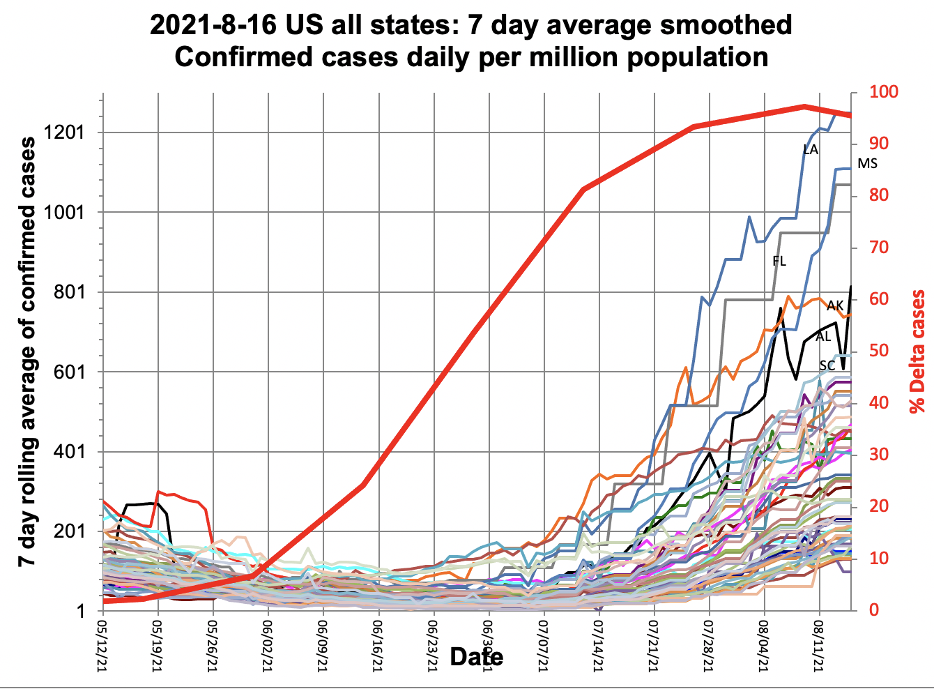
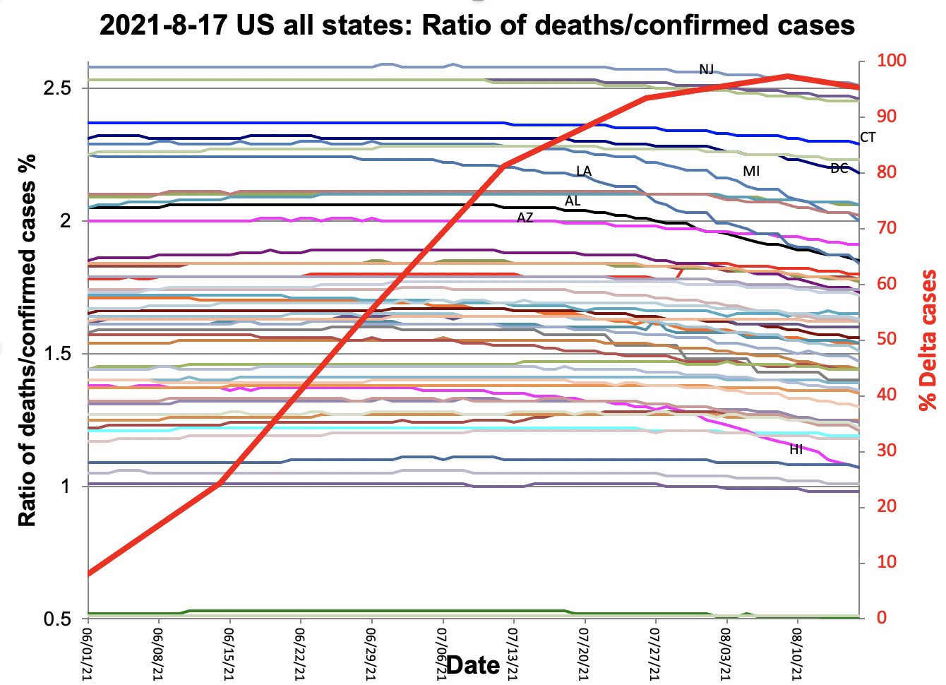
Fig 1
- Indicates the confirmed COVID-19 daily cases noticeably started to increase around the 3rd week in June 2021.
- At this time the delta variant was about 50%
- By August 17, 2021, the leading states in terms of daily cases were Louisianna, Mississippi, Florida, Arkansas, Alabama, and South Carolina
Fig 2 shows the ratio of deaths/confirmed cases, it is seen that
- As the % deltas variant passed 60% there is a noticeable decrease in the ratio, more specifically by 8/16/2021 for :
- Hawaii decreased by -22.5%, Louisianna -18.3%, Michigan -12.6%, Oklahoma -8.7%, Michigan -8.28%, and South Carolina by -7.93%.
- On the other hand, Maine increased by 2.46%, Wisconsin by 0.85%, Michigan by 0.49%, and Montana, South Dakota, Utah, and Minnesota had a 0% change.
- The average change in the ratio was 4.71%
+-4.6
Thus there is evidence that the delta variant does not kill as large a proportion of those it infects as do the previous variants.
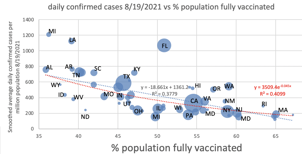
Fig 3 shows the daily confirmed cases on 8/19/2021 vs % population vaccinated for the US states. With the exception of Florida it is seen that the states (Mississippi, Lousiana, Alabama, and Arkansas) with the lower % of people fully vaccinated have the higher confirmed cases.
Fig 3 | |
|---|---|
|