Contents
Introduction
This is an attempt to use motion charts to visualize the daily growth, since January 2020, in US Covid-19 cases (confirmed and deaths) by State and by California county showing the population by bubble size and color by median age, education or income.
The visualization tool is https://www.charte.ca/, a Motion graphics chart tool. In particular, we use it to visualize the growth in time of Covid-19 cases, using the bubble size for population or population density and colors for education, age, political leaning, income etc.
In particular, try out the motion charts in the Results section below. There is a slider at the bottom of each chart to move backward and forward in time, and one can move the mouse over a bubble to find more details.
Method
The Covid-19 statistics are from the Johns Hopkins University (JHU). There are raw data for confirmed cases and deaths by date for each county in each US state. For the US state analysis, the data from the counties are aggregated into the values for each state.
For each state, we extracted various demographics including the ISO 2 character label, population, area, population density, education, income, median age, political leaning. The demographics were obtained from the following sources for the US.
A Perl script covid-us.pl was developed to gather the above information and cast it in a suitable form for the www.charte.ca motion charts and correlation data. See:
- here for an example of the output of covid-us.pl for California counties
- or here for the US.
- here for the visualization tool https://www.charte.ca/
- here for the actual motion charts
The script also ranks the age, income, and education demographics for each state or county into low, medium, or high based on their tertiles. This is so these demographics can be used with charte.ca's grouping feature.
In many cases we divide the demographic (e.g. per capita income) into 3 colors representing the tertile (red for low, yellow for medium and blue for high). The key is displayed above the chart.
Results
N.b. I am having problems with using www.charte.ca as one increases the number of Excel lines of data beyond around 2000. It often times-out after several minutes and asks if I wish to continue to wait, this may happen several times and there appears to be no guarantee it will finally provide a result, instead basically locking up and requiring re-logging into www.charte.ca. This is the reason the data is sometimes divided by Jan-Apr and May-Jun, and we only look at the data for each of every few (e.g.5) days. Also why we reduce the number of countries in a chart to <=10.
United States
Predictions
There are many models predicting the short term deaths, in particular, see https://projects.fivethirtyeight.com/covid-forecasts/ for listing and comparing multiple short-term predictions of the number of Americans who will die due to COVID-19. Longer-term, the University of Washington’s Institute for Health Metrics and Evaluation (IHME) released its latest pandemic forecast on September 11, 2020.
Linear Extrapolation
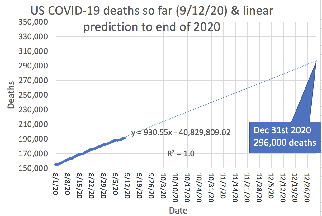
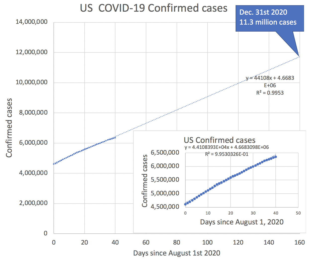
The author's simple linear extrapolations of the COVID19 confirmed cases and deaths for the US between August 1st 2020 and September 10, 2020 from the Johns Hopkins University (JHU) COVID-19 database yield almost 300,000 deaths and 11.3 million confirmed cases by the end of 2020:
Deaths
Confirmed cases
Spreadsheet
University of Washington pandemic forecast
See http://www.healthdata.org/sites/default/files/files/Projects/COVID/briefing_US_091120.pdf
This looks at the current state and the trends in key drivers of transmission (mobility, mask use, testing, and seasonality). They expect the daily death rate in the US, because of seasonality and declining public vigilance, to reach nearly 3,000 a day in December. Cumulative deaths expected by January 1 are 415,090; this is 222,522 deaths from now until the end of the year; or over 120,000 deaths more than the simple linear extrapolation above. The following comments from the forecast are very cogent.
- "The large increase in daily deaths expected in late November and December is driven by continued increases in mobility, declines in mask use, and – most importantly – seasonality. We estimate the likely impact of seasonality by examining the trends in the Northern and Southern Hemisphere. For example, Southern Hemisphere countries such as Argentina, Chile, southern Brazil, and South Africa had much larger epidemics than expected based on mobility, testing, and mask use. The statistical association between COVID-19 transmission rates and pneumonia seasonality patterns is strong and is the basis for our estimate of the magnitude of the seasonal increase that is expected. • If a herd immunity strategy is pursued, meaning no further government intervention is taken from now to January 1, then the death toll could increase to 611,784 by January 1. Compared to the reference scenario, this would be 196,694 more deaths from now to the end of the year.
- Increasing mask use remains an extraordinary opportunity for the US. Increasing mask use to the levels seen in Singapore would decrease the cumulative US death toll to 298,589, or 116,501 lives saved compared to the reference scenario."
Top 9 US states by Positivity ratio 9/8/2020

The top 9 states are shown below ranked by their Positivity Rate (from https://coronavirus.jhu.edu/testing/testing-positivity 9/8/2020) together with some demographics and statistics. The smoothing is a 7 day moving average.
- The population is from https://en.wikipedia.org/wiki/List_of_states_and_territories_of_the_United_States_by_population,
- the political leaning is from www.270towin.com updated: Sep. 9, 2020
- the Income per capita is from https://en.wikipedia.org/wiki/List_of_U.S._states_and_territories_by_income.
| State | ID | Population | Positivity | Covid-19 confirmed so far | deaths so far | %deaths/ confirmed | confirmed/ MPop so far | deaths/ MPop so far | smoothed (daily Confirmed/ MPop) | smoothed (daily Deaths/ MPop) | Political leaning | Income per capita ($) |
|---|---|---|---|---|---|---|---|---|---|---|---|---|
| North Dakota | ND | 756927 | 19.58% | 13872 | 156 | 1.12 | 18326.7343 | 206.0965 | 353.3083 | 2.076064 | Safe Republican | 33071 |
| South Dakota | SD | 858469 | 18.73% | 15403 | 173 | 1.12 | 17942.4068 | 201.5215 | 275.2408 | 0.99845539 | Safe Republican | 26959 |
| Alabama | AL | 4858979 | 18.42% | 133606 | 2277 | 1.7 | 27496.7231 | 468.617 | 176.1099 | 2.263850 | Safe Republican | 23606 |
| Kansas | KS | 2911641 | 18.36% | 56854 | 579 | 1.02 | 19526.4457 | 198.8569 | 224.5175 | 2.5513348 | Likely Republican | 27870 |
| Mississippi | MS | 2992333 | 17.28% | 89069 | 2619 | 2.94 | 29765.738 | 875.2368 | 186.0469 | 4.965070 | Safe Republican | 21036 |
| Iowa | IA | 3123899 | 15.31% | 71142 | 1185 | 1.67 | 22773.4635 | 379.3336 | 236.6091 | 2.7438239 | Leaning Republican | 28361 |
| Idaho | ID | 1654930 | 14.78% | 33978 | 389 | 1.14 | 20531.382 | 235.0553 | 140.2735 | 1.8990876 | Safe Republican | 23938 |
| Missouri | MO | 6083672 | 14.5% | 96181 | 1690 | 1.76 | 15809.6952 | 277.7928 | 221.7411 | 3.0057034 | Likely Republican | 26126 |
| Florida | FL | 20271272 | 13.32% | 650092 | 11915 | 1.83 | 32069.6205 | 587.7776 | 134.2646 | 3.8125735 | Tossup | 26582 |
The following charts are obtained from the analysis of the Covid-19 statistics are from the Johns Hopkins University (JHU). There are raw data for confirmed cases and deaths by date for each county in each US state. For the US state analysis, the data from the counties are aggregated into the values for each state.
Cumulative confirmed cases Click on chart for more details | Cumulative deaths Click on chart for more details |
|---|---|
 |  |
Covid-19 % deaths/confirmed cases Click on chart for more details | Covid-19 confirmed cases per million population Click on chart for more details | Covid-19 deaths per million population Click on chart for more details |
|---|---|---|
 |  |  |
Covid-19 smoothed confirmed cases per day per million population Click on chart for more details | Covid-19 smoothed deaths per day per million population Click on chart for more details |
|---|---|
 |  |
Details about the timelines, government resposes to, and impact of Covid-19 on the US states can be found via https://en.wikipedia.org/wiki/Category:COVID-19_pandemic_in_the_United_States_by_state. It is not hard to believe that some of the surges are related to events, behaviors, interventions, and responses. For example:
- In South Dakota, the surge of confirmed cases in July following the July 3rd Mount Rushmore Independence Day celebration. This in turn was followed by a spike in confirmed cases following the Sturgis motorcycle rally August 7-16.
Observations:
- Florida reported its first cases 3/3/20 and its first death 3/8/20, the latter date being the same day that Kansas and Missouri announced their first confirmed cases. None of the other 6 states had any confirmed cases by this date.
- As would be expected since Florida has over three times the population of any of the other states, its confirmed cases and. deaths lead the way by a wide margin.
- In terms of deaths/confirmed cases, Missouri led until the end of July when Mississippi took the lead.
- When one normalizes cases by the population of each state, then the confirmed cases and deaths are more evenly spread, and none of the states has flattened its curve of confirmed cases.
- Idaho appears to have managed to flatten its curve of deaths/million population after 5/11/20 until 7/15/20 when it took off again.
- Florida, Mississippi, and Alabama appear to have a peak in daily confirmed cases two to three weeks after the July 4th holiday. There is a further rise in daily confirmed cases for North and South Dakota, Iowa, and Alabama towards the end of August.
Possible Impact of US presidential campaign rallies
Method
We are interested in whether some of these events may have served as 'super-spreader' events.
The raw data we analyze is the Johns Hopkins University daily confirmed cases data for the US available at: https://raw.githubusercontent.com/CSSEGISandData/COVID-19/master/csse_covid_19_data/csse_covid_19_time_series/time_series_covid19_confirmed_US.csv
The question is whether there was a significant rise in daily confirmed Covid-19 cases after the rally, in particular in the 2-14 days following the rally (according to the CDC, Sep 18, 2020: "Symptoms may appear 2-14 days after you were exposed to COVID-19").
We have not analyzed the more recent rallies following President Trump's experimental treatment at the Walter Reed hospital for the virus, since there is insufficient delay compared to the 14 day incubation period, to clearly identify a rally's impact.
The social distancing at the rallies was minimal, and not everyone wore masks, see for example, the photos below taken at the Oshkosh rally.
|
|


Results
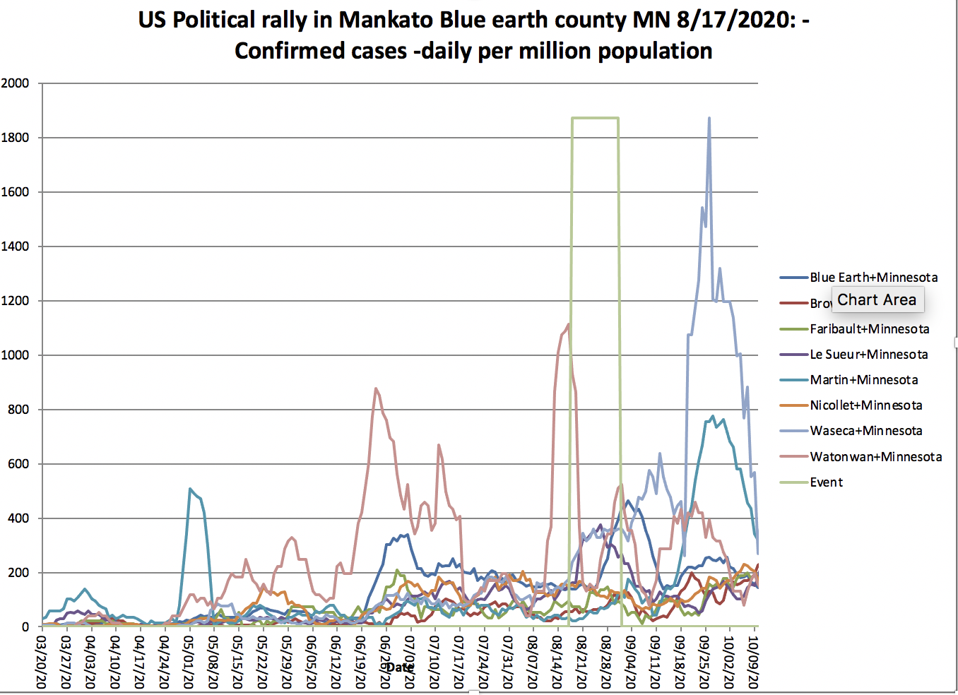
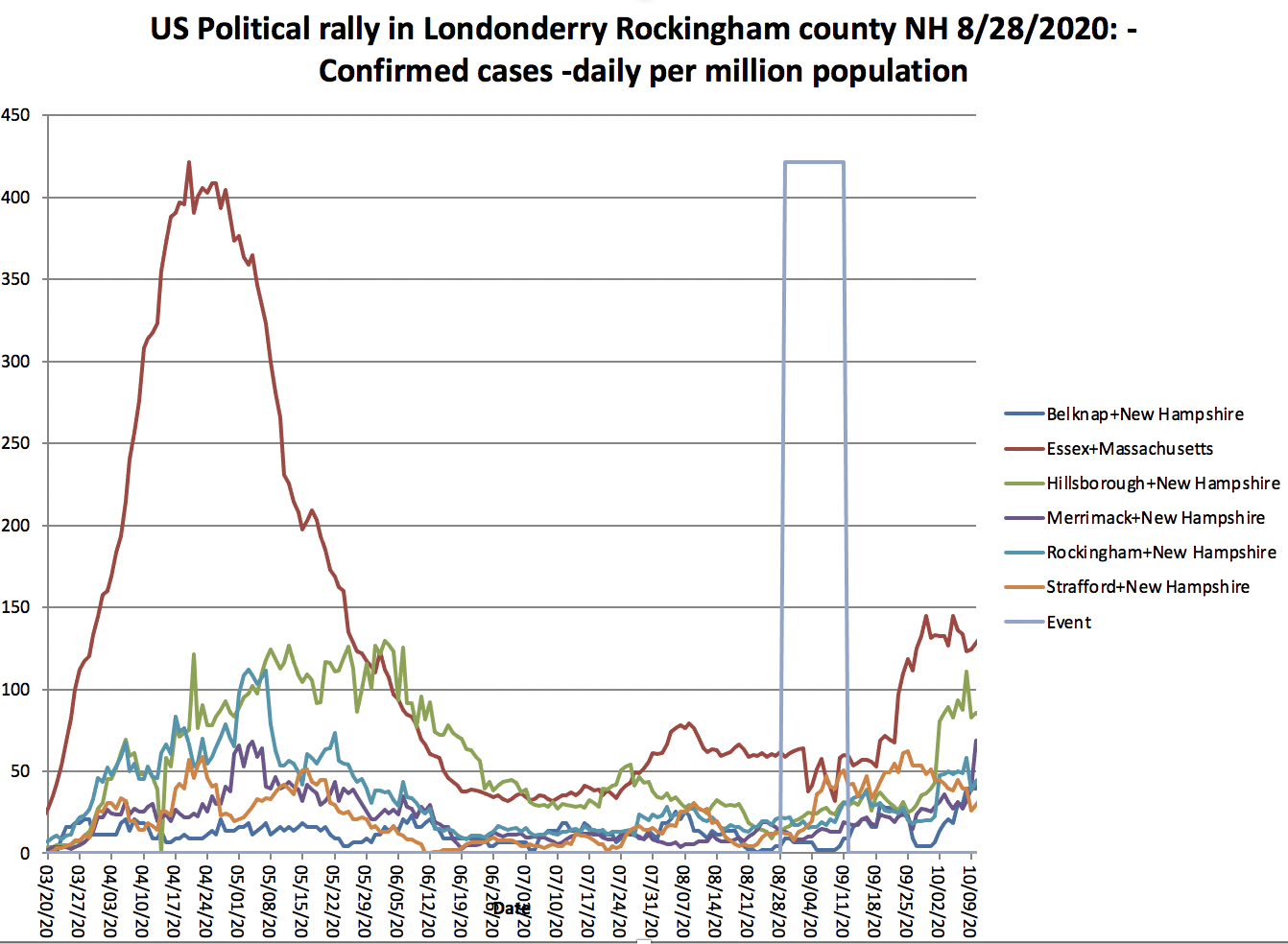
The links "Details in Excel file" in the table below (derived from https://en.wikipedia.org/wiki/List_of_post-election_Donald_Trump_rallies), provide access to Excel worksheets and charts of daily confirmed cases for each county plus identification of the event's starting date followed by a 14 day incubation period.
On clicking the "Details in Excel file" link it will prove access to the Excel workbook. On opening the workbook, open the Chart1 tab. You can move the mouse over a chart's line to get the date, value and county for the line.
Date of rally | City | County | State | Venue | Possible impact of rally on daily Confirmed cases in adjacent counties | Observations |
|---|---|---|---|---|---|---|
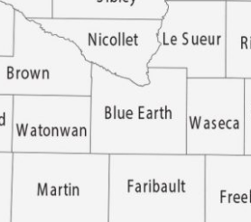
| Monday, August 17, 2020[110] | Mankato | Blue Earth County | MN | Mankato Regional Airport | Blue Earth sees a rise in cases 10 days after the rally. Brown sees a rise in cases 26 days after the rally. Faribault sees a rise in cases around 12-14 days after the rally. Le Sueur sees a rise in cases 3-4 days after the rally that rises to a peak after 11-12 days after the rally and then falls. We assume this not likely to be | |
| Monday, August 17, 2020[111] | Oshkosh | Winnebago County | WI | Oshkosh airway | Fond Du Lac, Outagamie and Winnebago's daily confirmed cases roughly doubled 12 days after the rally, and continued to rise. Follwing the nd of the 14 day incubation period there is a pronounced rise in daily confirmed cases for all counties. | |
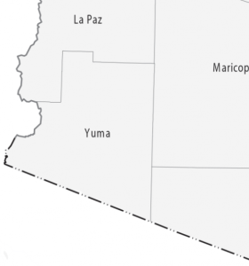
| Tuesday, August 18, 2020[112] | Yuma | Yuma County | AZ | Joe Foss Hangar | No apparent impact. | |
| Thursday, August 20, 2020[113] | Old Forge | Lackawanna County | PA | Mariotti Building Products | There are significant rises in the number of cases in the 2-14 days after the event on 8/20/20.
| |
| Friday, August 28, 2020[114] | Londonderry | Rockingham County | NH | Pro Star Aviation | There is a rise in confirmed cases for all counties except Essex, 5-14 days following the rally. Essex starts to climb 22 days after the rally. | |
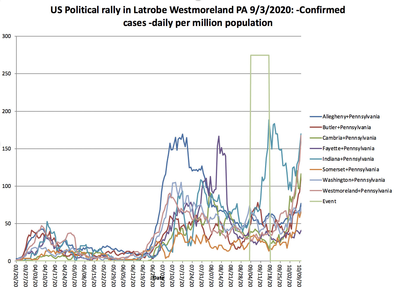
| Thursday, September 3, 2020[115] | Latrobe | Westmoreland County | PA | Arnold Palmer Regional Airport | Steep rise of cases in Indiana county, no apparent increase in other counties. | |
| Tuesday, September 8, 2020[116] | Winston-Salem | Forsyth County | NC | Smith Reynolds Airport |
| There is a steep rise in daily confirmed cases following the 14 day incubation period. |
| Thursday, September 10, 2020[117] | Freeland | Saginaw County | MI | Avflight Saginaw | There is a slow rise in daily confirmed cases starting in the 14 day incubation period and continuing afterwards | |
| Saturday, September 12, 2020[118] | Indoors | Douglas County | NV | Minden-Tahoe Airport | There is a rise in cases in 4 of the 5 counties starting a few days after the rally. | |
| Sunday, September 13, 2020[119] | Henderson | Clark County | NV | Xtreme Manufacturing | Clark, Mohave, and Nye counties all see a rise in confirmed cases starting between the 17th and 20th of September. | |
| Friday, September 18, 2020[120] | Bemidji | Beltrami County | MN | Bemidji Aviation Services | There is a pronounced rise in the daily confirmed cases that starts in the incubation period and continues afterwards. | |
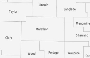
| Friday, September 18, 2020[121] | Mosinee | Marathon County | WI | Central Wisconsin Aviation | In this case, the rise in cases starts before the rally. |


| Date of Rally | City | County | State | Venue | Possible impact of rally on daily Confirmed cases in adjacent counties | Observations |
|---|---|---|---|---|---|---|
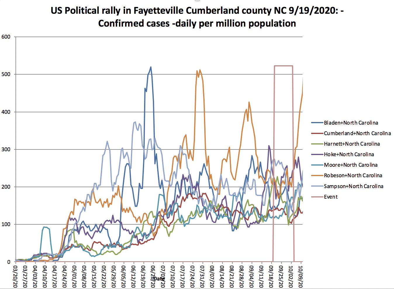
| Saturday, September 19, 2020[123] | Fayetteville | Cumberland | NC | Fayetteville Regional Airport | Several counties such as Hoke, Simpson, Hartnett, Moore and especially Robeson have an uptick of confirmed cases around the end of the incubation period. | |
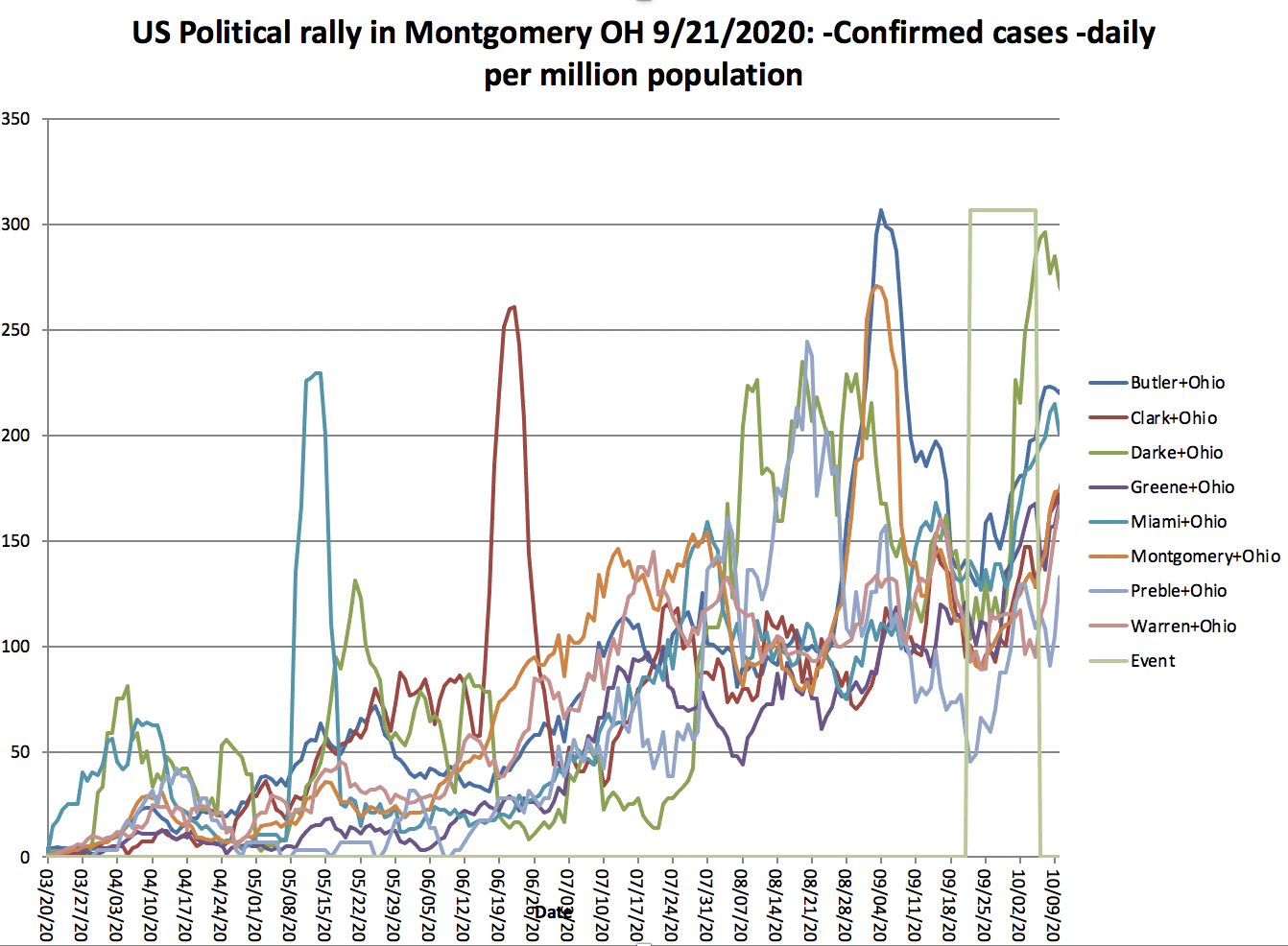
| Monday, September 21, 2020[124] | Vandalia | Montgomery | OH | Dayton International Airport | All counties experience an uptick in daily confirmed cases during the incubation period. | |
| Swanton | Fulton & Lucas | Toledo Express Airport | Most counties experience an uptick in confirmed daily cases during the incubation period. | |||
| Tuesday, September 22, 2020[125] | Pittsburgh | Alleghany | PA | Pittsburgh International Airport | Most counties experience an uptick in confirmed daily cases during the incubation period. | |
| Thursday, September 24, 2020[126] | Jacksonville | Duval | FL | Cecil Airport | There is no noticeable impact. | |
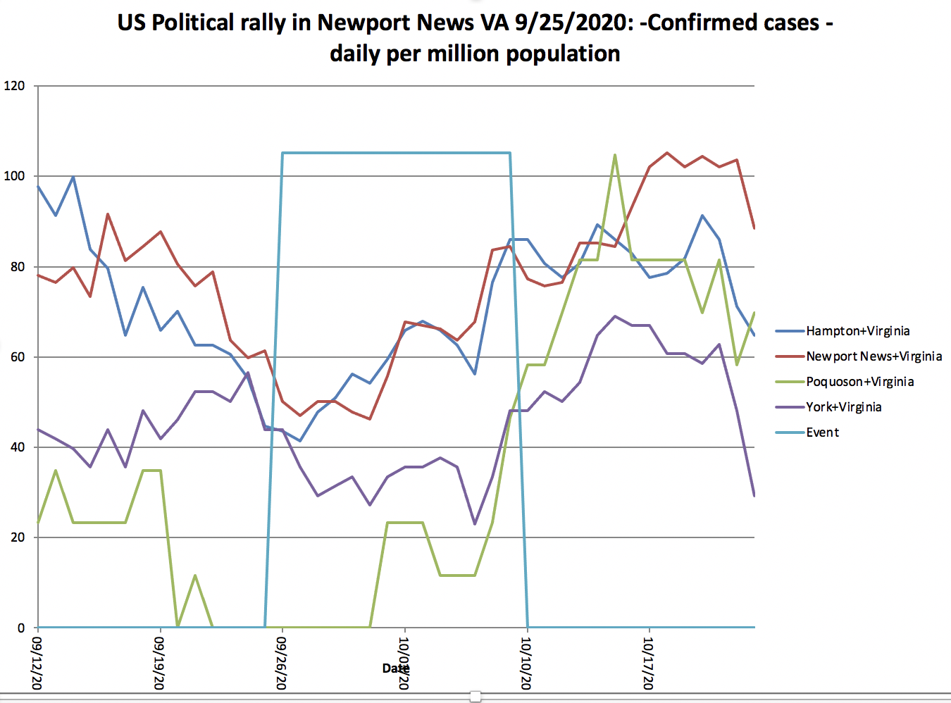
| Friday, September 25, 2020[127] | Newport News | Warwick | VA | Newport News/Williamsburg International Airport |
| Cases start to rise in all counties during and after the 14 day quaratine period following the rally. |
| Saturday, September 26, 2020[128] | Middletown | Dauphin | PA | Harrisburg International Airport | Most counties experience an uptick in confirmed daily cases during the incubation period. | |
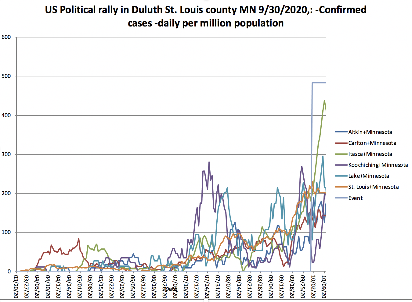
| Wednesday, September 30, 2020[129] | Duluth | St Louis | MN | Duluth International Airport | Most counties experience an uptick in confirmed daily cases during the incubation period. | |
| Monday, October 12, 2020[130] | Sanford | Seminole | FL | Orlando Sanford International Airport | ||
| Tuesday, October 13, 2020[131] | Johnstown | Cambria | PA | John Murtha Johnstown-Cambria County Airport | ||
| Wednesday, October 14, 2020[131] | Des Moines | Iowa | IA | Des Moines International Airport | ||
| Thursday, October 15, 2020[132] | Greenville | Pitt | NC | Pitt-Greenville Airport | ||
| Friday, October 16, 2020[133] | Ocala | Marion | FL | Ocala International Airport | ||
| Macon | Leon | GA | Middle Georgia Regional Airport | |||
| Saturday, October 17, 2020[134] | Muskegon | Muskegon | MI | Muskegon County Airport | ||
| Janesville | Rock | WI | Southern Wisconsin Regional Airport | |||
| Sunday, October 18, 2020[135] | Carson City | Carson City | NV | Carson City Airport | ||
| Monday, October 19, 2020[136] | Prescott | Yavapai | AZ | Prescott Regional Airport | ||
| Tucson | Tuscon | Tucson International Airport | ||||
| Tuesday, October 20, 2020[137] | Erie | Erie | PA | Erie International Airport | ||
| Wednesday, October 21, 2020[138] | Gastonia | Gaston | NC | Gastonia Municipal Airport | ||
| Friday, October 23, 2020[139] | The Villages | Sumter | FL | The Villages Polo Club | ||
| Pensacola | Escambia | Pensacola International Airport | ||||
| Saturday, October 24, 2020 | Lumberton | Robeson | NC | Robeson County Fairgrounds | ||
| Circleville | Pickaway | OH | Pickaway Agriculture and Event Center | |||
| Waukesha | Waukesha | WI | Waukesha County Airport | |||
| Sunday, October 25, 2020 | Manchester | Hillborough | NH | Manchester-Boston Regional Airport |


The Excel files come from a library of Excel workbooks illustrating the impact of COVID-19 on many different areas of the world.
Possibly Impacted counties
We looked at the adjacent counties in the same state or neighboring state (using https://gisgeography.com/us-county-map/) where we see the following counties.
Douglas County NV 9/12/20 | Clark County NV 9/13/20 | Winnebago WI 8/17/20 | Blue Earth MN 8/17/20 | Lackawanna PA 8/20/20 | Rockingham NH 8/26/20 |
|
|
|
|
|
|


| Marathon County WI 9/17/2020 | Yuma county AZ 8/18/2020 | Westmoreland PA 9/3/2020 | Forsyth NC 9/8/2020 | Saginaw MI 9/10/2020 | Beltrami County MN 9/18/2020 |
|---|---|---|---|---|---|
|
|
|
|
|
|


| Cumberland NC 9/19/20 | Montgomery OH 9/21/20 | Fulton & Lucas OH 9/21/2020 | Allegheny PA 9/22/2020 | Duval FL 9/24/20 | Newport News VA 9/25/2020 |
|---|---|---|---|---|---|
|  |
|
|
|
|


| Dauphin Philadelphia 9/26/2020 | St. Louis MN 9/30/2020 | Seminole FL 10/12/2020 | Cambria PA 10/13/2020 | Des Moines IA 10/14/2020 | Pitt NC 10/15/2020 |
|---|---|---|---|---|---|
|
|
|
|
|
|


| Marion FL 10/16/2020 | Muskegon MI 10/17/2020 | Rock Wi 10/18/2020 | Carson City NV 10/18/2020 | Yavapai NV, 10/19/2020 | Tuscon Pima County AZ, 10/19/2020 |
|---|---|---|---|---|---|
|
|
|
|
|
|


Also see
- https://time.com/5865890/oklahoma-covid-19-trump-tulsa-rally/
- https://www.axios.com/trump-rally-fined-violating-covid-guidelines-1566236b-0177-4407-b139-a7f69c11db66.html
- https://thenevadaindependent.com/article/nevada-health-officials-predict-uptick-in-covid-19-cases-following-labor-day-weekend-crowds-trump-rallies
- https://www.usatoday.com/story/news/investigations/2020/10/22/trumps-campaign-made-stops-nationwide-then-coronavirus-cases-surged/3679534001/
US States time series plots of Covid-19 cases, May-June
- time series plot of the US Confirmed cases by state on a log scale.
- percent deaths/confirmed cases by state as a function of date:
US States Motion Charts of Covid-19 deaths vs confirmed cases
Cumulative:
- cases with bubbles sized by US state population and colored by per capita income (Jan 28, 2020 - Apr 28, 2000)
- cases per million population with bubbles sized by US state population (May 1, 2020 - Jun 22, 2020)
- cases per million population with bubbles sized by US state population and colored by per capita income (May 1, 2020, Jun 25, 2020)
- cases with bubbles sized by population density of state and colored by per capita income (May 1 2020 - Jun 26, 2020)
- March 1, 2020 - July 20, 2020
Motion Charts with bubbles sized by US state population and colored by per capita income Mar 1, 2020 thru Jul 20
US State population > 10 Million population US State population 6-10 Million population US States 3-6 Million population US States 1.3-3M population 

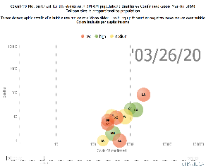

US by state + DC every 5 days color=income US by state + DC every 4 days color=%Hispanic+Black 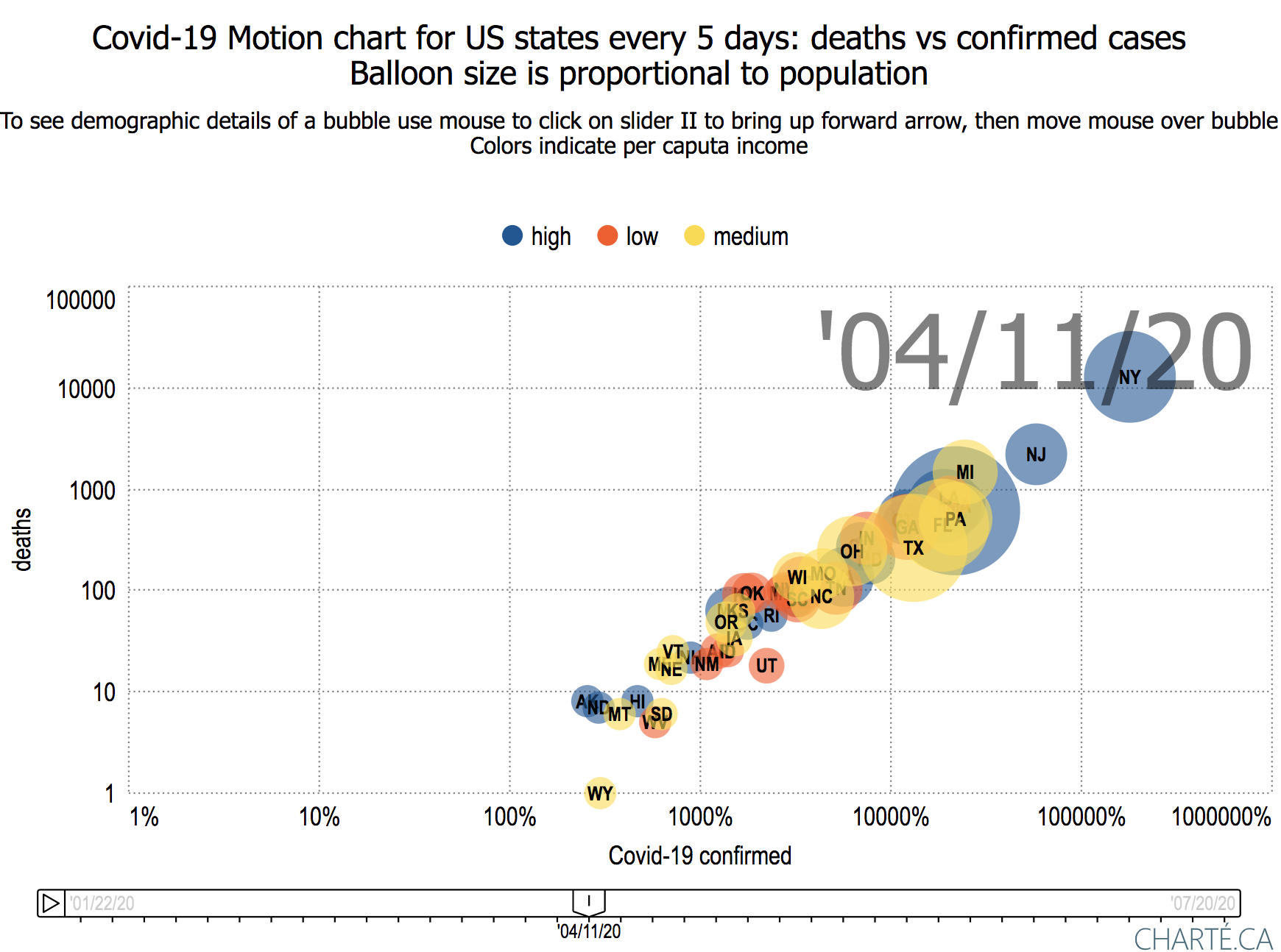


Daily:
- daily cases per million population with bubbles sized by US state population and colored by per capita income (May 1, 2020, Jun 26, 2020)
- cases with bubbles sized by US state population and colored by per capita income (May 1, 2020, Jun 26, 2020)
Observations
- Looking at the total deaths vs cases it is seen that New York (NY), Delaware (DE), Massachusetts (MA), Rhode Island (RI) and Connecticut (CT) lead the pack followed by Maryland (MD), Illinois (IL) and more recently Louisiana (LA) but other states are catching up.
- It is a similar situation when one normalizes the states by their populations.
- When one looks at the new daily confirmed cases/Million state population and deaths/Million state population it is seen to be very variable day-to-day.
- Arizona's increased confirmed cases pulled it away from the pack starting May 14, 2020, and Florida pulled away starting May 24, 2020
- The values of new Confirmed cases/day/Million State population appears to decrease as one moves forward in time beyond May 23 but then to increase again (driven by Arizona) starting June 14, 2020. Maybe this is part of the "opening".
- Comparing the above with the same data but not normalized by state population
- At the start of May there is a noticeable correlation between deaths and confirmed, by the end of June the correlation is much weaker
- At the start of May the deaths and confirmed is dominated by New York (NY), New Jersey (NJ), Illinois (IL), Massachusetts (MA), California (CA) and Maryland (MD). By the end of June California (CA)is still a leader joined by Texas (TX), Florida (FL), Arizona (AZ), and Georgia (GA).
- Looking at the cases with bubbles sized by population density:
- Some states with high population densities such as New York (NY), New Jersey (NJ) and Massachusetts (MA) have high numbers of confirmed cases while others such as Washington DC, Rhode Island (RI), Delaware (DE) have fairly low numbers of confirmed cases.
- In general, the deaths/confirmed cases appear to be falling with time for especially as we get into June. This may be a mixture of increased testing finding more cases as well as more effective treatment.
- Exceptions that are still increasing include: NJ, MA, PA, CT, SD, NH, IL.
- Jul 22 California passes New York in number of confirmed cases (California population ~ 39M, New York population 20M), New York still has roughly four times California's deaths.
Looking at the July 24, 2020 JHU data there is a strong correlation between the total Confirmed case/state population and the % Hispanic + Black of the state's population.
Confirmed cases/population vs % Hispanic & Black (bubble sizes proportional to state's population) Confirmed cases/population vs % Black (bubble sizes proportional to state's population) Deaths/population vs % Hispanic + Black (bubble sizes proportional to state's population) 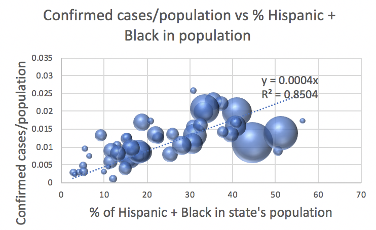


As would be expected there is strong correlation between the number of reported confirmed cases and a state's population and a noticeable correlation between the reported deaths and a state's population.
x axis is the state's population, y axis is the reported Confirmed cases on July 27. x axis is the state's population, y axis is the reported deaths on July 27. 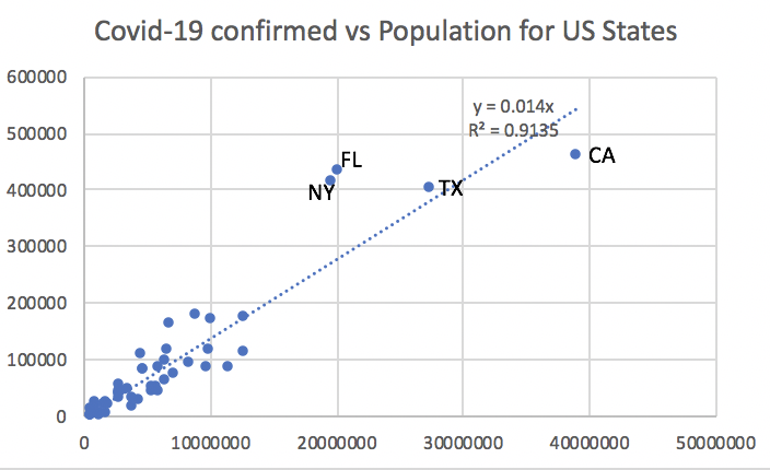

- Confirmed Cases/population
The ten states with the leading confirmed cases/population as of 7/26/2020 were:
State ID confirmed/Pop deaths/Pop Pop-Density(pop/sq-km) Delaware DE 0.026143 0.00143 485.343 Arizona AZ 0.023728 0.000484 60.109 Louisiana LA 0.023032 0.000806 108.109 Florida FL 0.020909 0.000289 378.019 New York NY 0.020799 0.001648 420.061 New Jersey NJ 0.020023 0.001762 1218.114 Mississippi MS 0.01765 0.000502 63.771 District of Columbia DC 0.017524 0.000864 11020.131 Rhode Island RI 0.017253 0.000949 1021.565 Massachusetts MA 0.017019 0.001255 871.08 The lowest ten states were:
State ID confirmed/Pop deaths/Pop Pop-Density(pop/sq-km) Hawaii HI 0.001176 0.000018 222.887 Vermont VT 0.002236 0.000089 67.923 Maine ME 0.002869 0.00009 43.1 West Virginia WV 0.003193 0.000056 76.717 Montana MT 0.003234 0.000045 7.097 Alaska AK 0.003419 0.000027 1.294 Oregon OR 0.004162 0.000072 41.974 Wyoming WY 0.004532 0.000063 6.037 New Hampshire NH 0.004837 0.000307 148.621 Kentucky KY 0.00612 0.000158 112.067 - The number of days from the first confirmed case to the first death was 57 +- 6 days.
California
Demographics by California county
For each California county, we extracted various demographics including: population, area, population density, education, income, median age, political leaning, ethnicity. The demographics were obtained from the following sources.
Map of counties and a map of regions see https://en.wikipedia.org/wiki/List_of_regions_of_Californiaa
California Counties Covid-19 San Francisco Bay Area confirmed cases and deaths
San Francisco Bay counties deaths/confirmed cases 8/25/20 Click on chart for more Information | San Francisco Bay counties smoothed daily cases per million population 8/25/20 Click on chart for more Information | San Francisco Bay counties smoothed daily cases per million population (log10 y scale) 8/25/20 Click on chart for more Information |
 |  |  |
San Francisco Bay Area counties % daily deaths/confirmed cases 8/10/20 Click on chart for more Information | San Francisco Bay Area counties Cumulative deaths per million population 8/10/20 Click on chart for more Information |
|---|---|
 |  |
San Francisco Bay Area daily confirmed cases / Million population (linear y axis) Click on chart for more Information | San Francisco Bay Area daily confirmed cases per Million population (log10 y axis) Click on chart for more Information |
|---|---|
 | 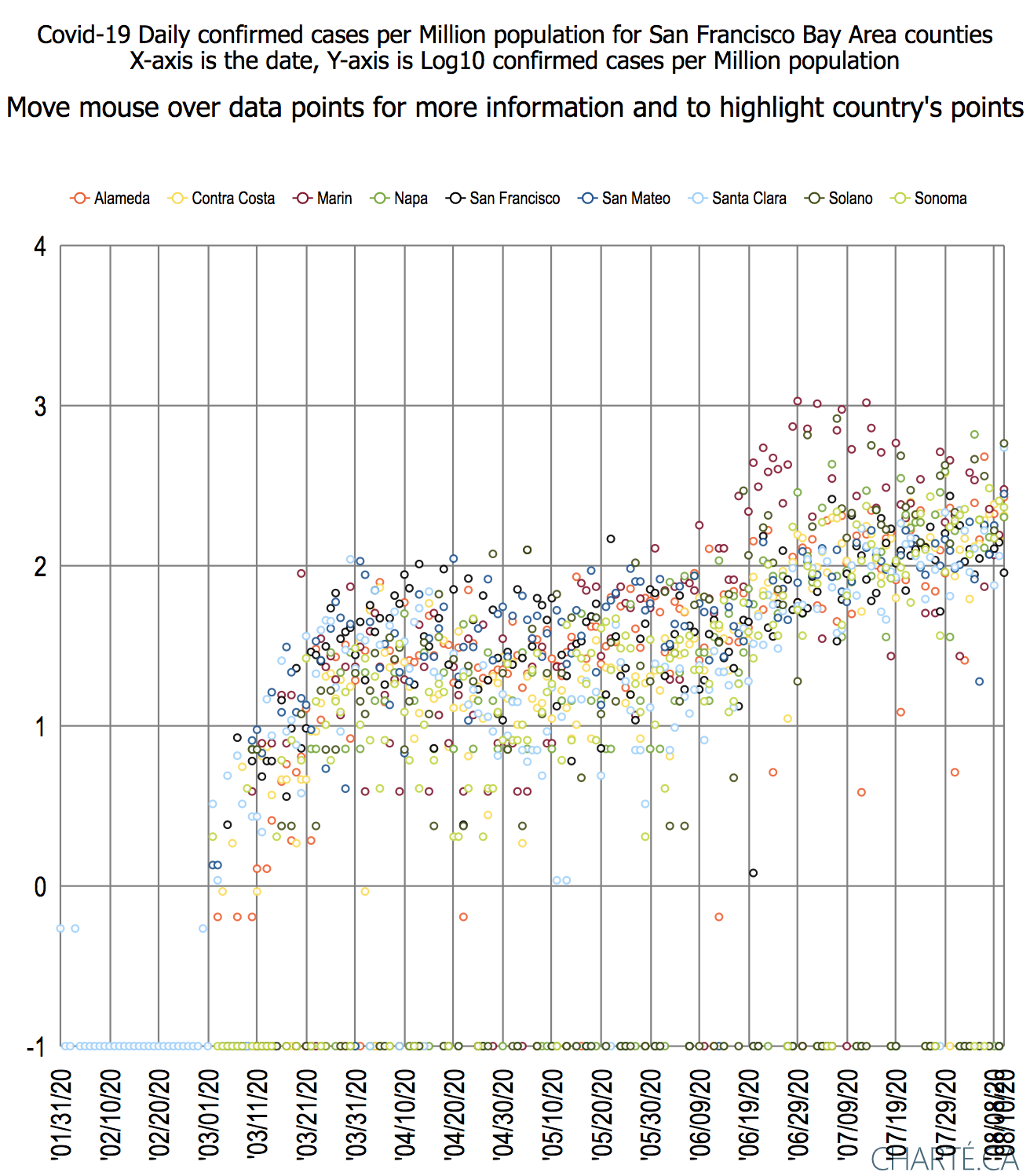 |
Observations:
- The first confirmed case was in Santa Clara 1/31/20.
- The first death was also in Santa Clara 3/10/2020.
- The second county to record a confirmed case was San Mateo on 3/16/2020.
- San Mateo took over the lead in cumulative deaths/Million population at the end of March, only to be overtaken by Marin mod July.
- All counties started to reduce the ratio deaths/confirmed cases after 5/5/2020.,
- Santa Clara, San Mateo, San Francisco, Contra Costa, Alameda, and Solano continue to reduce the ratio of deaths/confirmed cases.
- There was an uptick in the ratio of deaths/confirmed cases in Sonoma starting around 6/29/2020.
- There was an uptick in the ratio of deaths/confirmed cases in Marin starting around 7/3/2020.
- There was an uptick in the ratio of deaths/confirmed cases in Napa starting around 7/18/2020.
- Marin has recorded the highest daily confirmed cases/Million population. Also see https://abc7news.com/covid-cases-latino-california-coronavirus-marin-county/6329375/.
- Marin has also recorded the highest cumulative deaths per Million population
California Covid-19 for coastal counties from San Mateo southwards
California coastal counties confirmed cases 8/13/2020 Click on Chart for more information | California coastal counties cumulative deaths 8/13/2020 Click on Chart for more information |
|---|---|
 |  |
California coastal counties %deaths.confirmed cases 8/13/20 Click on Chart for more information |
|---|
 |
Observations:
- The firsr confirmed cases were in LA county and Orange counties Jan 26,2020.
- The first death was in LA county Mar 3, 2020.
- As of Aug 13, 2020 LA county (population almost 10 Million) is far and away the leader in confirmed case with 214K cases and 511 deaths. Orange county is next (with a population of just over 3 Million) with 42K cases.
- If one normalizes by county population, then Santa Barbara takes the lead followed by Orange county and Monterey county.
- For comparison we included San Mateo county one of the Bay Area counties top counties in terms of Covid-19 cases. It is one of the bottom 3 California coastal counties in terms of confirmed cases.
- Looking at the ratio %(deaths/confirmed cases) LA county leads followed by Santa Barbara county, San Mateo county and Orange County
California Sierra-Nevada counties
Counties
| Name | ID | Population | 1st confirmed case | 1st deaths | by 8/25/20 confirmed cases | by 8/25/20 deaths |
|---|---|---|---|---|---|---|
| Alpine | ALP | 1,202 | 4/1/20 | 0 | 2 | 0 |
| Calaveras | CAL | 44.291 | 3/11/20 | 7/21/20 | 197 | 2 |
| El Dorado | ED | 181,465 | 3/23/20 | 7/21/20 | 924 | 2 |
| Mariposa | MPA | 17,946 | 4/25/20 | 5/15/20 | 70 | 8 |
| Mono | MNO | 14,193 | 3/21/20 | 4/11/20 | 162 | 8 |
| Nevada | NEV | 398,606 | 5/22/20 | 4/4/20 | 423 | 3 |
| Placer | PLA | 361,518 | 3/2/20 | 3/4/20 | 2823 | 328 |
| Sierra | SIE | 3,019 | 5/22/20 | 0 | 6 | 0 |
Click on charts below for more details
| Cumulative confirmed cases | Cumulative confirmed cases per million population | Cumulative deaths per million population |
|---|---|---|
 |  |  |
| % deaths/confirmed cases | Log10(% deaths/confirmed) | daily confirmed cases per million population |
|---|---|---|
 |  |  |
California June 2020
bubbles sized by population density for CA Counties and colored by per capita income (Jan 25, 2020 - Apr 30, 2020)
cases per million population with bubbles sized by CA county population and colored by per capita income (May 1, 2020 - Jun 25, 2020)
California by County every 5 days colored by per capita income | Californa by county every 5 days colored by % Hispanic in county Low<0-33.4%, medium>=33.4%-<37.8%, high>= 37.8% |
|---|---|
 |  |
Observations:
- Deaths are roughly linear with confirmed cases on a log scale
- By March 24th the following counties were already observing deaths: Santa Clara (SCL), Riverside (RIV), San Jose (SJ), Sacramento (SAC), LA County, Orange County.
- By June 25th:
- In terms of confirmed cases and deaths per 1 Million county population
- The leading counties were Lake (LAK), Nevada (NEV), Mono (MNO) with Imperial (IMP) catching up since the end of May.
- These are followed by LA County (LA), Orange Country (OR), Kings County (KIN), Tuolumne (TUO) and Riverside (RIV).
- If one just takes the number of cases (i.e. do not normalize by the population of the county) then:
- The leading counties are LA County (LA), Orange County (OR), Riverside (RIV), San Diego County (SD) and San Bernadino County (SBD)
- In general, the counties with lower per capita income appear to have lower numbers of confirmed cases and deaths, The exceptions are Imperial County (IMP), Kern County (KER), Tuolumne County (TUO) and Fremont County (FRE).
- In terms of confirmed cases and deaths per 1 Million county population
- By July 20:
- LA county, Orange county (ORA), Lake, Riverside (RIV), San Diego (SD) and San Bernadino (SBD) counties by July 20 had a clear lead in deaths and confirmed cases.
- By this time LA county had almost four times the deaths of the next highest (Orange) county and almost three times the confirmed cases.
- The following counties still had zero deaths:
| County | ID | Covid-19 confirmed | deaths | Population() | %Hispanic Population |
| Alpine | ALP | 2 | 0 | 1202 | 7% |
| Amador | AMA | 57 | 0 | 37159 | 12.2% |
| Calaveras | CAL | 87 | 0 | 44921 | 10.2% |
| Colusa | COL | 223 | 0 | 21424 | 53.8% |
| El Dorado | ED | 443 | 0 | 181465 | 11.8% |
| Lassen | LAS | 512 | 0 | 33356 | 17.4% |
| Plumas | PLU | 24 | 0 | 19286 | 8% |
| Sierra | SIE | 22 | 0 | 3019 | 7.5% |
| Siskiyou | SIS | 50 | 0 | 44261 | 10.2% |
| Trinity | TRI | 104 | 0 | 13515 | 6.7% |
| Tuolumne | TUO | 101 | 0 | 54347 | 10.5% |
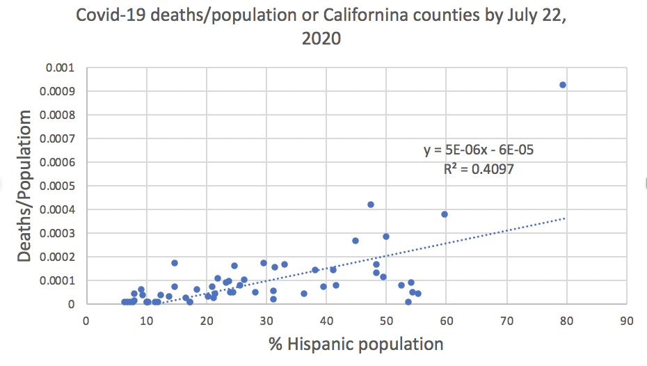
- Imperial county with a population of 177K had 8606 cases and 163 deaths, this compares with El Dorado county with a population of 181K that had 443 cases and 0 deaths. One big difference is the % Hispanic population: 79.6% for Imperial county and 11.8% for El Dorado county.
The following chart shows the daily confirmed cases per thousand population for a selection of California counties. The predominance of the Imperial (79.6% Hispanic) covid19-california-confirmed-time-series.svgand Kern (54% Hispanic) counties is apparent.
The following were the leading counties in terms of deaths/population
County ID Confirmed Deaths Population Deaths/population % Hispanic population Riverside RIV 29983 588 2266899 0.000259 45% KIngs KIN 3398 42 151390 0.000277 50.2% Tulare TUL 6896 167 451108 0.000370 59.8% Los Angeles LA 159045 4104 9974203 0.000411 47.5% Imperial IMP 8606 163 177026 0.000921 79.6% It is seen that these leading counties also had large Hispanic populations. Graphs of the ratios confirmed cases/population and deaths/population against the percent of Hispanic population in each California county are shown below, There are seen to be noticeable correlations (R2). The probability of a confirmed case is seen to be two to three times for counties with twice the percentage of Hispanic populations.

Given the "High Mortality from COVID-19 among Asian Americans in San Francisco and California" reported in https://asianarch.org/press_releases/Asian%20COVID-19%20Mortality%20Final.pdf, one would expect to find a strong correlation of deaths/population vs % Asian-American population for California counties. The labels on the charts below are the abbreviations for some of the counties (from https://sv08data.dot.ca.gov/contractcost/map.html).

The following were the leading counties in terms of deaths/confirmed cases:
County ID Deaths/confirmed % Population % Hispanic population Inyo INY 2.5 18439 18.7% San Mateo SM 2.5 739837 24.9% Los Angeles LA 2.58 9974203 47.5% Mariposa MPA 2.63 17946 9.4% Yolo YOL 2.84 204162 29.8% Shasta SHA 2.89 178520 8.3% Top ten California Counties by confirmed cases 7/26/2020
County ID Population() confirmed/Pop deaths/Pop Pop-Density(pop/sq-km) Hispanic% Imperial IMP 177026 0.051218 0.001022 42.385 79.6 Kings KIN 151390 0.025187 0.00031 108.959 50.2 Tulare TUL 451108 0.0182 0.000372 93.509 59.8 Marin MRN 256802 0.018006 0.000214 493.556 14.9 Los Angeles LA 9974203 0.017447 0.000437 2457.984 47.5 Kern KER 857730 0.017081 0.000143 105.477 48.5 Lassen LAS 33356 0.016639 0 7.345 17.4 Stanislaus STA 522794 0.015037 0.000166 349.735 41.3 Riverside RIV 2266899 0.014763 0.000281 314.564 45 San Joaquin SJ 701050 0.014444 0.000157 503.874 38.3 Ten California counties with the least confirmed cases/population 7/26/2020
County ID Population() confirmed/Pop deaths/Pop Pop-Density(pop/sq-km) Hispanic% Trinity TRI 13515 0.000222 0 4.251 6.7 Sierra SIE 3019 0.000331 0 3.167 7.5 Siskiyou SIS 44261 0.001378 0 7.05 10.2 Plumas PLU 19286 0.001452 0 7.554 8 Humboldt HUM 134876 0.00152 0.00003 37.802 9.6 Shasta SHA 178520 0.00163 0.000045 47.285 8.3 Alpine ALP 1202 0.001664 0 1.628 7 Amador AMA 37159 0.002045 0 62.496 12.2 Inyo INY 18439 0.002169 0.000054 1.811 18.7 Calaveras CAL 44921 0.002204 0.000022 44.04 10.2 California Confirmed cases / day and deaths / day:


The ratio of deaths/confirmed was about 2.5% mid April but had dropped to about 1.4% as of 7/26/2020. This may be related to the introduction of more effective treatments for the coronavirus over the past five months and the fact that hospitals are better prepared to handle patients (see https://www.sfchronicle.com/health/article/Why-coronavirus-cases-are-rising-but-deaths-are-15384724.php).
California (e.g. see https://www.cdph.ca.gov/Programs/CID/DCDC/Pages/COVID-19/CountyMonitoringDataStep1.aspx) uses a 14-day case rate to determine if it has exceeded some limit (100 per 100,000 population) for each county to determine what activities should be shut down for that county.
For California counties, the average number of days from the first recorded confirmed case to the first recorded death was 84+-39 days.
- Imperial county with a population of 177K had 8606 cases and 163 deaths, this compares with El Dorado county with a population of 181K that had 443 cases and 0 deaths. One big difference is the % Hispanic population: 79.6% for Imperial county and 11.8% for El Dorado county.


California Prisons
Information about California prisons and Covid-19 is available at: https://www.cdcr.ca.gov/covid19/.
This yields the following table where we have added the California counties information for 7/20/2020.
| Population | Confirmed | Deaths | Deaths/Confirmed | Confirmed/Pop | Deaths/pop | |
| Incarcerated | 101,851 | 7549 | 44 | 0.58% | 7.41% | 0.04% |
| staff | 1544 | 3 | 0.19% | |||
| California Counties | 38057585 | 397870 | 7770 | 1.95% | 1.045% | 0.020% |
There appears to be a much higher ratio (~seven times higher) of Confirmed cases to the population for incarcerated people compared to the overall ratio for all California counties and deaths/population being a factor of two higher for Incarcerated compared to the overall California population. On the other hand, the deaths/population is lower for both incarcerated prisoners and the prison staff compared to the overall California population.
California Residential Care Facilities for the Elderly (RCFE)
A possible source is https://www.cdss.ca.gov/Portals/9/Additional-Resources/Research-and-Data/DSSDS/RCFE-7-24.pdf
This provides cases and deaths by County. However, it does not appear to include the resident or staff totals.
One table, dated in a July 16 report, gives: positive cases = 5528 and deaths 575, giving a deaths/cases of 10.4% which is over five times higher than the ratio for California Counties.
Globally
Chart of deaths versus confirmed cases for countries with at least 50M population.
| January thru July deaths vs confirmed cases | January thru July deaths/population vs confirmed cases/population | January thru July Deaths/population density vs confirmed cases/population density |
|---|---|---|
 |  |  |
For more details on the US see Covid-19 - Visualizing the data with Motion Charts.
Observations:
- China starts much earlier than any other country.
- The first country to record a death after China (cn) is Japan (jp) on Feb 11, followed by Iran (ir) on Feb 17.
- By the 4th week of February, South Korea (kr) and Japan (jp) countries close to Japan, together with Iran (ir) and Italy (it) had taken the lead in deaths.
- By the start of Apr: Italy (it), Spain (es), the UK (uk), France (fr) and Iran (ir) had overtaken China in number of deaths and Germany (de) and Turkey (tr) were catching up.
- By the start of May: the US, Italy, France and the UK are clear leaders in terms of deaths, and Turkey (tr), Russia (ru), India (in) and Peru (pe) were close behind China in terms of deaths.
- At that time, the US had over 6 times the confirmed cases of the second place UK, and well over two times the deaths.
- It is noticeable that from Mar thru Jun Japan (jp), South Korea (kr) and Malaysia appear to have slowed the growth and are passed by many other countries.
- By Jul 17th, Brazil (br) was closing in on the US with both of Brazil's confirmed cases and deaths within a factor of two of the US.
- On July 18, concerning the ratio of deaths to confirmed cases, the lowest value was for Vietnam (0 deaths in 382 confirmed cases), followed by Bangladesh (1.3%), South Africa (1.5%) and Russia (1.6%). The highest ratio was for the UK (15.3%).
Chart of deaths versus confirmed cases for countries with other population ranges
| January thru July deaths vs confirmed for countries with between 30-50M populations | January thru July deaths vs confirmed for countries with between 17-30M populations | January thru July deaths vs confirmed for countries with between 10-17M populations |
|---|---|---|
 |  | |
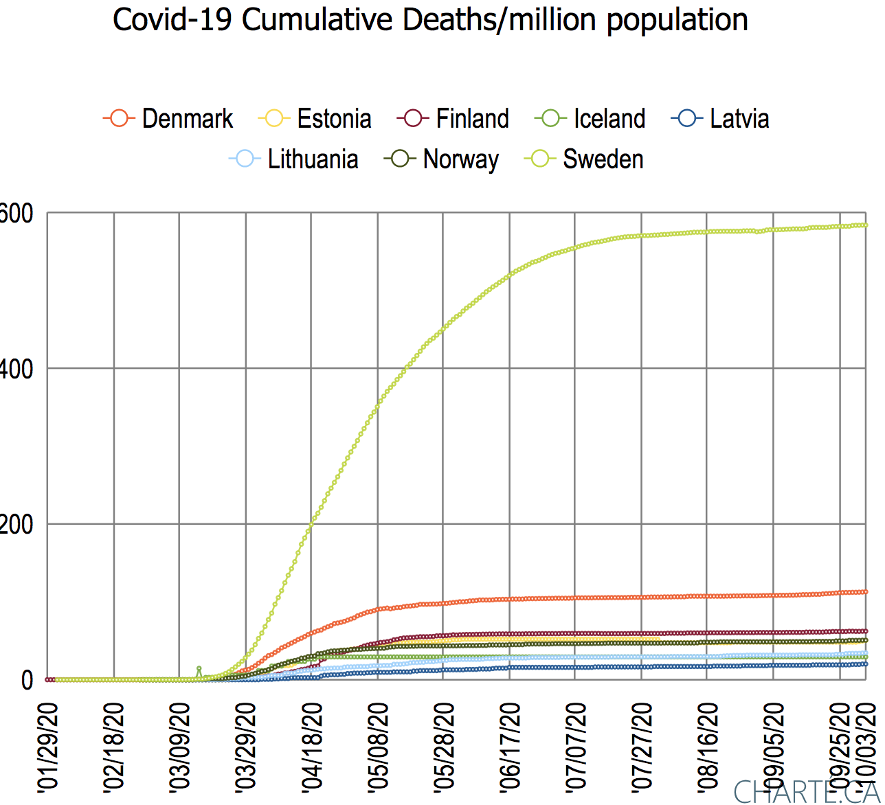
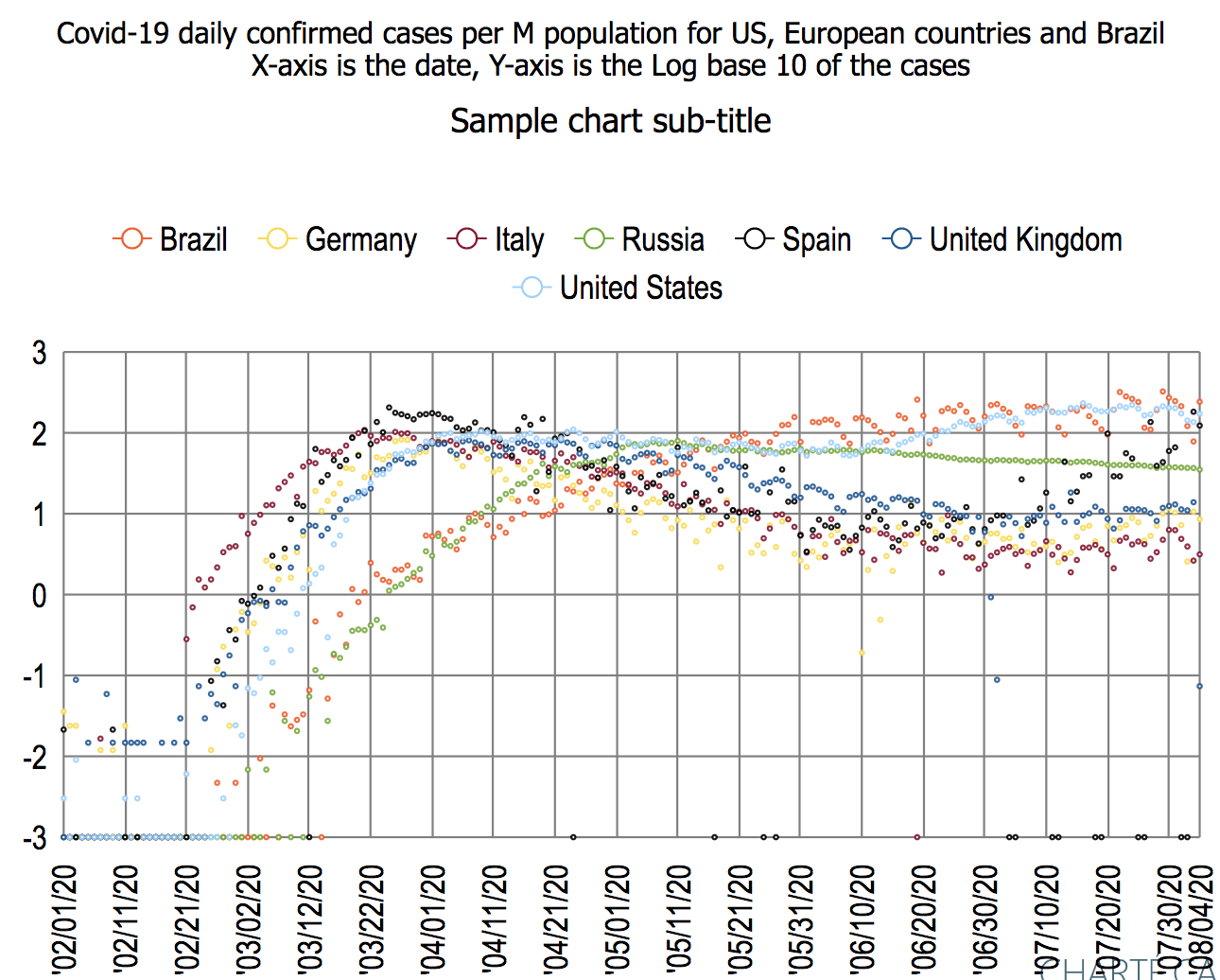
Western and Northern Europe and the US 10/4/20
| Major W European, the US, and Swedish countries | Northern European countries |
|  |
|
|

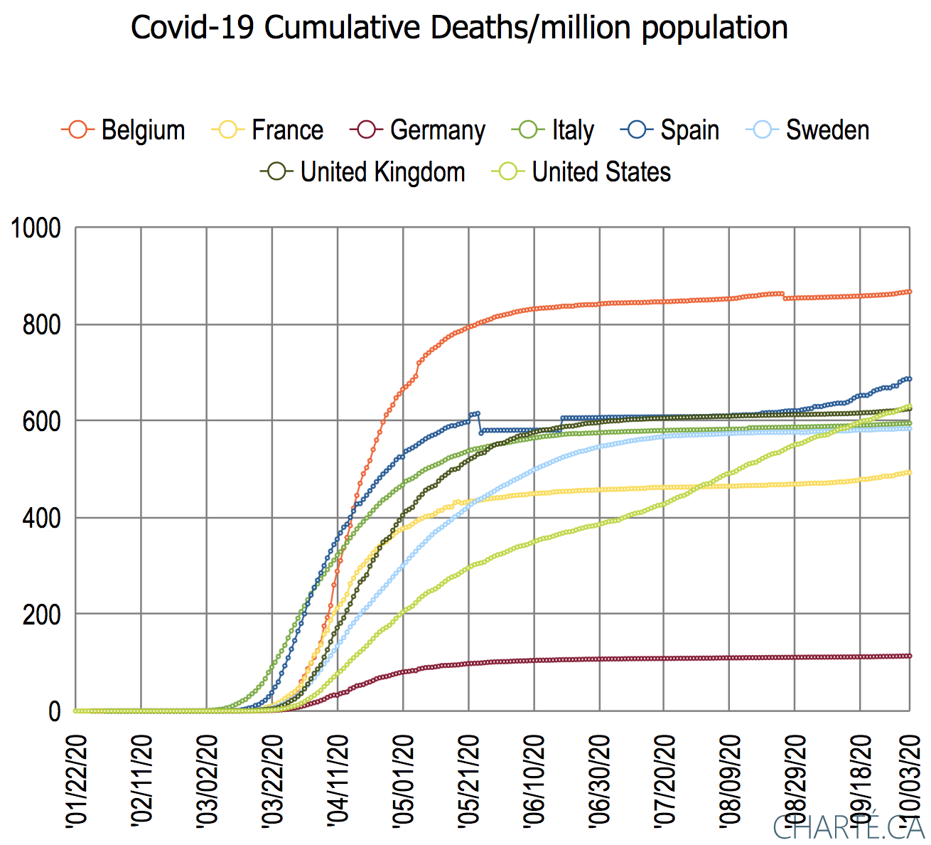
Observations:
- in early March and April 2020, Italy followed by Spain and Belgium were the first countries to experience an outbreak
- The initial peak for all countries with the exception of Sweden had passed by May 2020.
- Secondary peaks were experienced by Sweden in June and the US in July 2020.
- Spain, Belgium, France, and the UK in that order experienced a significant secondary increase in cases starting in July through August 2020.
- Spain appears to have peaked the second time in September 2020. Belgium, France, and the UK continued to climb in October 2020.
- In terms of cumulative deaths/million population, Germany has by far the lowest trajectory. The next lowest country, France, has over 4 times Germany's number of deaths/million population.
- The leader in cumulative deaths/million population is Belgium, followed by the US and the UK running almost dead equal with the US just having overtaken the UK.
- Northern Europe:
- Iceland was the first country to experience a notable rise in daily cases.
- By the middle of April 2020, all countries apart from Sweden had experienced a peak in cases and passed the peak.
- Sweden continued to experience an increase in daily confirmed cases per million population until the end of May 2020.
- The different trajectory of Swedish cases presumably reflects the fact that it did not implement a lockdown and "masks were never required and aren't commonly worn". Sweden "managed to flatten its curve, prompting its health leadership to claim victory -- but others question the cost of the strategy, as the country has a far higher death toll than its Scandinavian neighbors." see https://www.medpagetoday.com/infectiousdisease/covid19/87812.
- The Swedish deaths as seen in the North European deaths chart above are seen to be over five times that of the next N European country, Denmark.
- It appears significant that though Sweden leads in confirmed deaths/million population in Northern Europe, it is below Spain the second lowest in Western Europe.
Top 9 N hemisphere countries by Covid-19 confirmed cases 9/10/20
| State | ID | Population (K) | Covid-19 confirmed | deaths | % deaths/ confirmed | confirmed/ day/ million population | deaths/ day/ million population | smoothed ( daily Confirmed/ million population) | smoothed( daily Deaths/ million population) | WHO per capita health expenditure1 | Income per capita ($)2 |
|---|---|---|---|---|---|---|---|---|---|---|---|
| Colombia | co | 50882.891 | 694664 | 22275 | 3.21 | 153.548665 | 4.3629596 | 149.05375 | 4.65213909 | $374 | 14503 |
| France | fr | 65273.511 | 392243 | 30819 | 7.86 | 137.130665 | 0.2144821 | 118.234354 | 0.23417944 | $4026 | 44033 |
| India | in | 1380004.39 | 4562414 | 76271 | 1.67 | 69.96427 | 0.8760842 | 64.7686345 | 0.80734733 | $63 | 7166 |
| Iran | ir | 83992.949 | 395488 | 22798 | 5.76 | 24.561586 | 1.5358432 | 25.0735333 | 1.4831177 | $366 | 20885 |
| Mexico | mx | 128932.753 | 652364 | 69649 | 10.68 | 39.113413 | 4.6535887 | 39.3006644 | 3.67855105 | $535 | 18656 |
| Russia | ru | 145934.462 | 1042836 | 18207 | 1.75 | 36.386196 | 0.8702537 | 35.1557028 | 0.71264867 | $524 | 25763 |
| Spain | es | 46754.778 | 554143 | 29699 | 5.36 | 230.22246 | 1.5185614 | 200.529543 | 1.42078679 | $2354 | 39037 |
| United Kingdom | uk | 67886.011 | 360544 | 41697 | 11.57 | 43.175316 | 0.2062281 | 37.533506 | 0.17045381 | $4356 | 44920 |
| United States | us | 331002.651 | 6356715 | 191213 | 3.01 | 102.630598 | 2.7008847 | 105.162731 | 2.11564987 | $9536 | 59928 |
1 From https://en.wikipedia.org/wiki/List_of_countries_by_total_health_expenditure_per_capita
2 From https://www.worldometers.info/gdp/gdp-per-capita/
Cumulative confirmed cases Click on chart for more details | Cumulative deaths Click on chart for more details |
|---|---|
 |  |
% deaths/confirmed cases Click on chart for more details | Confirmed cases per million population Click on chart for more details | Deaths per million population Click on chart for more details |
|---|---|---|
 |  |  |
Smoothed daily confirmed cases Click on chart for more details | Smoothed daily confirmed cases Click on chart for more details | Smoothed daily deaths Click on chart for more details. |
|---|---|---|
 |  |  |
Observations:
- The confirmed cases indicate how far ahead the US was ahead in such cases, leading the runner up India by almost 1.8 million cases and over six times the number of cases for the third country Russia.
- In terms of deaths, the US leads second-place Russia by over 2.5 times, with Mexico close behind Russia.
- Looking at deaths/confirmed cases the UK and France took the lead from Spain in early April. The UK, France, and Spain all continue to reduce the deaths/confirmed ratio while other countries are currently holding steady or increasing the cases of Russia ad Iran.
- When one normalizes the confirmed cases by the population then the case count is noticeably increasing for all 9 countries.
- Again the US has a clear lead followed by Columbia and Russia.
- Looking at the deaths/million population, the leaders Spain and the UK have failed to flatten their curve as has the fifth place country France. the other countries all exhibit a noticeable increase. The third and fourth leading countries, the US and Mexico, are rapidly catching up with the leaders Spain and the UK, while Colomb catching up with fifth-placed France.
- India leads the daily confirmed cases with almost 90,000 cases per day followed by the US with about 35,000. India is still increasing daily while the US is in a downward trend.
- When one normalizes the confirmed cases by population it is apparent the US has seen two distinct peaks and Spain, France and the UK are on their way to a second peak. There also appear to be recent upticks for Russia and Mexico.
- In terms of daily deaths per million population, Iran, Spain, France, the UK, and the US were the early leaders. Today, in decreasing order, Columbia, Mexico the US, and Iran are the leaders.
European Union and the US
Here we compare the United States (US) cases with the top 8 European Union (EU) countries by population.
Also see:
- https://www.statista.com/chart/22102/daily-covid-19-cases-in-the-us-and-the-eu/
- https://www.motherjones.com/kevin-drum/2020/06/the-us-lags-way-behind-europe-in-covid-19-mortality/
- https://www.healthline.com/health-news/europe-fights-back-against-second-covid-19-wave#Why-are-cases-rising?
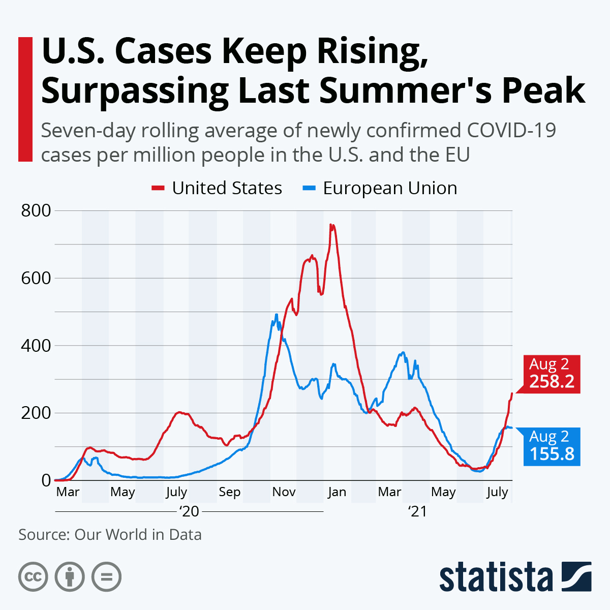
In particular, we wished to investigate in more detail the comparison between the US and the EU shown in https://www.statista.com/chart/22102/daily-covid-19-cases-in-the-us-and-the-eu/ and seen below:
| Augst 23 data | Current data |
|---|---|
|
|

Thus we extracted the EU Covid-19 results as of September 4th 2020, for the top 8 EU countries by population and compared them with the US, see below.
confirmed/million population Click on chart for more information | deaths/million population Click on chart for more information | |
|---|---|---|
 |  |
% Deaths/confirmed Click on chart for more information | Daily confirmed cases per million population Click on chart for more information | Daily deaths per million population Click on chart for more information |
|---|---|---|
 |  |  |
Observations:
- The first confirmed case is for the US on 1/22/20 followed by France on 1/24/20, Germany on 1/27/20 and Italy 1/31/20.
- The first death was for Italy on 2/21/20 (at this time 20 confirmed cases had been recorded for Italy) followed by the US on 2/28 (at this time 24 cases had been recorded for the US).
- In confirmed cases per million population, the US leads the European countries by a wide margin. The runner up is Spain followed closely by Belgium.
- It is noticeable that all 8 European Union countries flattened the curve of confirmed cases/million population in early May and held it until July with Romania being the first of the 8 EU to experience a renewed increase. The US has on the other has has yet to substantially flatten its curve.
- Looking at the deaths/million population, Belgium leads followed by Spain and Italy, with the US rapidly catching up with Italy. Poland and Germany have the lowest deaths/million population.
- All countries have passed the peak of deaths/confirmed cases with Italy having recently taken the lead from Belgium and France. The US and Poland have the lowest deaths/confirmed.
- In terms of confirmed cases /day/million population, the US has long held the lead peaking around the end of the 3rd week in July. It was overtaken by Spain which has seen a steep rise in daily confirmed cases starting the 2nd week of July. France has also seen steep rise since the start of August and is now in 3rd place. The other countries appear to have halted the second rise in daily confirmed cases/million population that started early July.
- Looking at the deaths/day/million population all countries had an initial peak between in March or April, the first to peak being Italy and Spain.
- Following the drop after the peaks, the US has held the lead since the end of May. By early September Romania was catching the US, while the other countries, apart from Spain which may be seeing a resurgence, were recording almost an order of magnitude fewer deaths/day/million population.
Southern Hemisphere countries with big outbreaks 9/2/2020
Here we chose 8 countries completely in the Southern hemisphere that had large pandemic outbreaks and one (New Zealand) that did not.
confirmed cases linear Y-axis Click on chart for more information | confirmed/million population Click on chart for more information | Log10 confirmed/million population Click on chart for more information |
|---|---|---|
 |  |  |
deaths linear Y-axis Click on chart for more information | deaths/million population Click on chart for more information | Log10 deaths/million population Click on chart for more information |
|---|---|---|
 |  |  |
% Deaths/confirmed Click on chart for more information | Smoothed daily confirmed cases per million population Click on chart for more information | Smoothed daily deaths per million population Click on chart for more information |
|---|---|---|
 |  |  |
The smoothing is a seven-day running average.
Observations:
- As would be expected Brazil, with the largest population by far (~ 3.5 times that of the runner up South Africa) had the largest number of confirmed cases.
- Once one normalizes the confirmed cases by the population then Chile takes the lead followed by Peru and then Brazil both of which are catching up with Chile, then a gap before South Africa, Bolivia and Argentina. Ecuador comes next, having considerably flattened its curve compared to the previous nations, and finally Australia and New Zealand.
- On January 26, 2020, Australia was the first of these countries to confirm a case, almost four weeks before the second country (Chile)
- Australia experienced exponential growth in confirmed cases throughout the month of March before dramatically flattening its curve in April.
- Australia then experienced a further rise in confirmed cases starting the second week of June and extending to the third week of August.
- Looking at the deaths, Brazil again has the most, over four and half time more than the runner up Peru.
- Once one normalizes the deaths by population then Peru is the leader followed by Chile with Brazil close behind, then Bolivia, Ecuador, South Africa and Argentina.
- The Log10 charts indicate that New Zealand has managed to successfully flatten both its confirmed cases and deaths, while Australia after flattening the curves has experienced a rise in both metrics starting in July.
- It appears that the ratio of deaths/confirmed with time has peaked and is going down for Ecuador, Brazil and Argentina. It apears to be rising again for Bolivia, Peru, Chile, South Africa and Australia. New Zealand is holding steady.
- The daily confirmed cases are on the rise for Chile and Argentina, falling for S. Africa, Chile, Australia and possibly Brazil.
- The daily deaths are falling for Brazil, Chile and S. Africa. They appear to be rising for Argentina and Australia. Ecuador and Bolivia appear to be roughly holding steady.
- New Zealand is a special case. Its first confirmed case was reported on February 28. The first death was a month later on March 29th by which time there had been 514 confirmed cases. The last death was May 29th (this was the 22nd cumulative death) by which time the number of confirmed cases totaled 1504.
Northern Hemisphere countries with contrasting strategies 8/31/20
Here we chose 9 countries in the Northern hemisphere with contrasting approaches to how they responded to the pandemic. All except India have high per capita incomes. The countries are:
| Name | Population (K) | Region | Income per capita ($) | Pop-Density (Kpop/sq-km) | Median Age (yrs) | Covid-19 information |
|---|---|---|---|---|---|---|
| Canada | 37742.154 | N America | 46510 | 0.004 | 41.4 | |
| Denmark | 5792.202 | N Europe | 54356 | 0.134 | 42.3 | https://en.wikipedia.org/wiki/COVID-19_pandemic_in_Denmark |
| Germany | 83783.942 | W Europe | 52556 | 0.235 | 46.6 | https://en.wikipedia.org/wiki/COVID-19_pandemic_in_Germany |
| India | 1380004.39 | S Asia | 7166 | 0.42 | 28.2 | https://en.wikipedia.org/wiki/COVID-19_pandemic_in_India https://en.wikipedia.org/wiki/Statistics_of_COVID-19_pandemic_in_India |
| Japan | 126476.461 | E Asia | 42067 | 0.335 | 48.2 | https://en.wikipedia.org/wiki/Timeline_of_the_COVID-19_pandemic_in_Japan |
| Sweden | 10099.265 | N Europe | 51405 | 0.022 | 41 | |
| Taiwan | 23816.775 | E Asia | 22497 | 0.658 | 42.2 | https://en.wikipedia.org/wiki/COVID-19_pandemic_in_Taiwan |
| United Kingdom | 67886.011 | W Europe | 44920 | 0.279 | 40.8 | https://en.wikipedia.org/wiki/COVID-19_pandemic_in_the_United_Kingdom |
| United States | 331002.651 | N America | 59928 | 0.035 | 38.3 | https://en.wikipedia.org/wiki/COVID-19_pandemic_in_the_United_States |
Also see
- Covid-19 - Visualizing the data with Motion Charts#19-VisualizingthedatawithMotionCharts-NordicandBalticcountries8/17/20 for more comparisons between Sweden and other North European countries.
- Covid-19 Europe for more detail on European countries.
confirmed cases linear Y-axis Click on chart for more information | confirmed/million population Click on chart for more information | Log10 confirmed/million population Click on chart for more information |
 |  |  |
deaths linear axis Click on chart for more information | deaths/million population Click on chart for more information | Log10 deaths/million population Click on chart for more information |
|---|---|---|
 |  |  |
% Deaths/confirmed Click on chart for more information | Daily confirmed per million population Click on chart for more information | Daily deaths per million population Click on chart for more information |
|---|---|---|
 |  |  |
Observations:
- In terms of total confirmed cases the US stands out as the leader with almost 6 million cases. India is next in line with almost 3.7 million cases.
- If one looks at the fraction of a country's population (in terms of cases/.million population) then again the US leads. The runner up is Sweden with about half the cases, followed by the UK, Canada, then Germany and Denmark running neck and neck, India, with Japan at 1/5th of india, but increasing, and Taiwan with about 1/25th of Japan's cases/million population.
- Confirmed cases continue to rise noticeably in all countries except Japan
- The log10 scale plot assists in seeing the differences between Japan and Taiwan.
- The steepest rises in confirmed cases per day per million population are for the US (~125 confirmed cases/day/million population) and India (~50 confirmed cases/day/million population).
- Deaths tell a similar story with the US leading with 183K deaths, followed by India with 65K deaths and the UK with 41.5K deaths.
- Deaths are still climbing in the US (~2.5/day/million population) and India (~0.6/day/million population) while other countries have pretty much stabilized at under 0.25 deaths/day/million population.
- The ratio of deaths/confirmed cases is highest for the UK followed by Canada and Sweden, followed by Germany and Denmark. The ratio is dropping with time.
Top ten countries with Covid-19 cases 8/9/20
Daily confirmed Click on the chart for more information | Daily deaths Click on the chart for more information |
|---|---|
 |  |
Total deaths/confirmed cases Click on the chart for more information |
|---|
 |
Observations among these countries:
- Iran was the first of the big 10 countries to record confirmed cases and deaths. The US followed about 2 weeks later.
- Iran peaked at the end of March. Iran's daily confirmed cases per capita hen dropped until the start of May after which they surged again and have held steady after the second week in June.
- The US daily confirmed cases per capita started to decline after the start of May but then increased again in the 30 days starting in the 3rd week of June.
- Russia's daily confirmed cases per capita caught up with the US at the start of June, then after tracking the US until around June 16th and then continued its downward slope while the US increased.
- Chile has the largest number of daily reported confirmed cases per capita from the 4th week of May to the 4th week of June.
- India's daily confirmed cases per capita and. deaths per capita have not peaked yet.
- Looking at the ratio of daily deaths/confirmed cases:
- Mexico has more than a factor 2 (nb. the y scale is log base 10) daily deaths/confirmed cases than any other country.
- Russia and S. Africa have the lowest daily deaths/confirmed cases since the end of June.
- Brazil, the US and India have reduced their ratio over the last two and a half months while Chlle's and Russia's has increased
Countries with the leading numbers of cases 7/28/2020
As of 7/28/2020, the US leads in confirmed cases :
| Confirmed | ID | Population (K) | Covid-19 confirmed | deaths | deaths / confirmed% | confirmed / MPop | deaths /M Pop | |
| United States | us | 331002.651 | 4339600 | 149087 | 3.44 | 13110.469 | 450.41029 | |
| Brazil | br | 212559.417 | 2483191 | 88539 | 3.57 | 11682.3382 | 416.53765 | |
| India | in | 1380004.39 | 1531669 | 34193 | 2.23 | 1109.90154 | 24.777457 | |
| Russia | ru | 145934.462 | 822060 | 13483 | 1.64 | 5633.07658 | 92.390788 | |
| South Africa | za | 59308.69 | 459761 | 7257 | 1.58 | 7752.00059 | 122.359809 | |
| Mexico | mx | 128932.753 | 402697 | 44876 | 11.14 | 3123.31034 | 348.057409 | |
| Peru | pe | 32971.854 | 395005 | 18612 | 4.71 | 11980.0664 | 564.481451 | |
| Chile | cl | 19116.201 | 349800 | 9240 | 2.64 | 18298.6149 | 483.359638 | |
| United Kingdom | uk | 67886.011 | 302261 | 45963 | 15.21 | 4452.47844 | 677.061435 | |
| Iran | ir | 83992.949 | 296273 | 16147 | 5.45 | 3527.35561 | 192.242327 | |
The US also leads in the number of deaths:
| State | ID | Population(K) | Covid-19 confirmed | deaths | deaths/confirmed% | confirmed/MPop | deaths/MPop | |
| United States | us | 331002.651 | 4339600 | 149087 | 3.44 | 13110.469 | 450.41029 | |
| Brazil | br | 212559.417 | 2483191 | 88539 | 3.57 | 11682.3382 | 416.53765 | |
| United Kingdom | uk | 67886.011 | 302261 | 45963 | 15.21 | 4452.47844 | 677.061435 | |
| Mexico | mx | 128932.753 | 402697 | 44876 | 11.14 | 3123.31034 | 348.057409 | |
| Italy | it | 60461.826 | 246488 | 35123 | 14.25 | 4076.75415 | 580.911996 | |
| India | in | 1380004.39 | 1531669 | 34193 | 2.23 | 1109.90154 | 24.777457 | |
| France | fr | 65273.511 | 221077 | 30226 | 13.67 | 3386.93287 | 463.066863 | |
| Spain | es | 46754.778 | 280610 | 28436 | 10.13 | 6001.73954 | 608.194525 | |
| Peru | pe | 32971.854 | 395005 | 18612 | 4.71 | 11980.0664 | 564.481451 | |
| Iran | ir | 83992.949 | 296273 | 16147 | 5.45 | 3527.35561 | 192.242327 | |
If one normalizes by dividing by the population then the United States drops to eighth in the world in reported confirmed cases per population:
| State | ID | Population(K) | Covid-19 confirmed | deaths | deaths/confirmed% | confirmed/MPop | deaths/MPop | |
| Qatar | qa | 2881.053 | 109880 | 167 | 0.15 | 38138.8333 | 57.964918 | |
| French Guiana | gf | 298.682 | 7562 | 43 | 0.57 | 25317.8966 | 143.965823 | |
| Bahrain | bh | 1701.575 | 39921 | 141 | 0.35 | 23461.2051 | 82.864405 | |
| Chile | cl | 19116.201 | 349800 | 9240 | 2.64 | 18298.6149 | 483.359638 | |
| Oman | om | 5106.626 | 77904 | 402 | 0.52 | 15255.474 | 78.721254 | |
| Kuwait | kw | 4270.571 | 65149 | 442 | 0.68 | 15255.3371 | 103.49904 | |
| Panama | pa | 4314.767 | 62223 | 1349 | 2.17 | 14420.9409 | 312.647241 | |
| United States | us | 331002.651 | 4339600 | 149087 | 3.44 | 13110.469 | 450.41029 | |
| Armenia | am | 2963.243 | 37629 | 719 | 1.91 | 12698.5873 | 242.639568 | |
| Peru | pe | 32971.854 | 395005 | 18612 | 4.71 | 11980.0664 | 564.481451 | |
and drops to 9th in deaths per population.
| State | ID | Population(K) | Covid-19 confirmed | deaths | deaths / confirmed% | confirmed / M Pop | deaths / M Pop | |
| Belgium | be | 11589.623 | 66662 | 9833 | 14.75 | 5751.86958 | 848.431394 | |
| United Kingdom | uk | 67886.011 | 302261 | 45963 | 15.21 | 4452.47844 | 677.061435 | |
| Spain | es | 46754.778 | 280610 | 28436 | 10.13 | 6001.73954 | 608.194525 | |
| Italy | it | 60461.826 | 246488 | 35123 | 14.25 | 4076.75415 | 580.911996 | |
| Sweden | se | 10099.265 | 79494 | 5702 | 7.17 | 7871.26588 | 564.595542 | |
| Peru | pe | 32971.854 | 395005 | 18612 | 4.71 | 11980.0664 | 564.481451 | |
| Chile | cl | 19116.201 | 349800 | 9240 | 2.64 | 18298.6149 | 483.359638 | |
| France | fr | 65273.511 | 221077 | 30226 | 13.67 | 3386.93287 | 463.066863 | |
| United States | us | 331002.651 | 4339600 | 149087 | 3.44 | 13110.469 | 450.41029 | |
| Brazil | br | 212559.417 | 2483191 | 88539 | 3.57 | 11682.3382 | 416.53765 | |
In terms of deaths/confirmed the Unites States drops to 55th highest among 179 countries.
Daily cases 7/31/2020
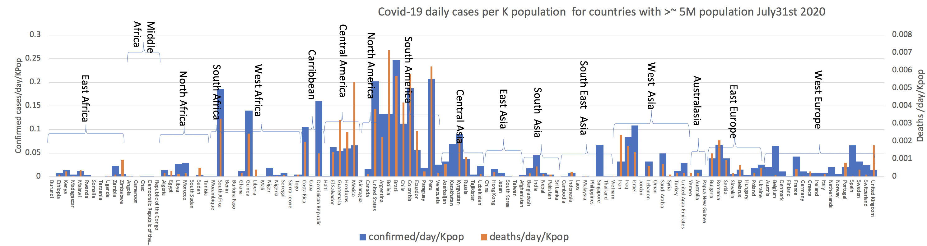
Looking in more details the leading countries by confirmed cases per day per 1000 population on July 31st were:
| Region | Population (K) | confirmed/day/Kpop | deaths/day/pop | |
| Brazil | America South | 212559.417 | 0.2464 | 0.005702 |
| Peru | America South | 32971.854 | 0.2065 | 0.006217 |
| United States | America North | 331002.651 | 0.2018 | 0.003788 |
| Colombia | America South | 50882.891 | 0.1865 | 0.005798 |
| South Africa | Africa South | 59308.69 | 0.1857 | 0.003254 |
| Dominican Republic | America Carribbean | 10847.91 | 0.1598 | 0.001291 |
| Guinea | Africa West | 13132.795 | 0.139 | 0.002437 |
| Bolivia | America South | 11673.021 | 0.1332 | 0.00711 |
| Argentina | America South | 45195.774 | 0.1312 | 0.002257 |
| Chile | America South | 19116.201 | 0.1115 | 0.004185 |
And by deaths:
| Region | Population (K) | confirmed/day/Kpop | deaths/day/pop | |
| Bolivia | America South | 11673.021 | 0.1332 | 0.00711 |
| Peru | America South | 32971.854 | 0.2065 | 0.006217 |
| Colombia | America South | 50882.891 | 0.1865 | 0.005798 |
| Brazil | America South | 212559.417 | 0.2464 | 0.005702 |
| Chile | America South | 19116.201 | 0.1115 | 0.004185 |
| United States | America North | 331002.651 | 0.2018 | 0.003788 |
| South Africa | Africa South | 59308.69 | 0.1857 | 0.003254 |
| Guinea | Africa West | 13132.795 | 0.139 | 0.002437 |
| Argentina | America South | 45195.774 | 0.1312 | 0.002257 |
| Dominican Republic | America Carribbean | 10847.91 | 0.1598 | 0.001291 |
Comparing the spread of Covid19 in Canada and the US with larger W European countries
Confirmed Cases
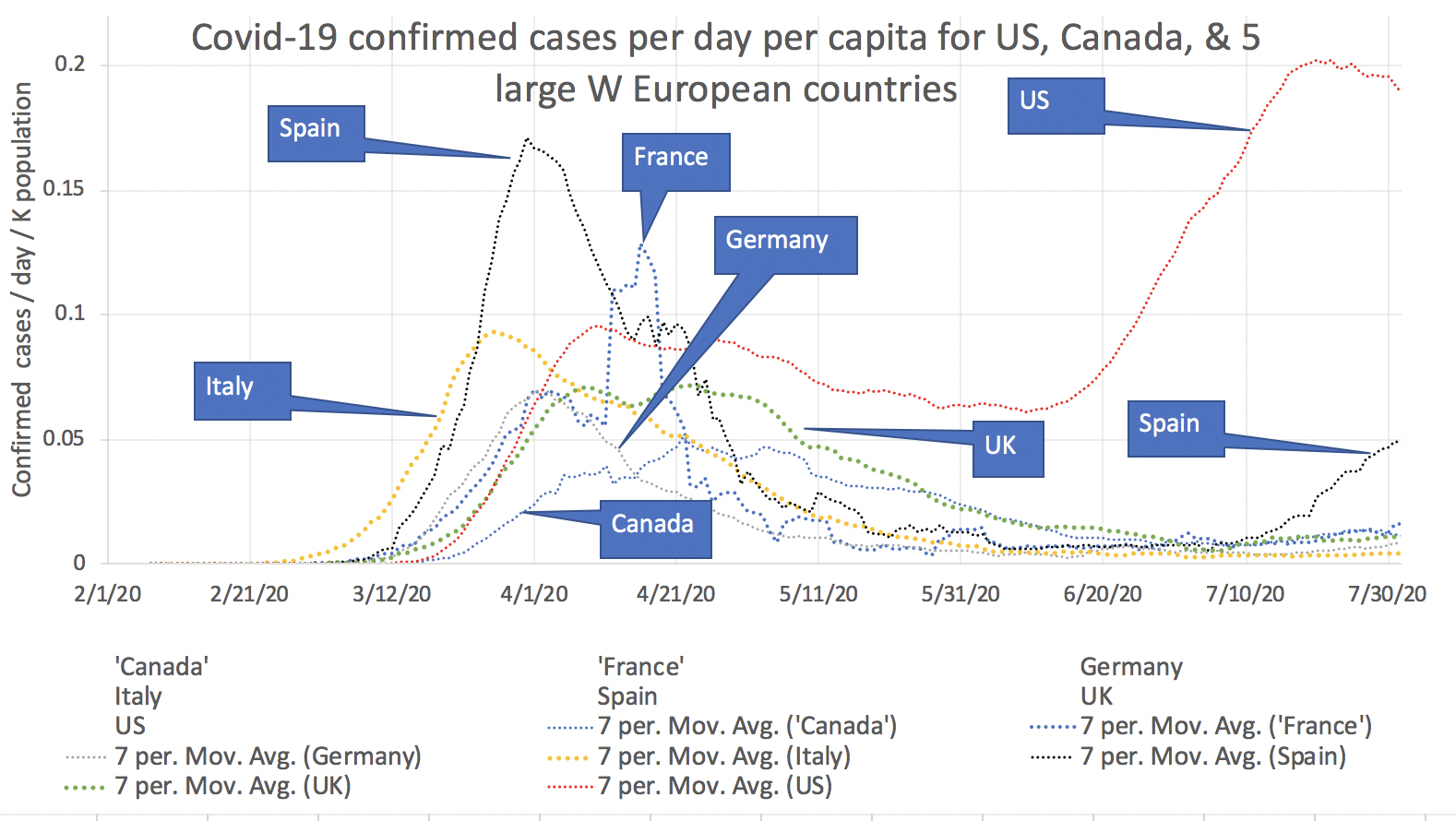
It is seen that Italy was the first country whose Covid-19 confirmed cases spike. This was followed by Spain then Germany and France. Germany was particularly successful in suppressing its peak. The UK has a long tail and the virus has just run away in the US which now has about 10 times more confirmed cases as the other countries with the exception of Spain. Recently Spain has seen an uptick in cases
Deaths
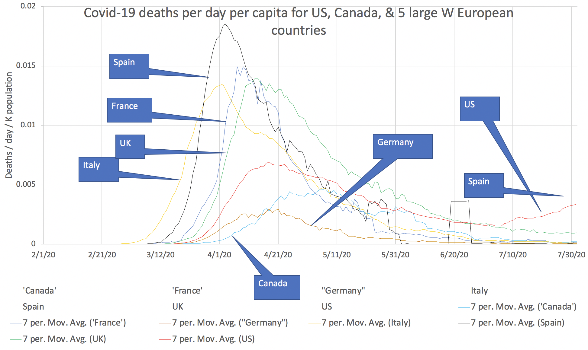

It is seen that US deaths / day / capita are over three times that of the nearest competitor (UK) and over 10 times greater than the next competitor (France)
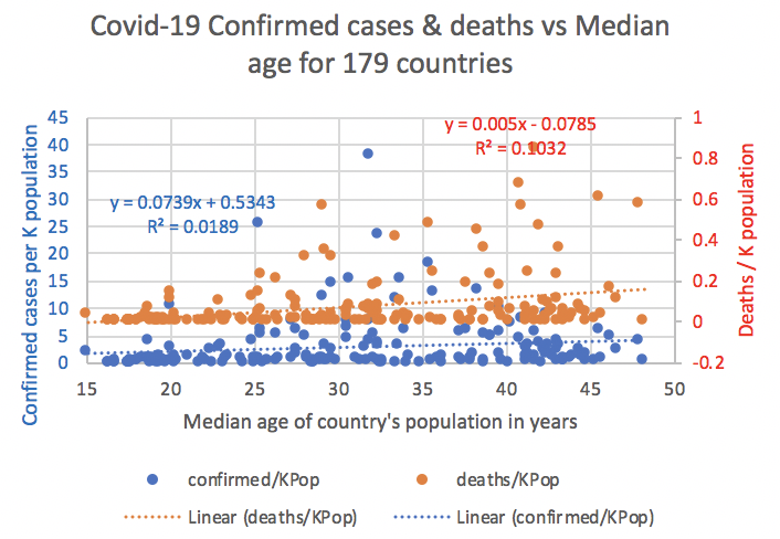
Possible correlation of Covid-19 cases per capita versus median population age for world's countries
The median population age varies by country from about 15 to 50. The 15 countries with the lowest median population age are all in Africa.
| State | ID | Population(K) | Median Age (yrs) | Income per capita($) | Covid-19 confirmed | deaths | deaths/confirmed% | confirmed/KPop | deaths/KPop |
| Niger | ne | 24206.644 | 15.1 | 1019 | 42936 | 937 | 2.18 | 1.773728 | 0.038708 |
| Mali | ml | 20250.833 | 16.4 | 2218 | 2520 | 124 | 4.92 | 0.124439 | 0.006123 |
| Uganda | ug | 45741.007 | 16.4 | 1868 | 1135 | 2 | 0.18 | 0.024814 | 0.000044 |
| Chad | td | 16425.864 | 16.700001 | 1945 | 926 | 75 | 8.1 | 0.056375 | 0.004566 |
| Angola | ao | 32866.272 | 16.799999 | 6658 | 1000 | 47 | 4.7 | 0.030426 | 0.00143 |
| Somalia | so | 15893.222 | 16.799999 | 3212 | 93 | 2.9 | 0.202099 | 0.005852 | |
| Burundi | bi | 11890.784 | 17.5 | 735 | 378 | 1 | 0.26 | 0.031789 | 0.000084 |
| Gambia | gm | 2416.668 | 17.5 | 1699 | 326 | 8 | 2.45 | 0.134896 | 0.00331 |
| Burkina Faso | bf | 20903.273 | 17.6 | 1866 | 1105 | 53 | 4.8 | 0.052863 | 0.002535 |
| Mozambique | mz | 31255.435 | 17.700001 | 1250 | 1720 | 11 | 0.64 | 0.05503 | 0.000352 |
| Tanzania | tz | 59734.218 | 17.700001 | 2948 | 509 | 21 | 4.13 | 0.008521 | 0.000352 |
| Zambia | zm | 18383.955 | 17.700001 | 4033 | 5002 | 142 | 2.84 | 0.272085 | 0.007724 |
| Malawi | mw | 19129.952 | 18.1 | 1205 | 3709 | 103 | 2.78 | 0.193884 | 0.005384 |
| Nigeria | ng | 206139.589 | 18.1 | 5887 | 41804 | 868 | 2.08 | 0.202795 | 0.004211 |
| Central African Republic | cf | 4829.767 | 18.299999 | 727 | 4599 | 59 | 1.28 | 0.95222 | 0.012216 |
Since Covid-19 death rates appear to be higher for older people (see for example https://www.cdph.ca.gov/Programs/CID/DCDC/Pages/COVID-19/COVID-19-Cases-by-Age-Group.aspx for California), we looked at the Covid-19 deaths per capita for 179 countries versus a country's population median age. However, there appears to be very little correlation.
Visualizing Africa, Asia, Europe and South America
Chart of deaths and confirmed cases for African countries by sub-regions Feb-Jun 2020
| Motion chart of deaths vs confirmed | Bubble chart of days between first confirmed case and first death | Bubble chart of deaths/confirmed vs population density | Bubble chart of deaths/confirmed vs confirmed |
|---|---|---|---|
Click on the chart to see the motion of the Covid cases with time |
Click on the chart for more details |
Click on the chart for more details |
Click on the chart for more details |


The sub-regions are from https://en.wikipedia.org/wiki/List_of_regions_of_Africa
Observations:
- The first Africa countries to report confirmed cases, in late February and early March, were the North African countries Algeria (DZ) and Egypt (EG)
- Egypt reported the first African country death on March 6th
- By March 18 Algeria, Egypt, Morocco (MA)and Tunisia (TN) all had reported deaths
- By March 22, South Africa (ZA) had reported over 550 confirmed cases, more cases than any other African country.
- The first West African country to report a death was Burkina Faso (BF) that reported 2 deaths on March 19th. By this time Algeria had reported 15 deaths.
- By April 1, the four North African countries Algeria, Egypt, Morocco and Tunisia each reported more deaths than any other African country.
- By mid April:
- several West African countries were following North African countries and South Africa's lead.
- Cameroon (CM), although being listed in the Mid African sub-region was behaving more like a West African region country.
- By the end of May several east African countries had a similar number of case that West Africa had the month before.
- By the end of June
- South Africa had by far the most confirmed cases (over 138K), the next highest confirmed cases was Egypt (EG) with 76K confirmed cases, followed by Niger (NE) with 30K confirmed cases and Nigeria (NG) with 29K cases..
- Egypt had the most deaths (over 2400)
- The following reported no deaths but had confirmed cases: Lesotho (LS) had over 90 confirmed cases, Namibia (NA) had over 480 confirmed cases, Seychelles (SC) had over 80 confirmed cases, and Uganda (UG) had over 850 confirmed cases.
- South Africa (ZA) stands out as having the most confirmed cases (1170) when it reported its first death
- Rwanda (RW) had the most days (77) between when it reported its first confirmed case and the first death. It is followed by the Central African Republic (CF), Mozambique(MZ), and Madagascar (MG)
Charts of deaths and confirmed cases for Asian countries by sub-regions Feb-Jun 2020
The sub-regions are from https://en.wikipedia.org/wiki/Geography_of_Asia
Central Asia and Russia

Click on the chart to view the full motion chart.
Observations:
- Russia was the first country to report a confirmed case on Feb 1.
- Mongolia was the second Central Asia country to report a confirmed case on Mar 10, when Russia reported 20 confirmed cases and no deaths.
- This was followed on Mar 11 when Kazakhstan announced 4 confirmed cases. At this time Russia reported 45 confirmed cases and Mongolia was still reporting a single confirmed case. neither were reporting any deaths.
- The last Central Asian countries to announce confirmed cases were Uzbekistan on Mar 13 and Tajikistan on Mar 16
- On Mar 23 Russia announced its first deaths, followed by Uzbekistan on Mar 26.
- By Jul 1, Russia led the way with 9844 deaths and 66,6941 confirmed cases, followed by Kazakstan with 188 deaths and 45,717 confirmed cases. Mongolia had the lowest score with 0 deaths and 220 confirmed cases.
East Asia

Observations:
- At the end of January (January 31st), China (CN) reported a sum of 11,891 confirmed cases and 259 deaths, Hong Kong (HK) reported 7,496 cases and 13 deaths, and Japan reported 20 cases and 0 deaths.
- From Mar 11 through mid June 16 the sum of confirmed cases for Hong Kong went from 134 to 1120 while the sum of deaths stayed at 4.
- On March 16 the sum of confirmed cases for china was 81,201 with 3241 deaths. After just under a month, on April 14 this went to 83,403 confirmed cases and 3346 deaths or 114 more deaths since March 16. Then on March 17, a day later the confirmed cases went to 83,760 and 4636 deaths, or an increase of 290 deaths in 1 day.
- By July 2 Hong Kong reported a sum of 1258 confirmed cases and 7 deaths.
South Asia

Click on the images below to look in more detail and move the mouse over the points for more information | |
 |  |
 |  |
Observations:
- January 30, the first confirmed cases were reported in India (IN), Nepal (NP) and Sri Lanka (LK).
- March 6, Bangladesh (BG) and the Malvinas (MV) reported their first confirmed cases. Bhutan (BT) reported its first confirmed case 2 days before on March 4.
- March 9, India was the first country to report a death.
- March 13, Pakistan overtakes India in reported confirmed cases. It then stays abreast of India until the end of March.
- March 16 and 17, Bangladesh and Pakistan reported their first deaths. By this time India had reported 4 deaths.
- May 22, after a slow start Bangladesh gets close behind the leaders India and Pakistan.
- By the end of the first week in August looking at the middle chart of daily confirmed cases it is apparent that:
- Pakistan has passed the peak of daily confirmed cases around 6/13/2020
- Nepal passed its peak at the end of June, however, the daily cases are starting to increase again
- Bangladesh reached a peak of about 22 confirmed cases per million population per day at the start on July, since then it has decreased but seems to now be holding steady around 15 cases per Million population per day.
- Afghanistan reached a peak of about 23 cases/million population/day by the first week in May and by August 8th was down to a couple of cases/million population/day.
- Cases in India continue to rise daily and by August 8 have reached over 45 cases/million population/day. Bear in mind India's population is approaching 1.4Billion so 45 cases/Million/population corresponds to about 63 thousand new confirmed cases per day.
- The net effect on the aggregated cases is seen in the chart on the right which illustrates the exponential growth in confirmed cases for India.
- The chart below shows the daily deaths per million population. It can be seen that India took the lead in July.
- Looking at the death/confirmed cases Bangladesh started out with a high ratio As of August 8, 2020 Afghanistan has the highest ratio
- For Afghanistan also see https://en.wikipedia.org/wiki/COVID-19_pandemic_in_Afghanistan
South East Asia

Observations:
- Singapore (SG) reports very low deaths compared to confirmed cases.
West Asia
| Motion chart of Deaths vs Confirmed | Bubble chart of days between first confirmed case and first death | Bubble chart of deaths/confirmed cases vs confirmed cases | Bubble chart of deaths/confirmed vs population density |
|---|---|---|---|
 |  |  |  |
Observations:
- The Arab Emirates (AE) was the first West Asian country to report a confirmed case on January 30.
- Iran (IR) was the first West Asian country to report a death on February 17 when it reported its first 2 deaths AND its first 2 confirmed cases on the same day. On this date, the Arab Emirates was the only other West Asian country reporting cases, and it reported an accumulated total of 19 confirmed cases and no deaths.
- On March 13, Iraq (IQ) was the second West Asian country to report a death when it reported 2 deaths. By this date Kuwait, (KW), Bahrein (BH), Israel (IL), Oman (OM), Jordan (JO) and Saudia Arabia (SA) had also reported confirmed cases. Also Iran had reported an accumulated sum of 2,922 confirmed cases and 92 deaths, while the Arab Emirates reported 27 confirmed cases and zero deaths.
- On April 8th, Yemen (YE) was the last West Asian country to report a confirmed case. On this date the leading West Asian countries were Iran which reported an accumulated 68,192 confirmed cases and 4,232 deaths while Turkey reported an accumulated 47,029 confirmed cases and 1,006 deaths.
- On June 30, the leading West Asian countries in terms of reported deaths were Iran, Turkey, Iraq and Saudia Arabia. Yemen as reporting an unusually high number of deaths (325) compared to the number of confirmed cases (1,221). On the other hand, the reverse was true for Qatar (QA) with only 118 deaths for 97,897 confirmed cases.
- Saudia Arabia (SA), Israel (IL), followed by Qatar (QA) and Kuwait (KW) have the highest numbers of confirmed cases when the first death was reported.
- The Arab Emirates (EM), Kuwait and Oman lead the way for number of days between the first confirmed case and the first death.
- Yemen stands out with the highest deaths/confirmed cases to confirmed cases.
- Qatar (QA) has the lowest deaths/confirmed cases = 0.13%, follwed by Bahrein (BH) with 0.33%.
Charts of deaths and confirmed cases for South American countries by sub-regions Feb-Jun 2020
South American Mercosur countries 8/14/2020
The Mercosur (or Southern Common Market) countries (see https://en.wikipedia.org/wiki/Mercosur) here include Argentina, Brazil, Paraguay, Uruguay, Chile and I have added Venezuela.
| Cumulative Confirmed cases per million population | Cumulative Deaths per million population |
|---|---|
 |  |
| To assist in showing the deaths for those countries with lower numbers of %(deaths/ million population) we take the log base 10 of the y axis. | Cumulative Deaths/confirmed cases |
 |  |
| Daily confirmed cases per million population |
|---|
 |
Observations:
- Chile recorded its first confirmed case Feb 23, followed by Brazil on Feb 26.
- Chile and Brazil followed by Argentina lead in terms of both confirmed cases and deaths.
- For the ratio deaths/confirmed cases Brazil takes the lead followed by a dead heat between Uruguay and Chile followed, in turn, by Argentina.
- In terms of the ratio deaths/confirmed cases:
- Brazil, Argentina and Chile passed their peak in the April May time-frame.
- Then in June Chile started rising again, passed the first peak and continued rising.
- Uruguay has remained fairly constant since May.
- Argentina and Paraguay appear to be seeing an increase again in August.
- Venezuela appears to have rapidly reduced the ratio and held it steady at about 1% since May. It also appears to have the lowest reported deaths. This is strange given the concerns over the Venezuelan Health care system and the impact of international sanctions (see https://en.wikipedia.org/wiki/COVID-19_pandemic_in_Venezuela)
- Looking at the daily confirmed cases per million population in Mercosur countries , Chile passed its peak in June. For the other countries, the daily confirmed cases are still increasing or flat.
South American Andean countries 8/14/2020
The sub-regions are roughly from https://en.wikipedia.org/wiki/List_of_regions_of_Latin_America with Venezuela added.
| Covid-19 confirmed cases per million population for South American Andean countries | Covid-19 deaths per million population for South American Andean Countries |
|---|---|
 |  |
| Covid-19 cumulative confirmed cases for South American Andean countries | Covid-19 daily confirmed cases for South America Andean countries |
|---|---|
 |  |
 |  |
Observations:
- The first confirmed case was from Ecuador on Mar 1, followed by both Columbia and Peru on Mar 6. Bolivia was the last country to announce a confirmed case on Mar 11.
- Peru leads in both number of confirmed case, number of confirmed case per million population and deaths per million population.
- Bolivia had the highest per cent deaths per confirmed cases (or Case Fatality Ration - CFR), followed by Bolivia.
- It does not appear that any of the Andean countries have passed the peak of daily confirmed cases.
South America 6/30/2020
The sub-regions are roughly from https://en.wikipedia.org/wiki/List_of_regions_of_Latin_America.
Deaths vs confirmed | Deaths/K population vs confirmed/K population | Bubble chart of days between first confirmed case and first death |
|---|---|---|
 |  |  |
Observations
- Brazil recorded the first confirmed Covid-19 case on February 24.
- Argentina recorded the first death on March 11, 8 days after its first recorded case. At this time it had 31 recorded confirmations.
- Brazil's first recorded death was March 16, by which time it had 372 recorded confirmations.
In terms of deaths/K population vs confirmed/K population:
the leading counties are Chile (CL), Peru (PE), Brazil (EC), and Ecuador (EC).
- and Venezuela (VE) has the lowest values.
The sub-regions are roughly from https://en.wikipedia.org/wiki/List_of_regions_of_Latin_America.
| Deaths vs confirmed | Deaths/K population vs confirmed/K population | Bubble chart of days between first confirmed case and first death |
|---|---|---|
| 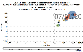 | |
Observations
- Brazil recorded the first confirmed Covid-19 case on February 24.
- Argentina recorded the first death on March 11, 8 days after its first recorded case. At this time it had 31 recorded confirmations.
- Brazil's first recorded death was March 16, by which time it had 372 recorded confirmations.
In terms of deaths/K population vs confirmed/K population:
the leading counties are Chile (CL), Peru (PE), Brazil (EC), and Ecuador (EC).
- and Venezuela (VE) has the lowest values.
Charts of deaths and confirmed cases for European countries
Nordic and Baltic countries 9/20/20
These include the Nordic countries: Denmark, Finland, Iceland, Norway, Sweden, and the Baltic countries: Estonia, Latvia, Lithuania. Greenland and the Faroe Islands are not included (they are autonomous countries within the country of Denmark and both have a population of under 60,000).
| State | ID | Population (K) | Income per capita ($) | Area(sq km) | Median Age (yrs) | Pop-Density (Kpop/sq-km) |
| Denmark | dk | 5792.202 | 54356 | 43094 | 42.299999 | 0.134 |
| Estonia | ee | 1326.535 | 33448 | 45227 | 42.700001 | 0.029 |
| Finland | fi | 5540.72 | 46344 | 338424 | 42.799999 | 0.016 |
| Iceland | is | 341.243 | 55322 | 103000 | 37.299999 | 0.003 |
| Latvia | lv | 1886.198 | 28362 | 64559 | 43.900002 | 0.029 |
| Lithuania | lt | 2722.289 | 33253 | 65300 | 43.5 | 0.042 |
| Norway | no | 5421.241 | 62183 | 323802 | 39.700001 | 0.017 |
| Sweden | se | 10099.265 | 51405 | 450295 | 41 | 0.022 |
See https://ktla.com/news/nationworld/sweden-has-less-cases-than-many-european-countries-following-unique-controversial-approach-to-coronavirus/ that discusses Sweden's low key Covid-19 strategy (e.g. not wearing masks) and that "According to the European Center for Disease Control, Sweden has reported 30.3 new COVID-19 cases per 100,000 inhabitants in the last 14 days, compared with 292.2 in Spain, 172.1 in France, 61.8 in the U.K. and 69.2 in Denmark, all of which imposed strict lockdowns early in the pandemic."
Comparing the Nordic countries per million population it appears the other countries still have a long way to go to catch up in terms of confirmed cases and deaths.
| Covid-19 Confirmed cases per million population | Covid-19 Deaths per million population |
|---|---|
|
|

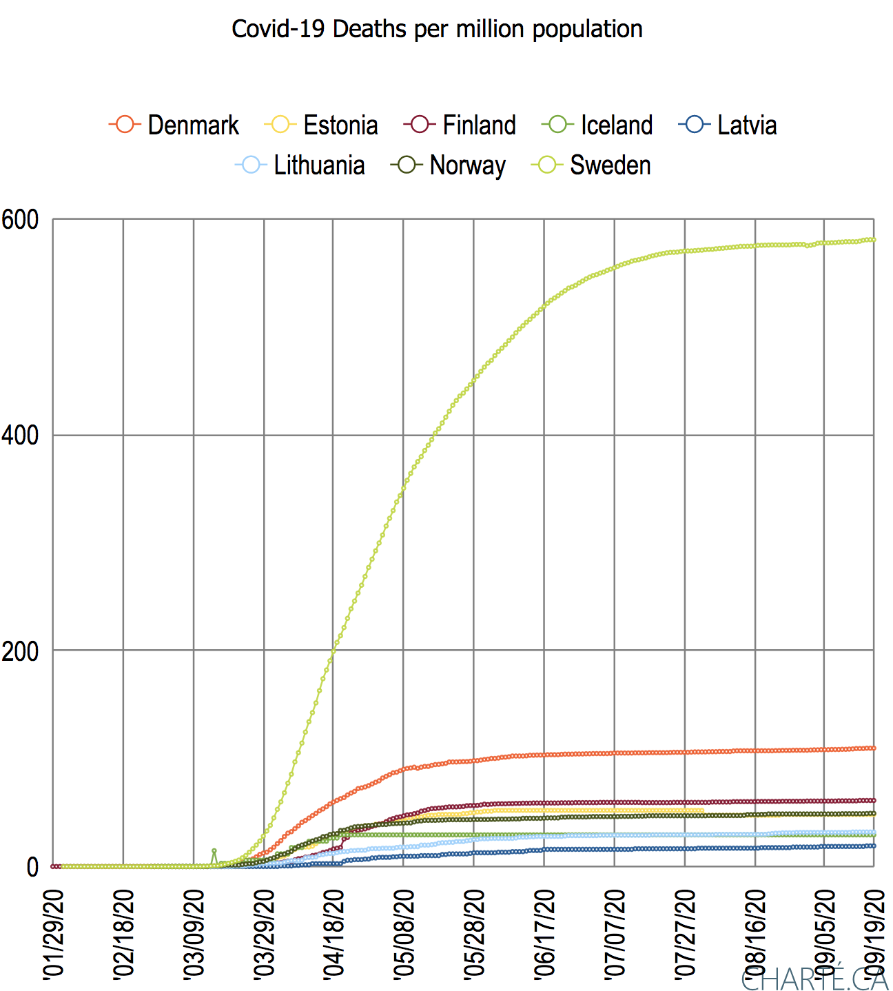
| Covid-19 Log base 10 (confirmed cases/million population) |
|---|
|

| Covid-19 Smoothed daily confirmed cases/million population | Covid-19 Smoothed daily deaths/million population |
|---|---|
|
|
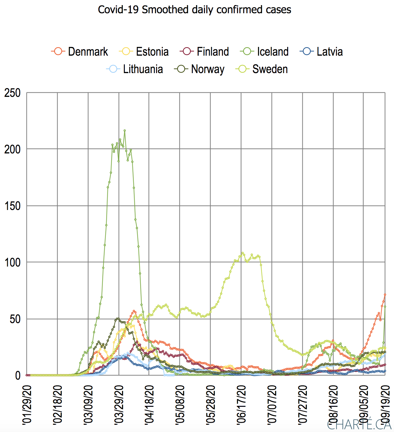
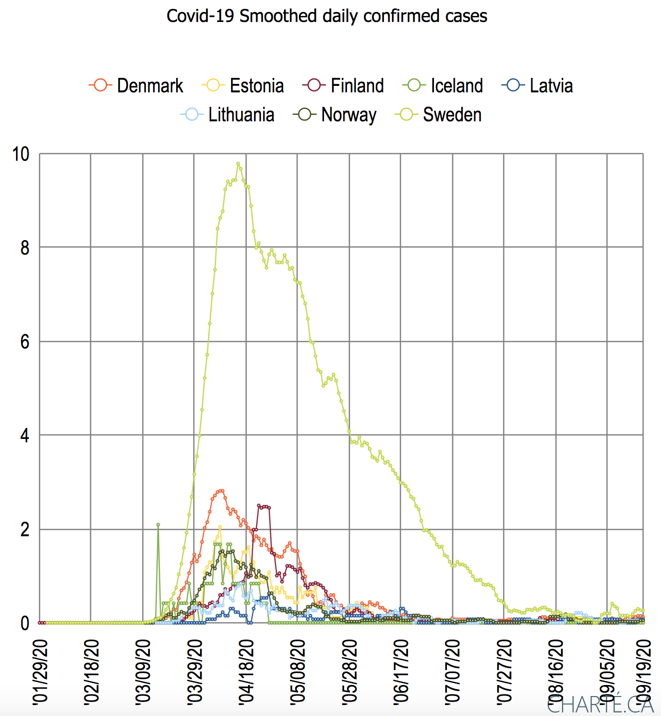
| Log base 10(smoothed daily confirmed cases/million population) | Log base 10(smoothed daily |
|---|---|
|
|
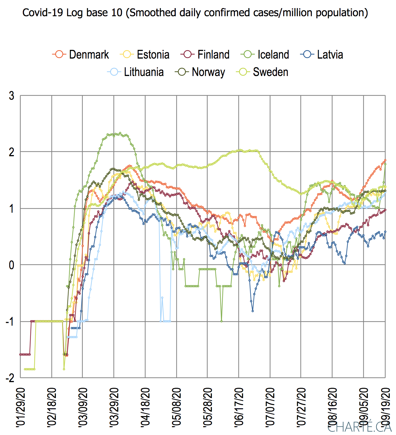
Nordic and Baltic countries 8/17/20
| Confirmed cases | Confirmed cases per million population | Deaths per million population |
|---|---|---|
 |  |  |
| %(deaths/confirmed cases) | Daily confirmed cases per million population |
|---|---|
 |  |
Observations:
- Finland recorded the first confirmed Covid-19 case 1/29/20, followed by Sweden on 1/31/20.
- Sweeden also recorded the fist death on 3/11/20.
- Sweden stands out as having the highest number of cases as well as the highest deaths per million population (over five times that of the runner-up Denmark) and the deaths/confirmed cases. See for example https://newsroom.uvahealth.com/2020/07/03/covid-19-deaths-in-sweden/ for how this is related to the country's lack of a lockdown.
- Iceland also stands out in the effectiveness in reducing the increase in confirmed cases. For more information on How Iceland beat the Virus see https://www.newyorker.com/magazine/2020/06/08/how-iceland-beat-the-coronavirus.
- After Sweden, Iceland has the second-highest confirmed cases/million population.
- On 3/2/20 Latvia was the last country to record a confirmed case and the last country to record a death on 4/13/20.
Western Europe 8/18/20
| Cumulative Confirmed cases | Cumulative Confirmed cases per million population | Cumulative deaths per million population |
|---|---|---|
 |  |  |
| Cumulative %deaths/confirmed cases | Daily confirmed cases per million population | |
|---|---|---|
 |  |
| 7 day smoothing of daily confirmed cases per million population | 7 day smoothing of daily deaths per million population |
 |  |
Observations:
- Spain and the UK lead in numbers of confirmed cases, with Spain having overtaken the UK in the second week of August. Spain and the UK are followed by Italy, France, and Germany.
- When one normalizes the confirmed case by the population then Spain still leads, but now followed by Belgium, the UK, Switzerland, and Italy. Austria and Germany have the lowest values.
- In terms of deaths per million population, Belgium leads followed by the trio of Spain, the UK, and Italy. Germany and Austria have the lowest values, about 10 times lower than Belgium.
- For all countries, there was an initial peak in daily confirmed deaths starting the 4th week in March and ending the 3rd week of April. There is a further rise starting in the 4th week in July.
- The ratio of deaths/confirmed cases for all countries except Italy peaked in May. Italy peak a month later. The ratio has continued to reduce for all countries since then. Belgium, France, and Spain saw a large decrease starting in August.
- in the 4th week of July the daily confirmed cases see an increase for all countries. Since then Spain, Belgium, the Netherlands, and France are taking the lead.
South East Europe 8/18/20
| Cumulative confirmed cases | Cumulative confirmed cases per million population | Cumulative deaths per million population |
|---|---|---|
 |  |  |
| Cumulative %deaths/confirmed cases | Daily confirmed cases per million population |
|---|---|
 |  |
Due to time-out problems with the www.charte.ca app, we had to reduce the number of countries we included in South East Europe. The reductions included removing Cyprus and Montenegro in turn.
Observations:
- The first countries to report a confirmed case were Croatia (2/25/20) followed by Greece and Macedonia (both on 2/26/20).
- The first countries to report a death were Greece and Albania (both 3/11/20).
- Serbia took the lead in confirmed cases in the first week of April and has held it ever since. Serbia is followed by Bosnia Herzegovina and Macedonia with less than half the number of confirmed cases. With about half the number of cases again come: Albania, Greece, and Croatia. Cyprus has the smallest number of confirmed cases.
- Between April and June Slovenia, Montenegro, Albania, and Croatia flattened their curves (also see https://emerging-europe.com/from-the-editor/nobodys-talking-about-south-east-europes-success-at-containing-coronavirus-anymore/). All are now trending upwards with Montenegro, Boznia Herzegovina, Serbia and Albania leading the charge (also see https://balkaninsight.com/2020/08/03/europes-southeast-grapples-with-covid-19-resurgence/)
- If we normalize by taking the number of confirmed cases per million population, then Montenegro and Macedonia are the leaders. They are followed by Boznia Montenegro, Serbia, and Albania. Greece has the lowest value.
- Albania and Serbia both peaked in the ratio of deaths/confirmed cases at the end of March/early April. Slovenia, Boznia Herzegovina, Macedonia, and Croatia all peaked in May-June.
- Overall Serbia appears to have managed to maintain the lowest deaths/confirmed cases since the 3rd week in March. Just recently Croatia is has achieved similar ratios.
- Bosnia Herzegovina and Serbia currently (8/18/20) have the highest daily confirmed cases. Slovenia, Croatia, and Greece have the lowest daily cases.
Eastern Europe 8/21/20
Our definition includes: Austria, Bulgaria, the Czech Republic, Hungary, Poland, Romania, Slovakia and Switserland. We do not include Liechensten with a population of 38,000.
| Cumulative confirmed cases | Cumulative confirmed cases per million population | Cumulative deaths per million population |
|---|---|---|
 |  |  |
| Cumulative % deaths/confirmed cases | 7 day smoothed daily confirmed cases per million population | 7 day smoothed daily deaths per million population |
|---|---|---|
 |  |  |
Observations:
- On 2/25/20 Austria and Switzerland were the first two E European countries to record a confirmed case.
- On 3/5/20 Swizerland announced its first Covid-19 death.
- Switzerland and Austria took the lead in confirmed cases early on.
- Poland and Romania have continued to increase the confirmed cases while the other countries remained fairly steady in the cumulative cases until July.
- Austria was overtaken by Poland and Romania in the second week of May.
- Switzerland held the lead in confirmed cases until mid June, when it was overtaken by Poland.
- Poland, in turn, was overtaken by Romania towards the end of June.
- Starting in July Switzerland, Austria, the Czech Republic and Bulgaria noticeably started to increase their cumulative confirmed cases.
- When one takes the cumulative confirmed cases per million population Switzerland and Austria maintain their lead until the last week of July when Austria is overtaken by Romania.
- Slovakia and Hungary appear to have been the most successful in flattening the curve of confirmed cases per million population.
- In terms of deaths per million population, Switzerland leads with over 220 cases/million population. Romania is in second place and catching up since the cumulative deaths for Switzerland are pretty flat while Romania's are increasing.
- Bulgaria and Poland also have cumulative deaths which are noticeably climbing.
- The ratio of deaths/confirmed cases has peaked for all countries and is in a downward trend,
- The daily confirmed cases for all countries peaked beween March 20 and April 20, wuth Switzerland having the highest confirmed cases/million population followed by Austria.
- After a lull in daily confirmed cases they started to rise again in June for all countries, most noteceably for Romania and Bulgaria.
- A similar chart (though with much lower absolute values) is seen for the daily deaths, though only Romania and Bulgaria appear to have the increase in July August.
More information:
- Austria see https://en.wikipedia.org/wiki/COVID-19_pandemic_in_Austria
- Bulgaria see https://en.wikipedia.org/wiki/COVID-19_pandemic_in_Bulgaria
- Czech Republic https://en.wikipedia.org/wiki/COVID-19_pandemic_in_the_Czech_Republic
- Hungary see https://en.wikipedia.org/wiki/COVID-19_pandemic_in_Hungary
- Romania see https://en.wikipedia.org/wiki/COVID-19_pandemic_in_Romania
- Slovakia see https://en.wikipedia.org/wiki/COVID-19_pandemic_in_Slovakia
- Switzerland see https://en.wikipedia.org/wiki/COVID-19_pandemic_in_Switzerland
Charts of deaths and confirmed cases for European countries by sub-regions Feb-Jun 2020
Motion chart deaths vs confirmed | Bubble chart of days between first confirmed case and first death | Bubble chart of deaths/confirmed cases vs density of population | Bubble chart of deaths/confirmed vs Confirmed cases |
|---|---|---|---|
Click on the chart to see the motion of the Covid cases with time |
Click on chart |
Click on chart |
Click on chart |


Observations:
- Italy (IT) reported its first deaths on February 20. At this time it reported 62 confirmed cases.
- France (FR) was the next country to announce deaths on February 24. At this time France reported 24 confirmed cases, and Italy reported 453 confirmed cases and 12 deaths.
- On March 2, Spain was the 3rd European country to report deaths, at this time Spain (ES) reported 22 confirmed cases, Italy reported 107 deaths and 3059 confirmed cases and France reported 4 deaths and 288 confirmed cases.
- Germany (DE) and Iceland (IS) lagged behind other countries in terms of deaths/confirmed cases.
- Italy and Spain then took the lead and maintained it until the third week of April. By this time, France and the UK (UK) had caught up Italy and Spain and on April 24, the four countries were reporting:
Country | Confirmed cases | Deaths |
|---|---|---|
| Italy | 195,351 | 26,384 |
| Spain | 205,905 | 22,902 |
| France | 161,644 | 22,617 |
| UK | 155,453 | 23,697 |
- Iceland (IS) succeeded in halting the rise in deaths and confirmed cases on April 21.
- From mid May onwards Byelorussia 's (BY) deaths/confirmed cases were lower than other countries (excluding Iceland and the Netherlands).
- By the beginning of June, Russia (RU), Germany(DE) and Turkey (TR) had pretty much caught up with Italy, Spain, France and the UK in terms of confirmed cases.
- The Scandinavian countries (Denmark (DK), Finland (FI), Norway (NO), Sweden (SE)), Latvia and Germany (DE) appear to lead the way in the number of confirmed cases when the first death occurs.
- By the first week of July:
- In terms of deaths/confirmed cases: Belgium (BE) leads the way with 16%, followed by in turn France (FR) 15%, the United Kingdom (UK) 15%, Italy (IT) 14%, Hungary (Hu) 14%) and Spain (ES) 11%. All except Belgium have a population of over 40M.
Notes
Demographic correlations for California
We investigated the correlations between the demographics and the confirmed Covid-19 cases for California. We used the R squared coefficient of determination to characterize the degree of correlation between the various demographics using a linear fit.
Demographic | Income | Education | Cases | Politics | Age | Population density | Population |
|---|---|---|---|---|---|---|---|
| Per capita income | * | 0.81 | 0.0032 | .28 | 0.008 | 0.12 | 0.19 |
% of people completing college education for CA | 0.81 | * | 0.016 | 0.43 | 0.009 | 0.20 | 0.043 |
| Covid-19 confirmed cases | 0.0032 | 0.016 | * | 0.34 | 0.012 | 0.14 | 0.77 |
| % of Registered voters who are registered as Democratic | 0.28 | 0.43 | 0.034 | * | 0.089 | 0.15 | 0.081 |
| Median age | 0.008 | 0.008 | 0.012 | 0.0089 | * | 0.0029 | 0.084 |
| Population density (people/sq mile) | 0.12 | 0.20 | 0.14 | 0.25 | 0.0029 | * | |
| Population | 0.19 | 0.043 | 0.77 | 0.081 | 0.084 | * |
It is seen that there is a strong correlation between the per capita income and education and between confirmed cases and population, a medium correlation between registered voter political leaning and education. The excel spreadsheet of the analysis of the above demographics and their correlations can be found here.
Use of www.charte.ca
We noticed that with a large amount of data (e.g. over 2200 lines of Excel comma-separated value data from say each day from January 22 thru July 22 and say greater than 20 states) the building of a grouped motion chart would not complete. Thus we broke the data down by either reducing the number of states (e.g. by selection states based on their population range)or reducing the number of days (e.g. by only including every 5th day).
Ungrouped
Deaths vs Confirmed:
We tend to use a log log chart which provides greater visibility of a wide range of data (compare the two charts below), and since both the confirmed data and deaths are exponential in their behavior for most states. Also note that with a logarithmic scale: a straight line means exponential growth, and the steeper a line, the faster the total number of confirmed coronavirus cases or deaths is doubling.
Linear plotLog Log plot

.- The first confirmed cases were seen by WA 1/22/20, IL a day later and AZ & CA on 1/25/20
.
- First deaths reported for Washington State were at the start of March
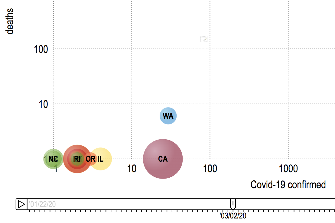 .
. - Deaths start to really increase in the second week in March
 .
. - By the start of April, NY followed by NJ were leading the way in both deaths and confirmed cases
 .
. - By the end of the second week in April, SD and UT are noticeably below the general line followed by other states
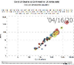 .
. - On 3/30/20 WV was the last state to record a Covid-19 death
- At the end of the second week in April, WY appears to be the last state to have greater than one Corona-19 death.
.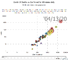
Deaths/Million Population vs Confirmed cases/Million Population
- The leading states in terms of deaths per million population are: NY, NJ, CT, MA, LA, MI, DE,DC, RI.
The leading states in terms of confirmed per million of population are: NY, NJ, MA, DE, CT,RI, LA, DC, MI
If one does not normalize by population the NY and NJ standout followed by the top of the bunch being MA and MI .
.
Looking at a log vs log plot the trailing states one sees the lowest deaths are for AK SD, HI, MT, WY, ND. The lowest Confirmed cases are for AK, SD, SD,HI, MT, WY, ND.
- Note that since it is a log-log scale no bubble appears for a state until there is at least 1 confirmed case and 1 death for the state.
- % Confirmed and deaths both low for AK, VT, NH, ID
- Cluster of DE, DC and RI with low deaths compared to the % confirmed cases
- NY, NJ, MA, DE, CT, LA, RI, DC have the highest % confirmed cases.
- By March 14th, WA, NY, CA, FL were reporting deaths.
Grouped data
If we color the bubbles by each state's political leaning the chart appears below. It is apparent that Covid-19 is impacting democratic states the hardest, followed by the swing states.


We can also group the data by age, income or education tertiles
Grouped by Income | Grouped by Age | Grouped by Education (Bachelor degree or Equivalent) |
|---|---|---|
 | 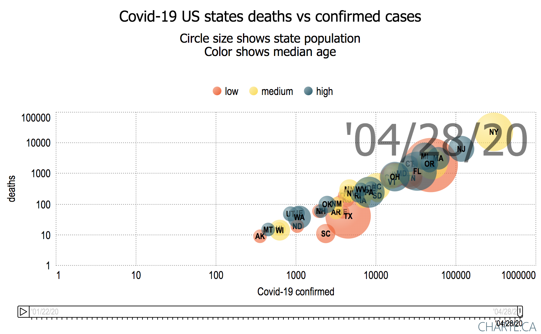 |  |