Contents
Introduction
This is an attempt to use motion charts to visualize the daily growth, since January 2020, in US Covid-19 cases (confirmed and deaths) by State and by California county showing the population by bubble size and color by median age, education or income.
The vizualization tool is https://www.charte.ca/, a Motion graphics chart tool. In particular, we use it to visualize the growth in time of Covid-19 cases, using the bubble size for population or population density and colors for education, age, political leaning, income etc.
In particular, try out the motion charts in the Results section below. There is a slider at the bottom of each chart to move backward and forward in time, and one can move the mouse over a bubble to find more details.
Method
The Covid-19 statistics are from the Johns Hopkins University (JHU). There are raw data for confirmed cases and deaths by date for each county in each US state. For the US state analysis, the data from the counties are aggregated into the values for each state.
For each state or California (CA) county, we extracted various demographics including the ISO 2 character label for the US or the Abbreviation for CA, population, area, population density, education, income, median age, political leaning. The demographics were obtained from the following sources for the US.
For CA they were obtained from here:
A Perl script covid-us.pl was developed to gather the above information and cast it in a suitable form for the www.charte.ca motion charts and correlation data. See:
- here for an example of the output of covid-us.pl for California counties
- or here for the US.
- and here for the visualization tool https://www.charte.ca/
The script also ranks the age, income, and education demographics for each state or county into low, medium, or high based on their tertiles. This is so these demographics can be used with charte.ca's grouping feature.
Results
N.b. I am having problems with using www.charte.ca as one increases the number of Excel lines of data beyond around 2500. It often times-out after several minutes and asks if I wish to continue to wait, this may happen several times and there appears to be no guarantee it will finally provide a result, instead basically locking up and requiring re-logging into www.charte.ca. This is the reason the data is divided by Jan-Apr and May-Jun.
US States
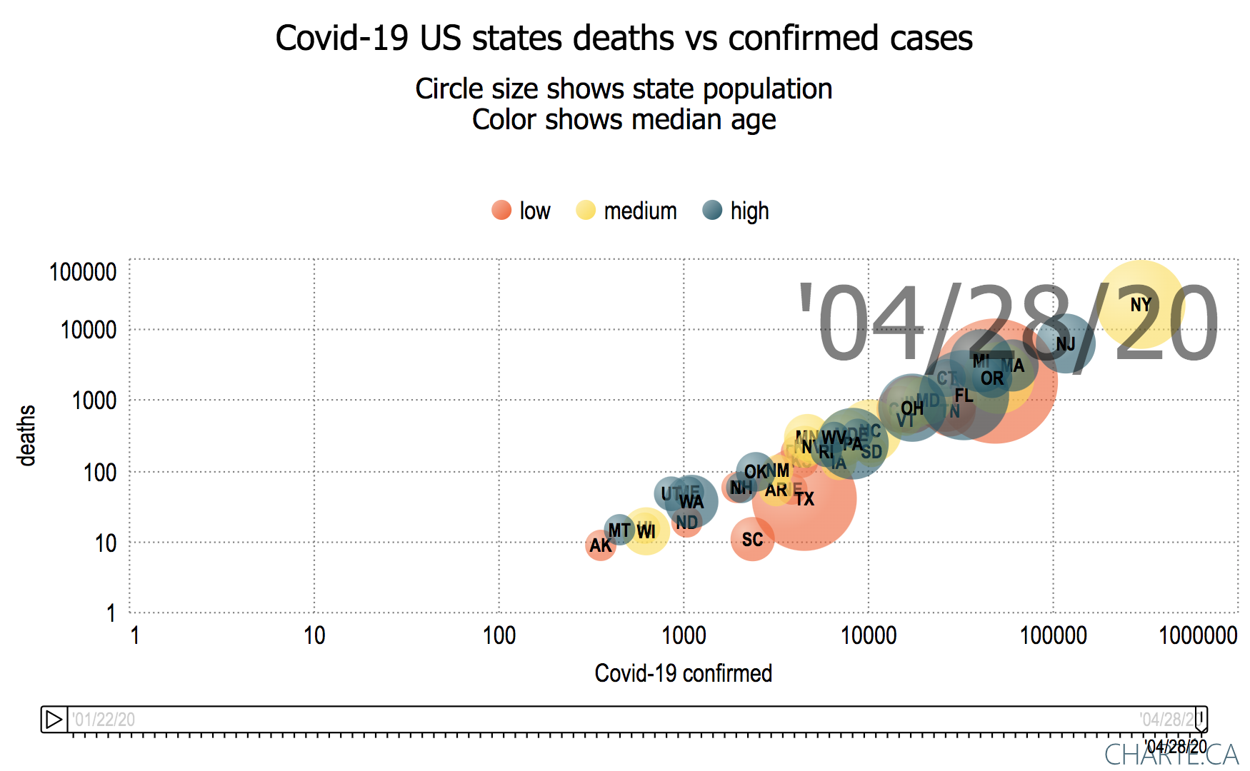
Motion chart of deaths vs Covid-19 Confirmed cases with bubbles sized by population for US states and colored by per capita income (Jan 28, 2020 - Apr 28, 2000)
Motion chart of Covid-19 deaths vs Confirmed cases per million population with bubbles sized by US state population (May 1, 2020 - Jun 22, 2020)
Motion chart of Covid-19 deaths vs Confirmed cases per million population with bubbles sized by US state population colored by per capita income (May 1, 2020, Jun 25, 2020)
Motion chart of daily Covid-19 deaths vs Confirmed cases per million population with bubbles sized by US state population colored by per capita income (May 1, 2020, Jun 26, 2020)
California Counties
Motion chart of Covid-19 deaths vs Confirmed cases with bubbles sized by population density for CA Counties and colored by per capita income (Jan 25, 2020 - Apr 30, 2020)
Motion chart of Covid-19 deaths vs Confirmed cases per million population with bubbles sized by CA county population and colored by per capita income (May 1, 2020 - Jun 25, 2020)
- Observations:
- In terms of confirmed cases and deaths per 1 Million county population
- The leading counties are Lake (LAK), Nevada (NEV), Mono (MNO) with Imperial (IMP) catching up since the end of May.
- These are followed by LA County, Orange Country (OR), Kings County (KIN), Tuolumne (TUO) and Riverside (RIV).
- If one just takes the number of cases (i.e. do not normalize by the population of the county) then:
- The leading counties are LA, Orange County (OR), Lake County (LAK), Nevada County (Nevada), Riverside (RIV), San Diego (SD) and San Bernadino (SBD)
- By March 24th the following counties were observing deaths: Santa Clara (SCL), Riverside (RIV), San Jose (SJ), Sacramento (SAC), LA County, Orange County.
- The last county to record a Covid-19 death was Sierra County (SIE) on May 21st, 2020.
- In general the lower per capita income counties appear to have lower numbers of confirmed cases and deaths, The exceptions are Lake County, Imperial County, Kern County, Tuolumne County and Fremont County.
- In terms of confirmed cases and deaths per 1 Million county population
Notes
Demographic correlations for CA
We investigated the correlations between the demographics and the confirmed Covid-19 cases for CA. We used the R squared coefficient of determination to characterize the degree of correlation between the various demographics using a linear fit.
| Demographic | Income | Education | Cases | Politics | Age | Population density | Population |
|---|---|---|---|---|---|---|---|
| Per capita income | * | 0.81 | 0.0032 | .28 | 0.008 | 0.12 | 0.19 |
% of people completing college education for CA | 0.81 | * | 0.016 | 0.43 | 0.009 | 0.20 | 0.043 |
| Covid-19 confirmed cases | 0.0032 | 0.016 | * | 0.34 | 0.012 | 0.14 | 0.77 |
| % of Registered voters who are registered as Democratic | 0.28 | 0.43 | 0.034 | * | 0.089 | 0.15 | 0.081 |
| Median age | 0.008 | 0.008 | 0.012 | 0.0089 | * | 0.0029 | 0.084 |
| Population density (people/sq mile) | 0.12 | 0.20 | 0.14 | 0.25 | 0.0029 | * | |
| Population | 0.19 | 0.043 | 0.77 | 0.081 | 0.084 | * |
It is seen that there is a strong correlation between the per capita income and education and between confirmed cases and population, a medium correlation between registered voter political leaning and education. The excel spreadsheet of the analysis of the above demographics and their correlations can be found here.
Ungrouped
Deaths vs Confirmed:
We tend to use a log log chart which provides greater visibility of a wide range of data (compare the two charts below), and since both the confirmed data and deaths are exponential in their behavior for most states. Also note that with a logarithmic scale: a straight line means exponential growth, and the steeper a line, the faster the total number of confirmed coronavirus cases or deaths is doubling.
Linear plot Log Log plot 

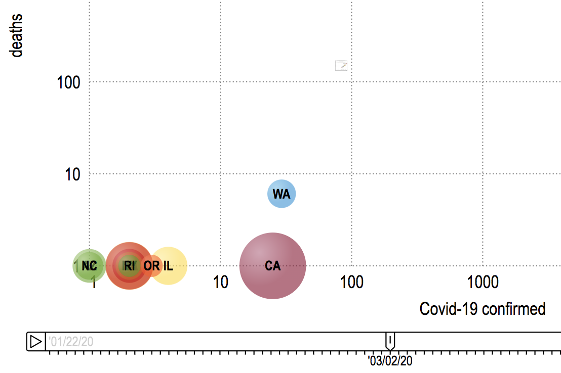
.- The first confirmed cases were seen by WA 1/22/20, IL a day later and AZ & CA on 1/25/20
.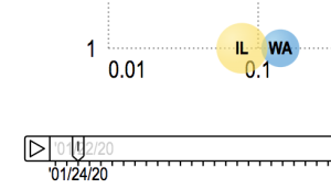
- First deaths reported for Washington State were at the start of March
 .
. - Deaths start to really increase in the second week in March
 .
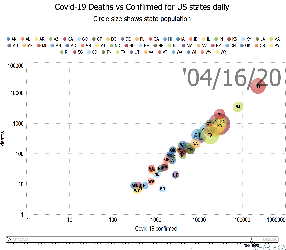
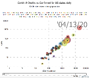
. - By the start of April, NY followed by NJ were leading the way in both deaths and confirmed cases
 .
. - By the end of the second week in April, SD and UT are noticeably below the general line followed by other states
 .
. - On 3/30/20 WV was the last state to record a Covid-19 death
- At the end of the second week in April, WY appears to be the last state to have greater than one Corona-19 death.
.
Deaths/Million Population vs Confirmed cases/Million Population
- The leading states in terms of deaths per million population are: NY, NJ, CT, MA, LA, MI, DE,DC, RI.
The leading states in terms of confirmed per million of population are: NY, NJ, MA, DE, CT,RI, LA, DC, MI
If one does not normalize by population the NY and NJ standout followed by the top of the bunch being MA and MI .
.
Looking at a log vs log plot the trailing states one sees the lowest deaths are for AK SD, HI, MT, WY, ND. The lowest Confirmed cases are for AK, SD, SD,HI, MT, WY, ND.
- Note that since it is a log-log scale no bubble appears for a state until there is at least 1 confirmed case and 1 death for the state.
- % Confirmed and deaths both low for AK, VT, NH, ID
- Cluster of DE, DC and RI with low deaths compared to the % confirmed cases
- NY, NJ, MA, DE, CT, LA, RI, DC have the highest % confirmed cases.
- By March 14th, WA, NY, CA, FL were reporting deaths.
Grouped data
If we color the bubbles by each state's political leaning the chart appears below. It is apparent that Covid-19 is impacting democratic states the hardest, followed by the swing states.


We can also group the data by age, income or education tertiles
| Grouped by Income | Grouped by Age | Grouped by Education (Bachelor degree or Equivalent) |
|---|---|---|
 |  |  |