Introduction
This is an attempt to use motion charts to visualize the growth in US Covid-19 cases (confirmed and deaths) by State and by day showing the state population by bubble bubble size and color by median age, education or income.
Method
The Covid-19 statistics are from Johns Hopkins University (JHU). There are raw data for confirmed cases and deaths by date for each county in each state. The data from the counties are aggregated into the values for each state.
For each state, we extracted various demographics including the ISO 2 character label, population, area, population density, education, income, median age, political leaning. The demographics were obtained from the following sources.
It also ranks the age, income, and education demographics for each state into low, medium, or high based on their tertiles. This is so these demographics can be used with the chare.ca's grouping feature.
A Perl script covid-us.pl was developed to gather the above information and cast it in a suitable form for the www.charte.ca motion charts and correlation data. See here for an example.
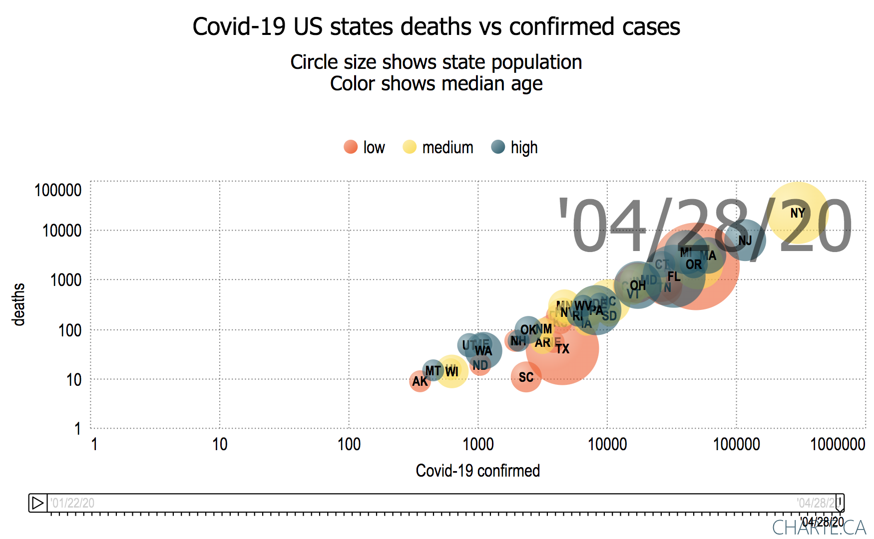
Results
Motion chart of deaths vs Covid-19 Confirmed cases with bubbles sized by population for US states and colored by political leaning
Notes
Ungrouped
Deaths vs Confirmed:
We tend to use a log log chart which provides a greater visibility of a wide range of data (compare the two charts below), and since both the confirmed data and deaths are exponential in their behavior for most states. Also note that with a logarithmic scale: a straight line means exponential growth, and the steeper a line, the faster the total number of confirmed coronavirus cases or deaths is doubling.
Linear plot Log Log plot 

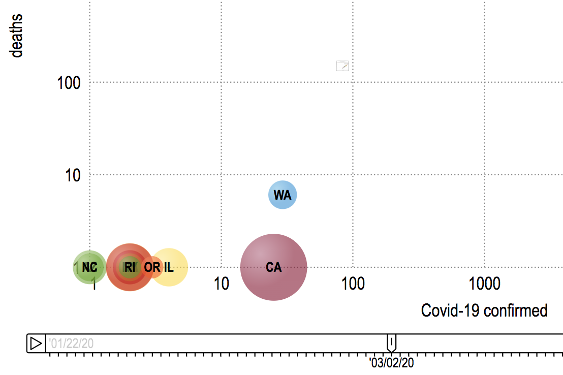
.- The first confirmed cases were seen by WA 1/22/20, IL a day later and AZ & CA on 1/25/20
.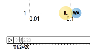
- First deaths reported for Washington State were at the start of March
 .
. - Deaths start to really increase in the second week in March
 .
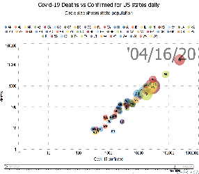
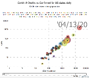
. - By the start of April, NY followed by NJ were leading the way in both deaths and confirmed cases
 .
. - By the end of the second week in April, SD and UT are noticeably below the general line followed by other states
 .
. - On 3/30/20 WV was the last state to record a Covid-19 death
- At the end of the second week in April, WY appears to be the last state to have greater than one Corona-19 death.
.
Deaths/Million Population vs Confirmed cases/Million Population
- The leading states in terms of deaths per million population are: NY, NJ, CT, MA, LA, MI, DE,DC, RI.
The leading states in terms of confirmed per million of population are: NY, NJ, MA, DE, CT,RI, LA, DC, MI
If one does not normalize by population the NY and NJ standout followed by the top of the bunch being MA and MI .
.
Looking at a log vs log plot the trailing states one sees the lowest deaths are for AK SD, HI, MT, WY, ND. The lowest Confirmed cases are for AK, SD, SD,HI, MT, WY, ND.
- Note that since it is a log-log scale no bubble appears for a state until there is at least 1 confirmed case and 1 death for the state.
- % Confirmed and deaths both low for AK, VT, NH, ID
- Cluster of DE, DC and RI with low deaths compared to the % confirmed cases
- NY, NJ, MA, DE, CT, LA, RI, DC have the highest % confirmed cases.
- By March 14th, WA, NY, CA, FL were reporting deaths.
Grouped data
If we color the bubbles by each state's political leaning the chart appears below. It is apparent that Covid-19 is impacting democratic states the hardest, followed by the swing states.

We can also group the data by age, income or education tertiles
| Grouped by Income | Grouped by Age | |
|---|---|---|
 |  |  |
Possible further work
- Look at the California counties data from JHU using the same analysis and visualization.