...
I many cases we divide the demographic (e.g. per capita income) into 3 colors representing the tertile (red for low, yellow for medium and blue for high). These are The key is displayed above the chart.
...
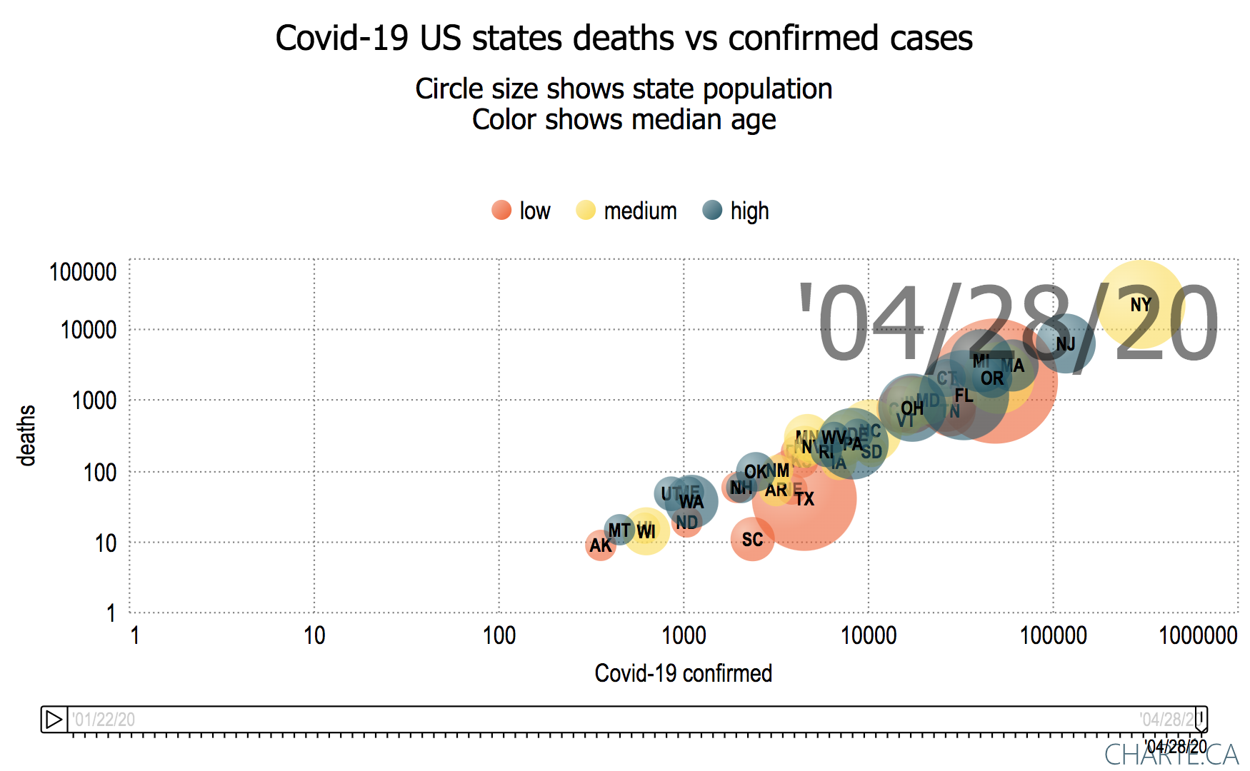
- cases with bubbles sized by US state population and colored by per capita income (Jan 28, 2020 - Apr 28, 2000)
- cases per million population with bubbles sized by US state population (May 1, 2020 - Jun 22, 2020)
- cases per million population with bubbles sized by US state population and colored by per capita income (May 1, 2020, Jun 25, 2020)
- cases with bubbles sized by population density of state and colored by per capita income (May 1 2020 - Jun 26, 2020)
- March 1, 2020 - July 20, 2020
Motion Charts with bubbles sized by US state population and colored by per capita income Mar 1, 2020 thru Jul 20
US State population > 10 Million population US State population 6-10 Million population US States 13-3 6 Million population US States 1.3-3M population 


Daily:
- daily cases per million population with bubbles sized by US state population and colored by per capita income (May 1, 2020, Jun 26, 2020)
- cases with bubbles sized by US state population and colored by per capita income (May 1, 2020, Jun 26, 2020)
...
| Grouped by Income | Grouped by Age | Grouped by Education (Bachelor degree or Equivalent) |
|---|---|---|
 |  |  |
Visualizing countries with larger populations
...
|
| Include Page | ||||
|---|---|---|---|---|
|
...