...
We tend to use a log log chart which provides a greater visibility of a wide range of data (compare the two charts below), and since both the confirmed data and deaths are exponential in their behavior for most states. Also note that with a logarithmic scale: a straight line means exponential growth, and the steeper a line, the faster the total number of confirmed coronavirus cases or deaths is doubling.
Linear plot Log Log plot 

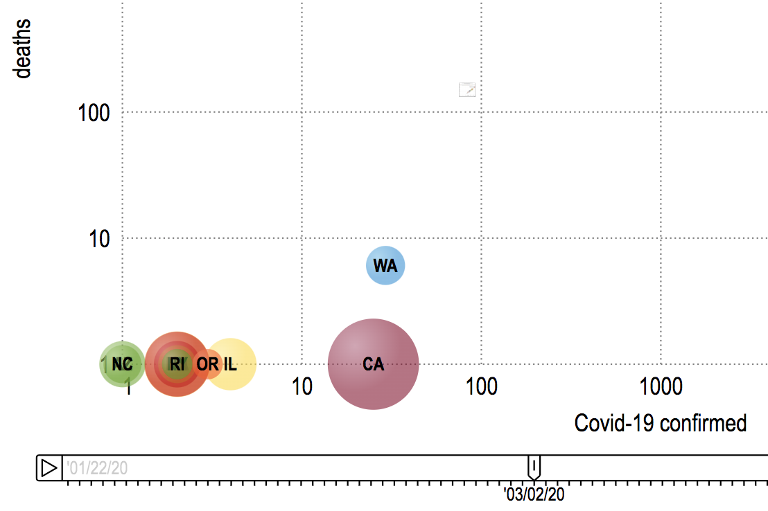
.- The first confirmed cases were seen by WA 1/22/20, IL a day later and AZ & CA on 1/25/20
.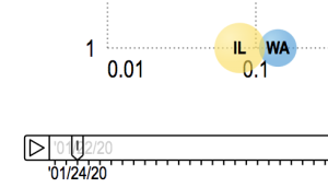
- First deaths reported for Washington State were at the start of March
 .
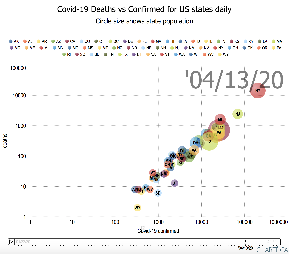
. - Deaths start to really increase in the second week in March
 .
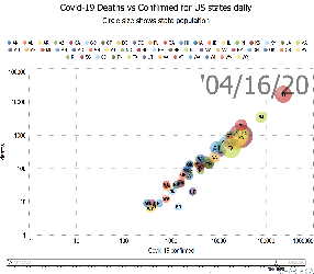
. - By the start of April, NY followed by NJ were leading the way in both deaths and confirmed cases
 .
. - By the end of the second week in April, SD and UT are noticeably below the general line followed by other states
 .
. - On 3/30/20 WV was the last state to record a Covid-19 death
- At the end of the second week in April, WY appears to be the last state to have greater than one Corona-19 death.
.
...