...
If we color the bubbles by each state's political leaning the chart appears below. It is apparent that Covid-19 is impacting democratic states the hardest, followed by the swing states.

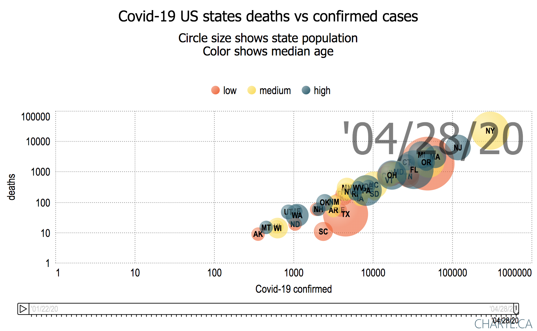
We can also group the data by age, income or education tertiles
| Grouped by Income | Grouped by Age | |
|---|---|---|
 |  |  |
Possible further work
- Looks at dividing states into 0-12%, 25-50%, 50%-75%, 75%-100% for the education and income demographics, and using these to group the states.
- Look at the California counties data from JHU using the same analysis and visualization.
...