Motivation
The PingER metrics motion charts are primarily used to visualize the trends in the Internet end-to-end performance statistics measured from the 100+ PingER monitoring nodes spread worldwide. Having gathered data since 1998, the charts enable the users to study the trends, step changes, significant improvements/degradations with the help of these 4-dimensional charts.
The different sets of charts (w.r.t. regions) enables the users to study the progress made by countries in comparison to their neighbours as well as the world in general.
Below are some examples:
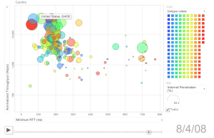
Observations made from Stanford Linear Accelerator Center (SLAC), USA:
View of the world |
View of the world |
View of the world |
|---|---|---|
|
|
|
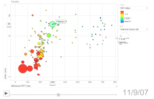
Observations made from CERN, Geneva, Switzerland:
View of South Asia |
View of the Balkans |
View of Africa |
|---|---|---|
|
|
|
Usage
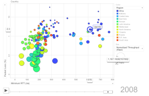
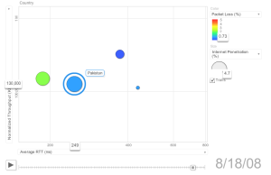
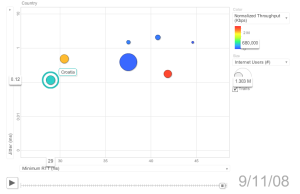
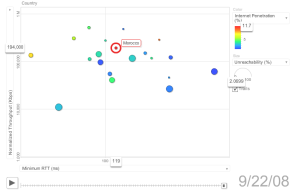
By default, this page shows a motion scatter/bubble plot of the ping (100 Byte) average RTT in msec. ( x ) versus the normalized derived TCP throughput in kbits/sec ( y ). Each bubble represents a country. By default the bubbles are colored by region and their sizes are proportional to the Internet users. The motion is the time. The time granularity is by year. Click on the play button to initiate the motion.
- To change the metric represented by the size of the bubble use the 'size' combo box to the right of the chart.
- Click on the pull down box of an axis' label to change the metric that is displayed on an axis or in a table. Other PingER metrics that are available include minimum RTT, jitter and unreachability.
- Move the mouse over a bubble to identify the values for the bubble.
- Moving the mouse over an axis to choose either linear or logarithmic axis scaling.
- Move the mouse over a colored legend symbol to blink the balloons associated with the symbol's color.
- To follow the changes in detail simply move the slider bar with the mouse.
- One can select a bubble by clicking on it to provide a label for the bubble that persists with the motion. The trails check box leaves a trail to follow the motion of selected bubbles. N.b. selected bubbles determine how far the data to be displayed goes back in time.
Implementation Details
xyz
Miscellaneous Details
- Tool: The interactive graph was generated using the Google Motion Chart Widget.
- Data: The data presented here was collected by the PingER project, processed by prmout. The same data is available in tabular format. The statistics of Population were acquired from the U.S. Census Bureau, the country to region mapping was obtained by the geographical database maintained by the PingER project, where as the Internet usage statistics were taken from Internet World Stats. Please note that while all the statistics were acquired over several years (i.e. since 1998), the Internet usage statistics were documented in Nov. 2007.
- Loading: The time to load and render the web page is largely determined speed of the link, the file length (about a MByte that is determined by the number of metrics and frequency of data points and the number of metrics) and the speed of the client rendering.
- Metrics: Average RTT (ms), Normalized Throughput (Kbps), Internet Users (#), Internet Penetration (%), Population (#), Minimum RTT (ms), Packet Loss (%), Unreachability (%), Jitter (ms), DOI Index, HDI Index,
- Authors: Umar Kalim & Les Cottrell 10/10/2008, version 1.3. Idea champion: Shahryar Khan.