Motivation
The PingER metrics motion charts are primarily used to visualize the trends in the Internet end-to-end performance statistics measured from the 100+ monitoring nodes spread worldwide. Having gathered data since 1998, the charts enable the users to study the trends, step changes, significant improvements/degradations with the help of 4-dimensional charts.
The different sets of charts (w.r.t. regions) enables the users to study the progress made by countries in comparison to their neighbours as well as the world in general.
Below are some examples:
Observations made from Stanford Linear Accelerator Center (SLAC), USA:
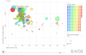
View of the world |
View of the world |
View of the world |
|---|---|---|
|
|
|
Observations made from CERN, Geneva, Switzerland:
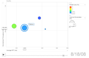
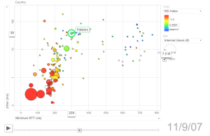
View of South Asia |
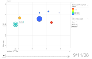
View of the Balkans |
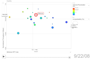
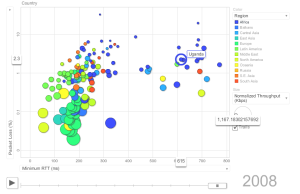
View of Africa |
|---|---|---|
|
|
|