Introduction
African Situation
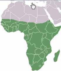
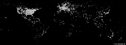
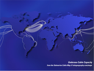
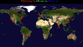
Internet coverage and performance in the Sub Sahara region of Africa (see Figure 1, for the UN definition of the Sub-Sahara) is exceedingly poor. This is illustrated by the number of Internet connections per city worldwide seen in Figure 2 where it is seen that Africa stands out as almost lacking any (i.e. it is dark). Figure 3 illustrates how Africa has very little submarine cable connectivity (white lines) compared to the rest of the world.
Figure 1: UN Definition of Sub-Sahara |
Figure 2: World Internet Connection Density |
Figure 3: Submarine Cables 2007, from telegeography.com |
|
|
|
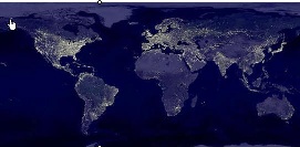
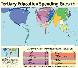
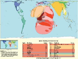
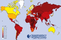
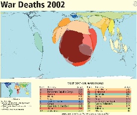
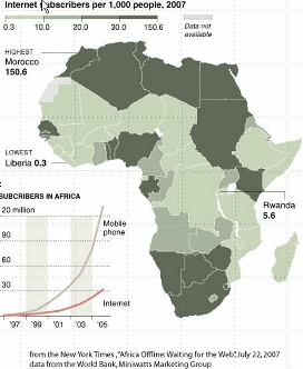
There are many reasons for this poor connectivity including: electricity (see Figure 5 for the light at night for the world and compare Africa with the rest of the world), import duties, skills (see Figure 6 for a cartogram (where territories are re-sized according to the subject of interest - all cartograms shown here are from http://www.worldmapper.org/) of tertiary education spending growth), disease (Figure 7), protectionist policies, corruption (see Figure 8), conflict (see Figure 9).
Figure 5: World light at night |
Figure 6: |
Figure 7: HIV Prevalence |
Figure 8: Corruption Perception Index |
Figure 9: |
|---|---|---|---|---|
|
|
|
|
|
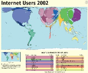
Another way of looking at the poor situation in Africa is to look at Figure 10, illustrating the lack of Internet users in Africa compared to the rest of the world.
Figure 10a: |
Figure 10b: |
Figure 10c: |
|---|---|---|
|
|
|
Capacity
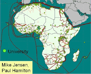
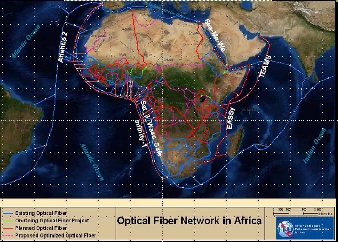
International capacity to African countries is mainly provided via satellite or via fibre links. Typically bandwidth costs in $/Mbits/s are 300-1000 times as expensive as fibre. However in 2004 only 14 of 49 sub-Saharan countries had access to fibre according to NEPAD. In fact as seen in Figure 11:
Figure 11: Fibre links to and within Africa and the locations of universities |
Figure 12: |
|---|---|
|
|
There is only one large-scale intercontinental fibre link to Sub-Saharan Africa (SAT-3/WASC/SAFE) which provides connections to Europe and the Far East for eight countries along the West Coast of the Continent. Except for some onward links from South Africa to its neighbours, and from Sudan to Egypt and from Senegal to Mali, the remaining 33 African countries are unconnected to the global optical backbones, and depend on the much more limited and high-cost bandwidth from satellite links. Even the few countries that have access to international fibre through SAT-3 are not seeing the benefits because it is operated as a consortium where connections are charged at monopoly prices by the state owned operators which still predominate in most of Africa, and in many other developing regions.
The first large-scale international fibre project in sub-Saharan Africa, SAT-3/WASC's first segment connects Portugal to the Cape in South Africa reaching eight coastal countries along the way: Senegal, Ivory Coast, Ghana, Benin, Nigeria, Cameroon, Gabon and Angola. A second segment, in the Indian Ocean, connects South Africa to Malaysia while passing through Mauritius and India (SAFE). Jointly funded by 36 members and spearheaded by South African Telkom which invested US$85 million for a 13 per cent stake, the project cost about US$650 million dollars. The cable was expected to lead to much reduced international bandwidth costs, but so far this has not occurred due to the business models used to develop the project.
Landlocked African operators who have tried to purchase international fibre capacity directly from one of the consortium's international members have found themselves being charged as much to reach the SAT-3 landing point as they were charged to get from the landing station to Portugal. Sadly, the high costs have made it cheaper to send the traffic directly by satellite, even for SAT-3 shareholders such as Telecom Namibia, which has no landing point of its own.
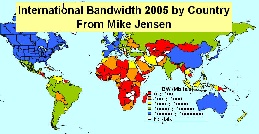
Mike Jensen
In fact prices have barely come down since it began operating in 2002 and are sold at satellite prices of $4-8K/Mbps/mo even though the capacity is only 5% used. As a result the lack of fibre and lack of competition on SAT-2, international bandwidth to African countries, as seen in Figure 12 lags well behind most of the rest of the world.
Costs
One result and immediate cause of this is the cost of this are costs of Internet connections in Africa and how they relate to income (Compare Figure 13a and 13b) and affordability.
Figure 13a: 2002 |
Figure 13b: |
|---|---|
|
|
Opportunities
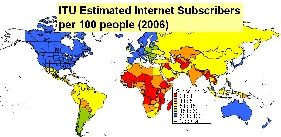
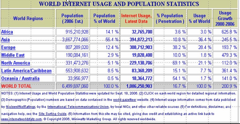
Africa has close to 1 billion people or about 14% of the world's population. However, the Internet penetration shown in the table below is only about 3.6% so it is a huge potential market.
At the same time there are promises of considerably increased fibre connectivity to sub-Saharan Africa in the next two years (in particular in time for the Soccer World Cup in South Africa in 2010) as can be seen in Figure 14.
Figure 14: |
|
|---|---|
|
|
Also the UN, governments such as China, the UK, Europe, the US and companies such as AMD, Intel,Microsoft, Cisco, Nokia and Ericsson are recognizing the opportunities and needs and investing. This will introduce challenges of new development models such as more inclusive business models; bottoms-up approach; working in new regulatory, policy and poor infrastructural availability environments; micro-payments; content in many new local languages; use of wireless for last mile connections, Internet kiosks and cafes, etc.
PingER and Internet Performance in Africa
The PingER project is arguably the most extensive active end-to-end Internet performance measurement project today. It data goes back over a decade and more recently has focused on measuring the Digital Divide. It covers measurements from over 16 countries to over 150 countries (see Figure 15) containing over 99% of the world's Internet connected population. 45 of the countries are in Africa.
Figure 15: PingER Deployment Dec 2007, red are monitoring sites, blue beacons that are monitored from most monitoring sites and green the monitored only sites. |
|
|---|---|
|
|
|
Worldwide Comparison
|
|
|
|
Packet Loss as seen from N. America |
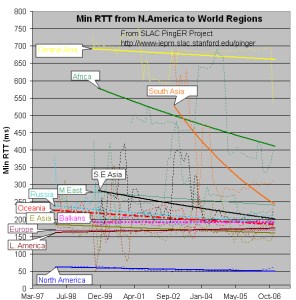
min RTT as seen from N. America |
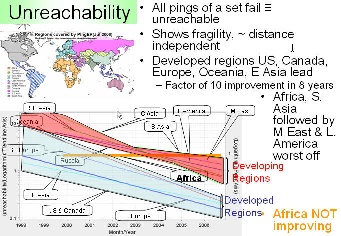
Unreachability |
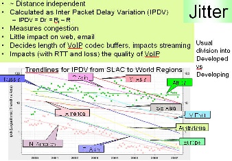
Jitter |
|---|
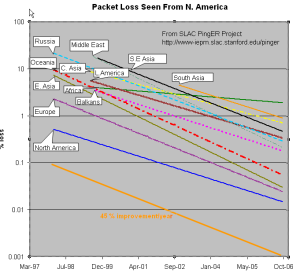
The left hand figure shows the packet loss to various regions of the world as seen from N. America. Since losses are fairly distance independent no attempt has been made to normalize the data. It is seen that the world divides up into two major super-regions: N. America, Europe, E. Asia and Oceania (mainly Australia and New Zealand) with losses below 0.1%, and Latin America, C. Asia, Russia, S.E. Asia, S. Asia and Africa with losses > 0.1% and as high as as a few per-cent. All countries are improving exponentially, but Africa is falling further behind most regions.
The second figure from the left shows the drop in the Minimum RTT from 2002-2006. The large step for S. Asia in 2003 was due to the change over from satellite to fibre. Central Asia (also Afghanistan) has hardly moved in its minimum RTT since it continues to use geostationary satellites.
The third figure from the left shows the unreachability of world regions seen from the US. A host is deemed unreachable if all pings of a set fail to respond. It shows the fragility of the link and is mainly distance independent (the reasons for fragility are usually in the last mile, the end site or host). Again the developed regions - US and Canada, E. Asia, and Oceania - have the lowest unreachability (< 0.3%) while the other regions vary from 0.7% to 2%. Africa shows poor statistics and is not improving, where as S. Asia has the second worst results.
The last graph shows the jitter (or variability of RTT) of world regions seen from the US. The jitter is defined as the Inter Quartile Range (IQR) of the Inter Packet Delay Variability (IPDV i = RTT i - RTT i-1). Jitter is relatively distance independent, it measures congestion, and has little impact on the Web and email. It decides the length of VoIP codec buffers and impacts streaming. We see the usual division into developed versus developing regions.
MOS for various Regions
There are three factors that significantly impact call quality: latency, packet loss, and jitter. We calculate the jitter using the Inter Packet Delay Variability (IPDV) , see the tutorial for further details.
Most tool-based solutions calculate what is called an "R" value and then apply a formula to convert that to an MOS score. Then the R to MOS calculation is relatively standard. The R value score is from 0 to 100, where a higher number is better. To convert latency, loss, and jitter to MOS we follow Nessoft's method. The graphs below shows the Exponentially Weighted Moving Average (using EWMI i = alpha * EWMI i-1 + (1 - alpha) * Obs i where alpha = 0.7 and EWMI 1 = Obs 1) for the MOS as seen from the W. Coast of America (SLAC) and Switzerland (CERN). N.B. MOS values of one are reported for heavy loss (loss > 40 %).
|
|
|
Mean Opinion Score as seen from the US |
Mean Opinion Score as seen from CERN |
Mean Opinion Score as seen from Europe |
|---|
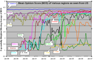
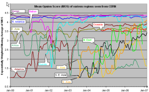
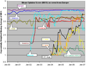
CERN monitors fewer remote hosts than SLAC (56 versus over 400) so the data is not as complete in the CERN case. Comparing the two graphs, it can be seen that, as expected, the MOS is better for the shorter distances (i.e. CERN to Europe is better than SLAC to Europe, SLAC to N. America is better than CERN to N. America.).
It is also seen in both graphs that the Balkans, Russia and Latin America improved dramatically in 2000-2002. Much of Latin America and Russia moved from satellite to land lines in this period. It can be seen from the above plot that VoIP ought to be successful between SLAC and the US, Europe, E. Asia, Russia, Latin America and the Mid East (all above MOS = 3.5). S. E. Asia is marginal, S. Asia people will have to be very tolerant of one another, and C. Asia and Africa are pretty much out of the question in general. In general the CERN graphs looks similar to the SLAC graph to the various regions, except that S. E. Asia is worse for CERN than SLAC as is S. Asia
The third graph shows the Mean Opinion Score (MOS) from Europe two various regions. We have five monitoring sites in Europe (one at CERN, one at ICTP, one in Germany, and two at UK. The improvement in Latin America and Russia in 2002 is the result of shift from satellite to fiber. The drop for Russia in Sep, 2006 is because we installed a new version of PingER and it started monitoring 9 hosts in Russia whereas previously it was monitoring 20 hosts. For Central Asia the number of sites went up from 3 to 15 in Sep 2006, so the latter results are a better indication of the overall performance of Central Asia. For Sub Sahara Africa the coverage improved in Sep, 2006 (increased from 8 to 39 sites). So for sub Sahara Africa the results after Sep 2006 presents a better picture. South Asia as seen from Europe is performing better than as seen from US because MOS is derived from average RTT which is distance dependent.
Information on Calculation MOS can be found at http://www.slac.stanford.edu/comp/net/wan-mon/tutorial.html#mos
TCP throughput from CERN & SLAC to World Regions
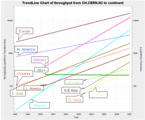
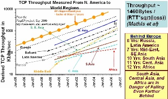
The graphs above show the derived TCP throughput using the Mathis formula. The macroscopic behavior of the TCP congestion avoidance algorithm by Mathis, Semke, Mahdavi & Ott in Computer Communication Review, 27(3), July 1997, provides a short and useful formula for the upper bound on the transfer rate:
Rate <= (MSS/RTT)*(1 / sqrt(p))
where:
Rate: is the TCP transfer rate or throughputd
MSS: is the maximum segment size (fixed for each Internet path, typically 1460 bytes)
RTT: is the round trip time (as measured by TCP)
p: is the packet loss rate.
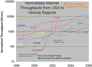
In the left hand two graphs the data points (average throughput per month) are fitted to exponential functions and for simplicity the trend lines only are shown. These lines enable us to see that Russia and Latin America are 6 years behind Europe, the Mid-East and SE Asia are 7 years behind, and S. Asia, C. Asia and Africa are 10 years or more behind. What is even more concerning is that Africa (in particular), South and Central Asia are not catching up.
The right hand most figure shows the yearly average derived TCP throughput normalized by the minimum RTT for the region (to reduce the proximity effects). It is seen that the throughputs are not simply exponential straigh lines, but typically change in steps as major changes are made in the routing and circuits.
Interesting Trends:
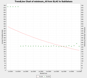
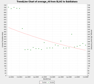
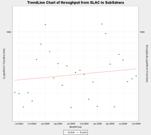
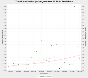
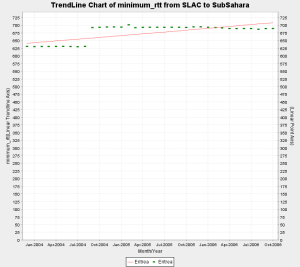
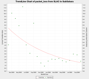
- Sudan shifted from average rtt of approx. 685 ms to approx. 260 ms in Nov 2004. This is a classic case of shift from Satellite to Fiber. However there is are no remarkable trends visible in the throughput. This is explained by the increase in packet loss over the same period of time. Thus the improvement in rtt was compensated by the increase in packet loss and the overall throughput fails to show any meaningful increasing trend.
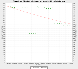
- Mauritania shows interesting behaviour. One of the hosts we monitor (www.pmd.mr) shows improved connectivity around Jan 2006 indicating a shift from satellite to landline. However the other host (www.maurifemme.mr), which is indicated as being on satellite and located in Norway (courtesy http://www.geoiptool.com) is showing the same rtt of around 680+ ms. If this host is actually in Mauritania then we can conclude that some parts of the country have shifted to fibre but others are still on satellite.
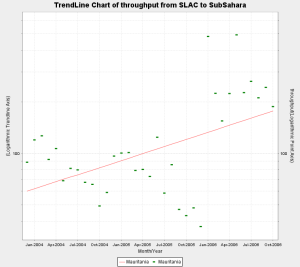
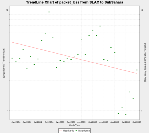
- In addition the throughput and packet loss for the both hosts show marked improvement since Jan 2006 which indicates better connectivity.
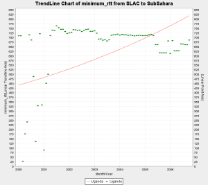
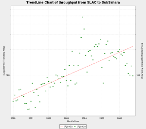
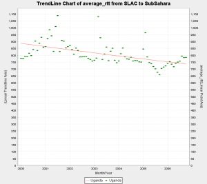
- Uganda has shown steady improvement in throughput and loss quality over the years since we started monitoring it in 2000. However the min_rtt of above 600 ms and the avg_rtt around 800 ms indicates that it is still mostly on Satellite.
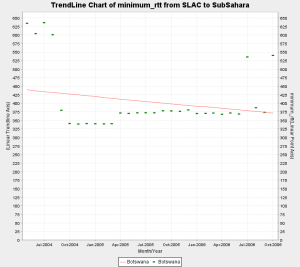
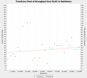
- Botswana shows a switch from satellite to fibre as the min_rtt switches from 600+ ms to around 350 ms around Sep 2004. Howver the packet loss and throughput do not show and particular trends which might indicate significant improvement.
- Very recent data for Ghana i.e. (Sep and Oct 2006) inidcates a shift from satellite to fiber. In particular if we examine the individual hosts we monitor in Ghana, one of the hosts shows a step change from 680+ ms to 260+ms, while the other still continues to show satellite indicating that part of the coutry may be shifting to fibre. Further more when we looked up the asn on both the hosts, the asn for host performing poorly was described as INTELSAT while the host which is now performing better had an ASN description of "UNSPECIFIED, NETWORK COMPUTER SYSTEMS, ACCRA GHANA".
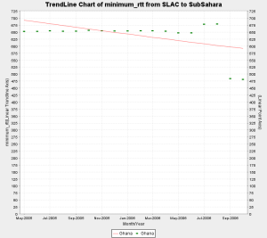
- There was a step change in the min RTT of Eritrea from 625 ms to 700 ms approx. in Sep, 2004.
- The loss quality of Namibia shows steady improvement.
- The following countries are on Satellite since we began monitoring them:
- Ghana May, 2005
- Kenya April, 2004
- Madagascar Jan, 2004
- Malawi Sep, 2005
- Mozambique Jan, 2004
- Niger July, 2004
- Nigeria July, 2004
- Rwanda Mar, 2005
- Tanzania Jan, 2004
- Uganda Jan, 2000
- The following countries are on Fibre since we began monitoring them:
- Benin March, 2005
- Mali March, 2005
- Sinegal Jan ,2004
- S. Africa May, 2003
Maps of Connectivity from South Africa
An interesting way to analyze the state of internet connectivity in Africa is to look at colored maps of various metrics as seen from our monitoring node in South Africa. 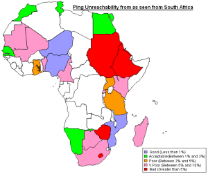
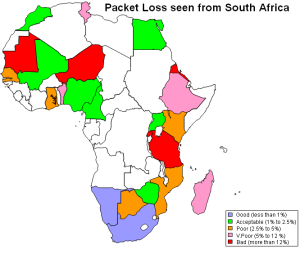
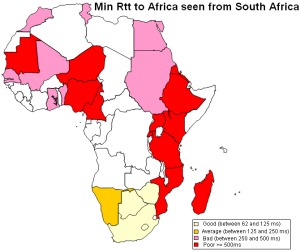
Ping Unreachability Packet Loss Min_rtt
Routing in Africa seen from SLAC
Using programs written to analyze traceroutes for different regions we have been able to generate topology maps of various regions in Africa as seen from SLAC. These maps provide a valuable insight into the various ASNs that are encountered as packets are routed from SLAC to Africa.
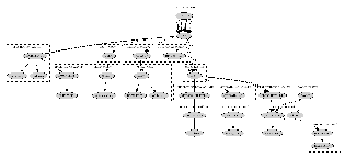


SLAC to West Africa SLAC to South Africa SLAC to East Africa
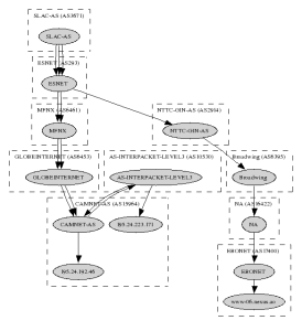
SLAC to Central Africa
Initiatives
GEANT has connections to EuMed in particular Marocco, Algeria, Tunisa and Egypt, see http://www.dante.net/upload/pdf/EUMED-poster.pdf . They are now working on connecting to Ubuntunet East and Ubuntunet South.
The SAT3 fibre serves some countries of Western and Southern Africa. The EASSY fibre is intended to assist Eastern Africa.
Useful Links
ICT in Africa: a Status Report, Mike Jensen
West Africa Submarine cable Connection
Web Atlas of Regional Integration in West Africa
African Scientific Network
African Universities
Columbia University Africa Studies
The bandwidth Initiative: Opening the power of the Internet to African Universities
University of Zambia Status.