Installations
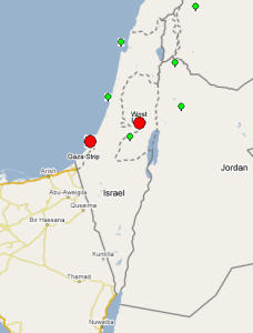
In March and April 2007 we worked with people from Palestine to install PingER measurement Points in Al Quds University in Ramallah and the Islamic University of Gaza. They were both connected to EUMED fibre optic cable.
Al Quds successfully installed PingER2 without help. It has been measuring and reporting since march 23, 2007. It has been very reliable with no losses of data.
Warren Matthews had to step in and assist IUGaza in getting PingER2 running. There were problems with the cronjob and possibly ntpd. IUGaza has been monitoring successfully since April 7th, 2007. They did not monitor data all day on April 22. There have been problems on 2 days gathering the data where I have either contacted the IUGaza site contact (Apr 28th to fix the web server) or had to re-run the gathering script (today).
On April 3rd the Quds Open University said they would prepare a new machine and install software. I responded on April 4th and April 17th, but have heard nothing since. I prompted them again today.
The locations of the sites are shown below.
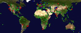
Pinger Coverage
The sites from which there is PingER monitoring are shown in red below, sites which are monitored by all monitoring hosts (these are referred to as beacon sites and also include monitor sites) are shown in blue, and other monitored remote sites are shown in green. From SLAC PingER monitors about 460 sites, CERN used to monitor about 132 sites, however after re-installing in December 2006) they now only monitor beacon sites (56). ICTP Trieste monitors 105 sites but only has data going back to September 2006. To the right of the PingER map we also show a map which defines how we are assigning countries to regions.
Before we start to compare Palestine (or more specifically the Middle East) to the rest of the world it is useful to look at a World Map of Internet Users. This shows that for most the developed world (US and Canada, W. Europe, Japan, Taiwan, S. Korea) typically 40% or more of the people have Internet connectivity while for S. Asia it is less than 5%, i.e. typically a factor of 10 less.
From SLAC: 1. Packet Loss, 2. Min RTT to World Regions, 3. Unreachability, 4. Jitter
The left hand figure shows the packet loss to various regions of the world as seen from N. America. Since losses are fairly distance independent no attempt has been made to normalize the data. It is seen that the world divides up into two major super-regions: N. America, Europe, E. Asia and Oceania with losses below 0.1%, and Latin America, C. Asia, Russia, S.E. Asia, S. Asia and Africa with losses > 0.1% and as high as as a few per-cent. All countries are improving exponentially, but Africa is falling further behind most regions.
The left middle figure shows the drop in the Minimum RTT from 2002-2006. The large step for S. Asia in 2003 was due to the change over from satellite to fibre. as the result of gradual shift from Satellite to fiber. Central Asia (also Afghanistan) has hardly moved in its minimum RTT since it continues to use geostationary satellites.
The right middle graph shows the unreachability of world regions seen from the US. A host is deemed unreachable if all pings of a set fail to respond. It shows the fragility of the links and is mainly distance independent (the reasons for fragility are usually in the last mile, the end site or host). Again the developed regions US and Canada, E. Asia, and Oceania have the lowest unreachability (< 0.3%) while the other regions have unreachability from 0.7% to 2%, and again Africa is not improving, with S. Asia having the second worst unreachability.
The right hand graph shows the jitter or variability of world regions seen from the US. The jitter is defined as the Inter Quartile Range (IQR) of the Inter Packet Delay Variability (IPDV i = RTT i - RTT i-1) . The Jitter is relatively distance independent, it measures congestion, and has little impact on the Web and email. It decides the length of VoIP codec buffers and impacts streaming. We see the usual division into dveloped verus developing regions.
MOS for various regions seen from US
The telecommunications industry uses the Mean Opinion Score (MOS) as a voice quality metric. The values of the MOS are: 1= bad; 2=poor; 3=fair; 4=good; 5=excellent. A typical range for Voice over IP is 3.5 to 4.2 (see VoIPtroubleshooter.com). In reality, even a perfect connection is impacted by the compression algorithms of the codec, so the highest score most codecs can achieve is in the 4.2 to 4.4 range.
There are three factors that significantly impact call quality: latency, packet loss, and jitter. We calculate the jitter using the Inter Packet Delay Variability (IPDV) , see the http://www.slac.stanford.edu/comp/net/wan-mon/tutorial.html#mosTutorial.
Most tool-based solutions calculate what is called an "R" value and then apply a formula to convert that to an MOS score. Then the R to MOS calculation is relatively standard. The R value score is from 0 to 100, where a higher number is better. To convert latency, loss, and jitter to MOS we follow Nessoft's method. The graphs below shows the Exponentially Weighted Moving Average (using EWMI i = alpha * EWMI i-1 + (1 - alpha) * Obs i where alpha = 0.7 and EWMI 1 = Obs 1) for the MOS as seen from the W. Coast of America (SLAC) and Switzerland (CERN). N.B. MOS values of one are reported for heavy loss (loss > 40 %).
CERN monitors fewer remote hosts than SLAC (56 versus over 400) so the data is not as complete in the CERN case. Comparing the two graphs, it can be seen that, as expected, the MOS is better for the shorter distances (i.e. CERN to Europe is better than SLAC to Europe, SLAC to N. America is better than CERN to N. America.). It is also seen in both graphs that the Balkans, Russia and Latin America improved dramatically in 2000-2002. Much of Latin America and Russia moved from satellite to land lines in this period. It can be seen from the above plot that VoIP ought to be successful between SLAC and the US, Europe, E. Asia, Russia and the Mid East (all above MOS = 3.5). S. E. Asia is marginal, S. Asia people will have to be very tolerant of one another, and C. Asia and Africa are pretty much out of the question in general. In general the CERN graphs looks similar to the SLAC graph to the various regions, except that S. E. Asia is worse for CERN than SLAC as is S. Asia
The third graph shows the Mean Opinion Score (MOS) from Europe two various regions. We have five monitoring sites in Europe (one at CERN, one at ICTP, one in Germany, and two at UK. The improvement in Latin America and Russia in 2002 is the result of shift from satellite to fiber. The drop for Russia in Sep, 2006 is because we installed a new version of PingER and it started monitoring 9 hosts in Russia whereas previously it was monitoring 20 hosts. For Central Asia the number of sites went up from 3 to 15 in Sep 2006, so the latter results are a better indication of the overall performance of Central Asia. For Sub Sahara Africa the coverage improved in Sep, 2006 (increased from 8 to 39 sites). So for sub Sahara Africa the results after Sep 2006 presents a better picture. South Asia as seen from Europe is performing better than as seen from US because MOS is derived from average RTT which is distance dependent.
The right most graph shows the Mean Opinion Score (MOS) seen from US to South Asian countries. In general South Asian can counties can be divided into two group with India, Pakistan, Sri Lanka and Maldives performing comparatively good (Voice Conference possible but voice quality not that good) whereas Afghanistan, Bangladesh, Nepal and Bhutan are dreadful and Voice conference from US t o these countries is not possible. We have good coverage in India and Pakistan so the results are a good indication of the overall performance. The spike in MOS for Pakistan in July 2005 is the result of fiber outage to Pakistan. The number of sites for Sri Lanka increased from 2 to 6 in Jan 2007 so the results after Jan 2007 is a better indication of the overall performance for Sri Lanka. Before Jan 2007 we were monitoring two hosts in Sri Lanka ( University Of Peradeniya performing very bad . Average RTT > 500 ms and LK Domain Registry performing very good Average RTT < 350 ms). Afghanistan is stuck with satellite connectivity and the land locked countries Nepal and Bhutan have limited fiber connectivity, so they mostly lie at the bottom.
TCP throughput from CERN & SLAC to World Regions
The graphs above show the derived TCP throughput using the Mathis formula. The macroscopic behavior of the TCP congestion avoidance algorithmby Mathis, Semke, Mahdavi & Ott in Computer Communication Review, 27(3), July 1997, provides a short and useful formula for the upper bound on the transfer rate:
Rate <= (MSS/RTT)*(1 / sqrt(p))
where:
Rate: is the TCP transfer rate or throughputd
MSS: is the maximum segment size (fixed for each Internet path, typically 1460 bytes)
RTT: is the round trip time (as measured by TCP)
p: is the packet loss rate.
In the left hand tow graphs the data points (average throughput per month) are fitted to exponential functions and for simplicity the trend lines only are shown. These lines enable us to see that Rusia and Latin America are 6 years behind Europe, the Mid-East and SE Asia are 7 years behind, and S. Asia, C. Asia and Africa are 10 years or more behind. What is even more concerning is that Africa In particular), South and Central Asia are not catching up.
The right hand most figure shows the yearly average derived TCP throughput normalized by the minimum RTT for the region (to reduce the proximity effects). It is seen that the throughputs are not simply exponential straigh lines, but typically change in steps as major changes are made in the routing and circuits.
Palestine
Round Trip Times, Losses and Througputs to Various Regions
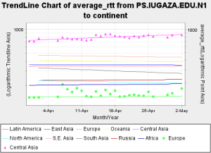
The average Round Trip Times (RTTs) from Al Quds and IUGaza are shown below. The individual data points daily avergae(average_RTT) are shown to show the variability.

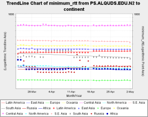
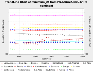
The minimum RTTs are shown below with the individual points (since minimum RTTs are more stable).
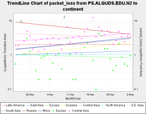
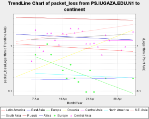
The packets losses are shown below: