...
For the sake of our study, I would break down the one-way latency into the following components. Assuming symmetric routes, we can simply double the latency to estimate RTT.
- Time taken for the packets to traverse down the stack (from the application, via sockets API, network, link. I imagine ICMP uses RAW sockets, while nping would regular TCP sockets. It would be prudent to confirm by looking at the code.)
- Time taken for the frames to reach the recipient (includes transmission delay, propogation delay, and queueing delay)
- Time taken for the packets to traverse up the stack
...
What would introduce and difference in the latencies?
When we consider the breakdown above, it appears that factors causing different results would be:
- Additional delay in processing TCP segments (at the transport layer) vs raw IP packets
- Difference in delay because ICMP traffic was treated differently as it flowed through the network
...
We would expect that the above aspects are the only two aspects that would create a difference. We will have to assume the following though:
- The routes do not change during the experiments (i.e., the same routes were used for both flows)
- The routes were symmetric
- Similar volume and types of cross traffic was experienced by the packets
We would need some instrumentation to measure the amount of time it takes for an ICMP packet and a TCP packet to be processed by the stack. Alternatively, we may also refer to recent research that may have looked at such measurements. For example, we could use strace to measure time taken by socket API / system calls. (strace has a -T option for timestamps.) There are network stack implementations that include instrumentation (I can't seem to recall the names. I'll google for them later.)
Preliminary analysis
Based on the above discussion and assumptions, I've tried to understand the measurements. If we change our approach, we'll have to revise our analysis too.
...
Below are few examples. Please see the download links at the bottom to for more examples. . The whiskers in the boxplots represent 95% confidence intervals, while the horizontal line in the center is the median. The bottom and top horizontal lines are the first and third quartiles. (Perhaps, we should change the whiskers to reflect standard deviation.)
| Code Block |
|---|
mit.edu: Two-sample Kolmogorov-Smirnov test data: sub_df$ping_avg and sub_df$nping_avg D = 0.28, p-value = 0.03968 alternative hypothesis: two-sided Shapiro-Wilk normality test data: sub_df$ping_avg W = 0.97335, p-value = 0.315 Shapiro-Wilk normality test data: sub_df$nping_avg W = 0.98432, p-value = 0.7418 [1] "ANOVA Summary" Df Sum Sq Mean Sq F value Pr(>F) tool 1 5.48 5.481 8.218 0.00508 ** Residuals 98 65.35 0.667 --- Signif. codes: 0 ‘***’ 0.001 ‘**’ 0.01 ‘*’ 0.05 ‘.’ 0.1 ‘ ’ 1 |
...
Observation: KS test tells is that we can reject the null hypothesis (that there is not enough evidence to confim that they are the same.)
| Code Block |
|---|
www.git.edu.cn:
Two-sample Kolmogorov-Smirnov test
data: sub_df$ping_avg and sub_df$nping_avg
D = 0.52083, p-value = 2.667e-06
alternative hypothesis: two-sided

Shapiro-Wilk normality test
data: sub_df$ping_avg
W = 0.54406, p-value = 5.471e-11

Shapiro-Wilk normality test
data: sub_df$nping_avg
W = 0.66366, p-value = 3.198e-09
[1] "ANOVA Summary"
Df Sum Sq Mean Sq F value Pr(>F)
tool 1 30509 30509 12.74 0.000566 ***
Residuals 94 225081 2394
---
Signif. codes: 0 ‘***’ 0.001 ‘**’ 0.01 ‘*’ 0.05 ‘.’ 0.1 ‘ ’ 1 |
| www.git.edu.cn: qqplot for ping | www.git.edu.cn: qqplot for nping | www.git.edu.cn: boxplot |
|---|---|---|
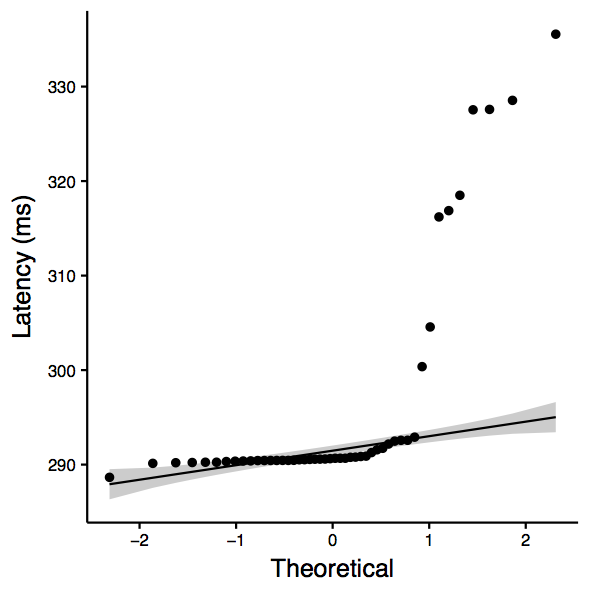 | 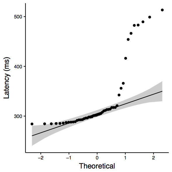 | 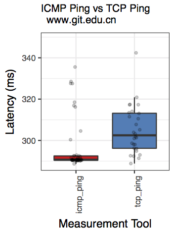 |
Observation: Although the QQplots show outliers, the shapiro test confirms normality. Therefore, we consider ANOVA, which is significant and therefore we can reject the null hypothesis (that there is not enough evidence to confim that they are the same.)
...
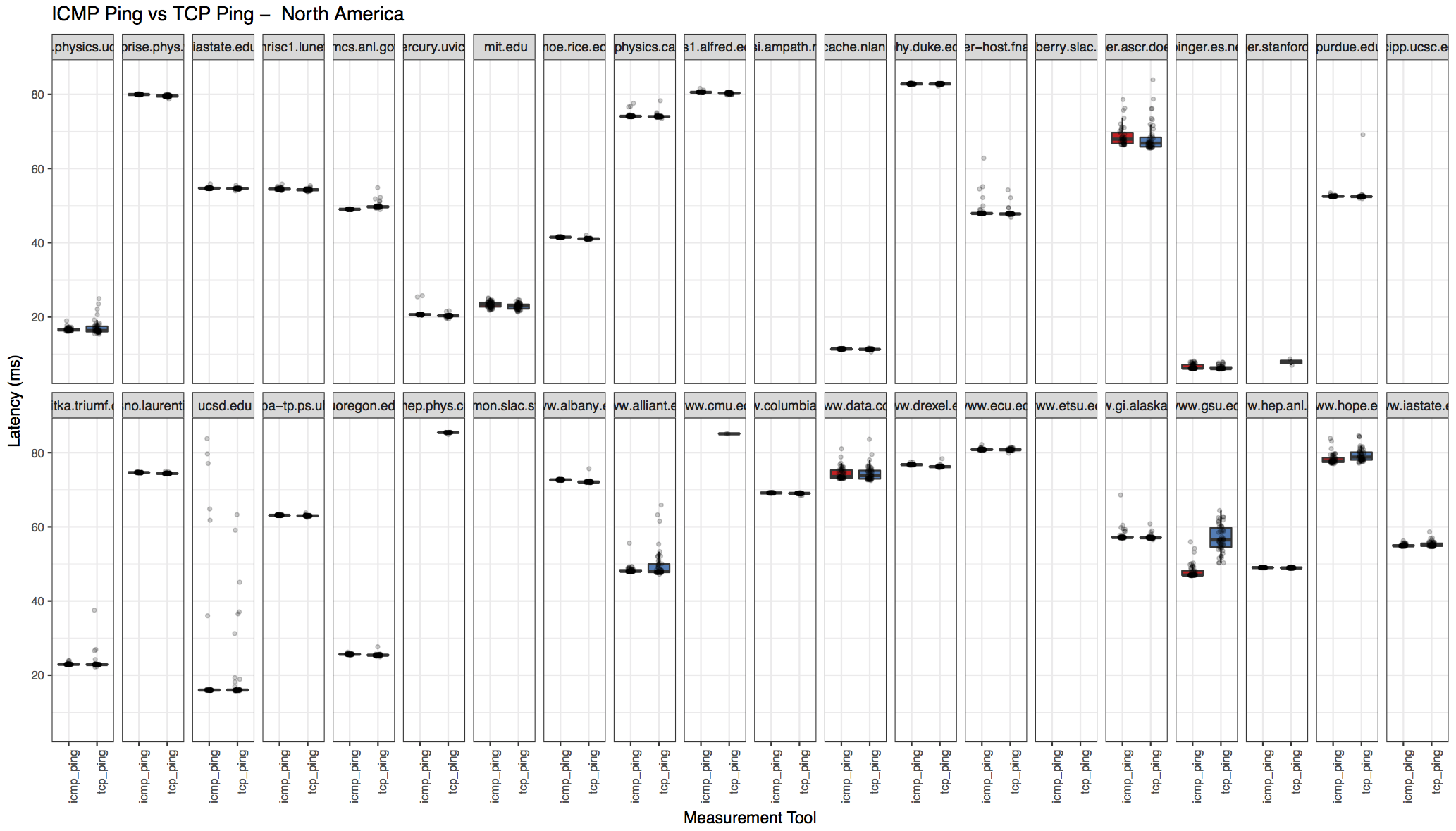
Region-wise breakdown
The results also includes region-wise breakdown. Download the "processed output" archive from the links below to see all the region plots.
| North America | Balkans |
|---|---|
 | 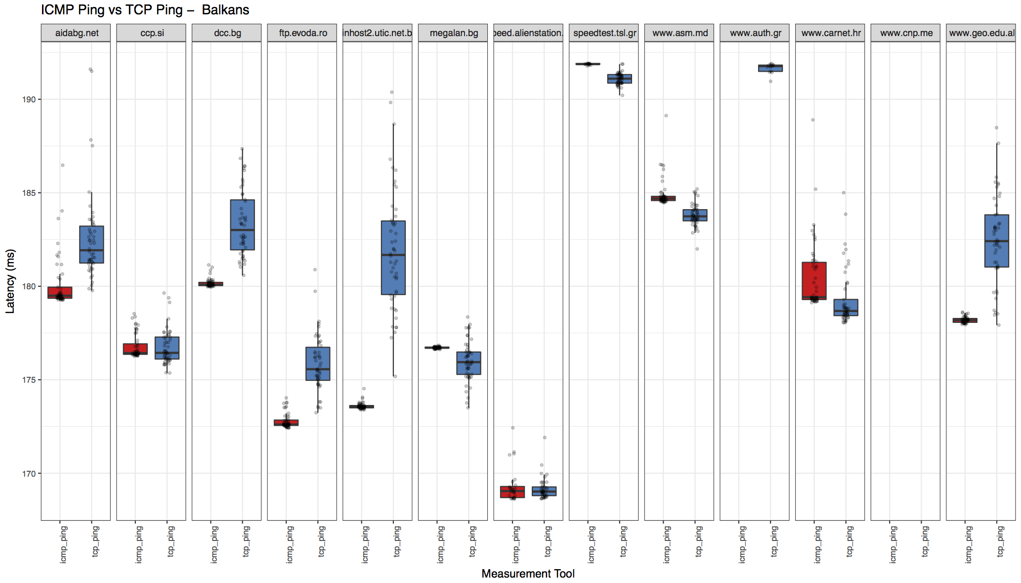 |
Analysis Script & Download Links
Once the logs from Les' script are available, they may be passed onto the analyze.r script for processing and generating output. I am attaching an example of processed output here.
...
- ping-vs-tcp.pl
- analyze.r
- partial input for analysis (2018-03-02-slac-v4-uk) (i.e., output of ping-vs-tcp.pl)
- processed output and associated files (2018-03-02-slac-v4-uk)
...
Requirements for running analysis script
...