Have a look at CAIDA's Archipelago Monitor Statistics, then for example scroll down to Africa and click on cmn-ma (to get to http://www.caida.org/projects/ark/statistics/cmn-ma.html) and scroll down to RTT vs Distance charts, click on the charts to get more details and in particular label the Distance axis.
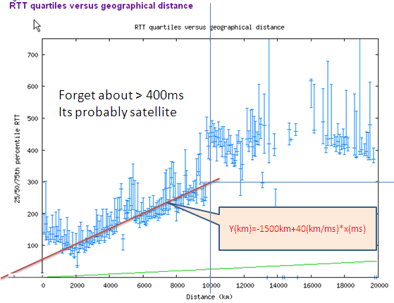
For example one can take the percentiles chart (25%, 75%, they do not show minima) and eyeball fit a straight line. Note that the line flattens out at 100ms. See the figure below, the green line is derived from the speed of light in fibre:
Other interesting charts are:
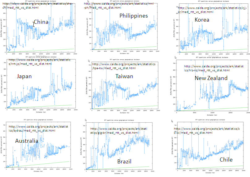
Australia, New Zealand, Brazil, Taiwan, China etc. They look very different and are very non linear, see below:
On the other hand the points are better behaved for Europe and North America. we can probably assume there are landmarks close by (<< 100ms) so we should use alphas for fits for the short distances.
Overview
Content Tools