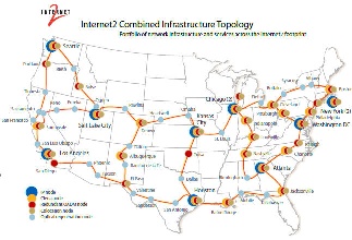
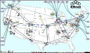
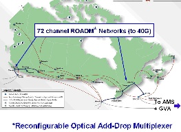
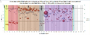
We looked at plots of RTT vs Distance for pairs of Landmarks within 25ms and 1000km radii for Europe and N. America. Europe seemed better behaved. We looked at the network topology for the major Academic and Research (A&R) networks in N. America, i.e. Internet2, ESnet and Canarie. They are shown below.
Internet2 |
ESnet |
Canarie |
|---|---|---|
|
|
|
Our initial results have showed an important insight about the intra regional connectivity for both regions. Our initial results are depicting a better intra regional connectivity in Europe than in North America. Both North America and Europe have many n*Gigabits links connecting one state to another in N.America or one country to another in Europe. But we want to see the state of connecitivity in few hundered miles radius around each landmark. Because in Geolocation last mile network is also very important in improving the accuracty of the technique.
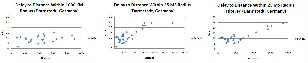
In our analysis first we calculated the correlation coefficient for all landmarks within 1000 KM and 25 MS radii of each landmark. We wanted to see the last few miles effect interms of distance as well delay. Below are the two graphs:
Plot within 1000 KM Distance Radius |
Plot within 25 MS Delay Radius |
|---|---|
|
|
There are two series in each graph, white balls represent the Correlation coefficient and red balls represent the number of target landmark available within each radii. Size of the ball represent the standard deviation of delay associated with each landmark and X-axis represents the ID of the landmark or simply the row number of spread sheet of raw data. You can find spread sheets of 1000KM_Radius and 25MS_Radius correlation_coefficient_1000km_radius.xlsx and Correlation_Coefficient_25MS_Radius.xlsx. As you can clearly see number of adjascent landmarks and correlation coefficient are both high for whole Europe but they are dispursed thourghout North America and this a bit contradictory provided the perception of very good connectivity inside North America. So, we decided to do further testing of this situation.
We then took the raw data of some landmark from Europe and North America again within a radii of 1000 KM and 25 MS and plotted delay to distance graphs, we see a similar trend. Below are some sample graphs.
European Landmarks |
North American Landmarks |
|---|---|
|
|
|
|
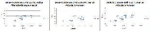
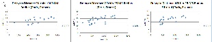
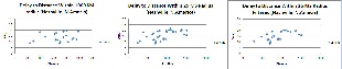
All these graphs have delay on X-axis and distance on X-axis and in all graphs with filtered caption we have applied the median filter on the values based upon delay. This was just to see the impact of removing outliers. In this case outliers are those delay values which are completely out of the trend. E.g. if there are three distance values 400,500,600 and their corresponding delay values 10,12,50. Here 50 is clearly an outlier. This is just to see the effect on the correlation. As you can also see cleary a pattern or correltion can be seen in European landmarks whereas almost a very little linear relationship exists between North American nodes. Which clearly indicates non-direct links between nodes as compared to North America. Raw data is available here, Nashville_NA.rar,Atlanta_NA.rar,Paris_France.rar,Darmstadt_Germany.rar.