Introduction
The PingER Monitoring Node Count Intensity Maps present a heat map of the number of PingER monitoring nodes spread over the world. These charts were generated using the information maintained by the PingER database. The same information may be viewed in the form of an overlay over Google Maps.
The charts were generated using the Google Visualization API for Intensity Maps.
An example of the charts is shown below:
PingER Monitoring Node Count |
|---|
|
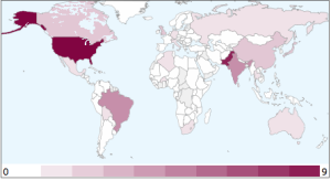
Interpretation
The numerical values labeling each chart (shown at the bottom) define the minimum (left) and the maximum (right) number of nodes that a country may host. For example USA hosts 9 monitoring nodes. Details of these monitoring sites may also be obtained from here. The magnified versions of the map presents the same information by zooming-in over regions (as defined by the Google Visualization API).
Implementation Details
HTML output
To create the intensity maps, the data must be loaded in a data structure (as explained by the Google Visualization API and) shown below:
 <html>
  <head>
    <script type="text/javascript" src="http://www.google.com/jsapi"></script>
    <script type="text/javascript">
      google.load("visualization", "1", {packages:["intensitymap"]});
      google.setOnLoadCallback(drawChart);
      function drawChart() {
        var data = new google.visualization.DataTable();
        data.addColumn('string', '', 'Country');
        data.addColumn('number', 'Node Count', 'a')

        data.addRows(3);

        data.setValue(0, 0, "UY");
        data.setValue(0, 1, 0);

        data.setValue(1, 0, "US");
        data.setValue(1, 1, 9);

        data.setValue(2, 0, "GB");
        data.setValue(2, 1, 2);


        var chart = new google.visualization.IntensityMap(document.getElementById('chart_div'));
        chart.draw(data, {});
      }
    </script>
  </head>

  <body>
    <div id="chart_div"></div>
  </body>
</html>
The data must comply with the formatting requirements (as stated by Google Visualization API and copied below):
- The first column should be a string, and contain country ISO 3166-1-alpha-2 codes.
- Any number of columns can follow, all must be numeric.
Relevant files
Following are the files involved in the process of generating the HTML page:
Application:
File path: /afs/slac/package/pinger/intesity-map/create-pinger-node-count-intensity-map.pl
The ISO 3166-1-alpha-2 codes are stored locally at:
File path: /afs/slac/package/pinger/intensity-map/country-codes.csv

File format:
#Country,code
Pakistan, PK
Korea  Rep, KR
United States,US
The PingER database file listing the up-to-date statistics for the monitoring nodes is located at:
File path: /afs/slac/package/pinger/nodes.cf

Example entry:
...
"ns.bnl.gov" => [
    "130.199.128.14",
    "bnl.gov",
    "GOV.BNL.N2",
    "Brookhaven National Laboratory",
    "Upton, NY",
    "United States",
    "North America",
    "40.76 -72.90",
    "D",
    "NOT-SET",
    "NOT-SET",
    "NOT-SET",
    "",
    "",
    "IUPAP PPDG ",
    "ccjsun.riken.go.jp "
  ],
...
Implementation