...
Based on the above data, I plotted a graph to see the relationship between distance and error distance in a graphical manner. The graph is shown below:

Same result shown in the form of bar graph is: 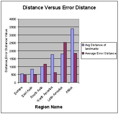
From the graph, we see that in Europe where number of landmarks is high and there is less average distance between landmarks, we get good results in terms of error distance. The trend looks fine when we move to next regions where average geographical distance is comparatively higher (error distance has also increased for these regions) but we see a different trend for North America where average geographical distance between landmarks is higher than other regions like East Asia and South Asia but yet, the Error distance is quite lower. In fact this result depicts that even though landmarks are geographically dispersed and not closely located in this region, the connectivity in this region is so better that we get quite reasonable results even then.
For all other regions, we see some impact of geographical distance and from this we can say that hopefully results for those regions can also improve if we could have more landmarks in those regions.
...