...
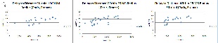
In our analysis first we calculated the correlation coefficient for all landmarks within 1000 KM and 25 MS radii of each landmark. We have also calculate the standard deviation for each landmark and number of other other landmarks within that radiiwanted to see the last few miles effect interms of distance as well delay. Below are the two graphs:
Plot within 1000 KM Distance Radius | Plot within 25 MS Delay Radius |
|---|---|
| |
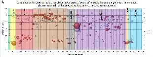
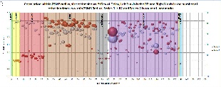
There are two series in each graph, white balls represent the Correlation coefficient and red balls represent the number of target landmark available within each radii. Size of the ball represent the standard deviation of delay associated with each landmark and X-axis represents the ID of the landmark or simply the row number of spread sheet of raw data. You can find spread sheets for each graph here 1000KM_Radius and 25MS_Radius. As you can clearly see number of adjascent landmarks and correlation coefficient are both high for whole Europe but they are dispursed thourghout North America and this a bit contradictory provided the perception of very good connectivity inside North America. So, we decided to do further testing of this situation.
We then took the raw data of some landmark from Europe and North America again within a radii of 1000 KM and 25 MS and plotted delay to distance gr
European Landmarks | North American Landmarks |
|---|---|
| |
| |
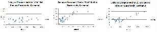
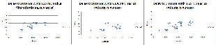
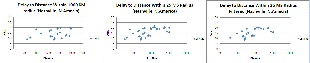
aphs. The graphs are as under: