...
PingER Metrics
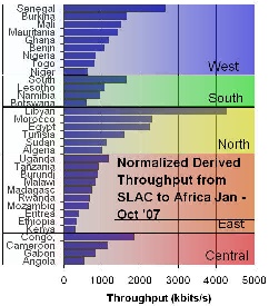
For African countries countries the PingER metrics are sgwon for shown for African countries ordered by sub region (e.g. N. Africa) and country, measured from Jan-Sep 2007 in the figure below:. It is also seen how the various components contribute to the derived throughput (8 * 1460 / (Average_RTT * sqrt(loss))
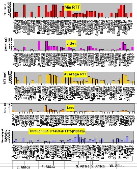
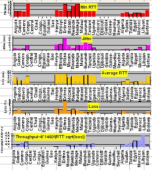
One way of showing how Africa is behind the rest of the world from the point of view of PingER Internet measures is to show maps of the performance for several metrics for January through September 2007. These are shown in the Figures below.
...
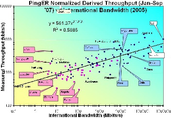
The figure below shows the correlation between International bandwidth Inn Figure 12) and the normalized derived PingER throughput. It can be seen that the correlation is good (R^2 ~ 0.59). It is also seen that the African countries (in Magenta) lie towards the bottom left where both the throughput and International Bandwidth are low. Libya is an anomaly since the only site monitored there is the email server for the Libya Telecommunications which should have good connectivity compared to most sites in Libya.
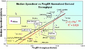
To To verify whether the order of magnitude of the normalized derived throughput is correct we compare it with the Speedtest results from www.zdnet.com.au/broadband/results.htm. This application sends a known amount of data between your computer and servers in Australia. Then it measures throughput and besides returning the result to the user, it also saves and makes available the results by country and ISP. The correlation is shown in the figure below. The orders of magnitude of the two methods agree and there is a strong correlation. As expected the African countries have the poorest results.
There are many indicators of countries' development from organizations such as the International Telecommunications Union, the United Nations, the CIA, the World Bank try to classify countries by their development. They are quite challenging and require careful consideration of: what can be measured, how useful is it, how well it is defined, how it changes with time, how it changes from country to country, the cost of measuring, the time it takes to gather (to avoid being too out of date, how subjective they are.
Typically they are based on some combination of GDP, life expectancy, literacy, education, phone lines, Internet penetration etc. Some examples include the Human Development Index (HDI), the Digital Opportunity Index (DOI), the Opportunity Index, the Technology Achievement Index etc. In general agree with one another (R^2~0.8). More information can be found here. For this report we focus on just two, the DOI (since it is recent and covers more countries than most) and the HDI since it different from the others and focuses on the human condition,
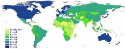
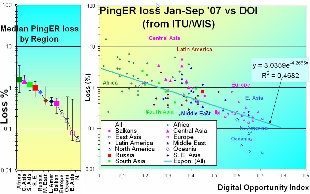
The Digital Opportunity Index (DOI) measures countries' ICT capabilities in infrastructure, access path and device, affordability and coverage, and quality. It covers 180 countries, and has recent (data 2005, announced in 2006). There are 11 indicators: that cover mobile telephony coverage, Internet tariffs, #computers, fixed line phones, mobile subscribers, Internet users all in relation to the population of the country. A map of the values for The International Telecommunications Union's Digital Opportunity Index (DOI) measures countries' ICT capabilities in infrastructure, access path and device, affordability and coverage, and quality. It covers 180 countries, and has recent (data 2005, announced in 2006). There are 11 indicators: that cover mobile telephony coverage, Internet tariffs, #computers, fixed line phones, mobile subscribers, Internet users all in relation to the population of the country. A map of the values for world countries and the correlation with the normalized derived PingER throughput is shown in the figures below. The Correlation is fairly good. As usual Africa is the worst off being 30 time worse than the US in terms of loss.
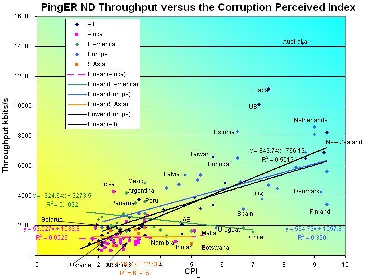
The Corruption Perception Index (CPI) relates to perceptions of the degree of corruption as seen by business people and country analysts, and ranges between 10 (highly clean) and 0 (highly corrupt).
The correlation between the Normalized derived throughput and the CPI is shown below. The overall correlation of R^2~0.55 is good, however if one looks at the correlations for a region such as Latin America, South Asia or Africa it is very poor and negative in the case of Latin America.
"The Human Development Index (HDI) is the measure of life expectancy, literacy, education, and standard of living for countries worldwide. It is a standard means of measuring well-being, especially child welfare. It is used to determine and indicate whether a country is a developed, developing, or underdeveloped country and also to measure the impact of economic policies on quality of life." from Wikipedia.
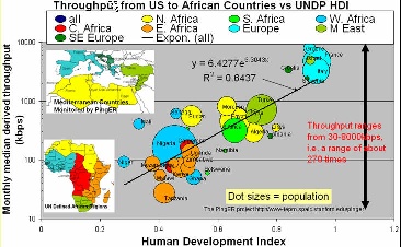
The figure below shows the correlation between the HDI and the normalized derived PingER throughput for Mediterranean and African countries. The correlation is seen to be strong (R^2~0.64). It is also seen that N. Africa has 10 times poorer performance than Europe, yet N. Africa is several times better than say E. Africa. E. Africa is poor, limited by its satellite access. For W. Africa there are big differences, some such as Senegal can afford SAT3 fibre while others use satellite, There is great diversity between and within regions. This is also show for the normalized derived PingER throughput for Africa in the figure to the right where one can see the overall throughput performance is poor to bad. There is a factor of 10 difference between Angola and Libya. N Africa is the best, and E Africa the worst. There are big differences within regions. In 2002, BW/capita ranged from 0.02 to over 40bps - a factor of over 1000
of loss.
"The Human Development Index (HDI) is the measure of life expectancy, literacy, education, and standard of living for countries worldwide. It is a standard means of measuring well-being, especially child welfare. It is used to determine and indicate whether a country is a developed, developing, or underdeveloped country and also to measure the impact of economic policies on quality of life." from Wikipedia.
The figure below shows the correlation between the HDI and the normalized derived PingER throughput for Mediterranean and African countries. The correlation is seen to be strong (R^2~0.64). It is also seen that N. Africa has 10 times poorer performance than Europe, yet N. Africa is several times better than say E. Africa. E. Africa is poor, limited by its satellite access. For W. Africa there are big differences, some such as Senegal can afford SAT3 fibre while others use satellite, There is great diversity between and within regions. This is also show for the normalized derived PingER throughput for Africa in the figure to the right where one can see the overall throughput performance is poor to bad. There is a factor of 10 difference between Angola and Libya. N Africa is the best, and E Africa the worst. There are big differences within regions. In 2002, BW/capita ranged from 0.02 to over 40bps - a factor of over 1000
The Corruption Perception Index (CPI) relates to perceptions of the degree of corruption as seen by business people and country analysts, and ranges between 10 (highly clean) and 0 (highly corrupt). The correlation between the Normalized derived throughput and the CPI is shown below. The overall correlation of R^2~0.55 is good, however if one looks at the correlations for a region such as Latin America, South Asia or Africa it is very poor and negative in the case of Latin America.
Routing
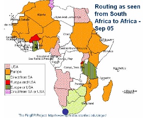
According to Mike Jensen, in 2002 ?there is almost no intra-African Internet connectivity and the vast majority of international bandwidth lands in the G8 countries - principally North America followed by Europe (Belgium, France, Germany, Italy, Netherlands, Norway, Portugal, and the UK). High intra-regional telecom prices have limited the establishment of links between neighbouring countries to just 5 - Gambia-Senegal, and South Africa's links to Namibia, Lesotho, Swaziland and Botswana. As a result increasing amounts of intra-African traffic must be transited through high cost cross-continental links.?
Looking at the figure below of the routing from the best connected country in Sub Saharan Africa, i.e. South Africa to the rest of Africa in 2005 it is seen that aprt from to Zimbabwe and Botswana traffic was routed via other continents. Not only does this increase costs but it means that In essence the African community is subsidizing the international carriers.
What is needed is to put into place International eXchange Points (IXPs) between countries to reduce costs and improve performance. This requires users (universities, countries) to band together to leverage influence, get deals etc. There is evidence of this happening in Ubuntunetand the Bandwidth Initiative referred to above. However, current providers (cable and satellite) have a lot to loose and many of these have close links to regulators and governments (e.g. over 50% of ISPs in Africa are government controlled), so this will be difficult in many cases and may require government intervention. Also the regulatory regimes on the whole are closed and resistant to change, and
sometimes ISPs themselves are unwilling to co-operate
...