...
For example, one might expect that as schools shut, people self-isolate, are sent home from, work from home, lockdowns are imposed etc., physical person-to-person communications would migrate to the Internet and will increase the use of the Internet e.g. by virtual learning, streaming. communicating, gathering information and entertaining for example. The thought is that this will lead to different Internet patterns and possibly lead to Internet congestion. A study of the impact of COVID-19 on Internet speeds by Ookla ("TRACKING COVID-19’S IMPACT ON GLOBAL INTERNET PERFORMANCE") is directly relevant, however, it is hard to identify any dramatic impact on the latencies in the report. There is also COVID-19 impacts on Internet traffic: Seattle, Northern Italy, and South Korea which looks at the impact on Internet traffic volumes. Also companies such as Netflix, Amazon, Apple, Disney, Google have reduced the quality of their videos to help reduce traffic and congestion of the Internet (see https://www.traffic-masters.net/covid19-web-traffic-statistics/).
PingER uses the ping facility to measure the Round Trip Time (RTT) between about 20 monitoring sites and target hosts in over 160 countries (over 10,000 pairs of monitor-remote(target)_sites). Every 30 minutes the monitor monitoring agent sends up to 30 pings at one-second intervals to each target until there are 10 responses, and records the data which are daily gathered, archived, analyzed and presented at the SLA C archiving site.
- A timeline for COVID-19 can be found here. Also looking at a map of how the COVID-19 traveled the world or the HealthMap one can see how and when various regions were impacted. Also see the Unacast interactive Social Distancing Scoreboard, updated daily, to empower organizations to measure and understand the efficacy of social distancing initiatives at the local level.
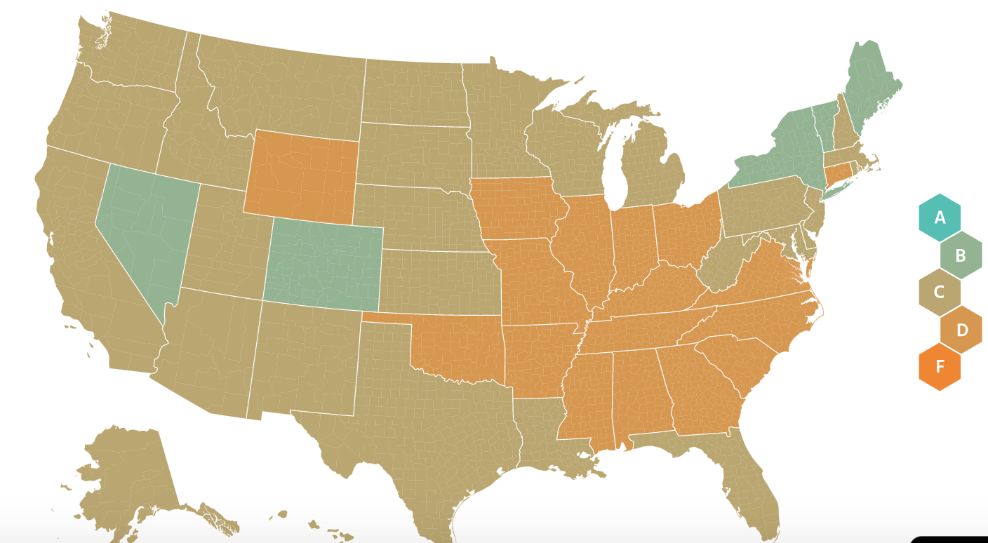
- Unacast is only for the US. It is broken down into States and counties. It uses cell phone location data to track locations. From this it derives for example distance traveled. An example of the information aggregated for the US is below (in the chart the bars are the new cases, the red dots are events, the state map colors are green for low mobility and dark orange for high mobility). Similar information is available state by state.

- Unacast is only for the US. It is broken down into States and counties. It uses cell phone location data to track locations. From this it derives for example distance traveled. An example of the information aggregated for the US is below (in the chart the bars are the new cases, the red dots are events, the state map colors are green for low mobility and dark orange for high mobility). Similar information is available state by state.
- For detailed statistics see:
- For the raw data:
- You can get up-to-date raw data on the coronavirus from Johns Hopkins from their GitHub site: https://github.com/CSSEGISandData/COVID-19. They have daily summaries and time-series data, both available as CSV files. You just have to browse around a bit to find what you want.
- To get down to the level of US states and counties see https://github.com/nytimes/covid-19-data
- For scientific modeling of the COVAD-19's impacts see:
- The Imperial College London reports on the Impact of non-pharmaceutical interventions (NPIs) to reduce COVID19 mortality and healthcare demand and Estimating the number of infections and the impact of non-pharmaceutical interventions on COVID-19 in 11 European countries.
- Projections for US hospital resources and deaths.
- For Interventions see
- For Intervention stringency vs cases see https://www.bsg.ox.ac.uk/sites/default/files/2020-04/BSG-WP-2020-031-v4.0_0.pdf
...