...
From this we created a bubble plot of x=Fertility Rate, y=throughput, bubble volume=population and colored the bubbles by the region. We also added an exponential trendline. The PingER derived throughput is inversely proportional to the Round Trip Time (RTT) and the RTTs are relativley short since they are measured from SLAC in North America. Thus the throughputs for North America are abnormally high so they are not included in the plots.
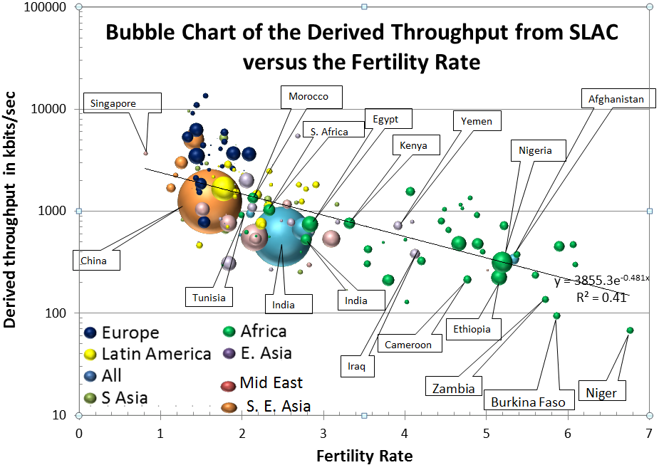
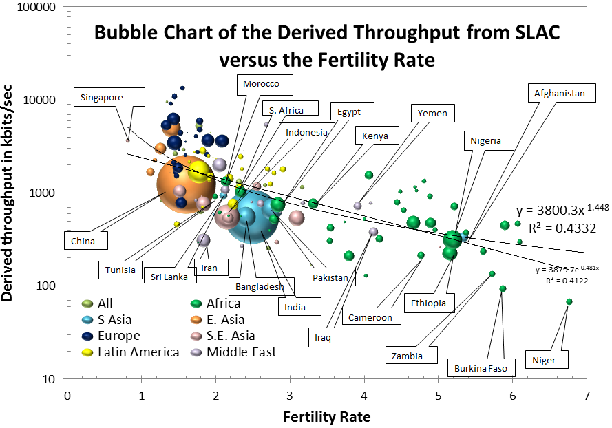
It is apparent that there is a negative correlation between throughput and fertility rate (i.e. countries with a lower Fertility Rate have a higher value of throughput). It is also apparent that Not only does Niger have the highest Fertility rate but it also has the lowest Internet performance, and as a region Africa leads the world in Fertility Rates and has the lowest Internet performance..
...