...
View of South Asia | View of the Balkans | View of Africa |
|---|---|---|
| | |
Usage (also see the video)
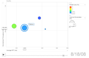
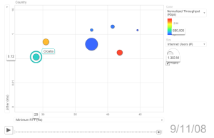
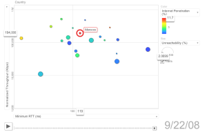
By default, PingER metrics motion chart shows a motion scatter/bubble plot of the ping (100 Byte) average RTT in msec. ( x ) versus the normalized derived TCP throughput in kbits/sec ( y ). Each bubble represents a country. By default the bubbles are colored by region and their sizes are proportional to the Internet users. The motion is the time. The time granularity is by year. Click on the play button to initiate the motion.
...