Getting the most out of your plots
Here is a possible outline for this section:
- explanations of basic types: clouds 1D/2D, histograms 1D/2D, tuples, etc.
- creating plots from a sample Driver (use Analysis101 or some other template)
- plotting on new window
- adding plot to existing window
- changing axis label: text value, font, size, etc.
- changing axis range min/max
- changing to log scale
- overlaying plots
- changing filled/unfilled and colors for value bars, error bars
- modifying fields that show in statistics box
- saving and reloading plots using .aida files
- discussion of various graphics formats (which is best for what purpose)
- importing into a Powerpoint presentation
- basic fitting (would keep this pretty simple)
It would probably be best done with more than one page.
Outline
Introduction
...
For plotting and fitting, org.lcsim provides an implementation of the Abstract Interfaces for Data Analysis AIDA.
AIDA objects is organized in Trees, which can have a directory structure like a file system.
This tutorial will assume that you are working in JAS3 and have either loaded an existing AIDA file or created objects in AIDA with the org.lcsim plugin.. For a first introduction how to create AIDA objects, you could execute one of the AIDA examples or one of the org.lcsim examples in JAS3 or follow Explanation of Analysis101 Driver. If you have executed some of the org.lcsim examples in JAS3, you have already used AIDA in lines like these:
| Code Block |
|---|
AIDA aida = AIDA.defaultInstance();
...
aida.cloud1D("nTracks").fill(tracks.size());
|
These lines create and fill an unbinned one-dimensional histogram named nTracks with the return value of tracks.size()
Teminology
AIDA provides two different kinds of histograms: binned and unbinned.
Binned histograms are called IHistogram1D, IHistogram2D, IHistogram3D for one, two and three-dimensional histograms.
Similarly, unbinned histograms are called ICloud1D, ICloud2D, ICloud3D
Teminology
Class name of the AIDA object | Description |
IHistogram1D, -2D, -3D | One-, two- and three-dimensional binned histograms - fixed and variable width binning
- support for simple arithmetic
- projections
- slices
|
ICloud1D, -2D, -3D | One, two and three-dimensional unbinned histograms - scatter plots
- can be (auto-)converted to histograms
|
IProfile1D, IProfile2D | One- and two-dimensional profile plots - access to bin and overall statistics
- scaling
|
IDataPointSet1D, -2D, -3D | Sets of one, two- and three-dimensional data points with errors - add, remove, get points
- scaling of values and errors
- simple arithmetic
- simple error propagation
|
ITuple | Tuple structure for persistence - data arranged in folders and sub-folders
- chaining
- projections to histograms, clouds and profiles
|
Viewing and Loading Plots
| Anchor |
|---|
| Viewing and Loading Plots |
|---|
|
...
| | Viewing and Loading Plots |
|---|
|
Lets start with viewing AIDA objects. You can either create them with the AIDA examples, the org.lcsim examples or you can load an existing AIDA file with File->Open File... in the menu.
All AIDA objects are arranged in trees. You can have many trees open at the same time; they are represented as Folders,  . Trees can contain, e.g. Clouds
  and/or Histograms
  , with the name of the object appearing next to it. If a folder is closed, double-clicking will open it and display its contents. Similarly, double-clicking on an open folder will close it, so that the contents are hidden.
...
In order to display an item together with an already displayed item, select Overlay on Current Plot from the context menu
Saving your work
| Anchor |
|---|
| Saving your work |
|---|
| Saving your work |
|---|
|
Saving your plots as image files
| Anchor |
|---|
| Saving your plots as image files |
|---|
| Saving |
|---|
|
...
| your plots as image files |
|
| Tip |
|---|
If you just want to include the plot in your presentation, you can copy it to the clipboard with Copy Plot... from the context menu. From there you can insert it into your presentation with the Edit->Paste menu entry of your presentation application. |
JAS3 supports various graphics formats, for both bitmap and vector graphics.
...
| Section |
|---|
| Column |
|---|
| | Note |
|---|
| Sometimes one of the plots shows an undesired (blue) frame. This blue frame will appear in the image. You need to make sure that none of the plots has this frame before saving the image. You can do that by clicking on an area outside of the frame.
Please note that if you try to save the plot by selecting the entry Save Plot As... from the context menu, it will always have the blue frame ! |
| Warning |
|---|
Don't try to remove the frame by hitting the delete key !
Hitting delete on a selected plot can result in data loss ! |
|
| Column |
|---|
| 
|
|
...
Saving your data in the AIDA format
| Anchor |
|---|
| Saving your data in the AIDA format |
|---|
| Saving your data in the AIDA format |
|---|
|
In order to save your whole tree with all Cloud and Histogram objects, right-click on the folder icon Image Added, and select Save As... from the context menu. Please select a filename with the extension .aida so that you will be able to recognize the file later.
Changing the layout
| Anchor |
|---|
| Changing the layout |
|---|
| Changing the layout |
|---|
|
Thanks to the close integration of JAS3 and AIDA, a plethora of manipulations is availabe via menus and dialogs. This tutorial can merely give an overview over the most commonly used ones.
Advanced Topics
For this section, you will want to take a look at
PAIDA and AIDA API
Changing Layout/Style/Properties with a Script
While it is convenient to be able to manipulate your data with the mouse, in many cases you will want to apply the same modifications to a set of similar data, or perform more complicated modifications that are quite possible to do with AIDA, but not (yet) implemented in JAS3. This is where a script comes in handy
Advanced Manipulations of Histograms
Adding and subtracting histograms
Fitting
Using predefined functions
Writing your own function
Tuples
Flat Tuples
Changing the title and the axis labels
| Anchor |
|---|
| Changing the title and the axis labels |
|---|
| Changing the title and the axis labels |
|---|
|
- Right-click on the plot and select
Plot Properties... from the menu. You will see tabs that represent different regions of the plot. - The Title of the plot can be found under the General tab. Change it so something descriptive and click on the Apply button to see it change.
- The axis labels can be changed under the Y Axis and X Axis tabs, respectively. After entering the label in the text field, click the Apply button to see it change
Changing the axis range / log scale
| Anchor |
|---|
| Changing the axis range / log scale |
|---|
| Changing the axis range / log scale |
|---|
|
The axis properties can be found in the Plot Properties... entry in the context menu, which you can bring up with a right-click. The Y Axis and X Axis tabs let you specify a range for the respective axis, as well as change the scale to logarithmic. Click the Apply button to make the change visible immediately.
Changing the appearance of the plot
| Anchor |
|---|
| Changing the appearance of the plot |
|---|
| Changing the appearance of the plot |
|---|
|
Changing the font
| Anchor |
|---|
| Changing the font |
|---|
| Changing the font |
|---|
|
You can change the font of the title or the axis labels. Open the context menu of the label you want to change by right-clicking on the text. The first item in the context menu is either Title Font... or Axis Font... depending on where you click.
Changing the color, line and filling options
| Anchor |
|---|
| Changing the color, line and filling options |
|---|
| Changing the color, line and filling options |
|---|
|
When overlaying two or more histograms, oftentimes important information is hidden behind the opaque histogram bars. In this case it is convenient to access the context menu with a right click and selecting Fill Histogram Bars. More sophisticated changes can be made by accessing the Plot Properties... dialog from the context menu. The Data tab shows all data sets contained in the current plot. Click each data set to access its options. After changing an option, click the Apply button to see the changes.
You can select for each data set whether you want to display it. JAS3 has also the option to plot a secondary Y Axis. You can select which of the two possible axes to associate your data with.
1D Plot Style/2D Plot Style: This is where you change the color, line width and other display properties of each plot. Click apply after your changes to confirm that this is what you wanted.
Changing the statistics box
| Anchor |
|---|
| Changing the statistics box |
|---|
| Changing the statistics box |
|---|
|
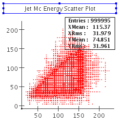
You can select what information should be displayed in the statistics box by right-clicking on the statistics box and selecting Statistics Properties.... If you want the statistics box to disappear completely, right-click on the main plot and select Show Statistics. This entry is also used to make the box re-appear.
| Tip |
|---|
|
There is currently no option in JAS3 to make the label box disappear. If, for some reason, you do not want to have it displayed, you can select it and resize it to a size of 0. |
Basic Fitting
| Anchor |
|---|
| Basic Fitting |
|---|
| Basic Fitting |
|---|
|
JAS3 provides some predefined functions.
- A Gaussian (3 parameters)
- An exponential (2 parameters)
- 0th, 1st and 2nd order polynomials (1, 2 and 3 parameters, respectively)
You can fit your data to one of these functions as well as to a sum of any combination of these.
Select Add function from the context menu by right-clicking on the histogram
Select Fit from the context menu and select the function you want to fit to the data.
The fit parameters will be displayed in the statistics box.
If, for some reason the fit has failed, you can access the parameters by accessing the Functions tab in the Plot Properties... dialog, which you can access from the context menu.
The Functions tab lets you choose: - The display properties of the function curve
- The fit parameters with their error and an indicator whether they are included in the fit
- A box that lets you select the fitter and the dataset which to fit, as well as an indicator whether the fit was successful and the chi-Squared value of the fit.
Before re-fitting the function, make sure the indicators of all parameters that you want included in the fit are checked. You can modify the Values of each Parameters, which will then be used as the new starting point for the fit. Click the checkbox labelled Fit to uncheck it, then click it again to start the new fit.
For further information on fitting, please visit Fitting Through The GUI and Fitting Tutorial
Advanced Tutorials
| Anchor |
|---|
| Advanced Tutorials |
|---|
| Advanced Tutorials |
|---|
|
- The second part of this Tutorial has more examples on fitting and scripting as well as Tuples
- The Documentation on the AIDA homepage contains many advanced examples together with code samples that demonstrate the features
- The Documentation on the PAIDA homepage contains many small examples of Python scripts together with images that demonstrate advanced AIDA capabilities. At the point of this writing, PAIDA contains some functionality that cannot be found in the JAIDA implementation, such as 3D plotting.
...