...
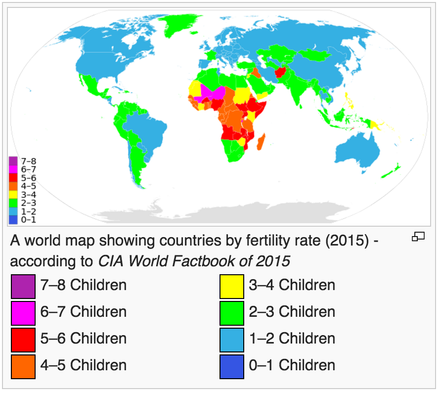
- We used the CIA World fact Book Country Comparison Fertility Rate (children born per woman) to provide a list of countries and their Fertility Rate for 2015. The map below from Wikipedia shows the distribution of Fertility Rates by country.
- We used http://www-iepm.slac.stanford.edu/pinger/pcm.html to provide the PingER throughput for 2015 for each country.
- The country name to TLD were derived from http://www-iepm.slac.stanford.edu/pinger/tld_country_list.txt
- The country name to regions was obtained from http://www.slac.stanford.edu/comp/net/mon/countries.tsv
- The populations were obtained from /afs/slac.stanford.edu/g/www/cgi-wrap-bin/net/offsite_mon/pinghistory/outputCountryPop.txt
...
It is apparent that there is a negative correlation between throughput and fertility rate (i.e. countries with a lower Fertility Rate have a higher value of throughput). It is also apparent that Africa leads the world in Fertility Rates. Also see the map below from Wikipedia.
The low throughputs for Africa are disturbing since achieving significant fertility declines requires education and easy access to information and this in turn is enabled by good internet access.