We are interested in alternative ways of actively measuring the throughputs for countries of the world especially for developing countries. Part of this is to compare the results from direct measurements of throughput with those obtained from the PingER derived throughputs. There are several active end-to-end throughput measurement web sites available today including Cnet, ZDNet.UK, ZDnet.AU, Ookla, NDT servers, NPAD servers, A Beltronica Telecom, Speakeasy. Of these NDT and NPAD are mainly diagnostic tools. NDT, NPAD, CNet and Speakeasy have servers in the US only, ZDNet.AU servers in Australia only, though it does not say we suspect ZDNet.UK probably has servers in the UK only. A Beltronica lists about 80 countries four of which are in Africa. We could find publicly accessible archives of results from only ZDNet.AU which we have analyzed elsewhere. Ookla solicited input so we contacted them by email on November 27, 2007 to see if we could get more complete data from their archives. Mike Apgar and Doug Suttles of Ookla were kind enough to reply, answer questions, and on December 6, 2007 provide data suitable for importing into Excel (CSV format) and analyzing.
Ookla Speedtest.net Information
Ookla maintains a fleet of speed-testing servers all over the world. A chosen server (by default selected as the nearest server to the client, though the client/user can select their own server) downloads a file of incompressible data to the user's client and then uploads it. They calculate the throughput by knowing the amount of data transferred and then dividing this by the time taken to transfer the data in each direction. A summary of this data is provided to the client user in real-time showing average download speed, upload speed, and ping Round Trip Time (RTT).
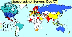
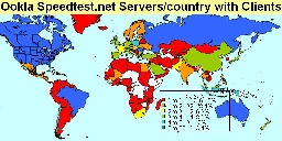
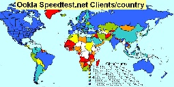
At the time of the data, Ookla speedtest.net had 193 servers in 68 countries. The locations of the servers are seen in the map to the left. The most servers/country were US (54), Australia (7), Russia(6), Brazil, Canada, Romania (5). A map of the number of servers / country is seen in the middle left below . Shown in the middle right is the number of servers/country for countries that had clients. Clients in countries without servers (red in the middle right map) will need to cross international boundaries from the server and so are likely to have poorer performance than clients with servers in their country. About 39% of the countries with clients also have one or more servers. The bar chart to the right shows the download speed per country together with the number of servers per country.
Map of Ookla Servers |
Ookla Servers/country with clients |
Download throughputs/country & servers/country |
|
|---|---|---|---|
|
|
|
|

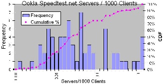
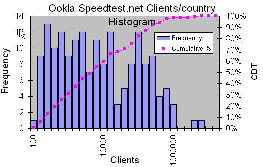
Below is a histogram (with logarithmic bin widths) of the Servers / 1000 clients for countries with servers. The leading countries with this metric are those with the smaller number of clients, e.g. Mali (6.8), Liechenstein(2.5), Maldives(1.5), Bahamas(0.95), Faroe Islands(0.77), Bermuda(0.49), Cyprus(0.33), Honduras(0.29), Qatar(0.26), Nicaragua(0.23).
Histogram of servers / 1000 clients |
|---|
|
The data is also archived together with the location of the client. This is determined based on the client IP address. Speedtest.net uses GeoIP databases from MaxMind to position the client and by default locate the closest server since the transfer speed depends on the TCP window and TCP is not usually optimized for increased RTT. While the information in MaxMind's GeoIP databases is very accurate, it is not perfect. More information on Ookla's speed test can be found here.
Ookla then uses the 95th percentile speeds for the IP address of each client. This way if a connection speed improves over time (or a better testing server for the region is added), it will improve the overall results. The same can be said for degradation of speed. These 95th percentile speeds are then what are averaged to determine the speeds shown in their data set. The ip_addresses column is the number of unique IP addresses from a specific country that have taken a test at Speedtest.net. The file provided contained aggregated data with one line for each country. It included data from 174 countries. The columns contained: the Top Level Domain, the Country name, the number of IP addresses, the average donload speed in kbits/s, the average upload speed in kbits/s. The data for each country was from >= 100 IP addresses.
Results
The US has the most IP addresses (clients) = 5.7M, followed by the UK (2.5M), Canada(890K), Germany(84-K), Italy(835K), Australia(607K), Poland(556K), Mexico(481K), Russia(442K). A map of Clients/country is shown below. The lowest number of clients/country are French Polynesia(100), Greenland(102), Zambia(106), Burkina Faso(107), Haiti (108), Madagascar(118), Northern Mariana Islands(121), Belize(130), Mali(146), Mauritania(149). A frequency histogram (with logarithmic bin widths) of clients/country is shown to the right. The relative flatness of the distribution (with logarithmic bins) indicates that the fall off in clients/country is exponential in nature.
Clients per country Map |
Clients per country Histogram |
|---|---|
|
|
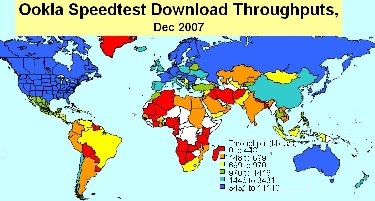
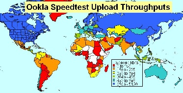
The highest download speed is Japan=11Mbits/s, followed by Sweden, Latvia, Romania, Netherlands, Bulgaria, Singapore, Germany, France, US. Slowest download speed is Cameroon (199kbits/s) followed by Mauritius, Botswana, Angola, Madagascar, Nepal, French Polynesia, New Caledonia, Tanzania, Kenya (i.e. bottom 5 in Africa). Fastest upload is Japan (5.1Mbits/s) followed by Russia, Romania, Sweden, Bulgaria, Latvia, Hong Kong, Lithuania, S. Korea, Moldova. The large number of Eastern European countries is interesting and not fully understood. The slowest download speeds are Madagascar (70kbits/s), followed by Yemen, Angola, Cameroon, New Caledonia, Botswana, Uruguay, Nepal, Zambia, French Polynesia (276 kbits/s). 50% of the slowest 10 download speed countries are in Africa. The median upload speed (303kbis/s) is 1/3 of the median download speed. Currently the African representation by country is only 26 (out of I think 54). It will be interesting to see if this improves as more measurements are made.
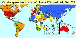
A map of the Ookla download and upload throughputs measured for clients in the various countries of the world is shown below. The poor coverage for Sub-Saharan Africa (there was no data for countries in white) is seen as is the much better performance for developed regions such as N. America, Europe, Japan and Australaisia compared to developing regions. Also on the right we show a map of the ratios for upload/download.
Map of Ookla Download Speedtest throughputs |
Map of Ookla Upload Speedtest Throughputs |
Map of Ookla Speedtest ratio of Upload/Download |
|---|---|---|
|
|
|
Ookla Speedtest.net Upload versus Download Throughputs
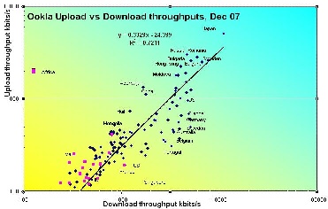
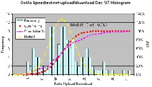
A scatter plot of the Ookla upload versus download throughput speeds is seen below on the left. Also the ratio of upload/download is seen in the map to the right above. In all cases the download exceeds the upload speed. The best value for the ratio of up/down is 80% (Azerbaijan). The worst is 9% (Portugal), the median is 34% +- 17%. It is seen that several Eastern European countries such as Russia, Romania, Bulgaria, and Moldova have anomalously high upload throughput speeds. Looking at the map of Ookla servers and reviewing the locations of Ookla servers in December 2007 there were 6 in Russia, 5 in Romania and 3 in Bulgaria. Presumably these servers can provide high throughput for clients. Several countries in Western Europe such as Portugal, Belgium, France and Germany have anomalously low upload throughput speeds. This may be the servers, or possibly the broadband is configured very asymmetrically. The figure below shows bar charts of the ratio of upload/download together with the download speeds, plus histograms of the ratio and download throughput.
Ookla Upload vs download speed |
Ratio of Ookla upload/download and the Download speeds |
Histogram of Ookla upload/download ratio |
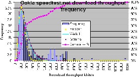
Histogram of Ookla Download throughputs |
|---|---|---|---|
|
|
|
|
Evaluation versus PingER Normalized Derived Throughput (NDT)
The results from Ookla are mainly oriented to broadband access for the residence and the performance of the local broadband providing ISP. The measurements are made at irregular intervals as determined by the whims of the client. The clients are self selected. Ookla also measures the true throughput separately in both the up- and downstream directions. PingER on the other hand is more oriented to measurements beween academic and research sites, the measurements are made at regular intervals (every 30 minutes) and the clients are selected by the server administrators. PingER also derives the throughput from its RTT and loss measurements using the Mathis formula (TCP throughput ~ 1460*8/(RTT*sqrt(loss)) where the result is in kbits/s if the RTT is in milliseconds. Thus the measurement is an average of the up and downstream directions. Though the Mathis formula is for classic versions of TCP's (e.g. New Reno) congestion control as used in most off the shelf computers today, it assumes TCP loss (and TCP provokes loss to detect congestion) whereas PingER gets the loss from pings and thus only samples loss. For these reasons and others PingER is only a rough estimate of throughput. The relationship between RTT, loss and throughput is seen here.
Our Ookla data has about 19 million IP client addresses. It is unclear how many times a given client makes a measurement or if it uses different servers from the default. PingER has about 1900 monitoring host (server) remote host (client) pairs each measured regularly every 30 minutes, or about 3 million measurements (where a single measurement is of 10 pings) per month.
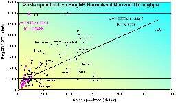
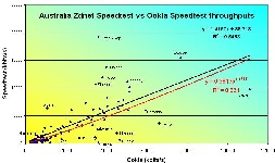
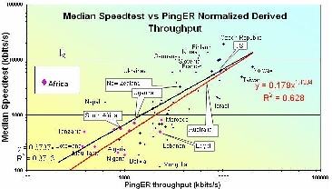
To validate whether the order of magnitude of the throughputs measured by Ookla agreed with those derived from the PingER losses and Round Trip Time (RTT) measurements we plotted the Ookla speedtest download and average measurements versus the Normalized Derived throughputs (NDT) from Pinger. It is seen that the order of magnitudes agree and there is a good positive correlation (R2 ~ 0.53). To see how well the Ookla speedtest download results agreed with those of the ZDnet's Australia Speedtest (though the name Speedtest appears in both they are not related) we also plotted the two speedtests against one another. As a comparison we also show the ZDnet Speedtest results vs. the PingER NDT.
PingER NDT vs. Ookla speedtest transfer rate |
ZDnet Speedtest vs Ookla Speedtest |
ZDnet speedtest vs PingER NDT |
|---|---|---|
|
|
|
For further validation see Throughput versus Loss where a correlation of R 2 ~ 0.85 is obtained for derived ping throughputs versus actual throughputs measured by Andy Germain in 1999 using ttcp between GSFC and LANL .