Introduction
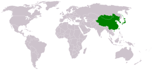
This document is a case study on the inter-regional connectivity of Eastern Asia. The figure - Eastern Asia - depicts the countries considered to be part of East Asia. These are China, Japan, North Korea, South Korea, Mongolia and Taiwan.
Here we study the current capacity, infrastructure and opportunities that the users of these countries have to access the Internet. Followed by that we analyze the Internet performance as measured by the PingER project in comparison to the world and neighbouring countries. Later we compare the performance statistics to the Human Development Indices.
Current circumstances
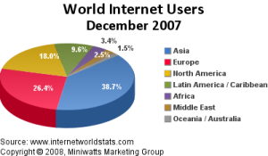
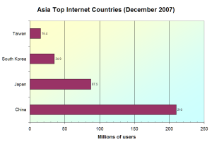
As shown in the following two figures, currently, Asia contributes approximately 40% of the Internet users towards the total. Among these 40%, the major contributors are some of the East Asian countries such as China, Japan, South Korea and Taiwan. (source: Internet World Stats)
|
|
World Internet Users |
Asia Top contributors towards |
|---|
This is primarily because of the high levels of Internet penetration compounded by the population. Also, the fact that these countries are densely populated, makes it easier for the telecommunication providers to extend services to large number of customers. Additionally the government policies promoting the establishment of a sound IT infrastructure has a positive impact. For example, by 2004 South Korea had spent approximately US$ 24 billion in setting up a national backbone linking government offices and public institutions. These policies have also encouraged competition among service providers resulting in decrease in the costs and increase in data rates. The summary is provided in Table 1 - Cost of Internet access.
Table - 1 Cost of Internet access (source: wikipedia)
|
Cost |
Data Rate |
Type |
Estimate |
|---|---|---|---|---|
China |
US$ 10 - 20 |
1 Mbps |
DSL |
2007 |
Japan |
US$ 90 |
1 Gbps |
FTTH |
2005 |
S. Korea |
US$ 30 |
100 Mbps |
FTTH |
2007 |
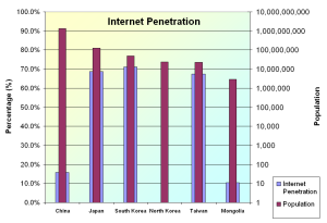
On average East Asia has an Internet Penetration level of 46.74%. South Korea features the highest Internet penetration level of 71.2% with Japan and Taiwan following closely at 68.7% and 67.4%. The statistics are listed in the table below (table 2). The same is summarized in the figure - Summary of Internet Penetration. These statistics were gathered from Internet World Statistics.
Table - 2 - East Asia Internet Usage
Asia |
Population |
Internet Users |
Internet Users |
Penetration |
% users in |
User growth |
|---|---|---|---|---|---|---|
China |
1,321,851,888 |
22,500,000 |
210,000,000 |
15.9 % |
41.1 % |
833.3 % |
Japan |
127,433,494 |
47,080,000 |
87,540,000 |
68.7 % |
19.0 % |
85.9 % |
South Korea |
49,044,790 |
19,040,000 |
34,910,000 |
71.2 % |
6.8 % |
83.4 % |
Taiwan |
22,858,872 |
6,260,000 |
15,400,000 |
67.4 % |
3.0 % |
146.0 % |
North Korea |
23,301,725 |
- |
- |
- |
- |
0 % |
Mongolia |
2,951,786 |
30,000 |
310,000 |
10.5 % |
0.1 % |
933.3 % |
|
Summary of |
|---|
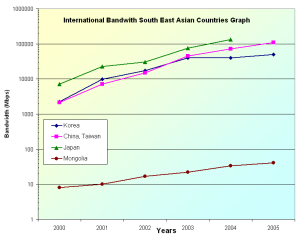
International Bandwidth for East Asia
The international bandwidths for China, Japan, North Korea, South Korea, Mongolia and Taiwan are shown in the figure below - International bandwidth. The statistics have been collected from Mike Jenson 10/18/07 - International bandwidth by country, Internet World Stats and ITU. They clearly show two groups of countries; those which have reasonable available resources (such as Japan ~100 Gbps aggregate, South Korea ~ 50 Gbps, Taiwan and China ~100 Gbps aggregate) and those which are lagging far behind (such as Mongolia and North Korea). North Korea is not known to have public internet access in general. Also, information about Internet connectivity is unavailable, however, N. Korea is known to have an internet cafe maintained via a satellite connection.
|
|
|
|
International Bandwidth |
Central project of the |
International bandwidth |
International bandwidth |
|---|
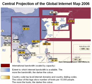
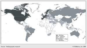
The central projection of the Global Internet Map 2006 shows the international internet bandwidth and is scaled by capacity. The map also shows color-coded tags, indicating the number of internet hosts per 10,000 people. Each country is color-coded according to the extent of international internet bandwidth available. The maps of central projection and international bandwidth usage per country were prepared by TeleGeography.
PingER and Internet Performance
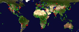
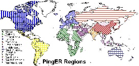
Pinger Coverage
|
|
PingER Coverage Worldwide |
PingER Regions |
|---|
The map - PingER coverage of Eastern Asia highlights the Monitoring (Red), Beacon (Blue) and Remote (green) sites in the region. The distribution of these nodes is shown in Table - 3 below.
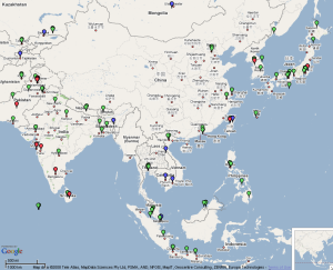
Table - 3 - Node Distribution in Eastern Asia
|
Monitoring |
Beacon |
Remote |
|---|---|---|---|
Japan |
1 |
1 |
9 |
China |
2 |
1 |
7 (east) |
South Korea |
1 |
1 |
4 |
Mongolia |
0 |
1 |
0 |
Taiwan |
1 |
1 |
0 |
North Korea |
0 |
0 |
0 |
Worldwide Comparison
|
|
|
|
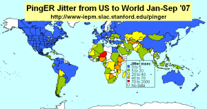
Packet Loss as seen from N. America |
min RTT as seen from N. America |
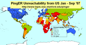
Unreachability |
Jitter |
|---|
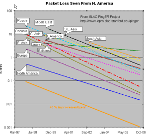
The left hand figure shows the packet loss to various regions of the world as seen from N. America. Since losses are fairly distance independent no attempt has been made to normalize the data. It is seen that the world divides up into two major super-regions: N. America, Europe, E. Asia and Oceania (mainly Australia and New Zealand) with losses below 0.1%, and Latin America, C. Asia, Russia, S.E. Asia, S. Asia and Africa with losses > 0.1% and as high as as a few per-cent. All countries are improving exponentially, but Africa is falling further behind most regions.
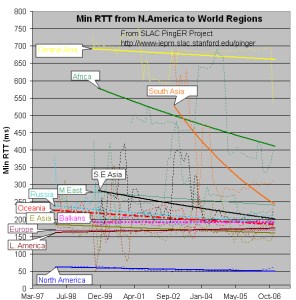
The second figure from the left shows the drop in the Minimum RTT from 2002-2006. The large step for S. Asia in 2003 was due to the change over from satellite to fibre. Central Asia (also Afghanistan) has hardly moved in its minimum RTT since it continues to use geostationary satellites.
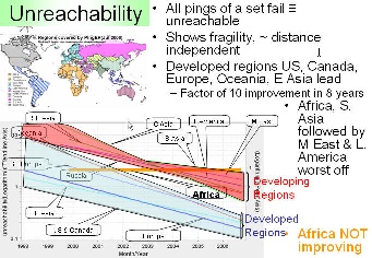
The third figure from the left shows the unreachability of world regions seen from the US. A host is deemed unreachable if all pings of a set fail to respond. It shows the fragility of the link and is mainly distance independent (the reasons for fragility are usually in the last mile, the end site or host). Again the developed regions - US and Canada, E. Asia, and Oceania - have the lowest unreachability (< 0.3%) while the other regions vary from 0.7% to 2%. Africa shows poor statistics and is not improving, where as S. Asia has the second worst results.
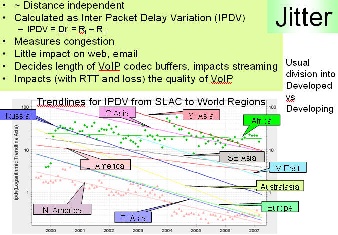
The last graph shows the jitter (or variability of RTT) of world regions seen from the US. The jitter is defined as the Inter Quartile Range (IQR) of the Inter Packet Delay Variability (IPDV i = RTT i - RTT i-1). Jitter is relatively distance independent, it measures congestion, and has little impact on the Web and email. It decides the length of VoIP codec buffers and impacts streaming. We see the usual division into developed versus developing regions.
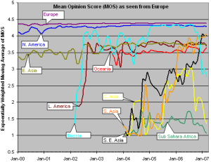
MOS for various Regions
There are three factors that significantly impact call quality: latency, packet loss, and jitter. We calculate the jitter using the Inter Packet Delay Variability (IPDV) , see the tutorial for further details.
Most tool-based solutions calculate what is called an "R" value and then apply a formula to convert that to an MOS score. Then the R to MOS calculation is relatively standard. The R value score is from 0 to 100, where a higher number is better. To convert latency, loss, and jitter to MOS we follow Nessoft's method. The graphs below shows the Exponentially Weighted Moving Average (using EWMI i = alpha * EWMI i-1 + (1 - alpha) * Obs i where alpha = 0.7 and EWMI 1 = Obs 1) for the MOS as seen from the W. Coast of America (SLAC) and Switzerland (CERN). N.B. MOS values of one are reported for heavy loss (loss > 40 %).
|
|
|
Mean Opinion Score as seen from the US |
Mean Opinion Score as seen from CERN |
Mean Opinion Score as seen from Europe |
|---|
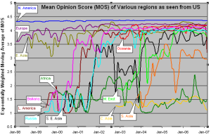
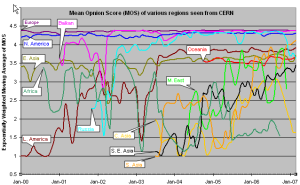
CERN monitors fewer remote hosts than SLAC (56 versus over 400) so the data is not as complete in the CERN case. Comparing the two graphs, it can be seen that, as expected, the MOS is better for the shorter distances (i.e. CERN to Europe is better than SLAC to Europe, SLAC to N. America is better than CERN to N. America.).
It is also seen in both graphs that the Balkans, Russia and Latin America improved dramatically in 2000-2002. Much of Latin America and Russia moved from satellite to land lines in this period. It can be seen from the above plot that VoIP ought to be successful between SLAC and the US, Europe, E. Asia, Russia, Latin America and the Mid East (all above MOS = 3.5). S. E. Asia is marginal, S. Asia people will have to be very tolerant of one another, and C. Asia and Africa are pretty much out of the question in general. In general the CERN graphs looks similar to the SLAC graph to the various regions, except that S. E. Asia is worse for CERN than SLAC as is S. Asia
The third graph shows the Mean Opinion Score (MOS) from Europe two various regions. We have five monitoring sites in Europe (one at CERN, one at ICTP, one in Germany, and two at UK. The improvement in Latin America and Russia in 2002 is the result of shift from satellite to fiber. The drop for Russia in Sep, 2006 is because we installed a new version of PingER and it started monitoring 9 hosts in Russia whereas previously it was monitoring 20 hosts. For Central Asia the number of sites went up from 3 to 15 in Sep 2006, so the latter results are a better indication of the overall performance of Central Asia. For Sub Sahara Africa the coverage improved in Sep, 2006 (increased from 8 to 39 sites). So for sub Sahara Africa the results after Sep 2006 presents a better picture. South Asia as seen from Europe is performing better than as seen from US because MOS is derived from average RTT which is distance dependent.
Information on Calculation MOS can be found here.
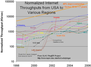
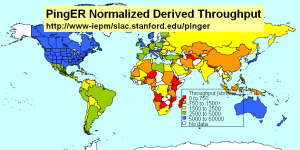
TCP throughput from CERN & SLAC to World Regions
|
|
|
Throughput trends as |
TCP throughput as seen |
Normalized Internet throughput |
|---|
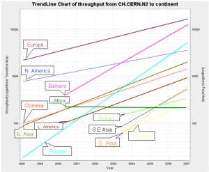
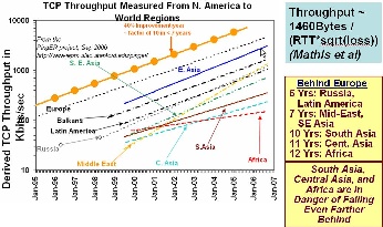
The graphs above show the derived TCP throughput using the Mathis formula. The macroscopic behavior of the TCP congestion avoidance algorithm by Mathis, Semke, Mahdavi & Ott in Computer Communication Review, 27(3), July 1997, provides a short and useful formula for the upper bound on the transfer rate:
Rate <= (MSS/RTT)*(1 / sqrt(p))
where:
Rate: is the TCP transfer rate or throughput
MSS: is the maximum segment size (fixed for each Internet path, typically 1460 bytes)
RTT: is the round trip time (as measured by TCP)
p: is the packet loss rate.
In the two graphs on the left - TCP throughput trends as seen from the US and CERN - the data points (average throughput per month) are fitted to exponential functions and for simplicity the trend lines only are shown. These lines enable us to see that East Asia is (approximately) 3 years behind Europe and is catching up, Russia and Latin America are 6 years behind Europe, the Mid-East and SE Asia are 7 years behind, and S. Asia, C. Asia and Africa are 10 years or more behind. Variation in results as observed from the US and CERN are due to the different monitoring sites. Also, our coverage in terms of monitoring sites is significantly greater as compared to that of CERN.
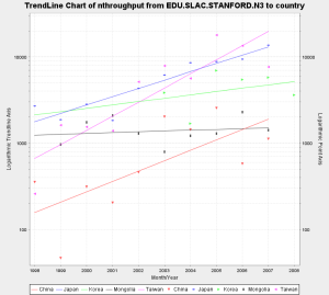
The figure - Normalized Internet throughput at seen from the US - shows the yearly average derived TCP throughput normalized by the minimum RTT for the region (to reduce the proximity effects). It should be noted that that the throughputs are not exponential straight lines, instead they step up (or down) as major changes are made (or occur) in the routing and circuits. For example for East Asia. there was a drop in the throughput in 2000 as a consequence of route changes from direct to via New York.
It is important to look at the aggregated statistics mentioned above in the light of International bandwidth possessed by the East Asian countries as shown below.
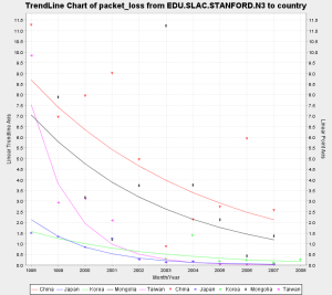
Packet Loss, Minimum RTT and Throughput
|
|
|
|
Average RTT (as seen |
Minimum RTT (as seen |
Packet Loss (as seen |
Throughput (as seen |
|---|
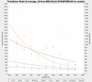
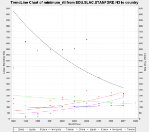
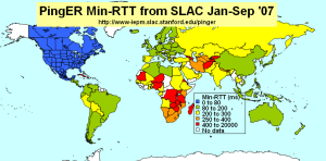
Round Trip Times are measurements which are influenced by the distance between the sites. We know that the distance between SLAC (California, USA) and observed nodes in East Asia is about 12,000 Km. Knowing the speed of light in fibre (roughly 0.6*c, we use 1ms. delay is equivalent to 100km) and considering the submarine cable map (discussed in the section titled Routing) the minimum RTTs for Korea and Japan are within the 'acceptable' (125 - 250 ms) and 'good' (82.5 - 125 ms) range respectively. Significant improvements were observed for South Korea after 2003. Since then S. Korea and Japan both have maintained their RTT measurements below 150 ms .
Measurements for China and Taiwan however show results in the years 1999 and 2000 (and 2001 for Taiwan) which do not agree with the constraints of nature. For these years the results (figure - Minimum RTT) show measurements of less than 100 ms which is not possible considering the speed of light in fibre and the distance between the observing (USA) and observed (China & Taiwan) nodes. We believe that the reason for this is that the observed nodes did not exist where they were expected to be. The nodes accessed for China and Taiwan were probably proxy nodes deployed somewhere in the US. Thus disregarding the years 1999-2001, the measurements for China are observed to be within the acceptable range (i.e. of less than 250 ms). These measurements however seem to increase slightly at a negligible rate of 0.007%. This may be attributed to the difference in rate of increase for the annual user growth i.e. 53.3% as compared to the increase in bandwidth resources i.e. 43.7%. Similarly for Taiwan, disregarding the measurements taken in 1999-2001, the results are found to be in the acceptable range and are maintaining themselves.
As a consequence of consistent government policies since 1994 and support from Asian Development Bank results for Mongolia have improved significantly i.e. from greater than 550 ms to less than 250 ms. However this barely brings the RTT measurements within the acceptable range. This is perhaps because of the poor ratio of users to available capacity. It should be noted that with the implementation of the ICT Vision 2010 plan particularly the setup of an Internet Exchange Router in 2005, we observe step improvements (for all parameters) in 2005 and 2006 i.e. in minimum RTTs, packet losses and throughputs.
The graph - packet loss - summarizes the losses as seen from SLAC. These observations are independent of the distance between the sites (hence independent of RTTs). Here Taiwan, S. Korea and Japan show good results with losses of less than 1.0%. Mongolia and China both have improved significantly over the years and since 2005 have been within the acceptable range of less than 2.5%.
The throughput observed by the monitoring node in SLAC is as expected. Japan and Korea appear to be steadily improving (considering the increase in international bandwidth as discussed earlier), though with different rates. Taiwan on the other hand has overtook Japan, which is understandable when we consider the ratio of the annual rate of increase in bandwidth resources (i.e. 34%, discussed above) as compared to annual rate of increase in internet users (i.e. 2%).
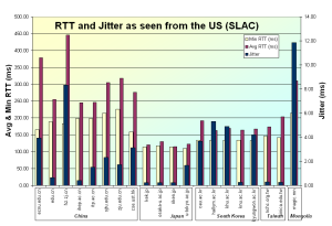
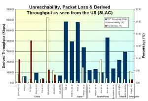
|
|
RTT and Jitter |
Unreachability, Loss and Throughput |
|---|
The summarized results shown in the graphs above feature interesting conclusions.
We observed that average RTT values for different sites in China vary significantly, however the minimum RTT values tend to agree with those of their peers which is understandable. Also, the difference between the minimum RTT and average RTT is significantly large for most of the sites. Additionally there are large variations in jitter measurements for these sites. These observations allow us to conclude that there is considerable amount of congestion within China. Also there are huge packet losses (5% - 17%) for few sites as shown in the figure above - Unreachability, Loss and Throughput. The rest show nearly acceptable results of less than 2.5% losses and similar (derived TCP) throughput values of approximately 900 Kbps. It is important to note that the sites with large variations in jitter and large difference between avg. RTT and min. RTT also show significantly less throughput, and more packet losses as compared to their peers.
The avg. RTT and min RTT measurements for Japan and Taiwan agree very strongly among themselves. Also the difference between avg. RTT and min RTT is minimal. The jitter is nearly negligible. The throughput measurements seem to agree with each other, the packet losses are nill. These results allow us to conclude that the network performance for Japan as well as Taiwan (as seen from the US) is excellent. One particular site shows relatively larger jitter and unreachability measurements which we think is a trait of the monitoring site and not the network in general.
As in the case of Japan, the avg. RTT and min. RTT measurements for South Korea agree strongly with each other and the difference between them is consistently that of 25 ms (approximately). The packet losses are within the acceptable range. Also, the average throughput is relatively good (3900 Kbps) as seen from the US. Considering each site independently, we observe that a particular monitoring site (i.e of Kyung Hee University) shows excellent results as compared to its peers, with minimal jitter and losses and relatively large (derived TCP) throughput values. The other sites, however show jitter of about 6 ms which is acceptable. Thus we conclude that the internet network of South Korea features minimal congestion.
Mongolia in comparison to all the above shows lower (derived TCP) throughput measurements which is understandable considering the international bandwidth and ratio of users to available resources. The difference between the avg. RTT and min. RTT, as well as the large jitter values encourages us to conclude that there is fair amount of congestion within Mongolia. Interestingly though there are negligible packet losses.
Below are the aggregated performance results for the individual sites as seen from SLAC for the year 2007.
|
|
|
|
min RTT as seen by PingER |
Jitter as seen by PingER |
Normalized Derived Throughput |
Unreachability as seen by |
|---|
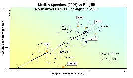
To verify whether the order of magnitude of the normalized derived throughput is correct we compare it with the Speedtest results. This application sends a known amount of data between your computer and servers in Australia. Then it measures throughput and besides returning the result to the user, it also saves and makes available the results by country and ISP. The correlation is shown in the figure below. The orders of magnitude of the two methods agree and there is a strong correlation.
|
Median Speedtest vs PingER |
|---|
Routing
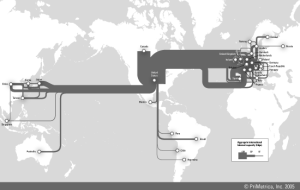
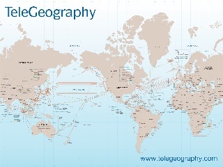
For the sake of reference, the figure below shows major international traffic routes and the submarine cable map. Domestic routes are omitted. The source is TeleGeography research.
|
|
International routes, |
Submarine cable map |
|---|
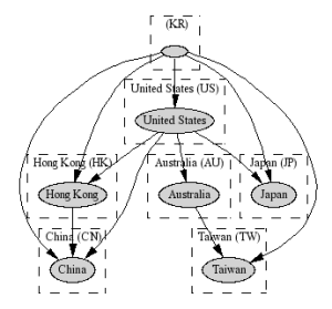
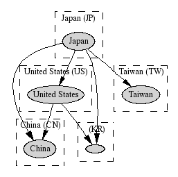
We have at least one monitoring node in South Korea, Japan, China and Taiwan. With the help of those, we gathered the traceroute results for the neighbouring countries as shown in the figures below.
|
|
|
|
Routes to neighbours |
Routes to neighbours |
Routes to neighbours |
Routes to neighbours |
|---|
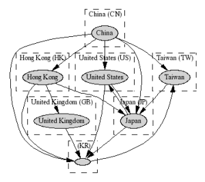
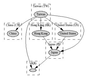
The traceroute results (annotated, raw) originating from China show that China is directly connected to its neighbours i.e. Taiwan (#5, 61 ms), South Korea (#27, 73 ms) and Japan (#8, 100 ms) and the traffic generally takes the direct routes. However some results show that traffic destined for selected nodes in South Korea is either routed via Japan (#7, 114 ms) or Japan and US (#16, 209 ms) or Hong Kong and United Kingdom (#54). Similarly, for selected destinations in Japan the traffic is routed via Hong Kong (#24, 206 ms) or Taiwan (#25, >90 ms). Also, traffic for selected nodes in Taiwan is sometimes directed via South Korea (#27, 245 ms). On the other hand when the destination is within China, the traffic stays within China which is what one would expect. Random tests to other countries in the Asia showed traffic flowing as expected (i.e. as per the submarine links). However the results below were interesting. The RTT values encouraged us to conclude that traffic was indeed traversing these links.
China to Thailand: China->Hong Kong->Japan->Thailand OR China -> Thailand
China to Vietnam: China->Hong Kong-> United Kingdom->Hong Kong-> Vietnam
China to Singapore: China ->Hong Kong->Japan->Singapore
China to Malaysia: China->Hong Kong->Malaysia
The results (annotated, raw) from South Korea show that Korea is directly connected to Japan (#1, 36 ms), Taiwan (#6, 214 ms), China (#11, 110 ms) and the US and the traffic generally takes the direct routes. However some results show that traffic destined for selected nodes in Japan is directed via the US (#23, 182 ms). Similarly, traffic destined for particular nodes in Taiwan is sometimes routed via the US and Australia (#2, >272 ms) and the traffic destined for specific nodes in China is sometimes routed via Hong Kong (#80, 97 ms). Lastly the traffic destined within Korea is observed to stay within Korea as one would expect. Random tests to countries in the Asia showed traffic flowing as expected (i.e. as per the submarine links). However the results below were interesting. The RTT values encouraged us to conclude that traffic was indeed traversing these links.
Korea to Thailand: Korea ->United States -> Canada ->Thailand
Korea to Vietnam: Korea -> United Kingdom-> Hong Kong -> Vietnam
Korea to Singapore: Korea -> United States -> Singapore
Korea to Philippines: Korea -> Germany->Hong Kong->Philippines
The traceroute results (annotated, raw) originating from Taiwan show that Taiwan is directly connected to its neighbours Japan (#1, 34 ms), China (#17, 61 ms), Korea (#7, 45ms), Hong Kong (#63, >30 ms) as well as the United States and the traffic generally takes the direct routes. However in some cases the results show that traffic destined for selected nodes in Japan is routed via the US (#23, >140ms) or Hong Kong (#74, 73ms). Also, the traffic destined for particular nodes in South Korea is sometimes routed via Japan (#18, >65 ms). As one would expect, the traffic destined for a node within Taiwan stays within Taiwan.
Interestingly though, the traceroute results (annotated, raw) show that Japan is directly connected to its neighbours i.e. Taiwan (#4, 34ms), Korea (#13, 40ms), China (#14, 130 ms) and nearly all the traffic to destinations in neighbouring countries is routed via the direct links. In very few cases the traffic destined for selected nodes in Korea is routed via the US (#28, 252 ms). Similarly traffic destined for selected nodes in China is routed via the US (#16, 219 ms). Random tests to countries in the Asia showed traffic flowing as expected (i.e. as per the submarine links). However the results below were interesting. The RTT values encouraged us to conclude that traffic was indeed traversing these links. It is worth noting that traffic destined for Vietnam from both China and Korea is routed via the US, when Japan is directly connected.
Japan to Thailand: Japan -> United States -> Canada -> Thailand
Japan to Vietnam: Japan -> Vietnam
Japan to Singapore: Japan -> Singapore
Japan to Malaysia: Japan -> United States -> Malaysia
The anomalous behaviour of traffic to selected nodes/networks may be attributed to the BGP policies enforced by ISPs.
Comparison with Human Development Indices
There are many indicators of countries' development from organizations such as the International Telecommunications Union, the United Nations, the CIA, the World Bank try to classify countries by their development. They are quite challenging and require careful consideration of: what can be measured, how useful is it, how well it is defined, how it changes with time, how it changes from country to country, the cost of measuring, the time it takes to gather (to avoid being too out of date, how subjective they are etc.
Typically they are based on some combination of GDP, life expectancy, literacy, education, phone lines, Internet penetration etc. Some examples include the Human Development Index (HDI), the Digital Opportunity Index (DOI), the Opportunity Index, the Technology Achievement Index etc. In general agree with one another (R 2 ~ 0.8). More information can be found here. For this report we focus on just two, the DOI (since it is recent and covers more countries than most) and the HDI since it different from the others and focuses on the human condition.
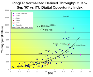
The Digital Opportunity Index (DOI) measures countries' ICT capabilities in infrastructure, access path and device, affordability and coverage, and quality. It covers 180 countries, and has recent (data 2005, announced in 2006). There are 11 indicators: that cover mobile telephony coverage, Internet tariffs, #computers, fixed line phones, mobile subscribers, Internet users all in relation to the population of the country. A figure of the correlation with the normalized derived PingER throughput is shown below. The correlation is fairly good. Again nearly all countries show significantly high values of throughput in comparison to DOI except for the case of Mongolia and China.
|
ITU DOI vs |
|---|
"The Human Development Index (HDI) is the measure of life expectancy, literacy, education, and standard of living for countries worldwide. It is a standard means of measuring well-being, especially child welfare. It is used to determine and indicate whether a country is a developed, developing, or underdeveloped country and also to measure the impact of economic policies on quality of life." from Wikipedia.
|
|
UNDP HDI vs |
GDP/capita vs |
|---|
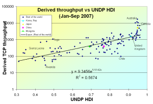
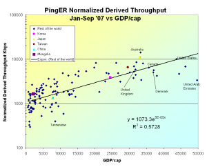
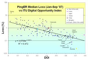
The figure above shows the correlation between the HDI and the normalized derived PingER throughput for the world and East Asian countries, and the PingER throughputs per East Asian country. The correlation is seen to be strong (R 2~ 0.56). It is also seen that except for Mongolia, all East Asian countries feature equally high throughput as compared to the HDI. Also, all conform to the trend maintained by the countries in general. Additionally, a comparison of loss percentage (as seen from the US) to DOI and Purchasing Power Parity (GDP/capita) to Unreachability confirms that nearly all the East Asian countries perform well and perform equal well or better than other leading countries such as Australia, Canada, United Kingdom, France etc.
|
|
ITU DOI vs loss % as |
GDP/capita vs Unreachability |
|---|
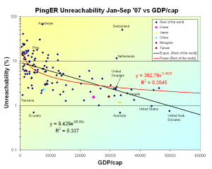
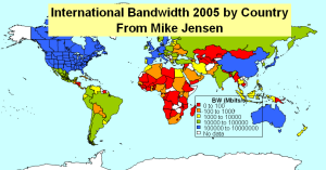
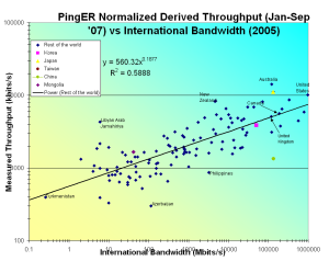
Below, the figure on the left shows the correlation between International bandwidth (as discussed earlier) and the normalized derived PingER throughput. A good correlation (R 2 ~ 0.59) is observed between the two. It is also seen that the East Asian countries (highlighted) lie towards the top right where both the throughput and International Bandwidth are high and match with the results of countries known to have good network infrastructures. On the other hand Mongolia is an anomaly. This can be attributed to the relatively low international bandwidth and resources available per user. The loss percentages are quite prominent as well (as discussed earlier). Also, the poor RTTs (due to delays in the last few hops) contribute towards significantly low throughput values.
|
International bandwidth (2005) |
|---|
Conclusions
(The conclusions may not be in the order of importance)
- Except for Mongolia - which shows average results - all East Asian countries show good (or acceptable) Internet performance. The trends show that these results are continuing to improve.
- Results as seen internationally are strongly influenced by the condition of the network within the country.
- This was confirmed by the step changes seen in performance in 2005/2006 when an Internet Exchange Router was setup connecting the ISPs of Mongolia.
- Nearly all results are skewed by the performance observed for the last few hops.
- Results as seen internationally are strongly influenced by the condition of the network within the country.
- Improvements (/changes) in the national backbones - as in the case of Mongolia in 2005 - result in step changes in Internet performance.
- Internet performance is closely tied with Human Development Indices - HDI.
- This is evident from the strong correlation of these parameters with Internet performance metrics as observed by PingER. In the case of East Asia, Japan, South Korea and Taiwan show good Internet performance results while maintaining high values for HDI. On the other hand, Mongolia shows average (and in some cases below average) Internet performance statistics while maintaining average HDI values.
- Generally the traffic is routed via optimal links. However, traffic for some destinations are routed indirectly even though shorter paths exist (which are used for traffic in general). This may be attributed to the BGP policies defined by the ISPs.
- Increase in PingER coverage results in accurate results. This is observed by the increased correlation of PingER results with Human Development Indices over the years 2006 and 2007.
Acknowledgements
We are grateful to all our collaborative partners in East Asia maintaining monitoring nodes which enabled us to conduct this study. The contact persons are Henry Wong (Dept. of Comp. Sci. and Eng., Hong Kong Univ. of Sci. and Tech.), C. S. Hong and Obaid Amin (Kyung Hee University, South Korea), Chen Hesheng (Institute of High Energy Physics Chinese Academy of Sciences, China), Trey (National Center for High Performance Computing, Taiwan), Takashi Ichihara (Institute of Physical and Chemical Research, Japan).