...
Here is an example of a congested link in China (www.hz.zj.cn). You can clearly see the day night effect here and huge losses. In first graph shows the data for the last two days in this case. (By default it shows the last 120 days and can be changed by selecting the date). The second one shows the data for the last 10 days and the third one shows the data for the last 30 days.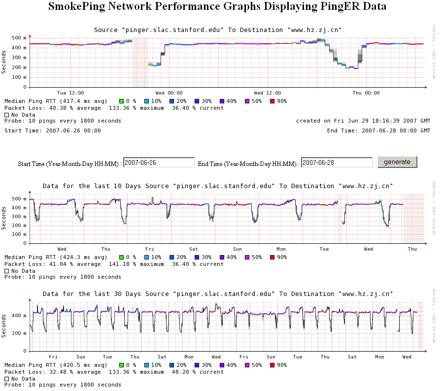
Interpreting the Graph
Smoke colors
| Include Page | ||||
|---|---|---|---|---|
|