...
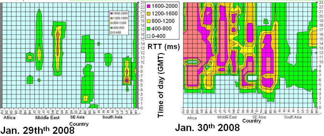
Looking in more detail at the impact hour by hour on January 30th we get the map on the right in the Figure below. It shows the hourly average RTTs (z axis) by time of day (y axis) on January the 30th from SLAC to 30 impacted hosts (x axis) in 17 countries identified by their Top Level Domain (TLD). In this graph the vertical (Average RTT) is chopped off at 2 seconds, though some hosts took up to almost 10 seconds to respond at times. It can be seen that the impact (sudden increase in RTT) is very abrupt. The time of the impact varies by 2-3 hours (between 4am and 7am). Most hosts continued to respond apart from 3 in Sudan and 1 in Bahrain, each of which did not respond for up to an hour. The magnitude of the impact also varies by more than an order of magnitude from country to country. By looking at the data for other days in particular Jan 29th (see the map in the left of the Figure below), we verified that the sudden increase was not caused by the normal diurnal variations of people coming to and leaving work etc.
We also looked at the losses as a function of time, see the Figure below. The numbers in each cell are the rough losses (rounded off to ahat not all sites in a country were equally affected. For Bahrain one of two sites were affected, India 2 out of 4, Jordan 3 out of 4, Sri Lanka and the Maldives none were affected. Sites in some countries such as Jordan and Bangladesh took more than 5 days to recover, for India 2 sites took 4 days to recover.
