...
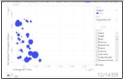
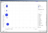
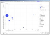
Probably the most dynamic way to show the effects is to use the PingER Metrics Motion Charts for the regions most badly affected: Middle East, South Asia and Africa (Egypt and Libya). These show the variation of multiple metrics as a function of time. To assist in this we have captured the charts for 21 days starting December 14th 2008. The charts for the three regions are shown below. To view them, for example, click on the Africa thumbnail, then click on the right arrow to play the data. After viewing this, select the size metric (by default to be Population (#)) to be Packet Loss (%). Under Select choose the country of interest to be trailed (e.g. Egypt), then click on the arrow to playback the performance of the throughput, the average RTT and packet loss all the while trailing the bubble for India. Note the dramatic change in increase of loss (bubble size), and average RTT starting on December 19th, and the rcovery recovery after December 22nd.
Africa | Middle East | South Asia |
|---|---|---|
| | |
...