...
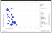
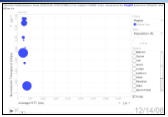
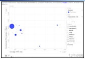
Probably the most dynamic way to show the effects is to use the PingER Metrics Motion Charts for the regions most badly affected, Middle East, South Asia an d Africa (Egypt and Libya). These show the variation of multiple metrics as a function of time. To assist in this we have captured the charts for 21 days starting December 14th 2008.
Losses
The measured effects on the losses seen from N. America (SLAC in California) to hosts in N. Africa (Egypt, Sudan); Middle East (Bahrein, Palestine, UAE, Oman, Jordan, Lebanon, Saudia Arabia); S. Asia (Sri Lanka, Maldives, Pakistan) are huge. As seen from PingER daily loss data measured from SLAC, comparing the losses on Friday Dec 19 with those on Mon-Thu (15-18 Dec) the losses have increased by a factor of 5 to 30 times for most of the hosts monitored in the above countries.
...