...
And plots of the time series appears as below (spreadsheet)?
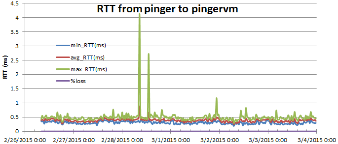
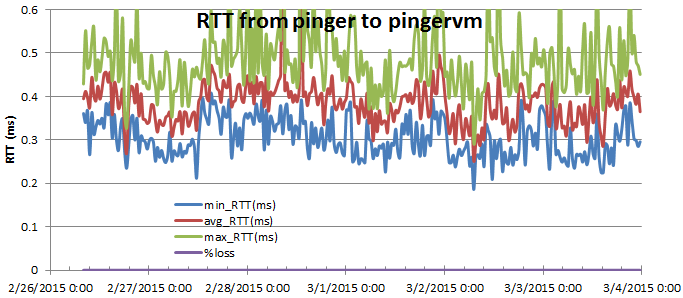
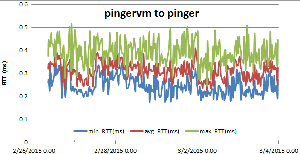
Looking at the above manually scaled plots of pinger>pingervm and pingervm>pinger it is apparent the RTTs from pinger to pingervm are > pingervm to pinger. Looking at the average, standard deviation, median and IQR tables and the differences between pinger as the monitoring site and pingervm as the monitoring site, we see in tabular form (where the average errors are +- (stdev(pinger>pingervm)+stdev(pingervm>pinger)) and the median errors are +- (IQR(pinger>pingervm) + IQR(pingervm>pinger)). the Probabilities are those that the pinger>pingervm and pingervm>pinger distributions are the same (assuming normal distributions).
...