...
Looking at the 120 days graphs it is seen that there were increased losses (increase in yellow background colors) starting around 2012-09-20 in both cases. More recently (see the 3 days plots) these increased for a while to over 20% (more red background colors).
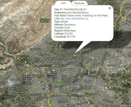
A Google map of Damascus showing the two sites (green balloons) and identifying the Thawra host is shown below;