...
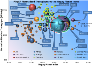
We compared the PingER Normalized Derived Throughput to the HPI for 2011. The result is seen below in the bubble plot with the bubble size being by country, and the bubble color identifying the region. To assist in distinguishing regions: European Countries are surrounded in yellow, East Asian countries are surrounded by green,and South Asian by red. the spread sheet is found here. The correlation with Internet performance is not strong. This is probably since the countries with the best Internet performance tend to the more advanced ones that also consume the most resources.