Before comparing regions of the world it is useful to look at a World Map of Internet Users. This shows that for most the developed world (US and Canada, W. Europe, Japan, Taiwan, S. Korea) typically 40% or more of the people have Internet connectivity while for Africa according to ITU figures for 2004 it is less than 3% and for Sub-Saharan Africa closer to 1.8% and without South Africa 2% closer to 1.3%.
. 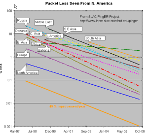


The left hand figure shows the packet loss to various regions of the world as seen from N. America. Since losses are fairly distance independent no attempt has been made to normalize the data. It is seen that the world divides up into two major super-regions: N. America, Europe, E. Asia and Oceania (mainly Australia and New Zealand) with losses below 0.1%, and Latin America, C. Asia, Russia, S.E. Asia, S. Asia and Africa with losses > 0.1% and as high as as a few per-cent. All countries are improving exponentially, but Africa is falling further behind most regions.
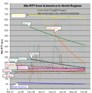
The left middle figure shows the drop in the Minimum RTT from 2002-2006. The large step for S. Asia in 2003 was due to the change over from satellite to fibre. as the result of gradual shift from Satellite to fiber. Central Asia (also Afghanistan) has hardly moved in its minimum RTT since it continues to use geostationary satellites.
...