ZDnet.com.au has a speedtest web page that enables a user to run an application that transfers a known amount of data from a server to the user's host. Knowing the amount of data and the time taken for the transfer, it estimates the throughput. Besides providing the user with the results it also collects the data and can provide throughputs by country, ISP, and Australian State. Though there is a FAQ many details are missing, such as where the server(s) are located, how much data is shipped, also the results do not show a breakdown of reults results by whether it is residential site or a university, company etc.
They do provide access to a table of countries, attempts, min throughput, max throughput, median throughput and average throughput. This table contains results for well over 100 countries and so it is interesting to compare with other measures, in particular PingER's normalized derived TCP throughput. One of the problems is that they do not distinguish between home connections, universities, companies etc. The and minima and maxima may help in differenziating differentiating between home connections and major sites. I also notice that currently African countries are poorly represented, e.g. of the countries with ITU Digital Opportunity Indices (DOI's) 42 do not appear in the Zdnet speedtest and 23 with PingER data do not appear in speedtest (1 appears in speedtest and not in PingER - Mauritius). This (reducing the number of missing speedtest countries) should improve with time. Also there are about 30 countries with 3 or fewer attempts, time should also improve this.
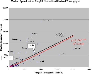
The correlation plot is shown below. It is seen that agreement is good for countries close to the server (may be fortuitous), i.e. Australia and New Zealand. The overall R^2 shows a strong correlation, aso also the absolute values seem to match up reasonably well (same order of magnitude).
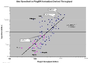
I also looked at the fastest speed test results and again compared with Pinger Normalized Derived Throughput. Since the speedtest results are maxes there is likely to be more spread, however maybe the maxes represent institutes/companies/universities rather than residential results. The results are shown below. The correlation is weaker. African countries (in Magenta) as expected perform poorly.