...
Nigeria vs. the rest of Africa
The chart below (and spreadsheet here) shows the derived throughput for the various African various African regions.
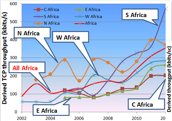
Comparing the median throughput seen from SLAC for W. Africa with that for Nigeria in the table above, it is seen that NG.AUN.EDU is worse off, NG.UNLILAG.EDU is slightly better off, and NG.BENUESTATE.GOV is much better off.
...
Comparing the through put of African regions with the rest of the world, one gets the chart below: 
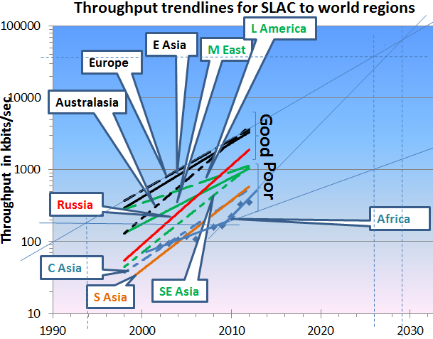
It is seen that Africa is much worse than the rest of the world. If one extrapolates back in time from where Africa was in in 2008 (before the world cup and the installation of multiple subsea fibre optic cables to Sub-Saharan Africa) then one see African performance was roughly equivalent to that of Europe in 1994. Not only was Africa behind Europe by 14 years, but it was falling further behind year by year, such tha]On the other hand if one assumes the trend since in African throughput continues, then Africal could catch up with by 2028,2008