...
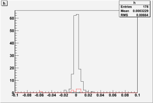
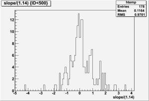
The MIP peak values exhibit no systematic drift. The plots below shows a histogram show histograms of the slope of the trend line (The left in units of MIP's per year, and the right in units of raw PHA per year).
...
As is apparent from the plots, the MIP peaks are quite stable, to within about 5 4 percent of a MIP per year. The is no indication of any systematic degrading. The Gaussian distribution of the trends suggests that the appearance that some individual tiles are trending down is more likely due to noise than to any degrading of particular tiles. The mean of the trends is even slightly positive. The only possible systematic effect is demonstrated by the red bars on both plots. These bars are the data from the eight PMT's attached to the four large bottom tiles on the sides. As can be seen, all eight of these PMT's are trending downward. Due to their larger size, these tiles may be degrading more quickly than the others. However, this degrading is again at it's maximum around 4 percent of a MIP per year, and could easily be noise, as these tiles are not outside the Gaussian at all, simply concentrated on one side of it.
Pedestals
Even though the MIP peaks are quite stable, there is still a possibility that since the MIP peaks are pedestal subtracted, downward trending pedestals could mask degrading tiles. However, the pedestals are also very stable (much more stable than the MIP peaks in fact), thus indicating that this is not the case. Below are histograms of the Pedestals (The left is in units of fraction of the pedestal per year, the right in raw PHA per yea).