...
Default view | Highlighted countries with |
|---|---|
| |
Usage
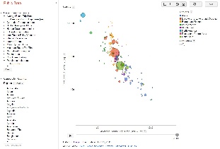
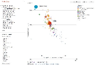
By default the pinger data explorer shows the bubble chart between throughput in log scale to average_rtt in log scale. Each bubble represents a country. The size of the bubble shows population of the country. The color of the bubble shows the region of the country. The motion is the time. The time granularity is by the year. Click on the play button to initiate motion.
...
The scripts and files are placed at /afs/slac.stanford.edu/package/pinger/explorer . Two scripts have to be run for generating the data file in the format required by the google data explorer. First script is generate-metric-files-for-explorer.pl . This script takes metric values from prmout folder (http://www-iepm.slac.stanford.edu/pinger/prmout/) and![]() transposes the data such that years are now incremented vertically and not horizontally. The files generated by generate-metric-files-for-explorer.pl are then given as an input to the script generate-alldata-for-pinger-data-explorer.pl, which outputs the data for all the metrics altogether in one file named file.csv. This file is in the format as required by the google data explorer.
transposes the data such that years are now incremented vertically and not horizontally. The files generated by generate-metric-files-for-explorer.pl are then given as an input to the script generate-alldata-for-pinger-data-explorer.pl, which outputs the data for all the metrics altogether in one file named file.csv. This file is in the format as required by the google data explorer.
...