Motivation
Pinger data explorer is primarily used to visualize the trends in the Internet end-to-end performance statistics measured over 200 countries from +90 active PingER monitoring hosts. Having gathered data since 1998, the explorer graphs enable the users to study the trends, step changes, significant improvements/degradations.
The data can be viewed in 4 different ways: Motion bubble chart, Motion Map, Motion Histogram and Line Chart.
The different sets of charts (w.r.t. regions) enables the users to study the progress made by countries in comparison to their neighbours as well as the world in general.
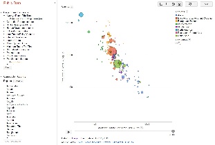
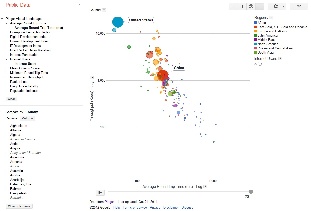
Below are some examples of the Motion bubble chart:
Default view | Highlighted countries with |
|---|---|
| |


Usage
By default the pinger data explorer shows the bubble chart between throughput in log scale to average_rtt in log scale. Each bubble represents a country. The size of the bubble shows population of the country. The color of the bubble shows the region of the country. The motion is the time. The time granularity is by the year. Click on the play button to initiate motion.
- On the left, there are two panels: PingER Visual Landscape and Compare by Country
- PingER Visual Landscape shows the metrics which are measured by PingER and which can be compared to other metrics or indices of the world.
- Click on a metric name, a sub heading of the metric will appear. Click the sub heading, a menu will open which will allow you to choose the metric to be displayed at X-axis, Y axis; or to color the bubbles on the basis of this metric; or to size the bubbles on the basis of this metric.
- Other PingER metrics that are available include minimum_rtt, ipdv, packet_loss, internet users, population, n throughput, MOS, Ping unreachability, Corruption Perception Index (CPI), Digital Opportunity Index (DOI), Human Development Index (HDI), ICT Development Index (IDI) and internet penetration index.
- A log scale or a linear scale can be chosen for X and Y axis by going to the chart options (top right), a drop down menu appears which allows you to select default colors; allows you to set same bubble size for all bubbles; and allows you to show the trails.
- The lower left panel allows you to compare countries within a selected region or with all the countries of the world.
- In the lower left panel, below compare by country, and next to regions there is a drop down menu of colors. This allows you to choose countries to be compared in a region or with all the regions; and also allows you to color the bubbles according to regions. By default it is set to compare all the countries of the world.
- Move the cursor over a bubble to identify the values for the bubble.
- Move the cursor over a colored legend symbol to blink the bubbles associated with the symbol's color.
- To follow the changes in detail simply move the slider bar with the mouse.
- One can select a bubble by clicking on it to provide a label for the bubble that persists with the motion. The trails check box leaves a trail to follow the motion of selected bubbles.
- By clicking the link at the right top of the page, one may select the vantage point, the observed region and the granularity of the measurements.
- Only one axis (or metric) can be chosen for Motion map, Motion histogram and Line chart. Line chart requires countries of interest to be selected to view the line chart of that metric with respect to years as it does not have motion feature.
Implementation Details
HTML Output
...