...
We downloaded the HPI data from the web and compared it with the PingER Normalized Derived Throughput for 2011. The result is seen below in the bubble plot with the bubble size being by country, and the bubble color identifying the region. To assist in distinguishing regions: European Countries are surrounded in yellow, East Asian countries are surrounded by green,and South Asian by red. the The spread sheet is found here. The correlation with Internet performance is not strong. This is probably since the countries with the best Internet performance tend to the more developed ones that also consume the most resources.
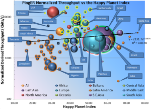
The ideal is to have high throughput and a high HPI (i.e. people live a long healtyhy life and the impact on the planets resources are minimal). Thus the closer to the top right (shaded blue) the better. It is seen that Costa Rica has the highest HPI. In general Latin American countries fare better when measured by the HPI. African countries (blue with orange surround) tend to be the worst off (i.e. in the pink regions) in throughput, happiness and offending the planet. The best developed country in terms of HPI is the Netherlands. A big offender in terms of HPI appears to be the USA with Russia and the Ukraine not far behind.. On the other hand big producers like Germany and China have better HPI values.