Introduction
The following Case Study of Sub-Saharan Africa was put together following the presentation at the "2nd IHY-Africa Workshop" 11-16 November 2007, Addis Ababa, Ethiopia, and the presentation at the "Internet & Grids in Africa: An Asset for African Scientists for the Benefit of African Society", 10-12 December 2007, Montpellier, France. It contains most of the information presented plus much more background information.
We first discuss the current situation including infrastructure, capacity, costs and opportunities. We then discuss the Internet performance measured by PingER comparing Africa to the rest of the world, and between sub-regions in Africa. We compare PingER measurements with other measures for capacity and throughput and for different development and corruption indices. We also look at the routing and bandwidth utilization in Africa. We then go on to show some examples of the effect of the poor African performance and suggest some possible remedies. Finally we wind up with some conclusions. Appendices are included: on detailed measurements and routing per country; and further useful reading.
African Situation
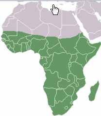
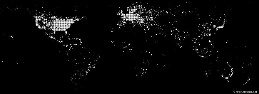
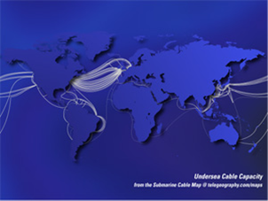
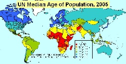
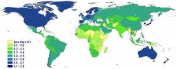
Internet coverage and performance in the Sub Sahara region of Africa (see Figure 1, for the UN definition of the Sub-Sahara) is exceedingly poor. This is illustrated by the number of Internet connections per city worldwide seen in Figure 2 where it is seen that Africa stands out as almost lacking any (i.e. it is dark). Figure 3 illustrates how Africa has very little submarine cable connectivity (white lines) compared to the rest of the world.
Figure 1: UN Definition of Sub-Sahara |
Figure 2: World Internet Connection Density |
Figure 3: Submarine Cables 2007, from telegeography.com |
|
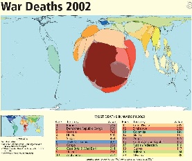
|
|
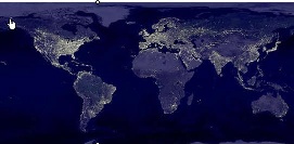
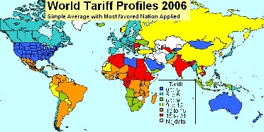
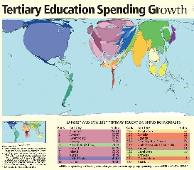
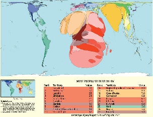
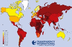
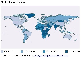
There are many reasons for this poor connectivity including: electricity (see Figure 4 for the light at night for the world and compare Africa with the rest of the world), import tariffs (see figure 5), skills (see Figure 6 for a cartogram (where territories are re-sized according to the subject of interest - all cartograms shown here are from http://www.worldmapper.org/) of tertiary education spending growth), disease (Figure 7), protectionist policies, corruption (see Figure 8), conflict (see Figure 9), unemployment (see figure 10) and brain drain.
Figure 4: World light at night |
Figure 5: World Tariff Profiles |
Figure 6: |
|---|---|---|
|
|
|
Figure 7: HIV Prevalence |
Figure 8: Corruption Perception Index |
Figure 9: |
|
|
|
Figure 10: Global Unemployment 2007 |
|
|
|
|
|
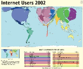
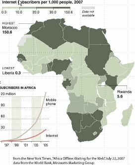
Another way of looking at the poor situation in Africa is to look at Figure 11, illustrating the lack of Internet users in Africa compared to the rest of the world. At the bottom left of figure 11c is shown the growth of Internet users and cell phone subscribers. This may suggest that cell phone infrastructure may be a very valuable way to leverage Internet growth.
Figure 11a: |
Figure 11b: |
Figure 11c: |
|---|---|---|
|
|
|
Capacity
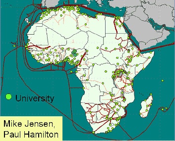
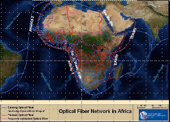
International capacity to African countries is mainly provided via satellite or via fibre links. Satellite links are not only much more expensive (300-1000 times) in terms of $/Mbps but they also induce long delays of over 400mseconds that result in lack of interactivity and poor performance. However in 2004 only 14 of 49 sub-Saharan countries had access to fibre according to NEPAD. In fact as seen in Figure 12:
Figure 12: Fibre links to and within Africa and the locations of universities |
Figure 13: |
|---|---|
|
|
There is only one large-scale intercontinental fiber link to Sub-Saharan Africa (SAT-3/WASC/SAFE) which provides connections to Europe (via Portugal) and the Far East for eight countries (Senegal, Ivory Coast, Ghana, Benin, Nigeria, Cameroon, Gabon and Angola) along the West Coast of the Continent and south to the Cape in South Africa. A second segment, in the Indian Ocean, connects South Africa to Malaysia while passing through Mauritius and India (SAFE). Jointly funded by 36 members and spearheaded by South African Telkom which invested US$85 million for a 13 per cent stake, the project cost about US$650 million dollars. The ownership of the cable was established as a club consortium, which is a confidential shareholder agreement about which little is known (despite efforts by the South African government to release the details). The cable was expected to lead to much reduced international bandwidth costs, but so far this has not occurred due to the business models used to develop the project. Even the few countries that have access to international fiber through SAT-3 are not seeing the benefits because it is operated as a consortium where connections are charged at monopoly prices by the state owned operators which still predominate in most of Africa, and in many other developing regions. Landlocked African operators who have tried to purchase international fibre capacity directly from one of the consortium's international members have found themselves being charged as much to reach the SAT-3 landing point as they were charged to get from the landing station to Portugal. Sadly, the high costs have made it cheaper to send the traffic directly by satellite, even for SAT-3 shareholders such as Telecom Namibia, which has no landing point of its own. Except for some onward links from South Africa to its neighbors, and from Sudan to Egypt and from Senegal to Mali, the remaining 33 African countries are unconnected to the global optical backbones, and depend on the much more limited and high-cost bandwidth from satellite links.
Mike Jensen
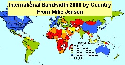
In fact SAT-3 prices have barely come down since it began operating in 2002 and are sold at satellite prices of $4-8K/Mbps/mo even though the capacity is only 5% used. As a result the lack of fiber and lack of competition on SAT-3, international bandwidth to African countries, as seen in Figure 13 lags well behind most of the rest of the world.
It should also be pointed out that the fact there is only one fiber optic cable means the only backup is satellite which may not be configured to take the re-0reouted traffic, and in any case may have inadequate capacity.
The ATICS survey of 84 leading tertiary institutions in Africa found 850,000 students and staff with access to a total of only 100Mbps international bandwidth. By contrast, Australia's tertiary community of 250,000 share 6Gbps of international bandwidth (although even this is still insufficient to meet their needs).
Costs
One result and immediate cause of this is the cost of Internet connections in Africa and how they relate to income (Compare Figure 14a and 14b) and affordability. For example "Currently [2007] prices on SAT-3 are up to US$15,000 / Mbps/month, while it is estimated to cost the consortium only about US$300/Mbps/month". From a posting by Dewayne Hendricks on Dave Farber's Iper list -- Bill St Arnaud. Figure 14c (from Mike Jensen) shows the GDP per capita in 2006.
Figure 14a: 2002 |
Figure 14b: |
Figure 14c: GDP/capita for 2006 |
|---|---|---|
|
|
|
Market Research conducted by Paul Budde Communications indicates that 1 year of Internet access is greater than the annual income of most Africans. Only in Egypt, Libya, and Mauritius is the annual cost of Internet access < 10% of the annual income. A study on Promoting African Research & Education Networking (PAREN), sponsored by IDRC, in Jan 2005 showed that African universities pay on average 50 times more for bandwidth than, for example, U.S. universities ($5.46/ Kbps/month vs. $0.12/Kbps/month). W. Africa pays on average $8/Kbps/month, and N Africa $0.52/Kbps/month. An OECD study on Broadband in November 2007 showed a median for OECD countries of $16/Mbps/month with Japan at $3.09/Mbps/month. Even a recent Bandwidth Initiative by a coalition of 11 African Universities (MZ, TZ, UG, GH, NG, KY) + four major US Foundations to provide satellite through Intelsat though it reduced the costs by a factor of three they are still at $2.23K/Mbps/month. Thus Africans are paying hundreds of times what is being paid by residences in OECD countries.
Opportunities
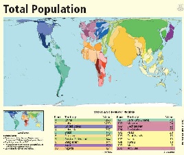
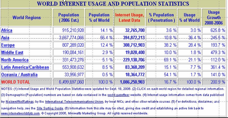
In 2006 Africa had reached close to 1 billion people or about 14% of the world's population. The Internet usage is growing faster than the rest of the world. However, the Internet penetration shown in the table below is only about 3.6% so it is a huge potential market.
At the same time there are promises of considerably increased fibre connectivity to sub-Saharan Africa, see figure 15a. In fact, four major undersea cable projects are currently engaged in a race to be the first to lay a fibre-optic link connecting the eastern seaboard of Africa to the rest of the world, with the most vicious competition centering on the connections to Europe, which is the destination for 85 per cent of international bandwidth traffic in Africa. The four projects are the East African Submarine Cable System (Eassy), Seacom, TEAMS and Reliance of India. The goal is to have these cables in place in time for the Soccer World Cup in South Africa in 2010.
Figure 15a: |
Figure 15b: Median Population age |
|---|---|
|
|
GEANT has connections to EuMed in particular Marocco, Algeria, Tunisa and Egypt, see http://www.dante.net/upload/pdf/EUMED-poster.pdf . They are now working on connecting to Ubuntunet East and South.
Also the UN, governments such as China, the UK, Europe, the US and companies such as AMD, Intel,Microsoft, Cisco, Nokia and Ericsson are recognizing the opportunities and needs and investing. This will introduce challenges of new development models such as more inclusive business models; bottom-up approach; working in new regulatory, policy and poor infrastructural availability environments; working with governments and others to ensure fibres are installed with any major relevant projects (railways, roads, electricity pylons etc.); micro-payments; content in many new local languages; use of wireless for last mile connections; Internet kiosks and cafes, etc.
Though there are currently (2007) only 3 NRENs (Kenya/KENET, Malawi/MAREN, and South Africa/TENET) in Sub-Saharan Africa, another 9 are under construction.
Finally, Africa has a very young population:
Despite the general trend toward population ageing, countries that still have relatively high fertility will have a younger population than the rest by 2050. Mostly least developed countries are in this group. In 2050, the youngest populations will be found in 11 least developed countries whose median ages are projected to be at or below 23 years. These countries include Angola, Burundi, Chad, the Democratic Republic of Congo, Equatorial Guinea, Guinea-Bissau, Liberia, Niger and Uganda. Today, the median age in Mali, Niger and Uganda is16 years or less, making their populations the youngest in the planet.
From "World Population Prospects, The 2004 Revision" UN available at: [http://www.un.org/esa/population/publications/WPP2004/2004Highlights_finalrevised.pdf|
http://www.un.org/esa/population/publications/WPP2004/2004Highlights_finalrevised.pdf]
This is illustrated in the map in figure 15b where the data is from the UN "World Population Prospects, The 2004 Revision".
PingER and Internet Performance in Africa
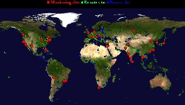
The PingER project is arguably the most extensive active end-to-end Internet performance measurement project today. Its data goes back over a decade and more recently has focused on measuring the Digital Divide. It covers measurements from over 16 countries to over 150 countries (see Figure 16) containing over 99% of the world's Internet connected population. 45 of the countries are in Africa.
Figure 16a: PingER Deployment Dec 2007, red are monitoring sites, blue beacons that are monitored from most monitoring sites and green the monitored only sites. |
Figure 16b: Google map of African sites Dec 07 |
|
|---|---|---|
|
|
Worldwide Comparison
|
|
|
|
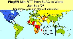
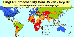
Packet Loss as seen from N. America |
min RTT as seen from N. America |
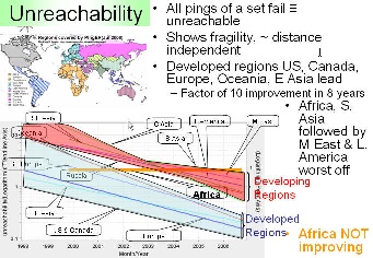
Unreachability |
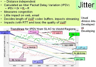
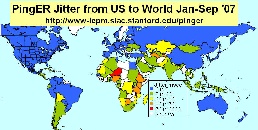
Jitter |
|---|
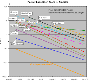
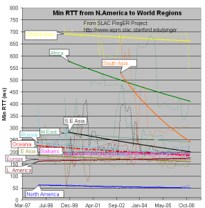
The left hand figure shows the packet loss to various regions of the world as seen from N. America. Since losses are fairly distance independent no attempt has been made to normalize the data. It is seen that the world divides up into two major super-regions: N. America, Europe, E. Asia and Oceania (mainly Australia and New Zealand) with losses below 0.1%, and Latin America, C. Asia, Russia, S.E. Asia, S. Asia and Africa with losses > 0.1% and as high as as a few per-cent. All countries are improving exponentially, but Africa is falling further behind most regions.
The second figure from the left shows the drop in the Minimum RTT from 2002-2006. The large step for S. Asia in 2003 was due to the change over from satellite to fibre. Central Asia (also Afghanistan) has hardly moved in its minimum RTT since it continues to use geostationary satellites.
The third figure from the left shows the unreachability of world regions seen from the US. A host is deemed unreachable if all pings of a set fail to respond. It shows the fragility of the link and is mainly distance independent (the reasons for fragility are usually in the last mile, the end site or host). Again the developed regions - US and Canada, E. Asia, and Oceania - have the lowest unreachability (< 0.3%) while the other regions vary from 0.7% to 2%. Africa shows poor statistics and is not improving, where as S. Asia has the second worst results.
The last graph shows the jitter (or variability of RTT) of world regions seen from the US. The jitter is defined as the Inter Quartile Range (IQR) of the Inter Packet Delay Variability (IPDV i = RTT i - RTT i-1). Jitter is relatively distance independent, it measures congestion, and has little impact on the Web and email. It decides the length of VoIP codec buffers and impacts streaming. We see the usual division into developed versus developing regions.
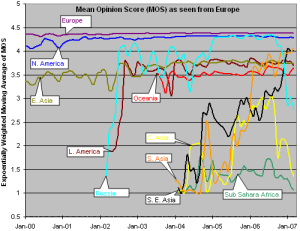
MOS for various Regions
There are three factors that significantly impact call quality: latency, packet loss, and jitter. We calculate the jitter using the Inter Packet Delay Variability (IPDV) , see the tutorial for further details.
Most tool-based solutions calculate what is called an "R" value and then apply a formula to convert that to an MOS score. Then the R to MOS calculation is relatively standard. The R value score is from 0 to 100, where a higher number is better. To convert latency, loss, and jitter to MOS we follow Nessoft's method. The graphs below shows the Exponentially Weighted Moving Average (using EWMI i = alpha * EWMI i-1 + (1 - alpha) * Obs i where alpha = 0.7 and EWMI 1 = Obs 1) for the MOS as seen from the W. Coast of America (SLAC) and Switzerland (CERN). N.B. MOS values of one are reported for heavy loss (loss > 40 %).
|
|
|
Mean Opinion Score as seen from the US |
Mean Opinion Score as seen from CERN |
Mean Opinion Score as seen from Europe |
|---|
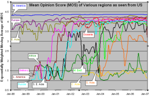
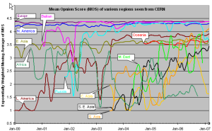
CERN monitors fewer remote hosts than SLAC (56 versus over 400) so the data is not as complete in the CERN case. Comparing the two graphs, it can be seen that, as expected, the MOS is better for the shorter distances (i.e. CERN to Europe is better than SLAC to Europe, SLAC to N. America is better than CERN to N. America.).
It is also seen in both graphs that the Balkans, Russia and Latin America improved dramatically in 2000-2002. Much of Latin America and Russia moved from satellite to land lines in this period. It can be seen from the above plot that VoIP ought to be successful between SLAC and the US, Europe, E. Asia, Russia, Latin America and the Mid East (all above MOS = 3.5). S. E. Asia is marginal, S. Asia people will have to be very tolerant of one another, and C. Asia and Africa are pretty much out of the question in general. In general the CERN graphs looks similar to the SLAC graph to the various regions, except that S. E. Asia is worse for CERN than SLAC as is S. Asia
The third graph shows the Mean Opinion Score (MOS) from Europe two various regions. We have five monitoring sites in Europe (one at CERN, one at ICTP, one in Germany, and two at UK. The improvement in Latin America and Russia in 2002 is the result of shift from satellite to fiber. The drop for Russia in Sep, 2006 is because we installed a new version of PingER and it started monitoring 9 hosts in Russia whereas previously it was monitoring 20 hosts. For Central Asia the number of sites went up from 3 to 15 in Sep 2006, so the latter results are a better indication of the overall performance of Central Asia. For Sub Sahara Africa the coverage improved in Sep, 2006 (increased from 8 to 39 sites). So for sub Sahara Africa the results after Sep 2006 presents a better picture. South Asia as seen from Europe is performing better than as seen from US because MOS is derived from average RTT which is distance dependent.
Information on Calculation MOS can be found at http://www.slac.stanford.edu/comp/net/wan-mon/tutorial.html#mos
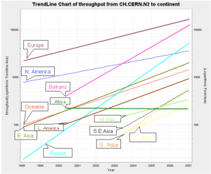
TCP throughput from CERN & SLAC to World Regions
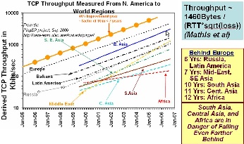
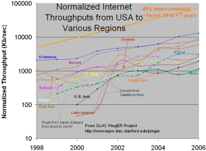
The graphs above show the derived TCP throughput using the Mathis formula. The macroscopic behavior of the TCP congestion avoidance algorithm by Mathis, Semke, Mahdavi & Ott in Computer Communication Review, 27(3), July 1997, provides a short and useful formula for the upper bound on the transfer rate:
Rate <= (MSS/RTT)*(1 / sqrt(p))
where:
Rate: is the TCP transfer rate or throughputd
MSS: is the maximum segment size (fixed for each Internet path, typically 1460 bytes)
RTT: is the round trip time (as measured by TCP)
p: is the packet loss rate.
In the left hand two graphs the data points (average throughput per month) are fitted to exponential functions and for simplicity the trend lines only are shown. These lines enable us to see that Russia and Latin America are 6 years behind Europe, the Mid-East and SE Asia are 7 years behind, and S. Asia, C. Asia and Africa are 10 years or more behind. What is even more concerning is that Africa (in particular), South and Central Asia are not catching up.
The right hand most figure shows the yearly average derived TCP throughput normalized by the minimum RTT for the region (to reduce the proximity effects). It is seen that the throughputs are not simply exponential straigh lines, but typically change in steps as major changes are made in the routing and circuits.
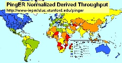
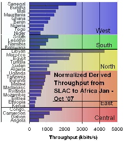
PingER Metrics for Africa
For African countries the PingER metrics are shown for African countries ordered by sub region (e.g. N. Africa) and country, measured from Jan-Sep 2007 in the figure below. It is also seen how the various components contribute to the derived throughput (8 * 1460 / (Average_RTT * sqrt(loss))
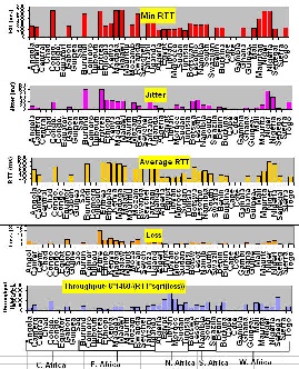
One way of showing how Africa is behind the rest of the world from the point of view of PingER Internet measures is to compare maps of the performance for several metrics for January through September 2007. These are shown in the Figures below.
Red indicates geostationary satellite |
Voice & Video de-jitter required |
Host & Network Fragility |
Data Transfer |
|---|---|---|---|
|
|
|
|
Correlation between PingER and Other Metrics
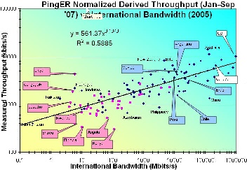
The figure below shows the correlation between International bandwidth Inn Figure 12) and the normalized derived PingER throughput. It can be seen that the correlation is good (R 2 ~ 0.59). It is also seen that the African countries (in Magenta) lie towards the bottom left where both the throughput and International Bandwidth are low. Libya is an anomaly since the only site monitored there is the email server for the Libya Telecommunications which should have good connectivity compared to most sites in Libya.
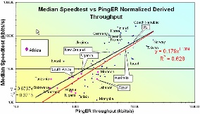
To verify whether the order of magnitude of the normalized derived throughput is correct we compare it with the Speedtest results from www.zdnet.com.au/broadband/results.htm. This application sends a known amount of data between your computer and servers in Australia. Then it measures throughput and besides returning the result to the user, it also saves and makes available the results by country and ISP. The correlation is shown in the figure below. The orders of magnitude of the two methods agree and there is a strong correlation. As expected the African countries have the poorest results.
There are many indicators of countries' development from organizations such as the International Telecommunications Union, the United Nations, the CIA, the World Bank try to classify countries by their development. They are quite challenging and require careful consideration of: what can be measured, how useful is it, how well it is defined, how it changes with time, how it changes from country to country, the cost of measuring, the time it takes to gather (to avoid being too out of date, how subjective they are.
Typically they are based on some combination of GDP, life expectancy, literacy, education, phone lines, Internet penetration etc. Some examples include the Human Development Index (HDI), the Digital Opportunity Index (DOI), the Opportunity Index, the Technology Achievement Index etc. In general agree with one another (R 2 ~ 0.8). More information can be found here. For this report we focus on just two, the DOI (since it is recent and covers more countries than most) and the HDI since it different from the others and focuses on the human condition,
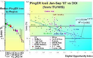
The Digital Opportunity Index (DOI) measures countries' ICT capabilities in infrastructure, access path and device, affordability and coverage, and quality. It covers 180 countries, and has recent (data 2005, announced in 2006). There are 11 indicators: that cover mobile telephony coverage, Internet tariffs, #computers, fixed line phones, mobile subscribers, Internet users all in relation to the population of the country. A map of the values for world countries and the correlation with the normalized derived PingER throughput is shown in the figures below. The Correlation is fairly good. As usual Africa is the worst off being 30 time worse than the US in terms of loss.
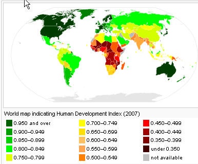
"The Human Development Index (HDI) is the measure of life expectancy, literacy, education, and standard of living for countries worldwide. It is a standard means of measuring well-being, especially child welfare. It is used to determine and indicate whether a country is a developed, developing, or underdeveloped country and also to measure the impact of economic policies on quality of life." from Wikipedia.
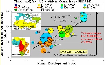
The figures below shows a map of HDI by country, the correlation between the HDI and the normalized derived PingER throughput for Mediterranean and African countries, and the PingERE throughputs per African country. The correlation is seen to be strong (R 2 ~ 0.64) in the middle figure. It is also seen that N. Africa has 10 times poorer performance than Europe, yet N. Africa is several times better than say E. Africa. E. Africa is poor, limited by its satellite access. For W. Africa there are big differences, some such as Senegal can afford SAT3 fibre while others use satellite, There is great diversity between and within regions. This is also show for the normalized derived PingER throughput for Africa in the figure to the right where one can see the overall throughput performance is poor to bad. There is a factor of 10 difference between Angola and Libya. N Africa is the best, and E Africa the worst. There are big differences within regions. In 2002, BW/capita ranged from 0.02 to over 40bps - a factor of over 1000.
Map of HDI 2007 |
Throughput vs HDI for African countries, also showing population |
Pinger throughput by African sub-region |
|---|---|---|
|
|
|
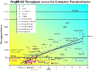
The Corruption Perception Index (CPI) from Transparency International relates to perceptions of the degree of corruption as seen by business people and country analysts, and ranges between 10 (highly clean) and 0 (highly corrupt). It covers 180 countries. See figure 8 for a map of its values for various countries in 2006. The correlation between the Normalized derived throughput and the CPI is shown below. The overall correlation of R 2 ~ 0.55 is good, however if one looks at the correlations for a region such as Latin America, South Asia or Africa it is very poor and negative in the case of Latin America.
Routing and Bandwidth use
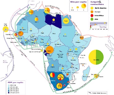
According to Mike Jensen, in 2002 there was almost no intra-African Internet connectivity and the vast majority of international bandwidth lands in the G8 countries - principally North America followed by Europe (Belgium, France, Germany, Italy, Netherlands, Norway, Portugal, and the UK). High intra-regional telecom prices limited the establishment of links between neighbouring countries to just 5 - Gambia-Senegal, and South Africa's links to Namibia, Lesotho, Swaziland and Botswana. As a result increasing amounts of intra-African traffic must be transited through high cost cross-continental links. The utilization of bandwidth in 2002 is seen in the figure below.
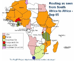
Looking at the figure below of the routing from the best connected country in Sub Saharan Africa, i.e. South Africa to the rest of Africa in 2005 it is seen that aprt from to Zimbabwe and Botswana traffic was routed via other continents. Not only does this increase costs but it means that In essence the African community is subsidizing the international carriers.
One thing that is needed is to put into place International eXchange Points (IXPs) between countries to reduce costs and improve performance. This requires users (universities, countries) to band together to leverage influence, get deals etc. There is evidence of this happening in Ubuntunetand the Bandwidth Initiative referred to above. Further the successful launch on December 28 2007 of the RASCOM-1 (named after its parent operator the Regional African Satellite Corporation) is expected to cut costs by providing competition, provide inter-urban links, provide broadband for rural areas, and provide directs links between all African countries.
However, current providers (cable and satellite) have a lot to loose and many of these have close links to regulators and governments (e.g. over 50% of ISPs in Africa are government controlled), so this will be difficult in many cases and may require government intervention. Also the regulatory regimes on the whole are closed and resistant to change, and sometimes ISPs themselves are unwilling to co-operate
Some Examples of the Impact
- We had answers from Benin, Cameroun, Egypt, Kenya, Nigeria, Libya, Liberia, S. Africa (3), Algeria, Burkina Faso (2), Mozambique,. Ivory Coast, Congo DR, Congo R, Niger, Ethiopia, Uganda
- We did not get answers from from Senegal and Namibia
- 50% of the responders used commercial email addresses such as yohoo.com
- Typical leading university had tens of thousands of students and 1000 or staff.
- The best university had 2 Mbits, worst dial up 56kbps
- In some cases it is DSL at 128kbps or even dial up at 56kbps (c.f. typical US or European University with >= 1Gbps)
- Often only faculty are allowed to use the Internet.
- Only in 7 countries (Egypt, Cameroun, S. Africa, Burkina Faso, Mozambique, Ethiopia) are all universities connected.
- For other countries it varies from 5% to 50% of universities have Internet access.
- For Sub-Saharan Africa only S. Africa (TENET), Burkina Faso (RENER), Kenya (KENET) and Malawi (MAREN) have an NREN.
- Four countries have Internet connectivity in capital only (Ivory Coast, Niger, Congo DR, Congo Rep).
- South Africa has access almost anywhere people can afford it.
- Most want more bandwidth and reduced costs. Suggestions to increase competition, remove monopolies, open markets to international companies. Reliable power is often cited as a problem.
In 2006, the ATICS survey of 84 leading tertiary institutions in Africa found 850,000 students and staff with access to a total of only 100Mbps international bandwidth. By contrast, Australia's tertiary community of 250,000 share 6Gbps of international bandwidth (although even this is still insufficient to meet their needs).
Other examples from Heloise Emdon at the Acacia Southern Africa UNDP Global Meeting for ICT for Development, in Ottawa 10-13 July 2006 include:
- School in a secondary town in an East Coast country with networked computer lab spends 2/3rds of its annual budget to pay for the dial-up connection. It gives up and disconnects.
- A primary health care giver, somewhere in Africa, with sonar machine, digital camera and arrangement with national academic hospital and/or international health institute to assist in diagnostics. After 10 dial-up attempts, she abandons attempts to connect.
- Telecentre in a country with fairly good connectivity has no connectivity. The telecentre resorts to generating revenue from photocopies, PC training, CD Roms for content.
Also from the Harvard African Higher Education Study:
- Access to the internet is so desirable to students in Africa that they spend considerable time and money to get it. Many students surveyed, with no internet connection at their universities, resorted to private, fee-charging internet cafes to study and learn.
Possible Remedies
Advantage of investing in ICT
In the industrial age a pre-requisite was an expensive infrastructure of roads, railways, ports to distribute raw materials and products, plus factories (e.g. steel making, cars etc.). In today's information age help and technical information is readily accessible online, so one person with a computer and an Internet connection can be productive (e.g. outsourcing of help, information services etc.) An Internet connection is a necessary pre-requisite and cheaper to install than a highway. To compete in today's world, investment in ICT and networking is critical to enable opportunity and productivity. It can also help minimize the brain drain by making the country/region more attractive to trained people.
Ten Steps for Improving Internet Performance
It is clear that there are many Digital Divides, by region, country, within countries, age groups, city vs rural etc. How one reduces the Digital Divide varies from country to country, region to region etc. Based on what we have seen for Brazil, Romania, Pakistan and India tackling the Digital Divide typically involves a combination of the following:
- Recognize that it is not possible fix all ills for all people over night.
- Identify where to focus and invest effort. One good area is educating the teachers & students so they can teach others etc. another related area is research to help reverse the brain drain. Hence a focus on education and basic (university) research is a good place to start.
- Choose a champion application (e.g. education, science, telemedicine, video conferencing, distance learning) that will convince decision makers of the value of investing in good Internet facilities.
- Find energetic leaders from the country/region who can communicate the way forward. and the benefits to be gained
- Engage policy makers for science, ICT, research, technology, education and training to raise awareness of the realities of the information era, and help them understand the needs, identify the benefits to their country/region/community of good Internet connectivity and digital literacy in terms of increased productivity. Encourage policy makers to provide inducements for ICT development, networking and Internet adoption, e.g. by addressing funding, taxation, regulation, competition, transparency, education/skills, improved infrastructure (e.g. power, fibre capacity), Internet adoption, creating incentives, and rewarding effort.
- Collaborate among institutions in a region (e.g. create consortium), between leading disciplines, between continents, countries and regions (e.g. for Internet Exchange Points to provide direct connections) to increase influence, provide leadership and strengthen negotiation and collective bargaining bargaining positions. Consider forming a consortium of institutions as a basis for collaboration.
- Form partnerships with vendors vendors of equipment, communications infrastructure and services to lead the way, showcase leadership, demonstrate cost effectiveness, drive market penetration and create demand. Establishment of a cyber-infrastructure and good Internet connectivity are long term investments for the future, both for the company and the country/region.
- Get support:
- statements and cost-benefit examples from collaborators in other countries and internationally, and from organizations such as IHY, ICTP, ICFA, HEP, and professional societies (national and overseas).
- funding from agencies such as NSF, NASA, GEANT, EU, World Bank, Foundations, multinationals, companies.
- involve the diaspora.
- Utilize network performance measurements to quantify, explain and support the case for improvement (e.g. ITU, UNDP, PingER, World Bank, CIA ...), to compare with other countries/regions, and to validate the effects of improvements.
- Acknowledge the needs for new business/development models appropriate for the country/region.
Conclusions
- Poor performance affects data transfer, multi-media, VoIP, IT development & country performance / development.
- DD exists between regions, within regions, within countries, rural vs cities, between age groups.
- Decreasing use of satellites, expensive, but still needed for many remote countries in Africa and C. Asia.
- Last mile problems, and network fragility.
- International Exchange Points (IXPs) needed.
- Internet performance (non subjective, relatively easy/quick to measure) measured by PingER correlates strongly with economic/technical/development indices.
- Increase coverage of monitoring to understand Internet performance and validate improvements.
- Africa worst by all measures (throughput, loss, jitter, DOI, international bandwidth, users, costs etc.) and falling further behind.
Appendix A: Interesting Trends:
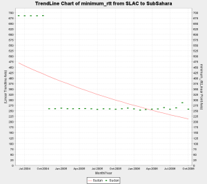
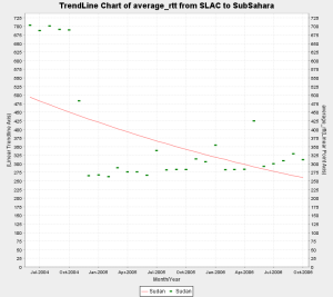
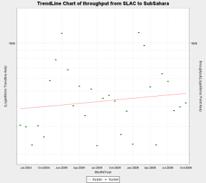
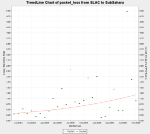
- Sudan shifted from average RTT of approx. 685 ms to approx. 260 ms in Nov 2004. This is a classic case of shift from Satellite to Fiber. However there is are no remarkable trends visible in the throughput. This is explained by the increase in packet loss over the same period of time. Thus the improvement in rtt was compensated by the increase in packet loss and the overall throughput fails to show any meaningful increasing trend.
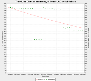
- Mauritania shows interesting behaviour. One of the hosts we monitor (www.pmd.mr) shows improved connectivity around Jan 2006 indicating a shift from satellite to landline. However the other host (www.maurifemme.mr), which is indicated as being on satellite and located in Norway (courtesy http://www.geoiptool.com) is showing the same rtt of around 680+ ms. If this host is actually in Mauritania then we can conclude that some parts of the country have shifted to fibre but others are still on satellite.
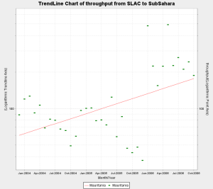
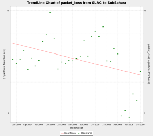
- In addition the throughput and packet loss for the both hosts show marked improvement since Jan 2006 which indicates better connectivity.
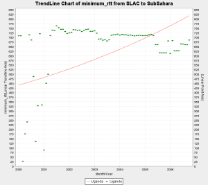
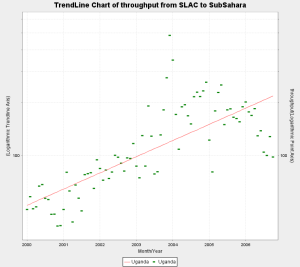
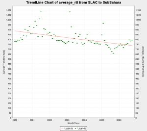
- Uganda has shown steady improvement in throughput and loss quality over the years since we started monitoring it in 2000. However the min_rtt of above 600 ms and the avg_rtt around 800 ms indicates that it is still mostly on Satellite.
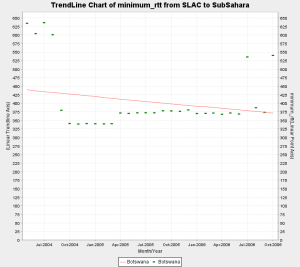
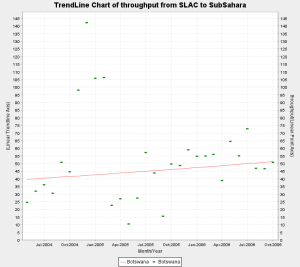
- Botswana shows a switch from satellite to fibre as the min_rtt switches from 600+ ms to around 350 ms around Sep 2004. Howver the packet loss and throughput do not show and particular trends which might indicate significant improvement.
- Very recent data for Ghana i.e. (Sep and Oct 2006) inidcates a shift from satellite to fiber. In particular if we examine the individual hosts we monitor in Ghana, one of the hosts shows a step change from 680+ ms to 260+ms, while the other still continues to show satellite indicating that part of the coutry may be shifting to fibre. Further more when we looked up the asn on both the hosts, the asn for host performing poorly was described as INTELSAT while the host which is now performing better had an ASN description of "UNSPECIFIED, NETWORK COMPUTER SYSTEMS, ACCRA GHANA".
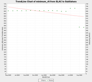
- There was a step change in the min RTT of Eritrea from 625 ms to 700 ms approx. in Sep, 2004.
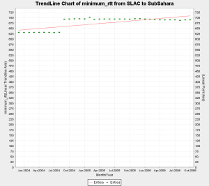
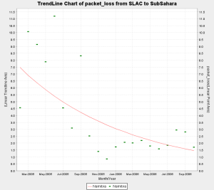
- The loss quality of Namibia shows steady improvement.
- The following countries are on Satellite since we began monitoring them:
- Ghana May, 2005
- Kenya April, 2004
- Madagascar Jan, 2004
- Malawi Sep, 2005
- Mozambique Jan, 2004
- Niger July, 2004
- Nigeria July, 2004
- Rwanda Mar, 2005
- Tanzania Jan, 2004
- Uganda Jan, 2000
- The following countries are on Fibre since we began monitoring them:
- Benin March, 2005
- Mali March, 2005
- Sinegal Jan ,2004
- S. Africa May, 2003
Maps of Connectivity from South Africa
An interesting way to analyze the state of internet connectivity in Africa is to look at colored maps of various metrics as seen from our monitoring node in South Africa. 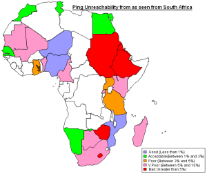
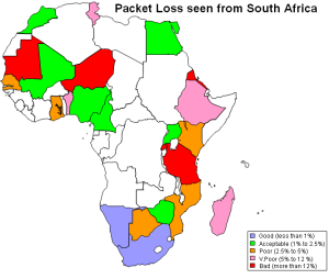
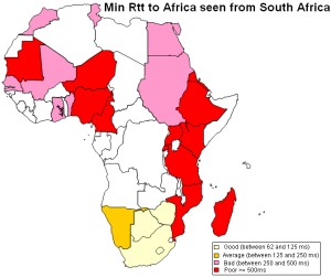
Ping Unreachability Packet Loss Min_rtt
Routing in Africa seen from SLAC
Using programs written to analyze traceroutes for different regions we have been able to generate topology maps of various regions in Africa as seen from SLAC. These maps provide a valuable insight into the various ASNs that are encountered as packets are routed from SLAC to Africa.
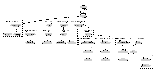

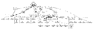
SLAC to West Africa SLAC to South Africa SLAC to East Africa
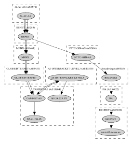
SLAC to Central Africa
Appendix B: Useful Links
ICT in Africa: a Status Report, Mike Jensen
West Africa Submarine cable Connection
Web Atlas of Regional Integration in West Africa
African Scientific Network
African Universities
Columbia University Africa Studies
Lowering the Cost of Internet Access in Africa
The bandwidth Initiative: Opening the power of the Internet to African Universities, Anna Bon
Can the Internet in tertiary education in Africa contribute to social and economic development?
University of Zambia Status.
Submarine Cables
Africa's New Satellite Rascom-1
International Workshop on African Research & Education Networking September 25-27 2005 CERN - Geneva, Switzerland
Orange to link Madagascar to broadband internet